Irene Sempere / ➀ Multidisciplinary designer, strategist, and facilitator based in Madrid. I have worked independently and within design studios, agencies, and interdisciplinary teams on projects spanning branding, visual identity, editorial design, web, user experience, and strategic and service design. I combine my design practice with teaching and cultural work. ➁ Since 2018, I’ve been running Mesa de Mezclas, a project that seeks to collectivize ideas, learnings, and experiences emerging from creative practices. ✷ Feel free to reach out to view my full portfolio or explore potential collaborations.
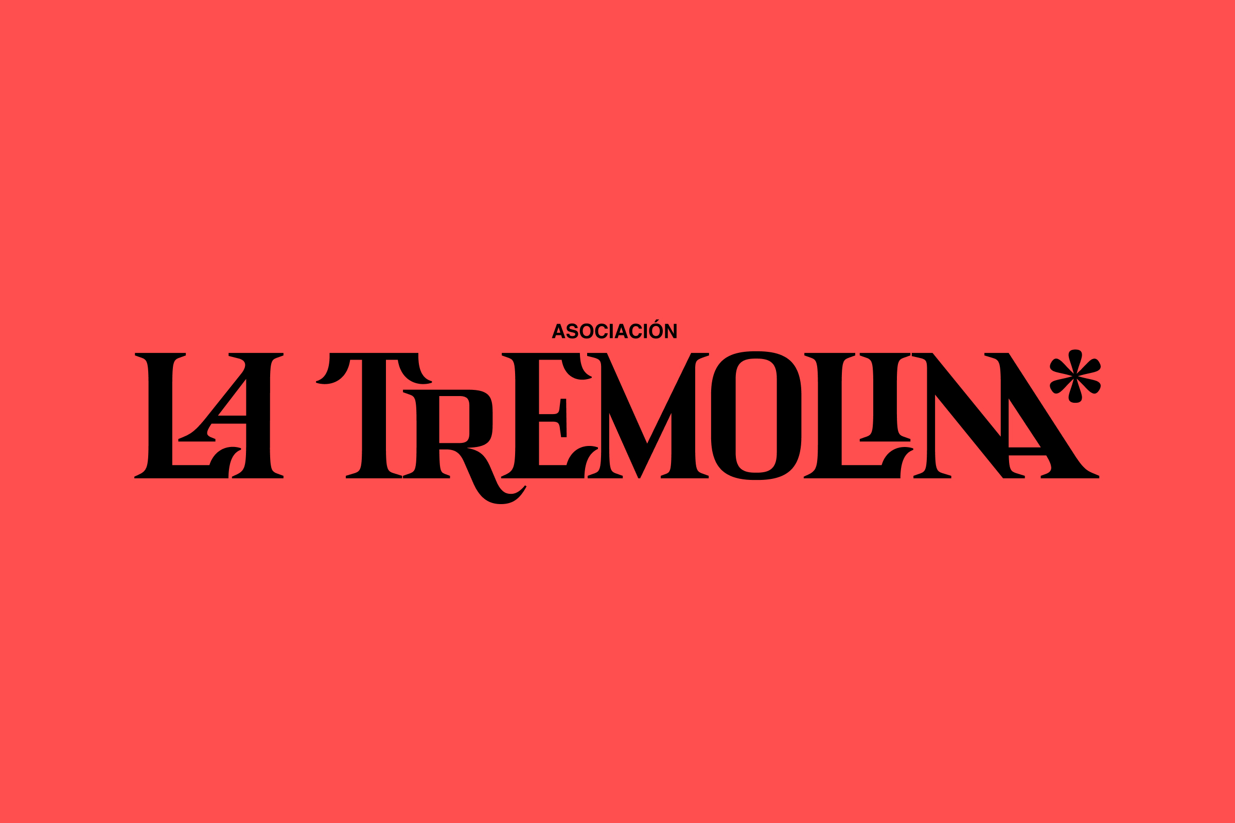
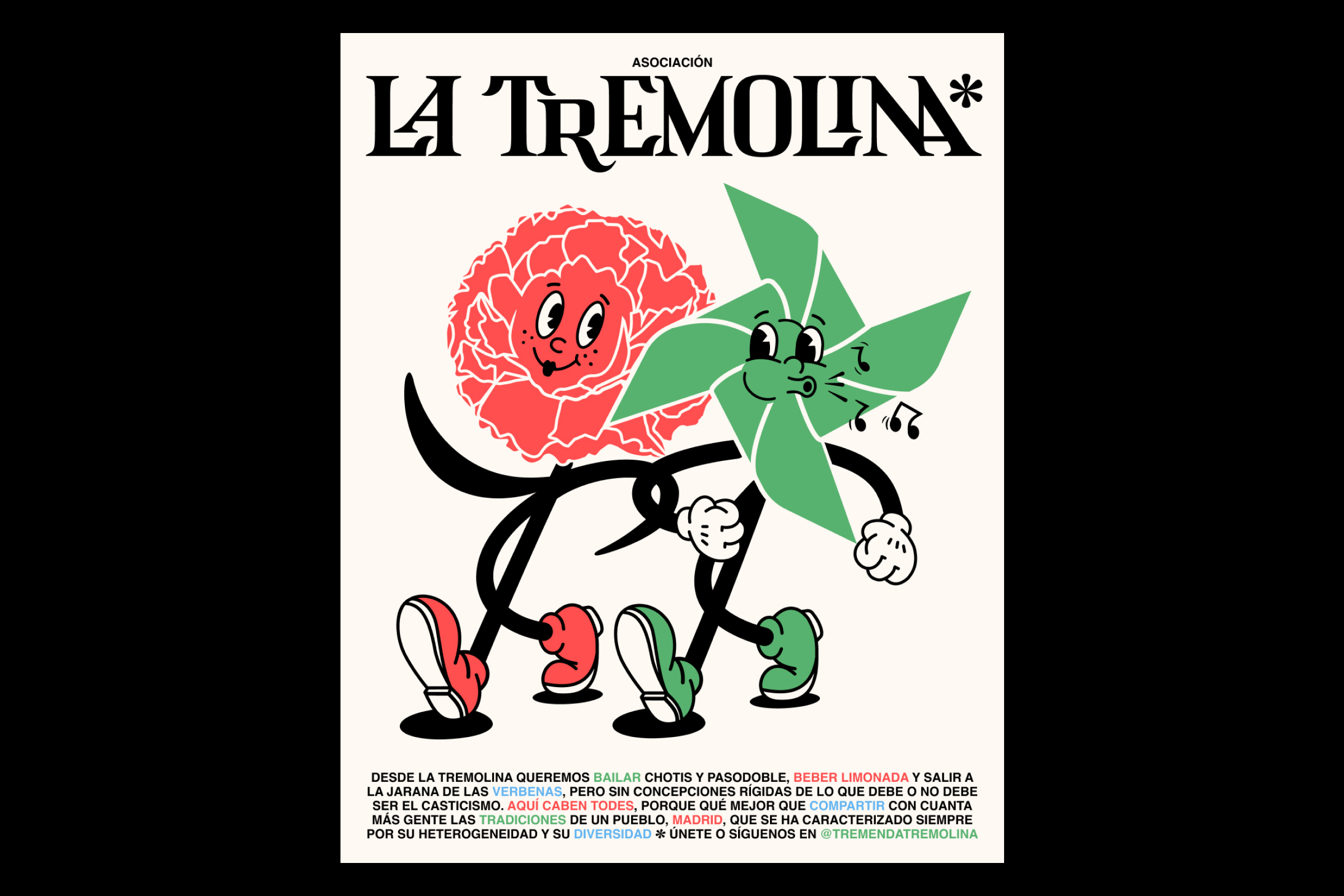
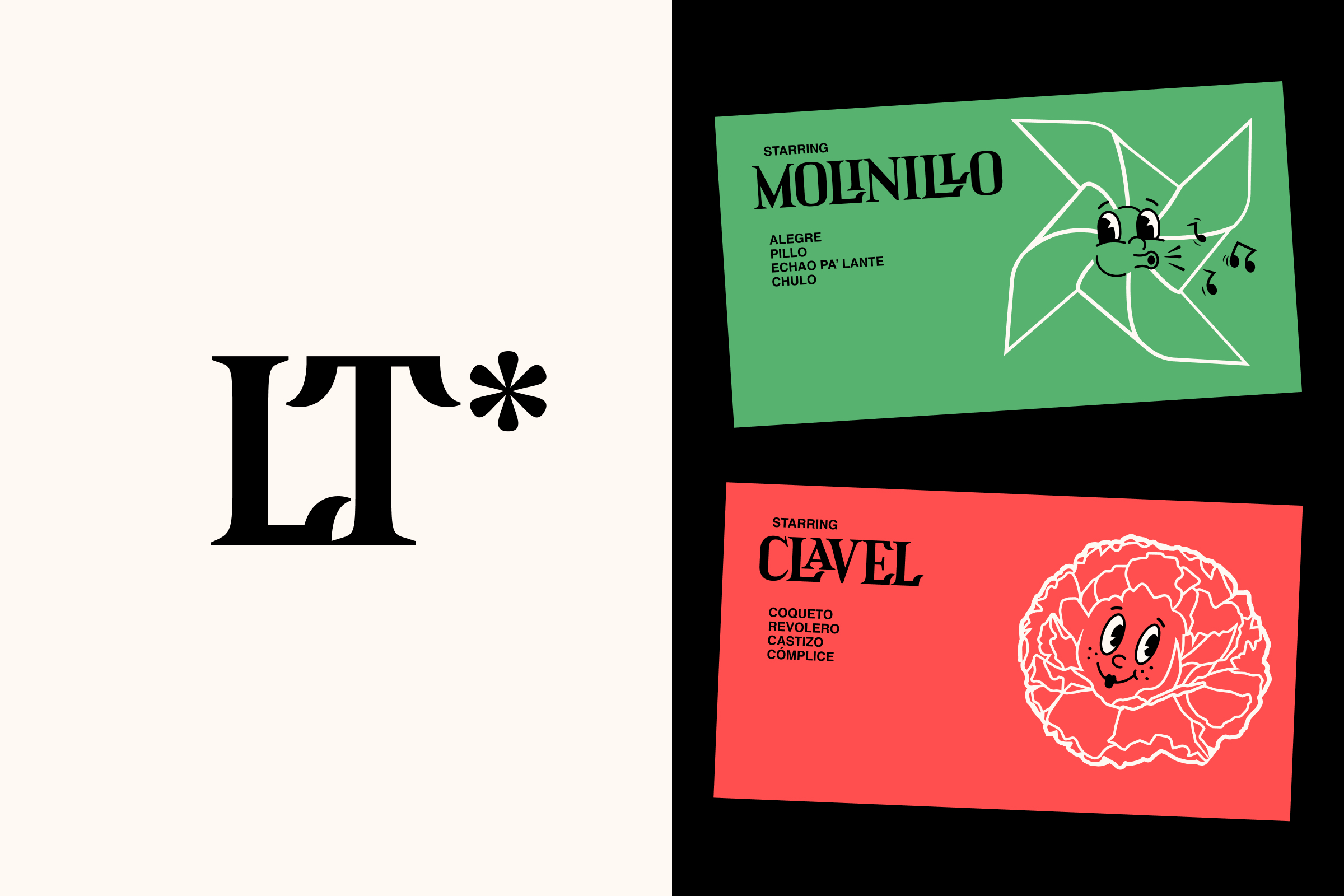
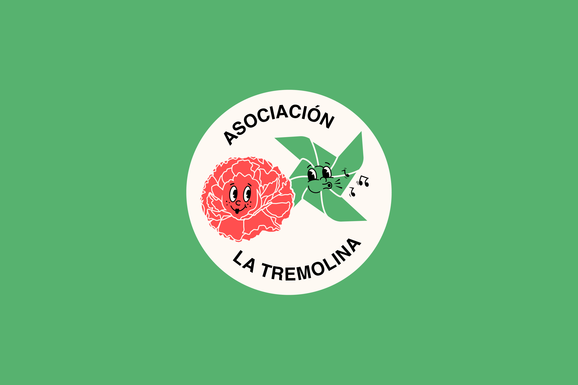
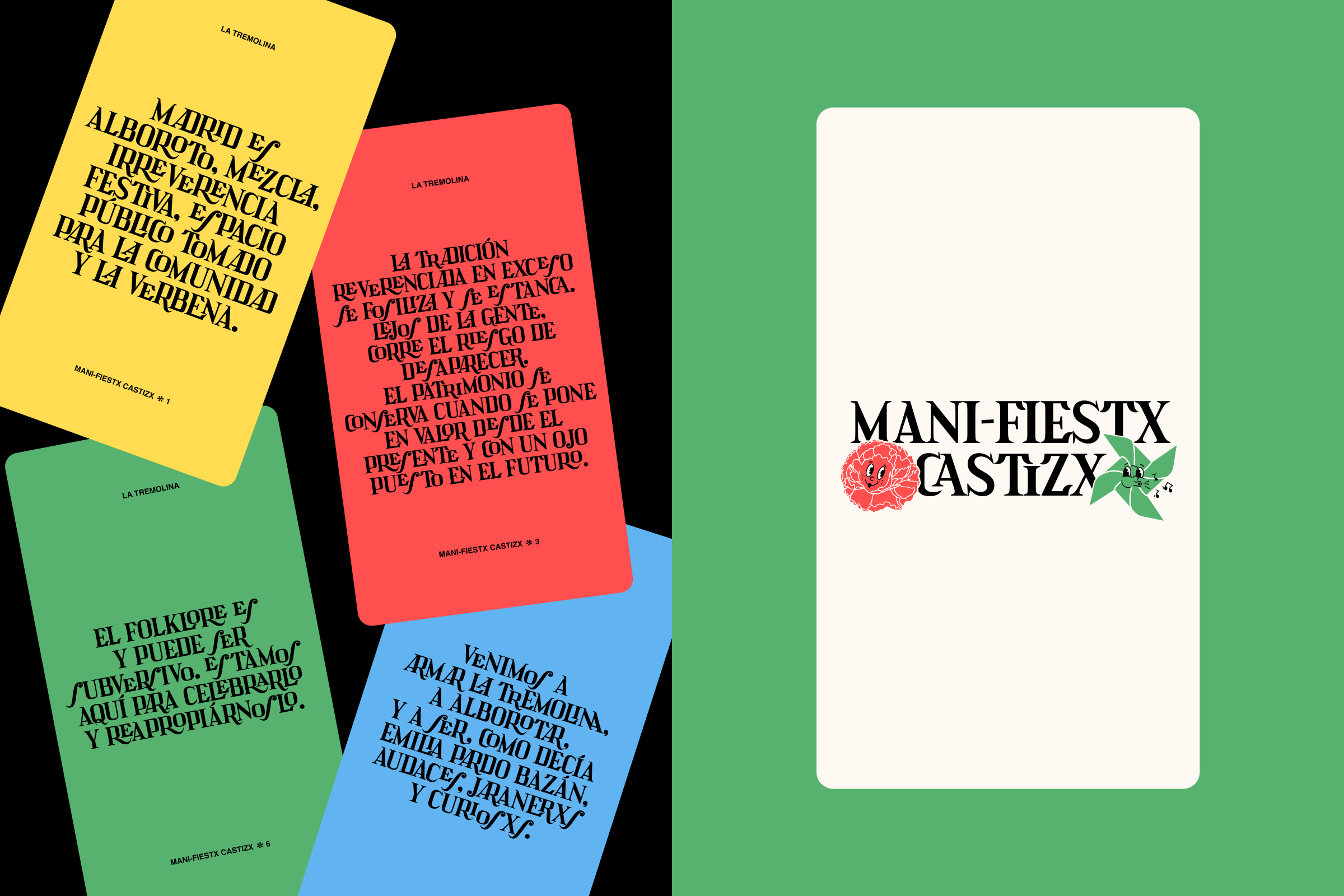
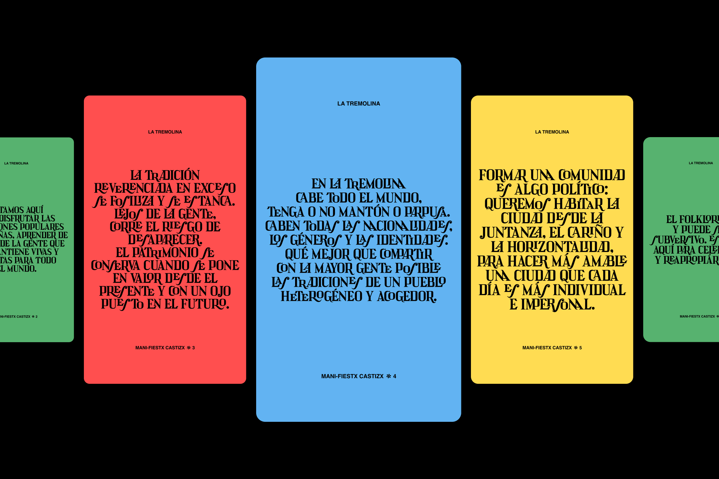

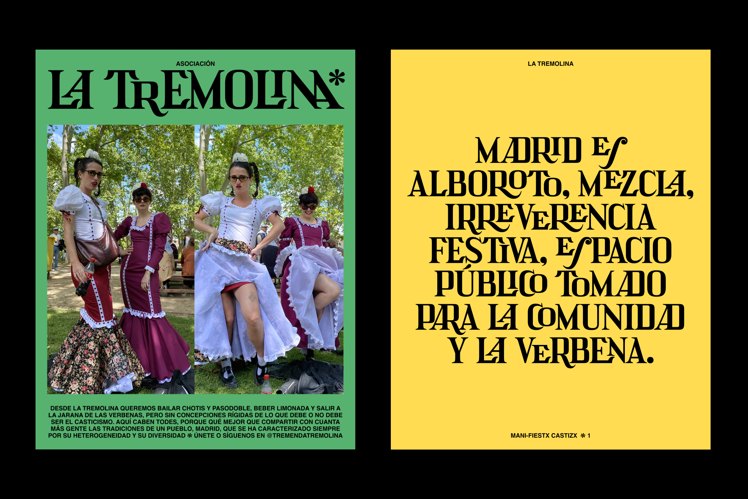
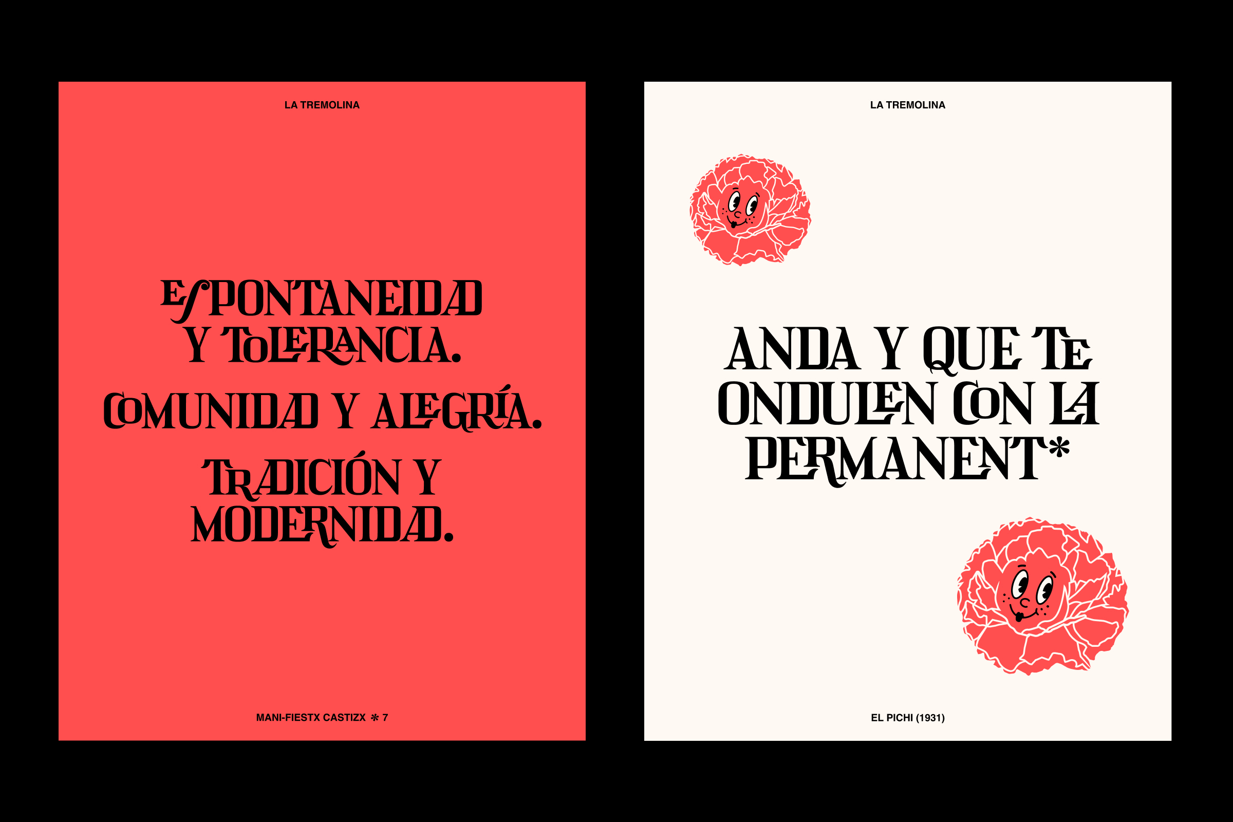
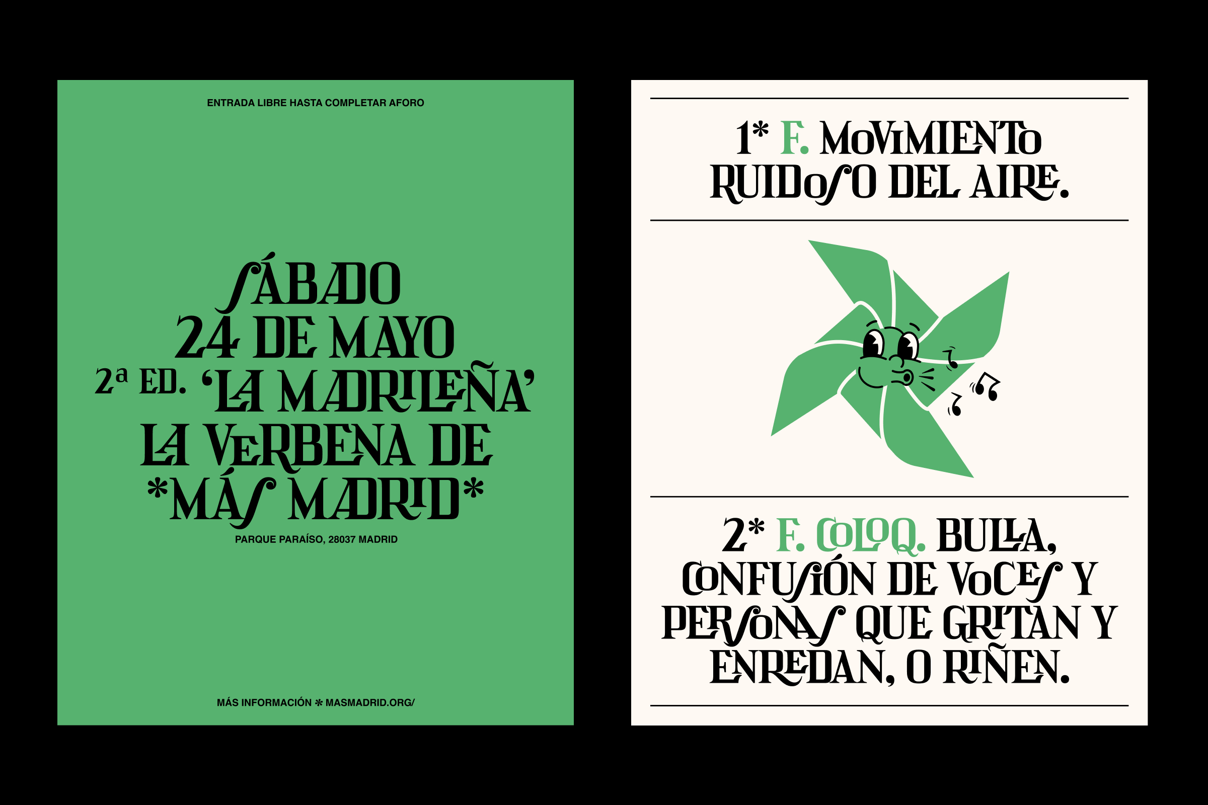
Logo, visual identity and communication design for La Tremolina, a new cultural association that celebrates Madrid’s uproar, mixture, festive irreverence, and its popular dances—chotis and pasodobles—reclaiming public space through collectivity and advocating for a living, open culture for all. Two animated characters, Molinillo (Little Spinner) and Clavel (Carnation), embody the spirit of the verbena: playful, proud, and full of attitude. Alongside them, the primary typeface, Pontejos 2—designed by Juanjo López and Ales Santos (Manufacturas Tipográficas Madrileñas), and inspired by the baroque lettering on Madrid’s ceramic street signs—moves through the identity like one more member of the troupe. / Character illustration: Pep Sempere. <2025>
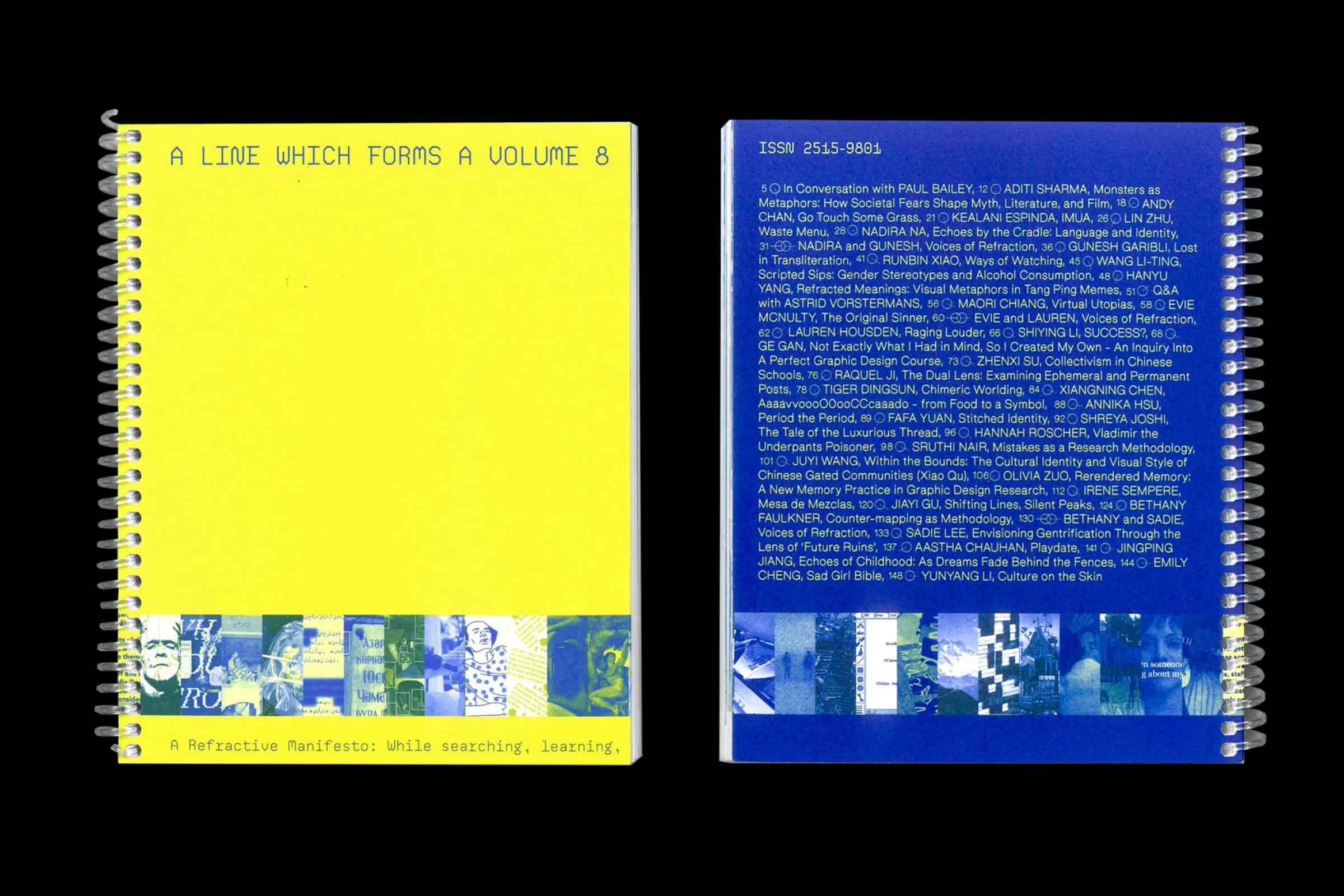
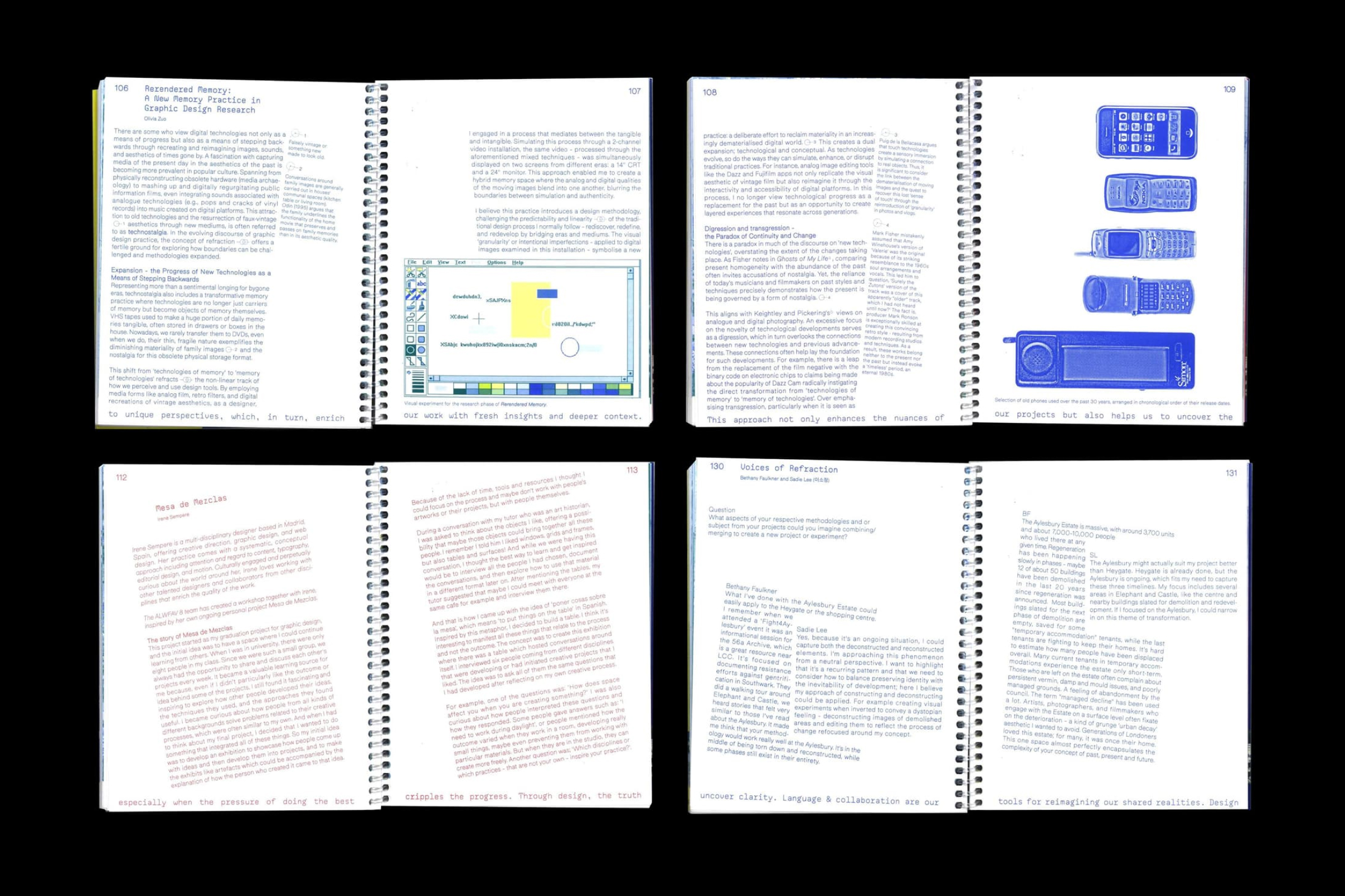
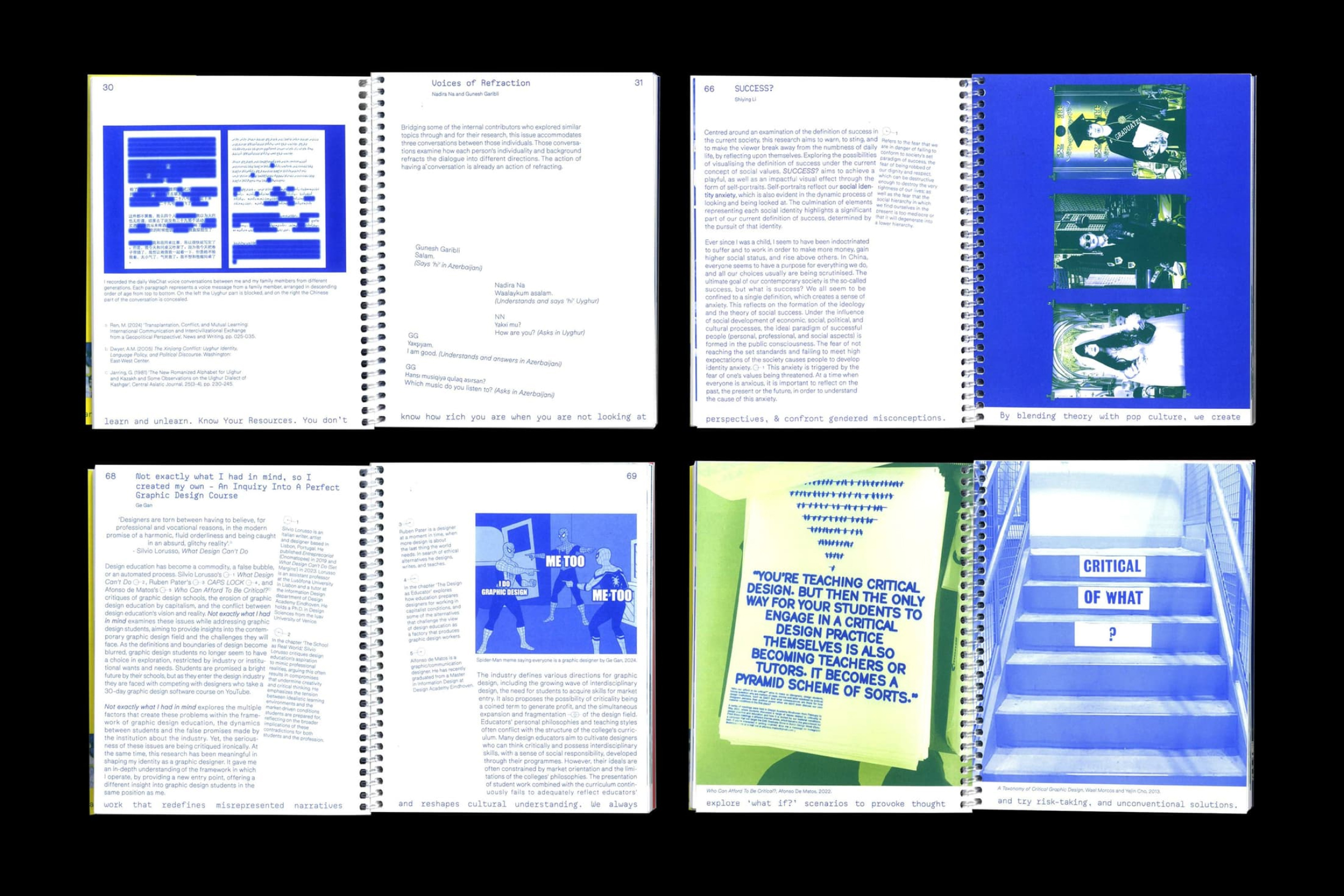
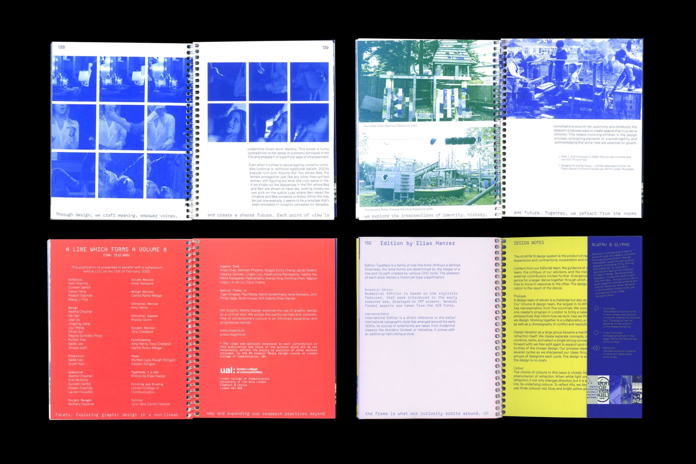
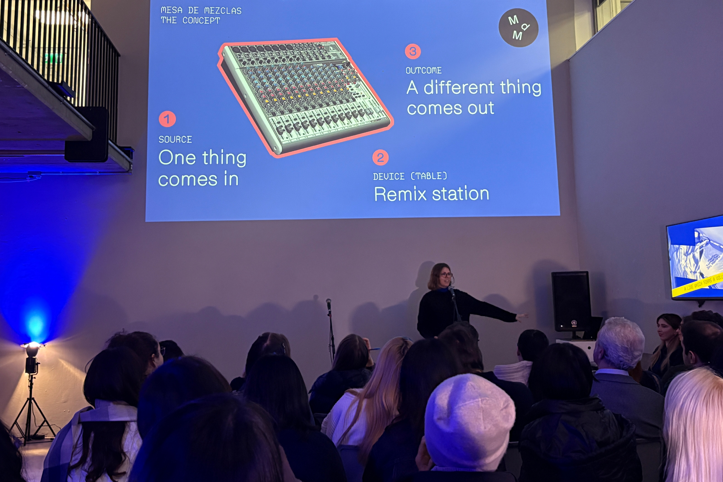
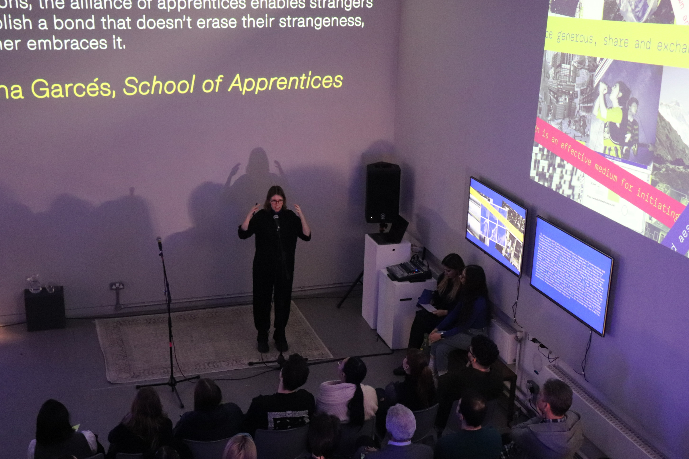
In 2024, I participated as Volume Advisor in the 8th edition of A Line Which Forms a Volume —the annual publication developed by students of the MA Graphic Media Design at London College of Communication (UAL)— supporting a group of 20 students —the largest cohort in ALWFAV’s history— in developing a unifying concept and translating it into a coherent editorial system. ALWFAV 8 explores ‘refraction’ as a lens to facilitate and deepen understanding of design, research, and collaboration, featuring 38 contributions from MA GMD participants and design practitioners. <2024-2025>
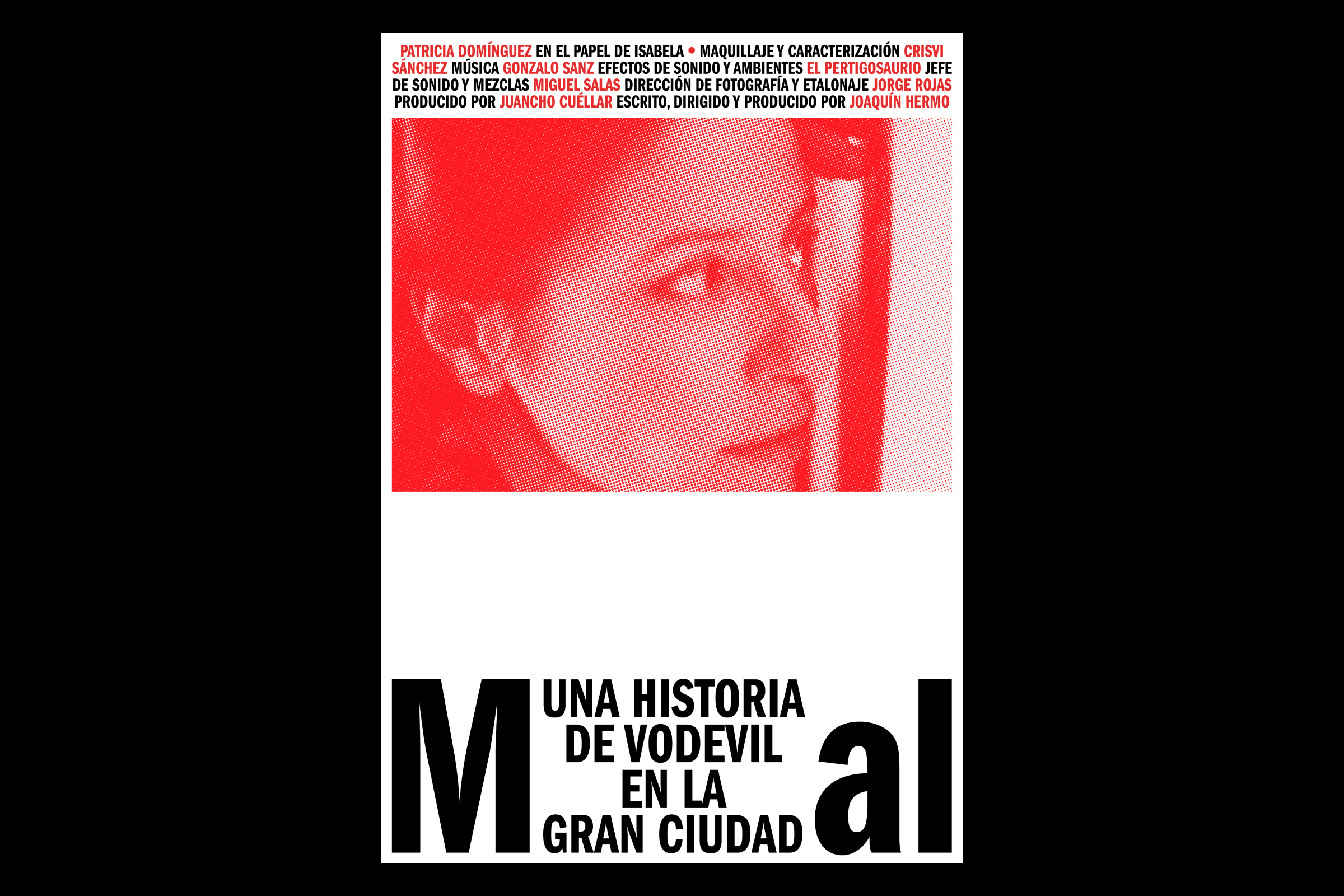
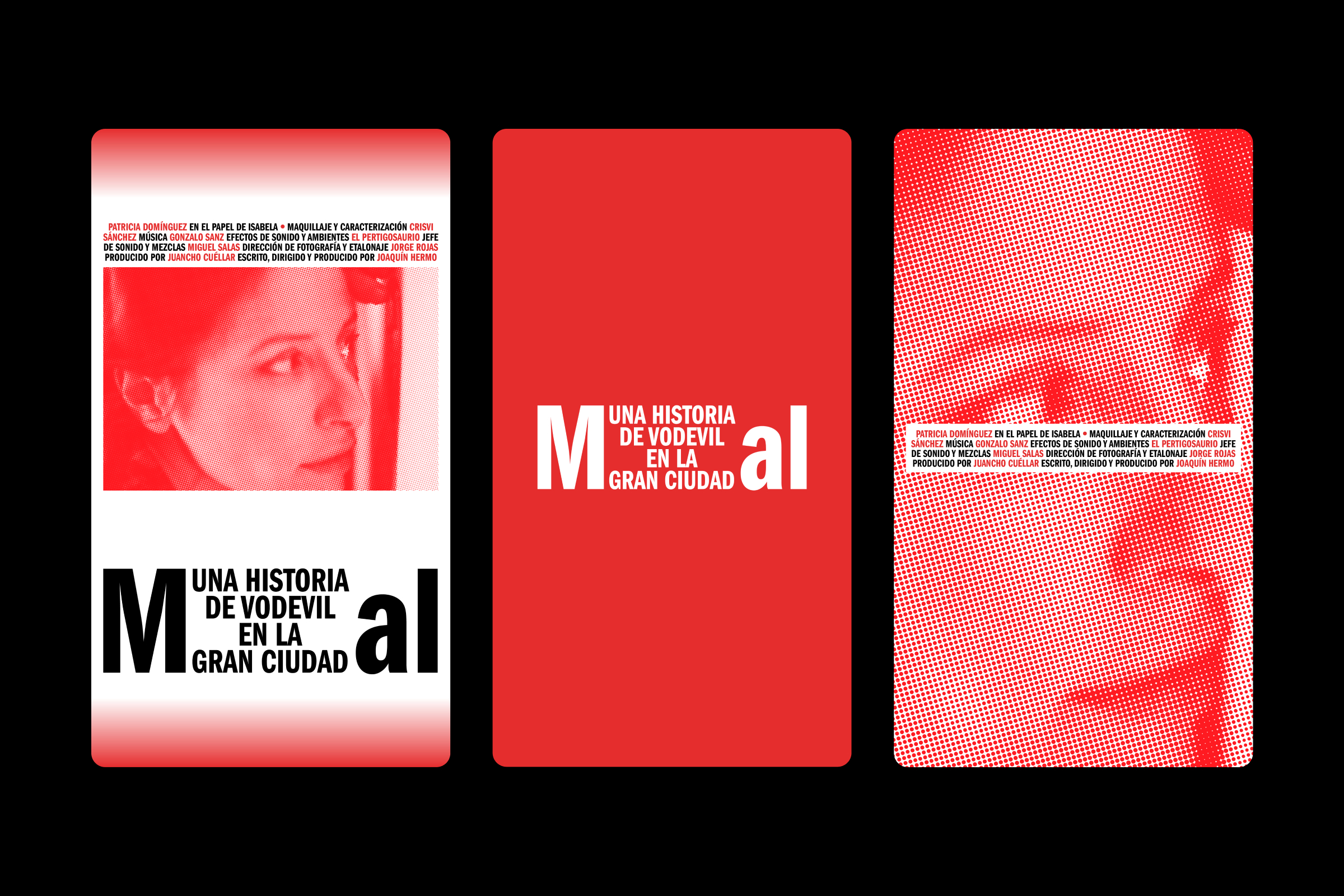
Poster for the international distribution of Mal—a section of Vaudeville in the Big City, a short film written, directed, and produced by Joaquín Hermo. <2025>
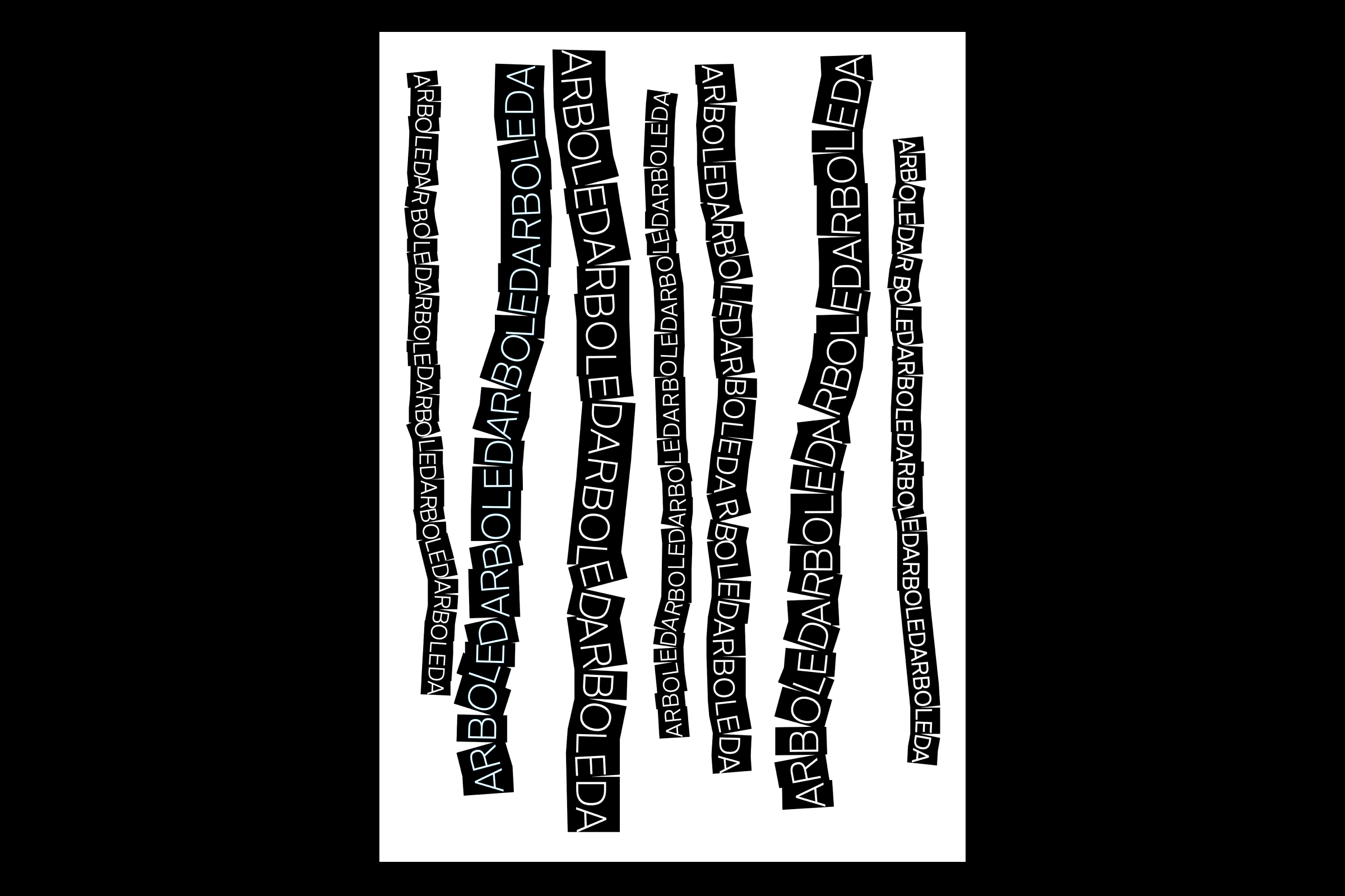
Poster for the word “Arboleda” (Grove) for Palabras Imaginadas (Lectura Gráfica), an exhibition held at the Casa del Lector in Matadero as part of the Madrid Gráfica Abierta festival. / Organized by: The City Council of Madrid, Iberoamérica Diseña, Foro por Madrid. Curated by: Manuel Estrada, Fernando Beltrán. Dimensions: 100x70 cm. <2024>

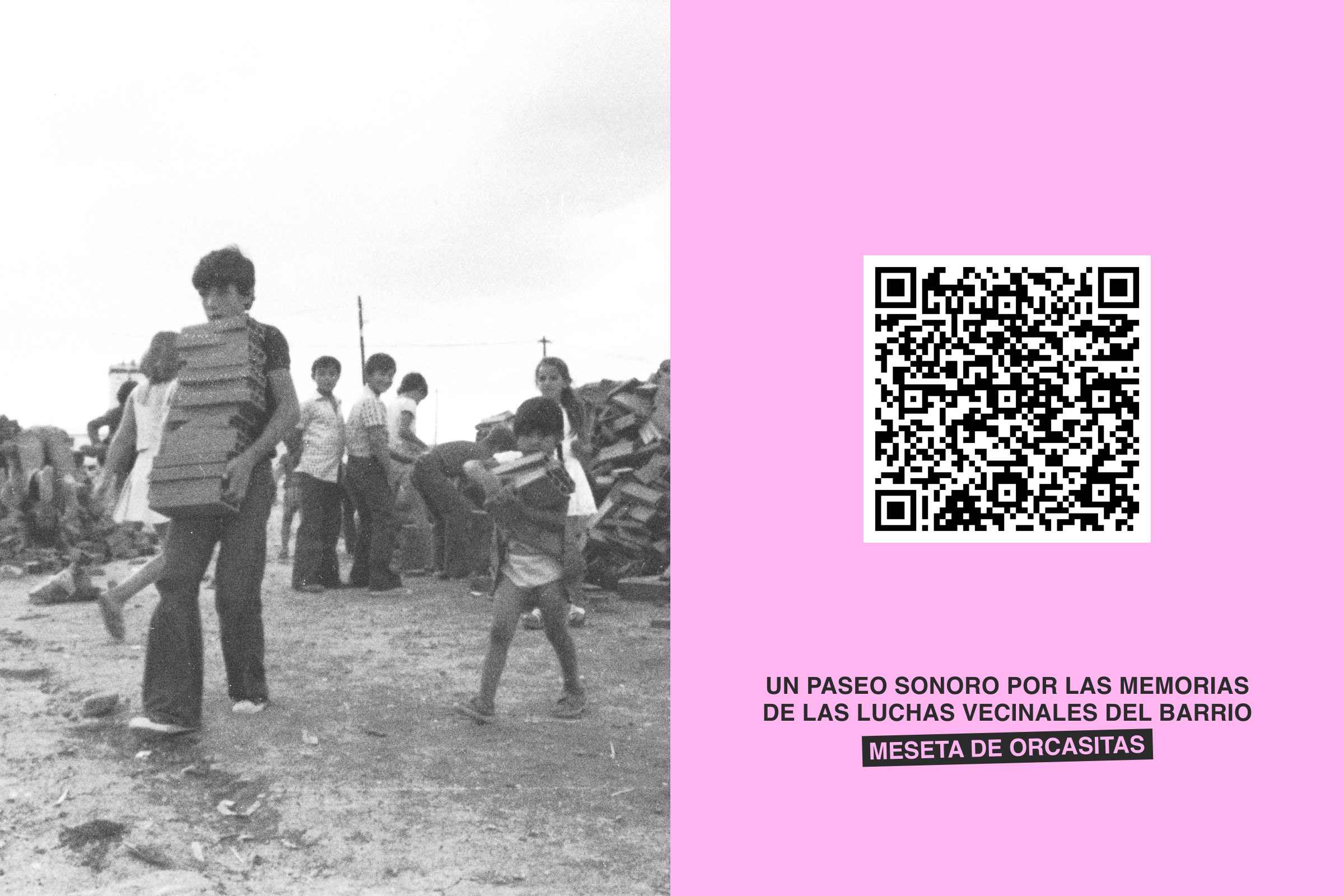
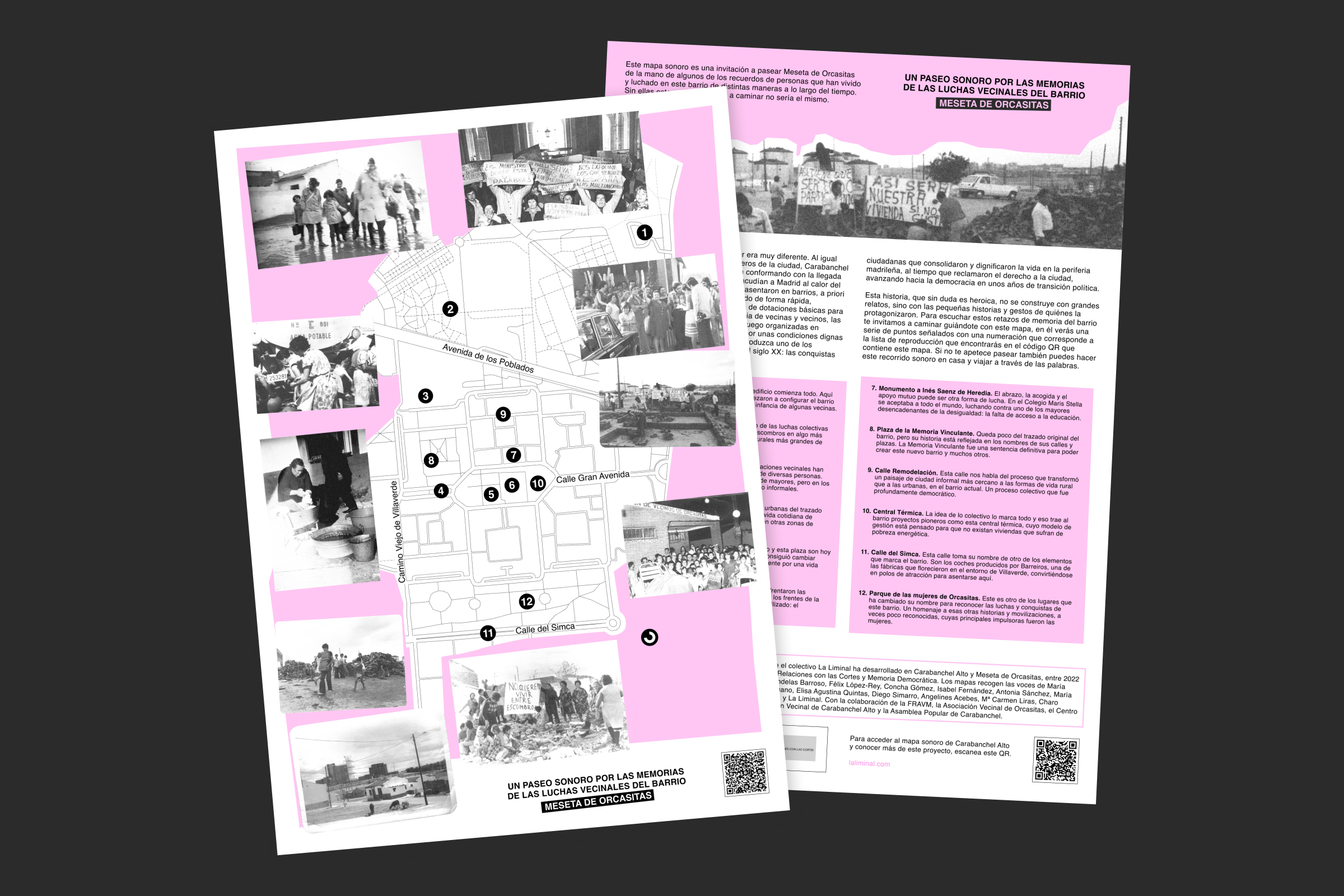

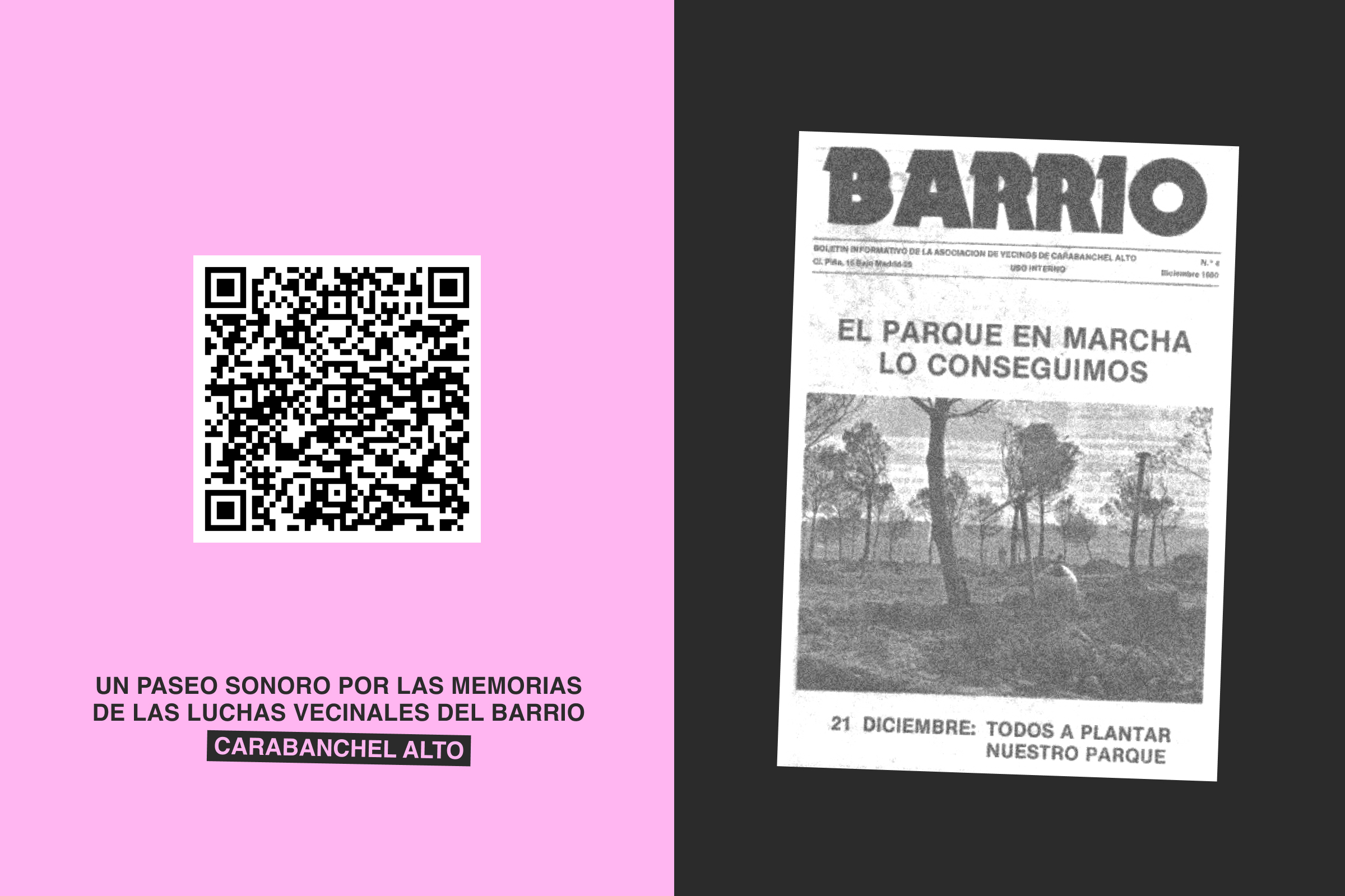
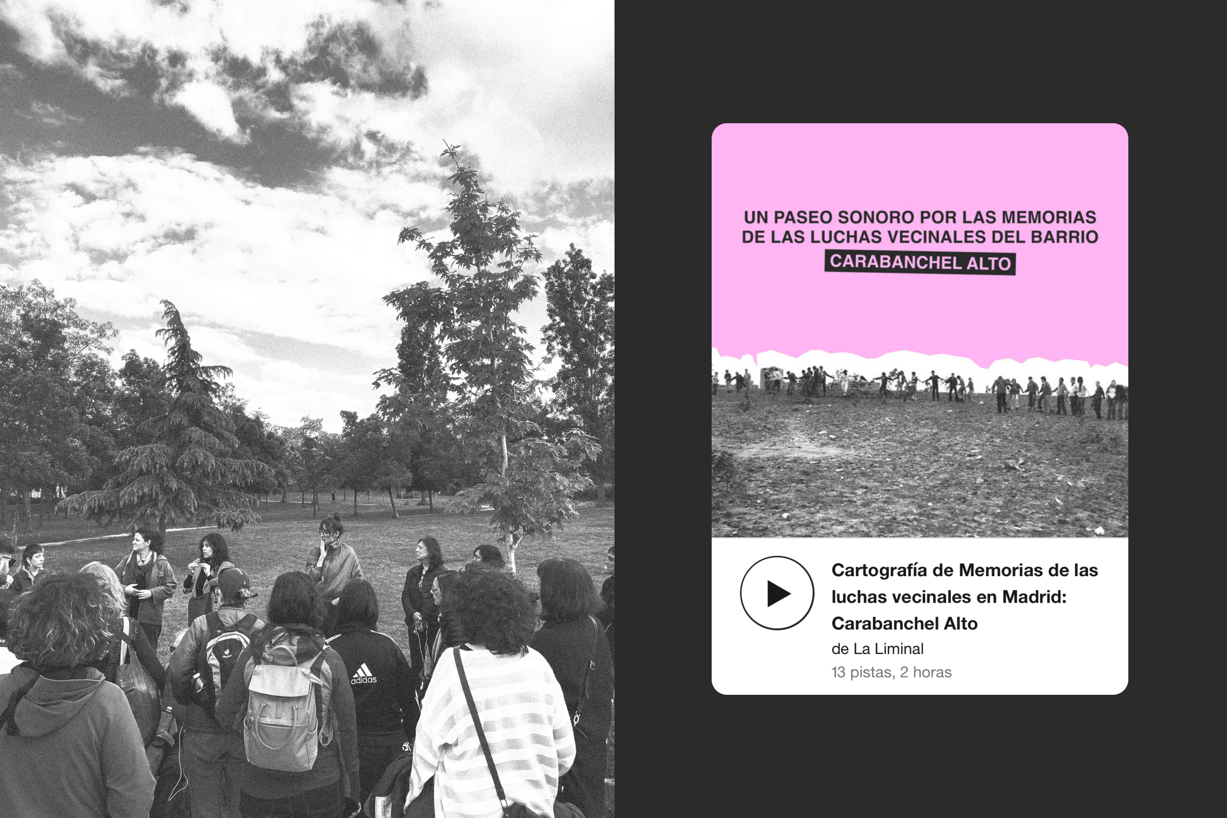
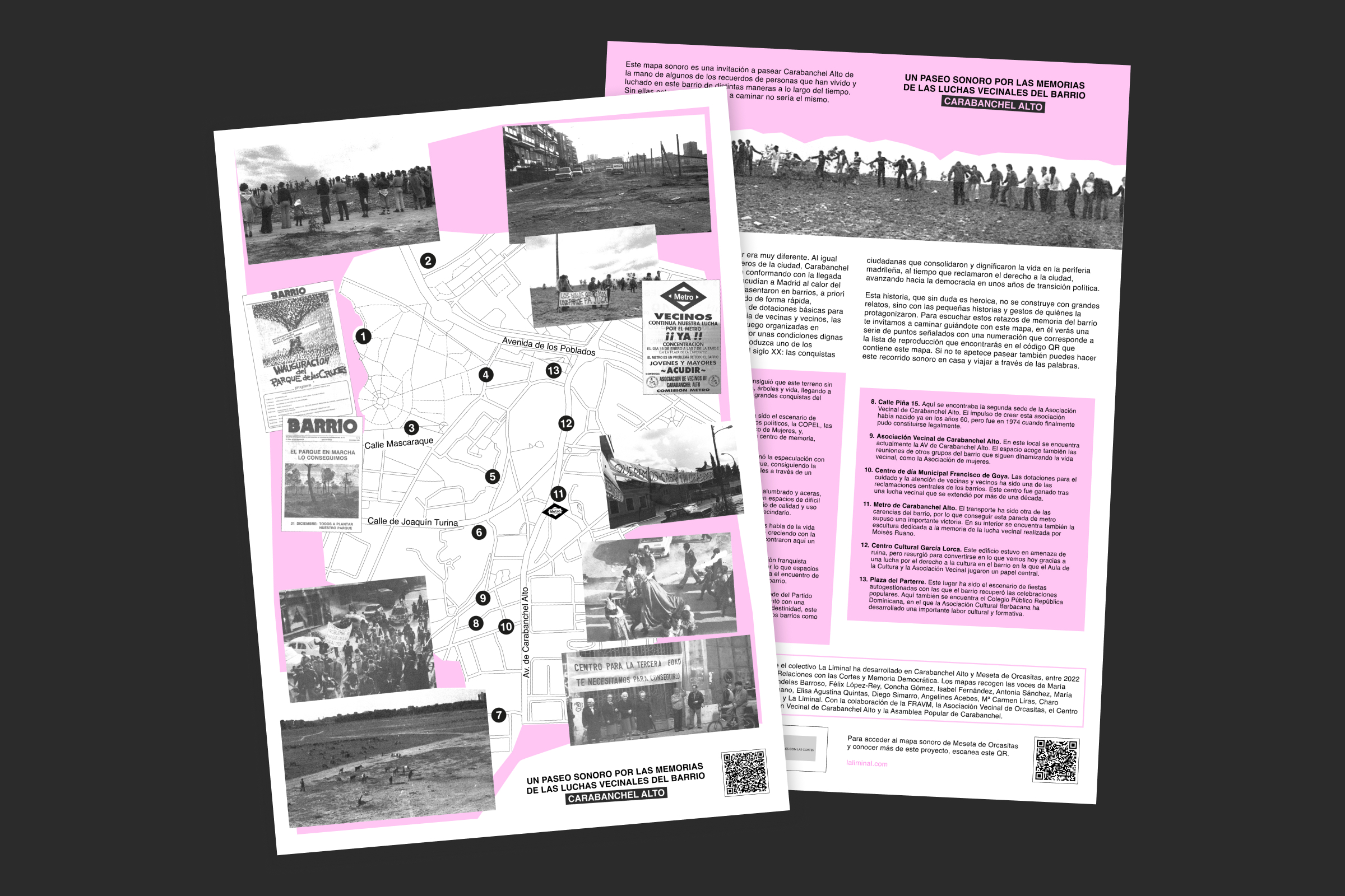

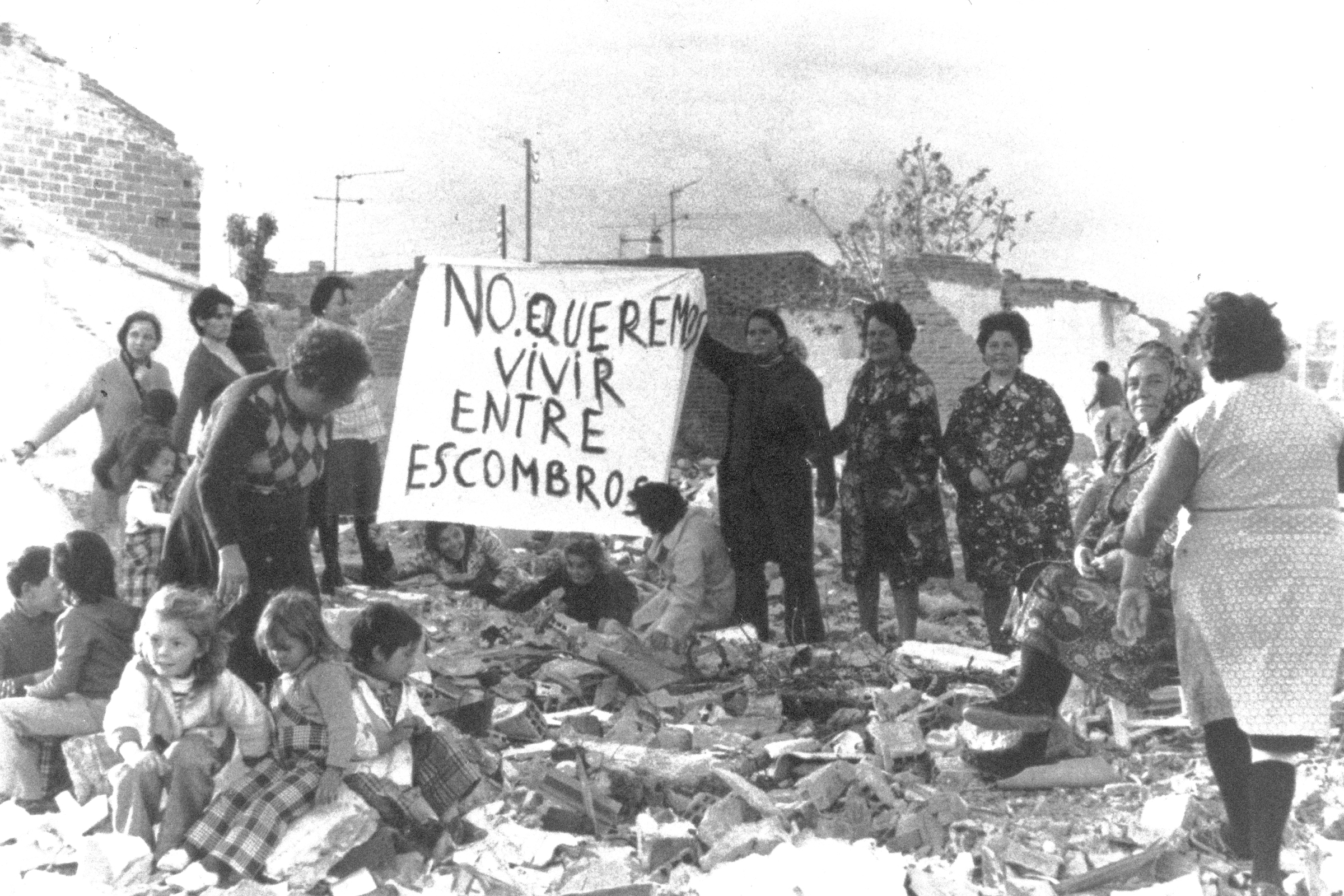
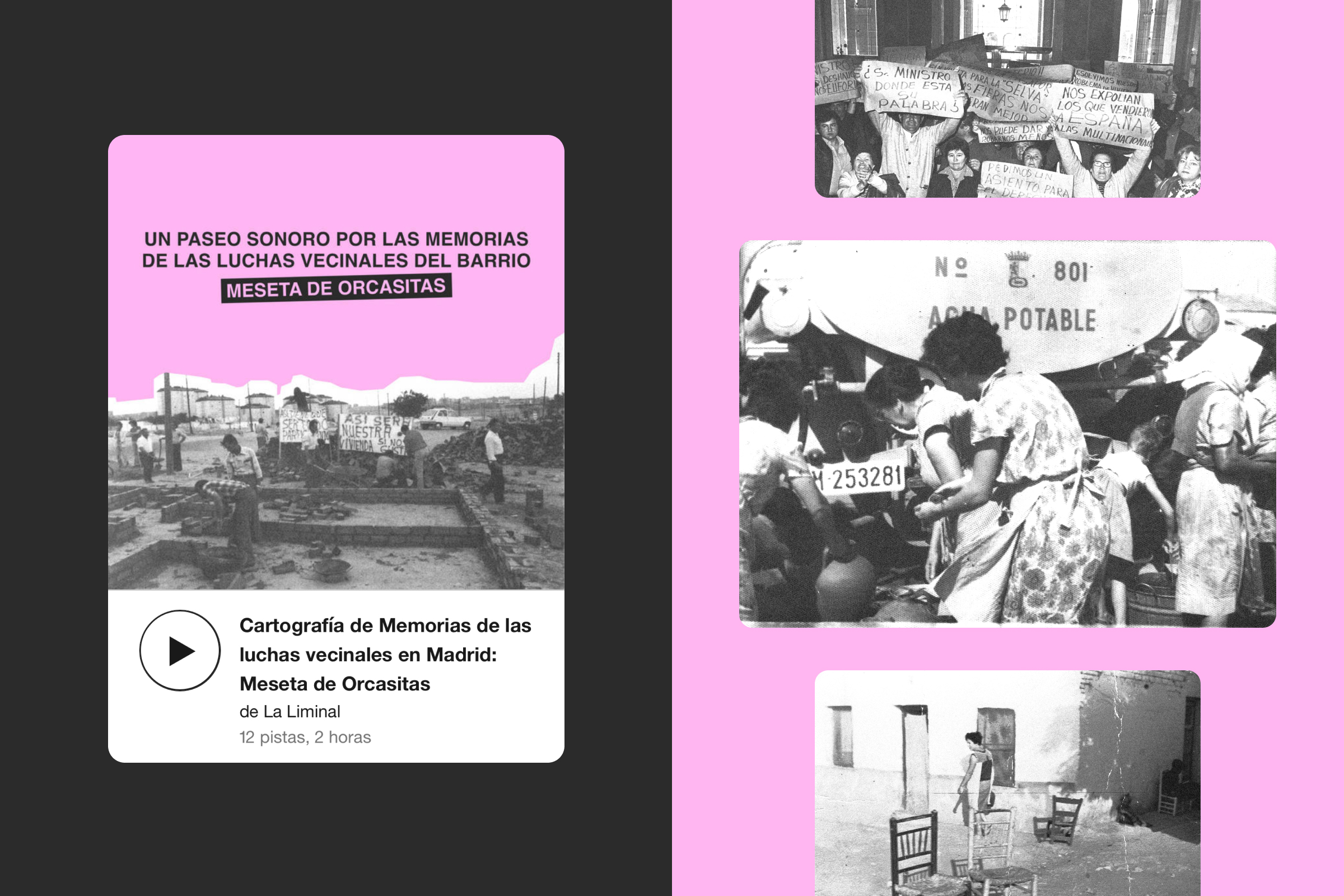
Conceptualization and design of the sound maps for the project “Cartography of Memories of Neighborhood Struggles in Madrid”, driven by La Liminal collective: an invitation to walk through the neighborhoods of Meseta de Orcasitas and Carabanchel Alto, guided by the memories of people who have lived and fought in them in various ways over time. / Sound editing and sound landscapes: Alberto García Aznar. Images: provided by the neighborhood associations. Riso: Imprenta San Delfín. Formato: A3. <2024>
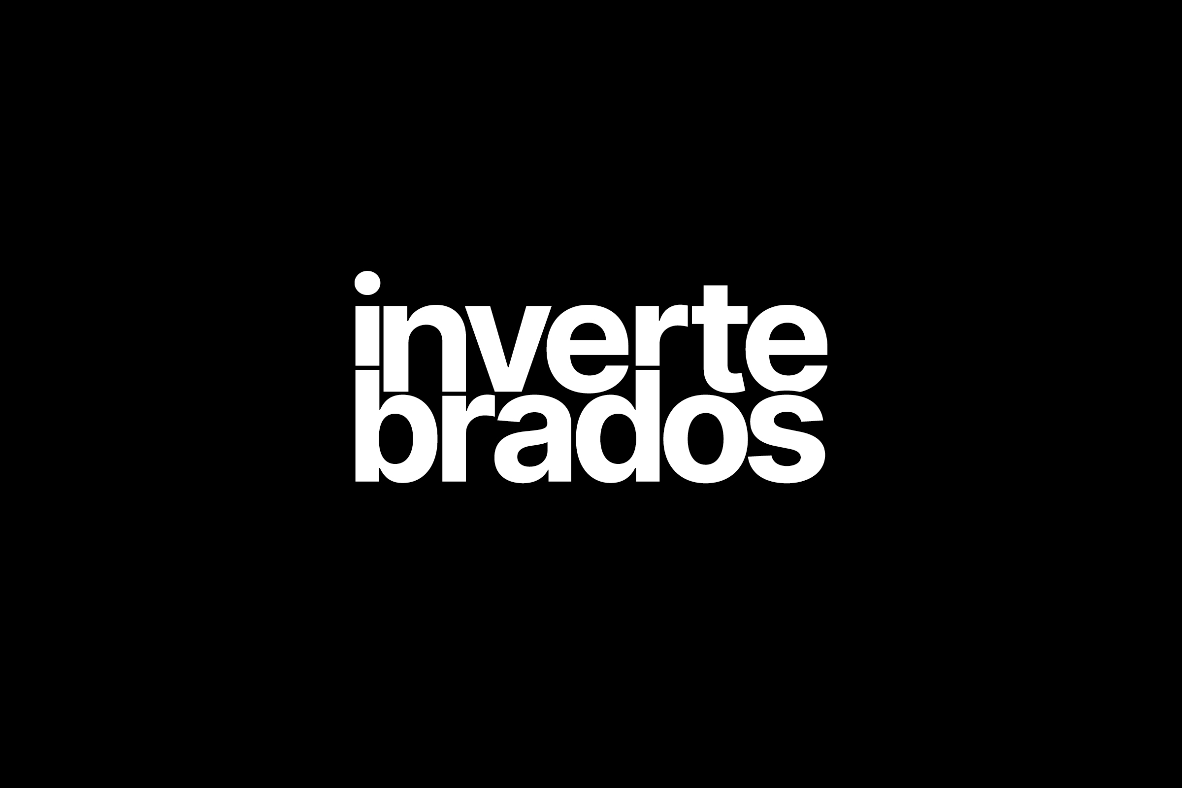
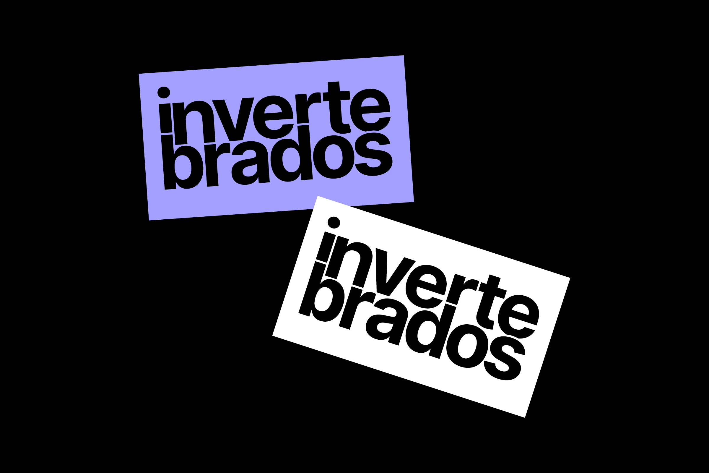
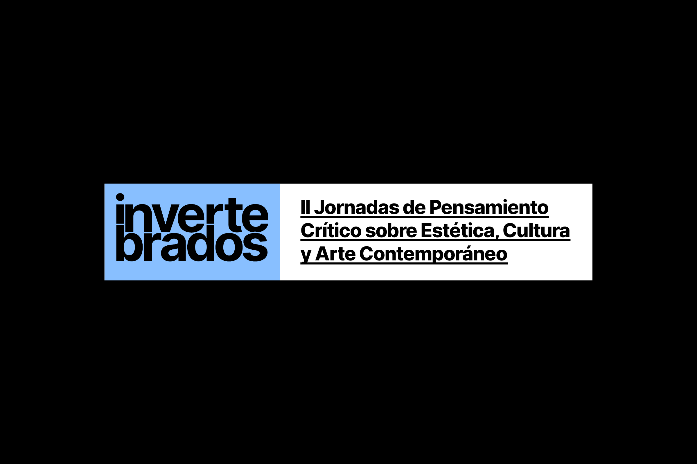
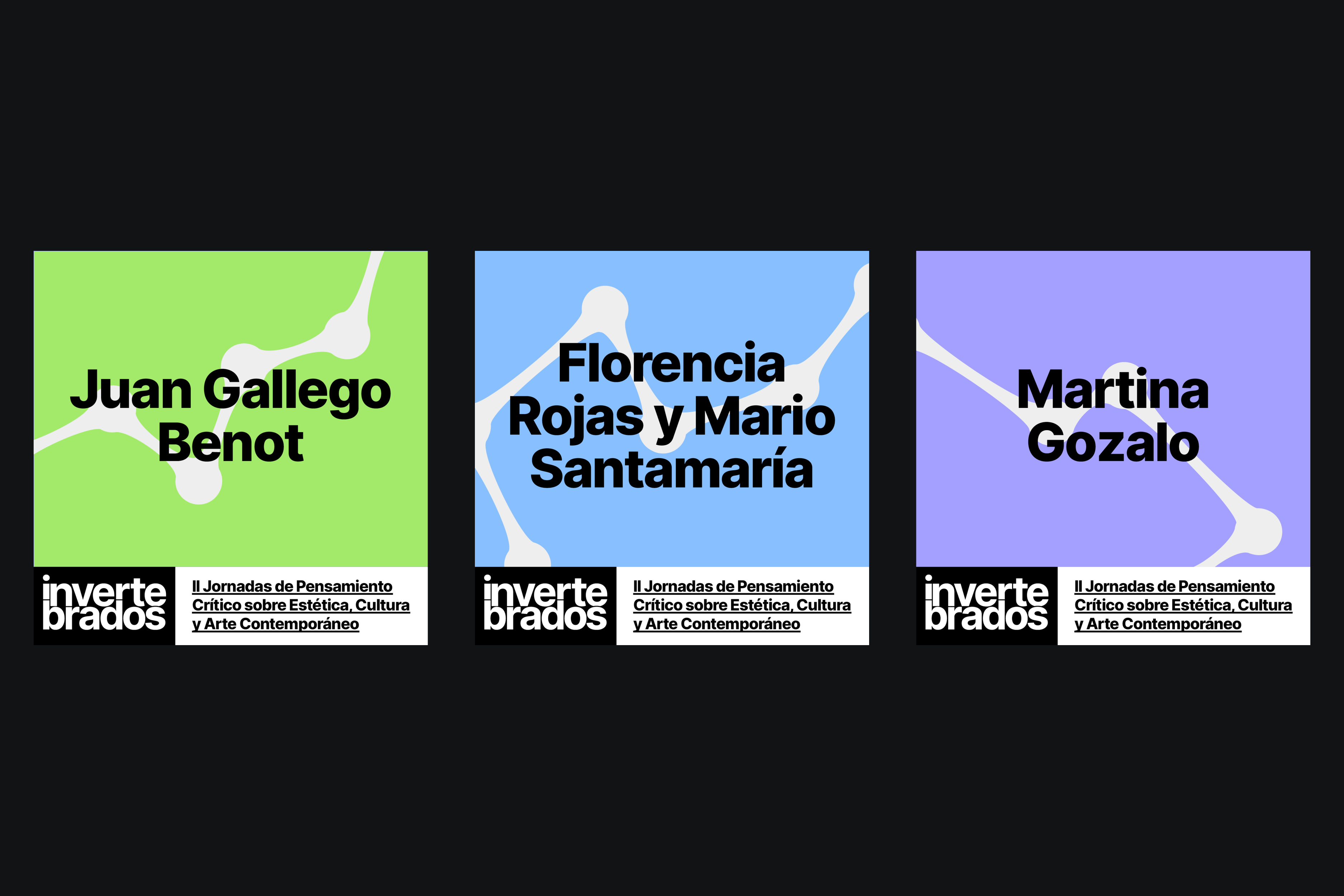
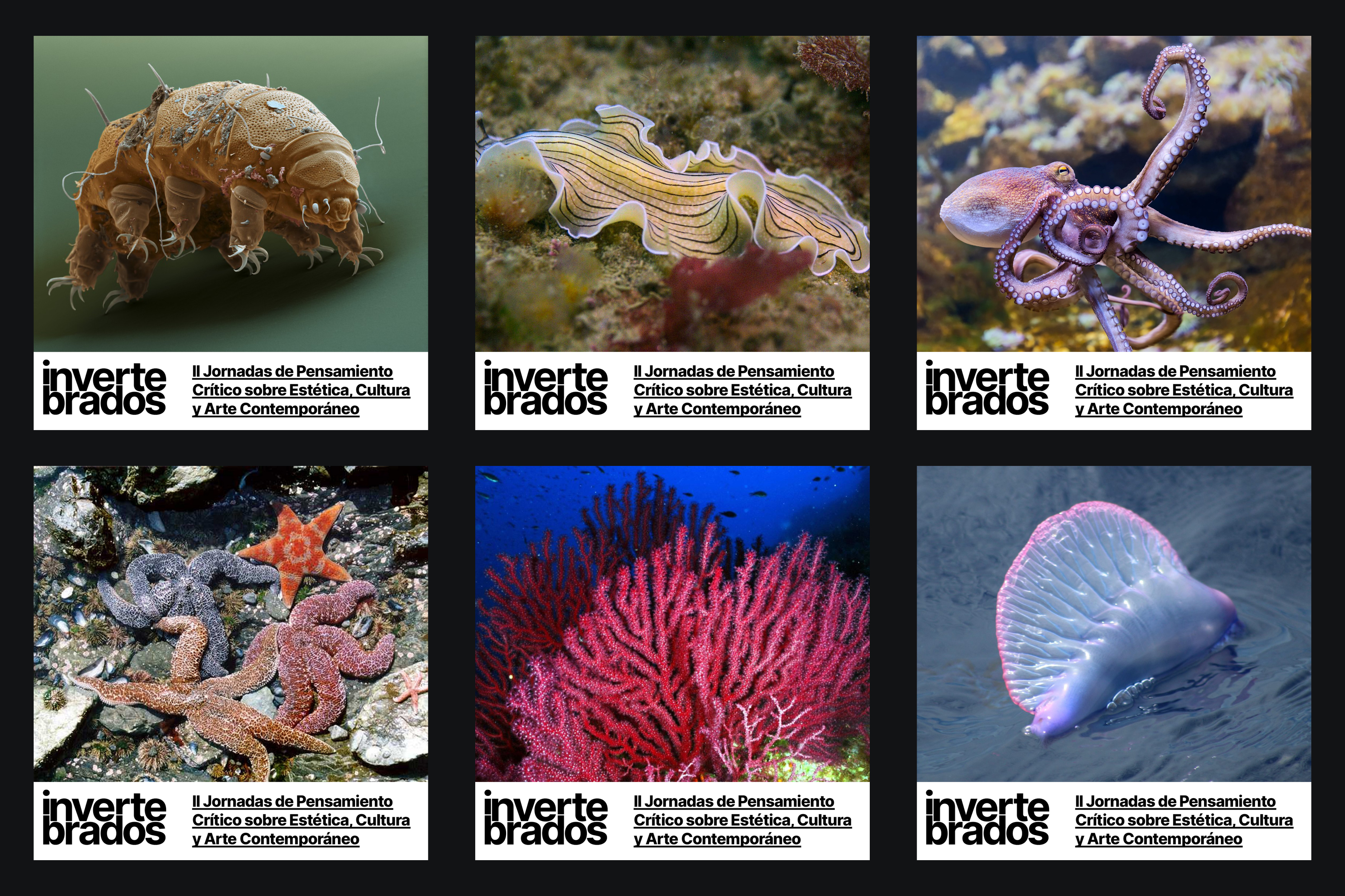
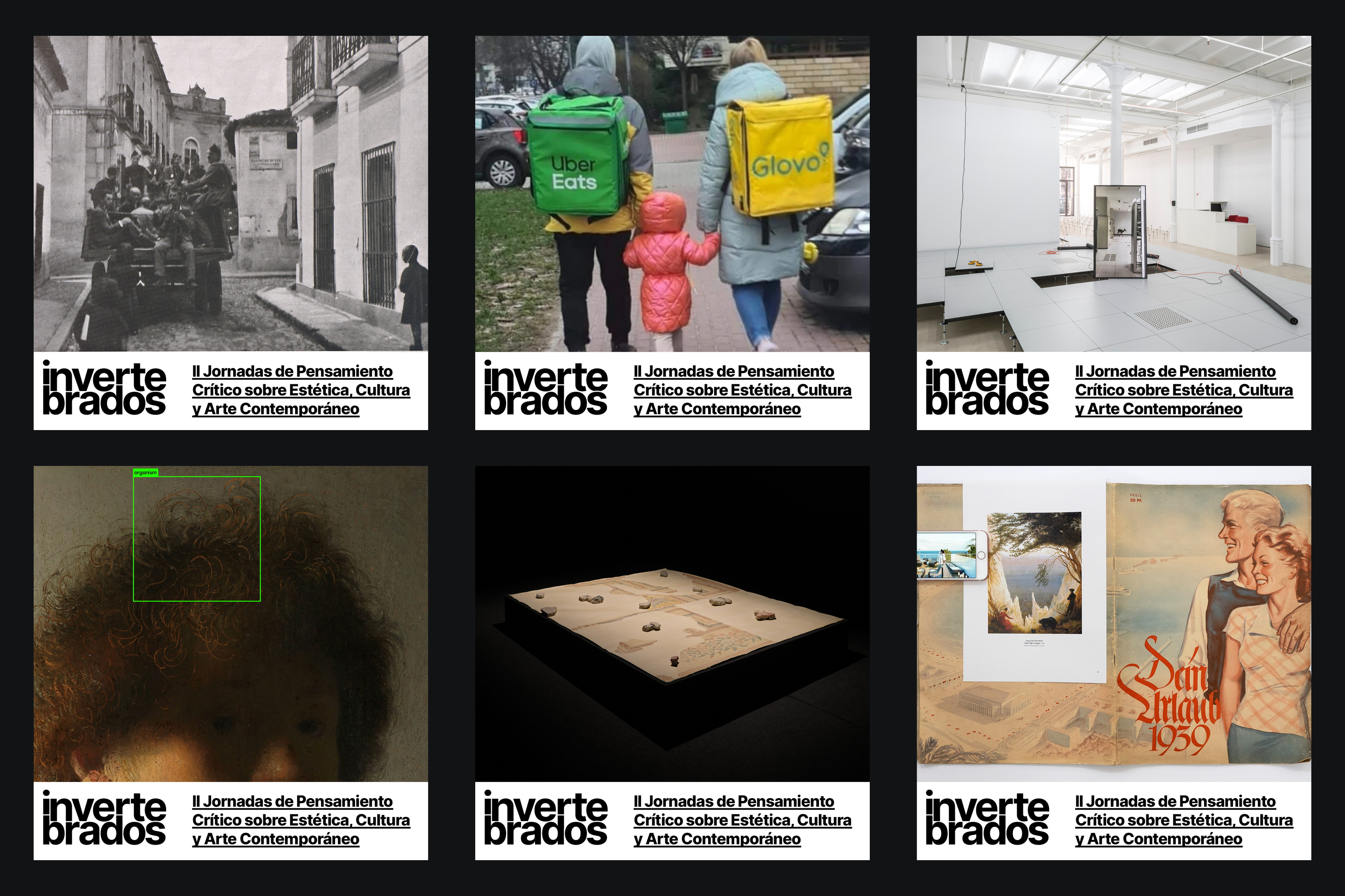
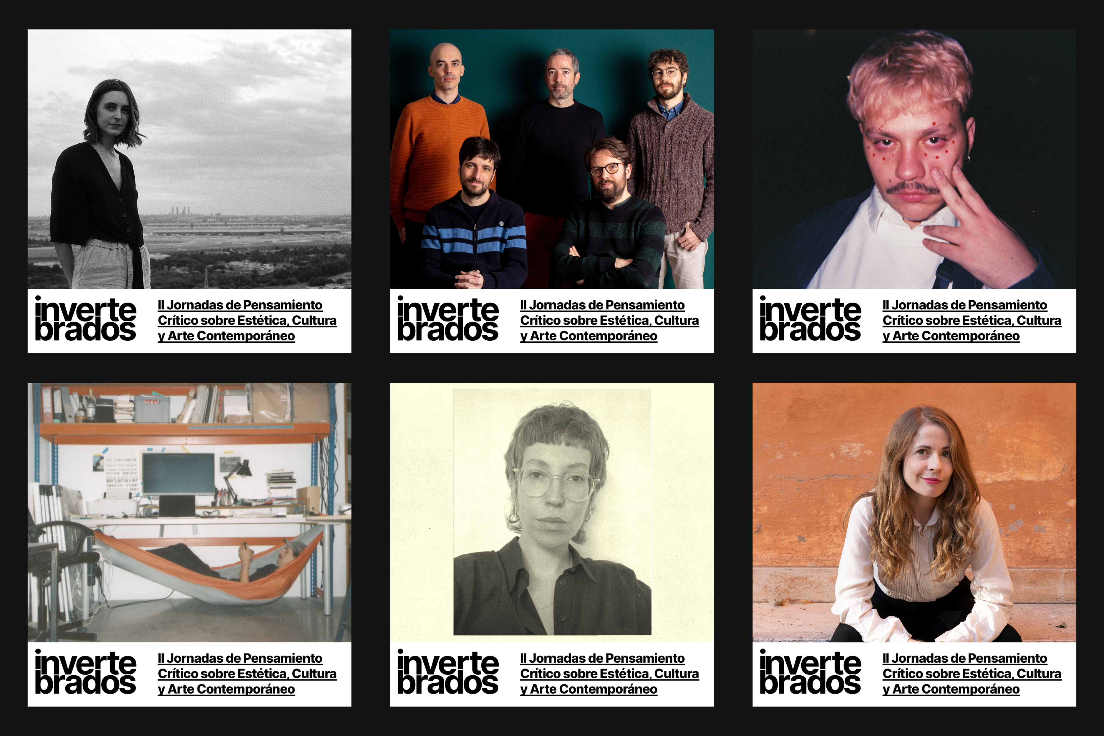
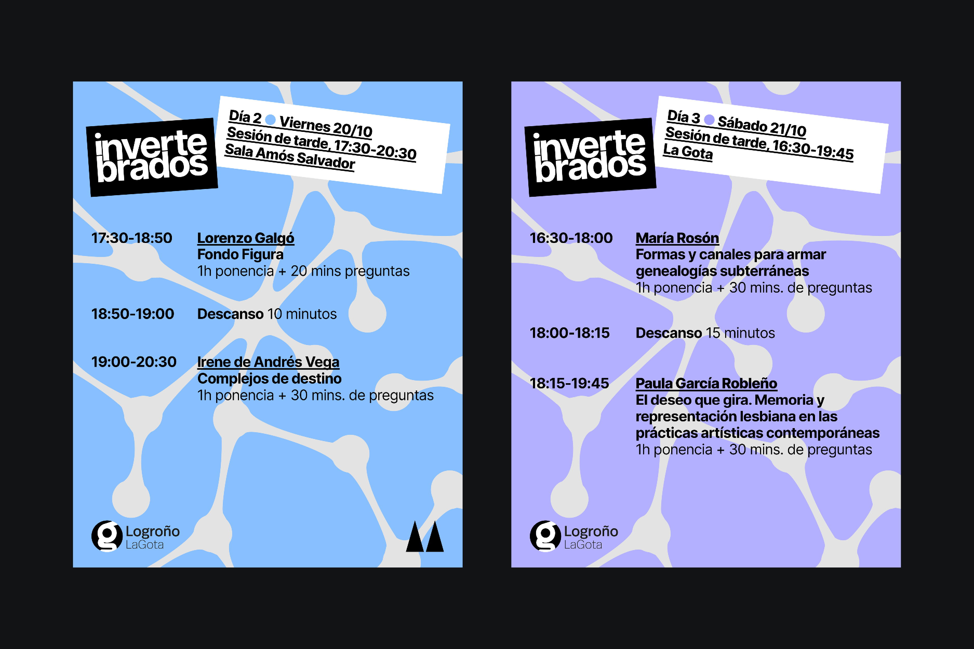
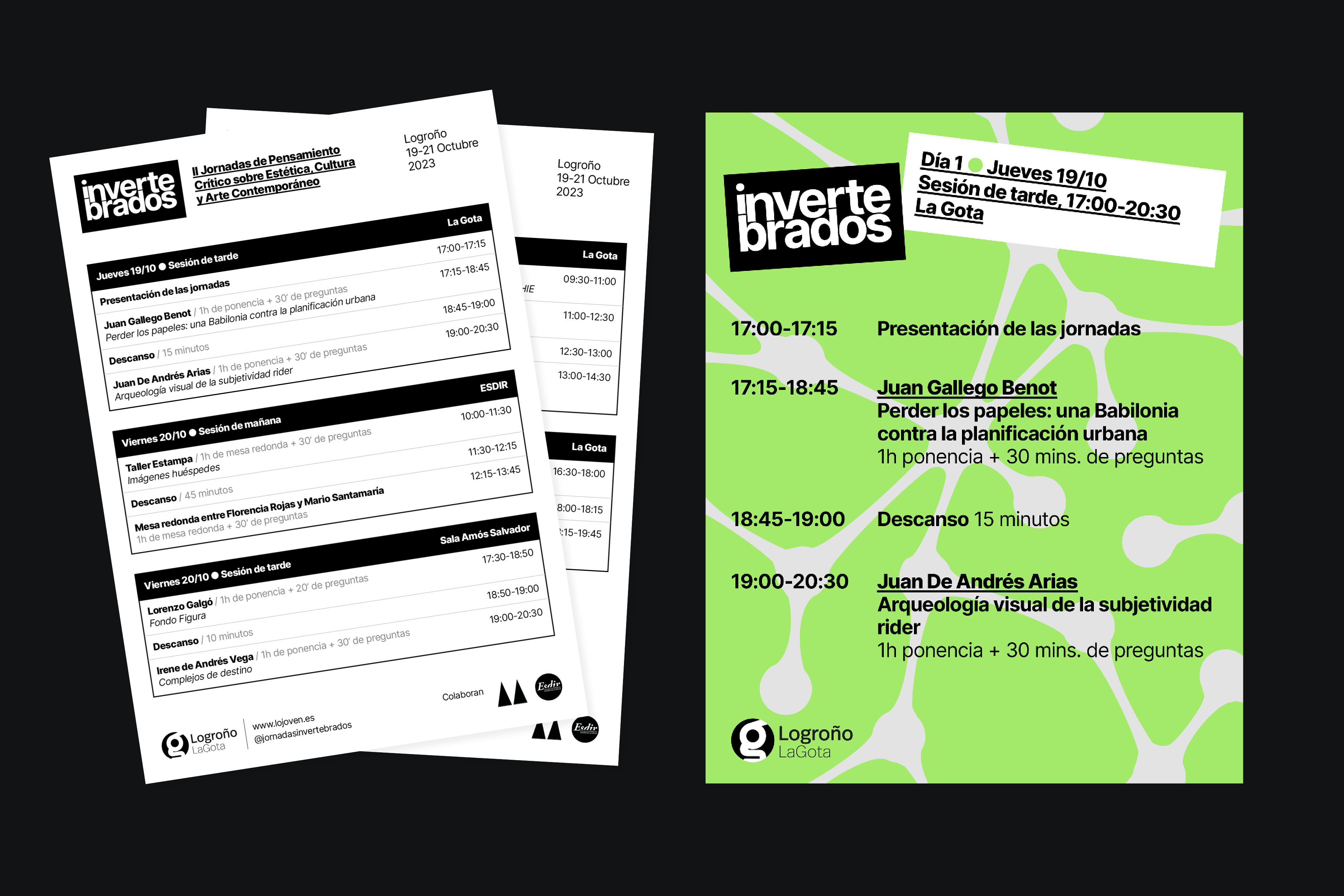
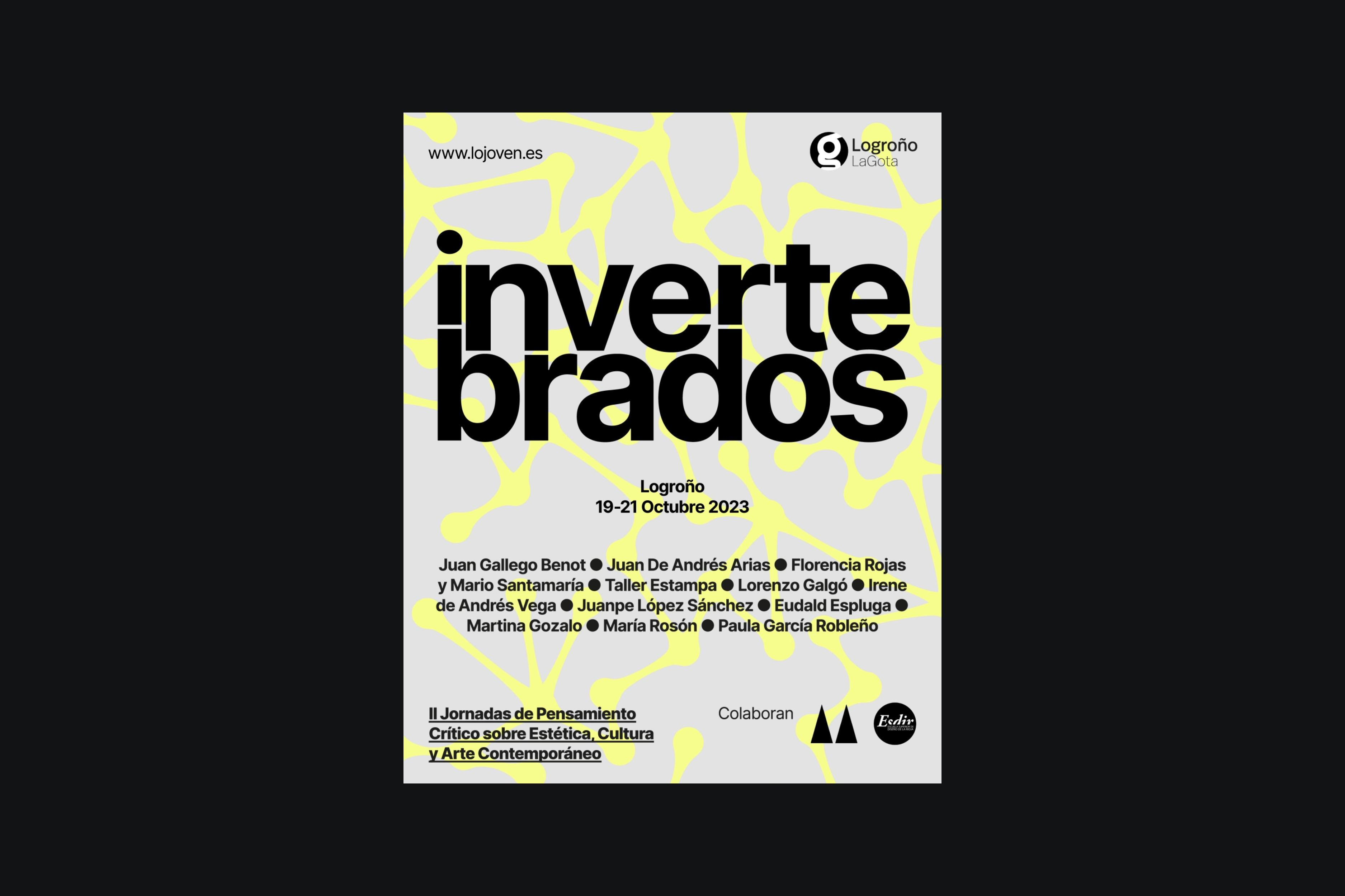
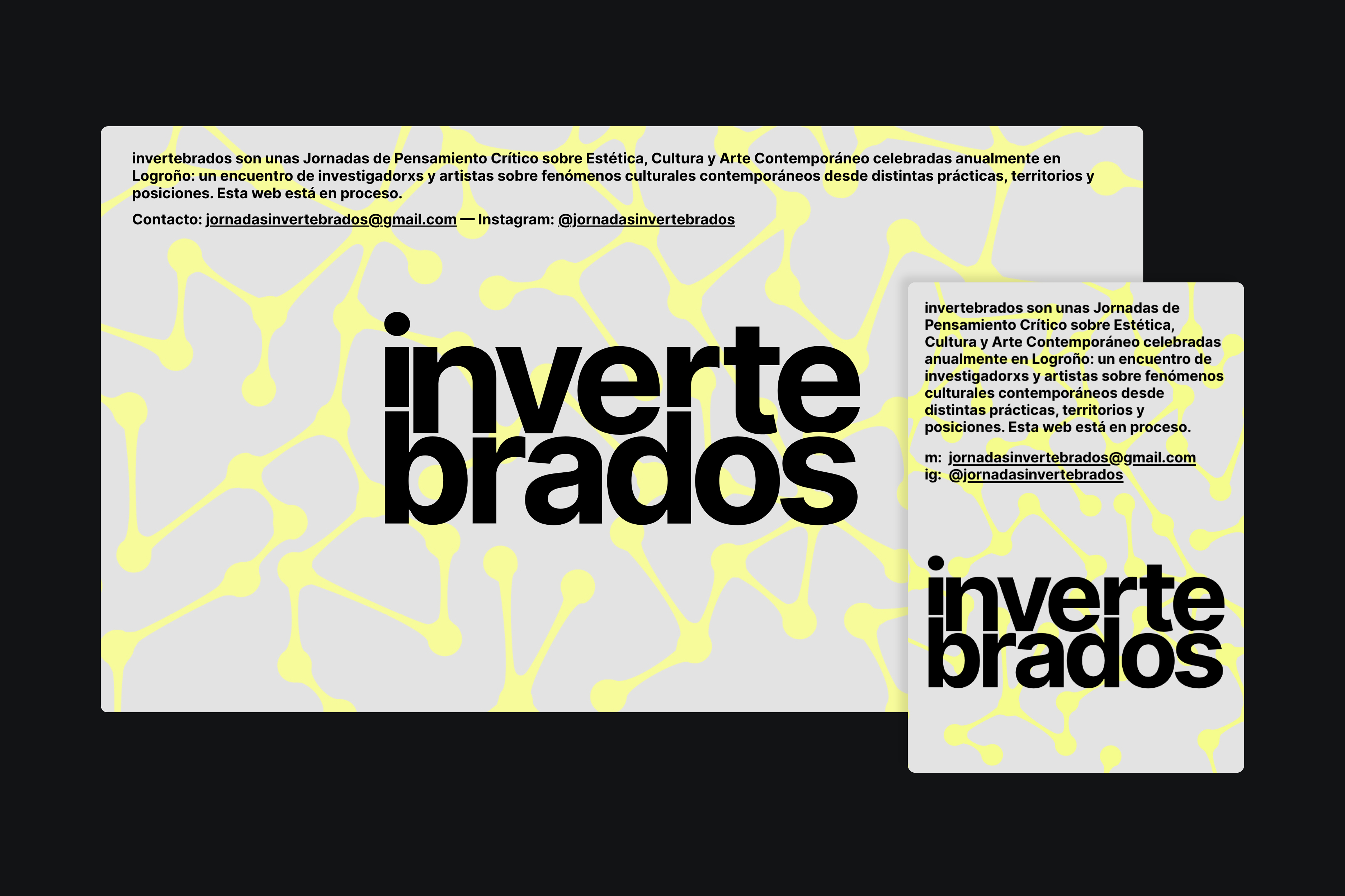
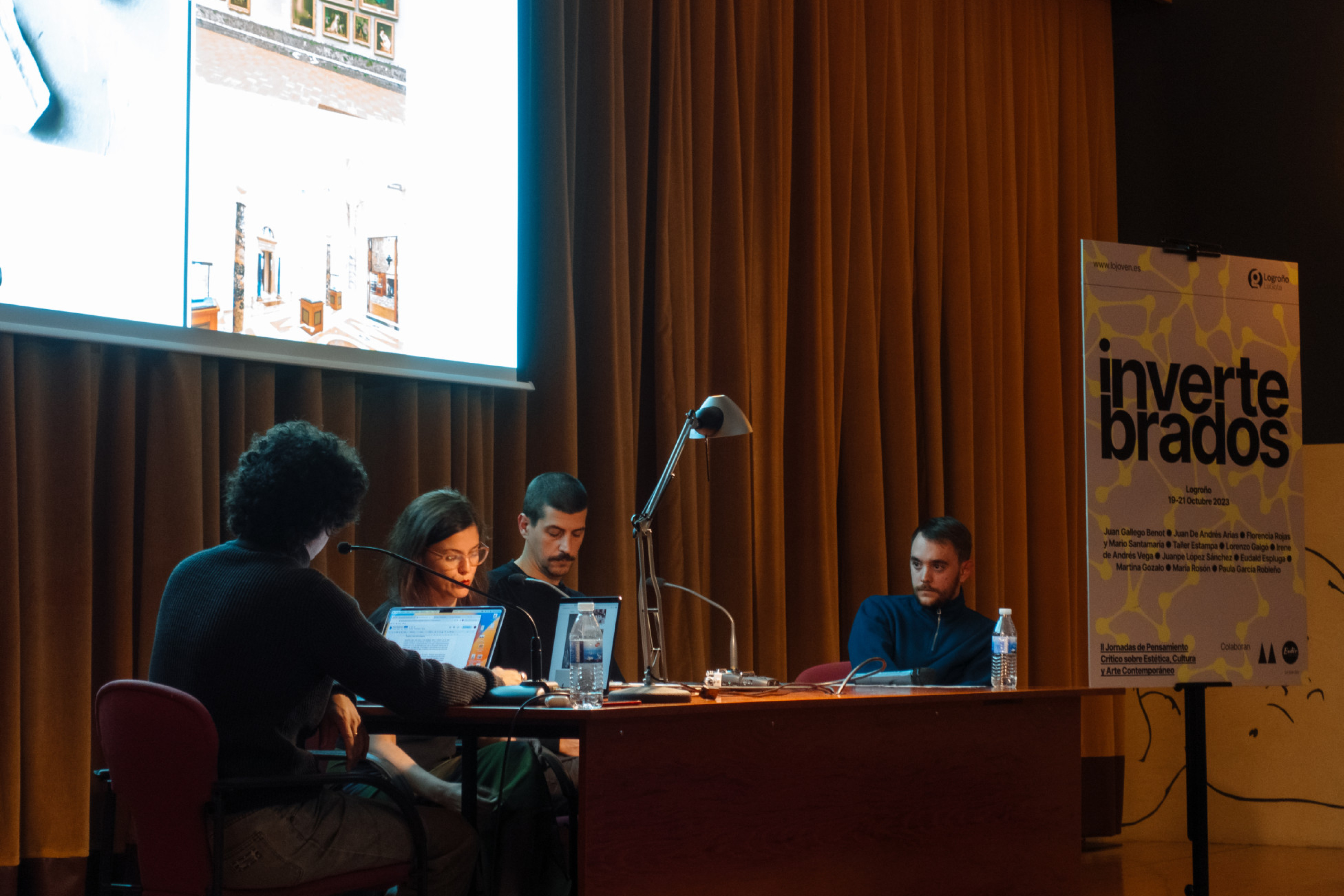
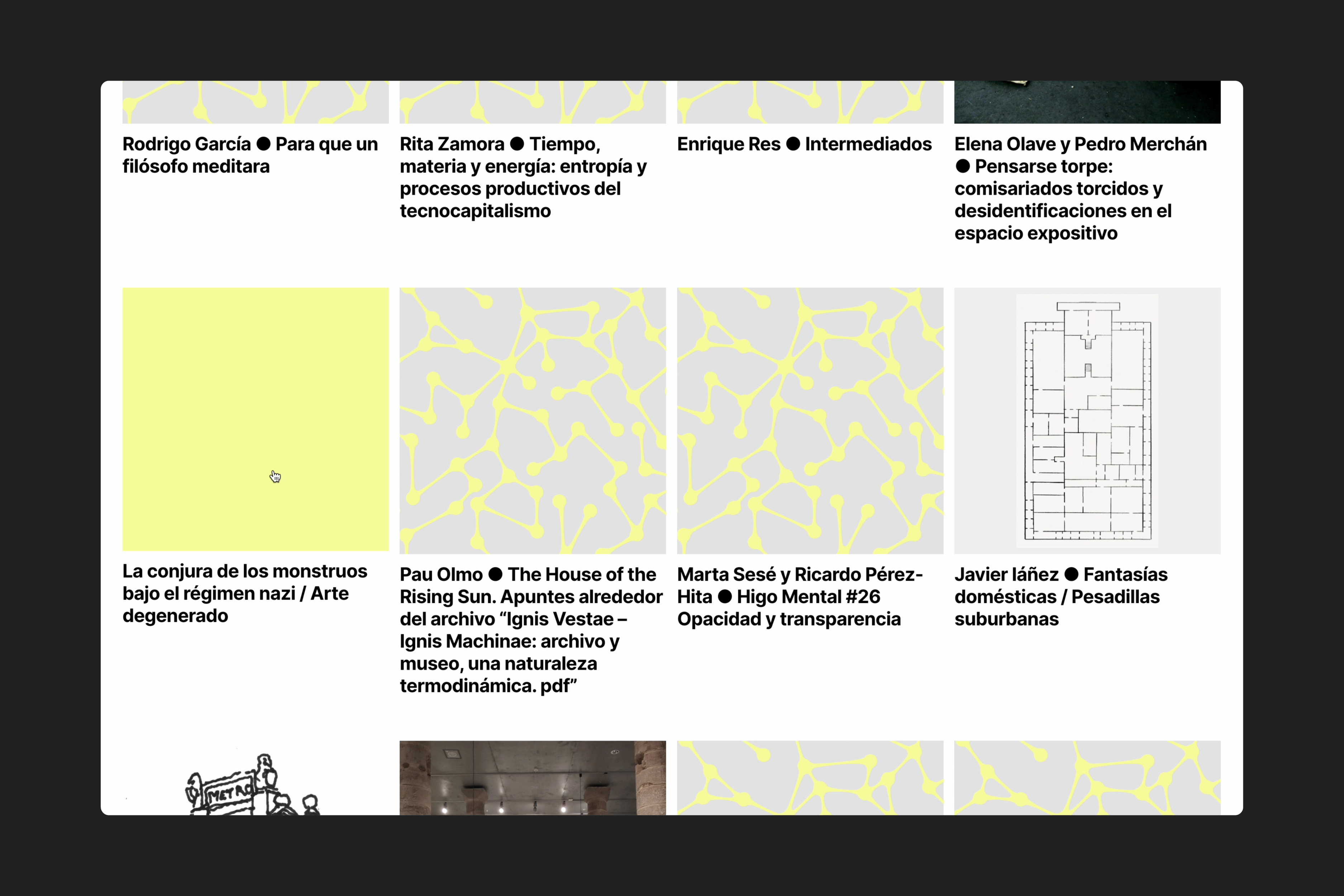
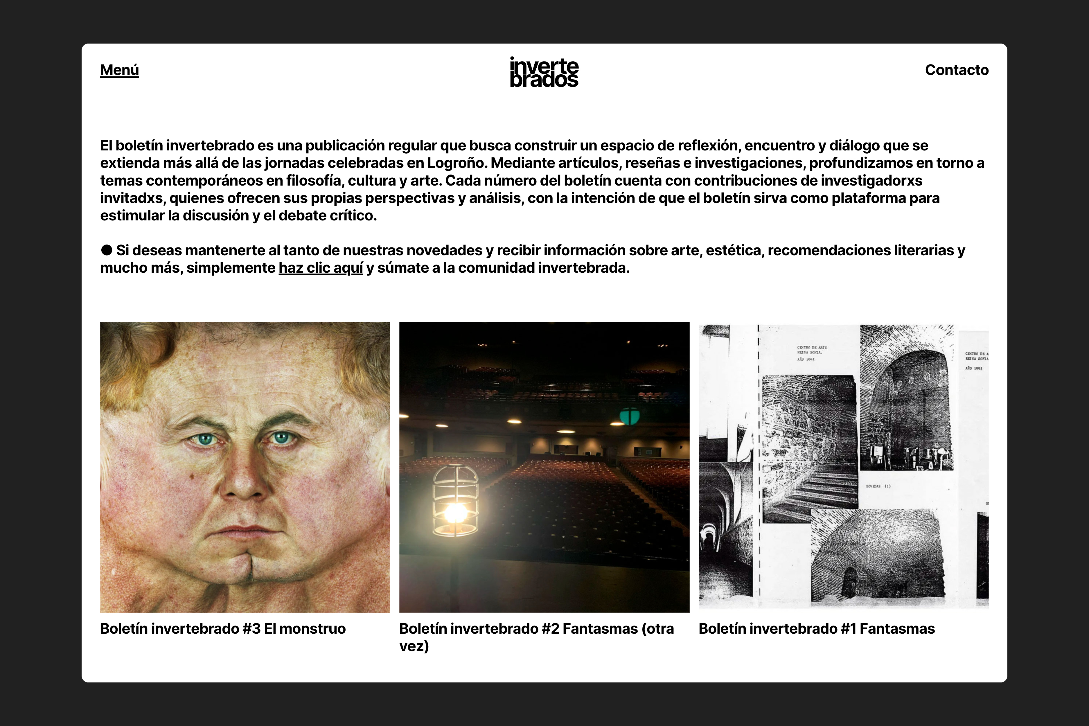
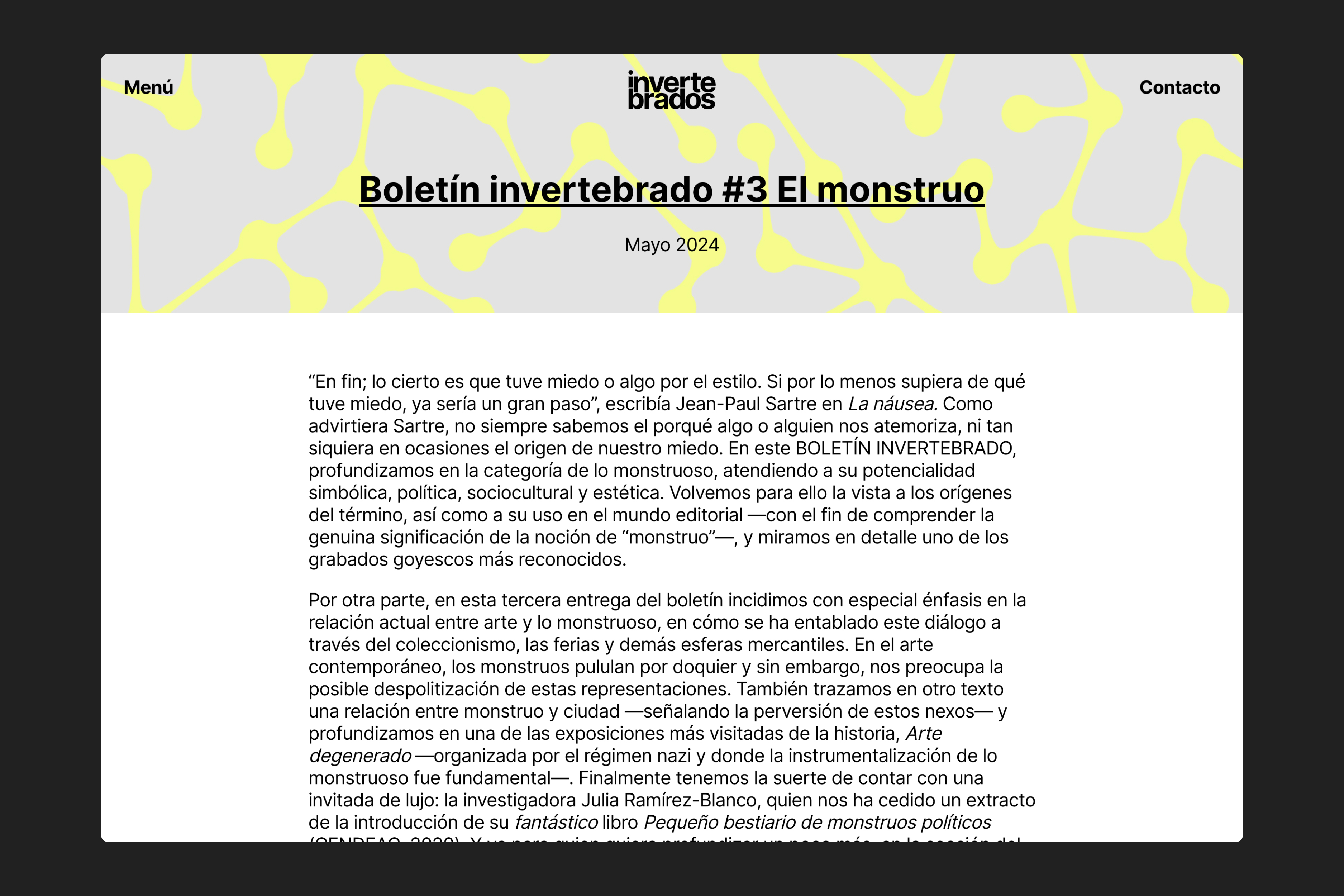
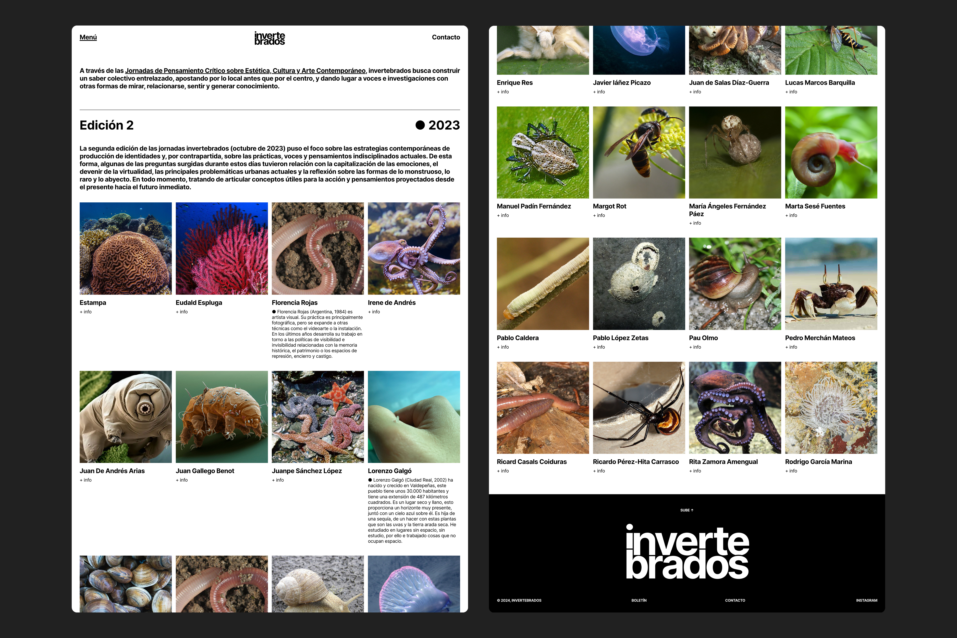
Visual identity and website for invertebrados, a project aimed at developing critical thinking about our present and becoming a meeting point for researchers and artists working on contemporary cultural phenomena from different practices, territories, and positions. + Design of the visual identity for their II Critical Thinking Symposium on Aesthetics, Culture, and Contemporary Art. / Website developed using LayTheme. <2023-2024>
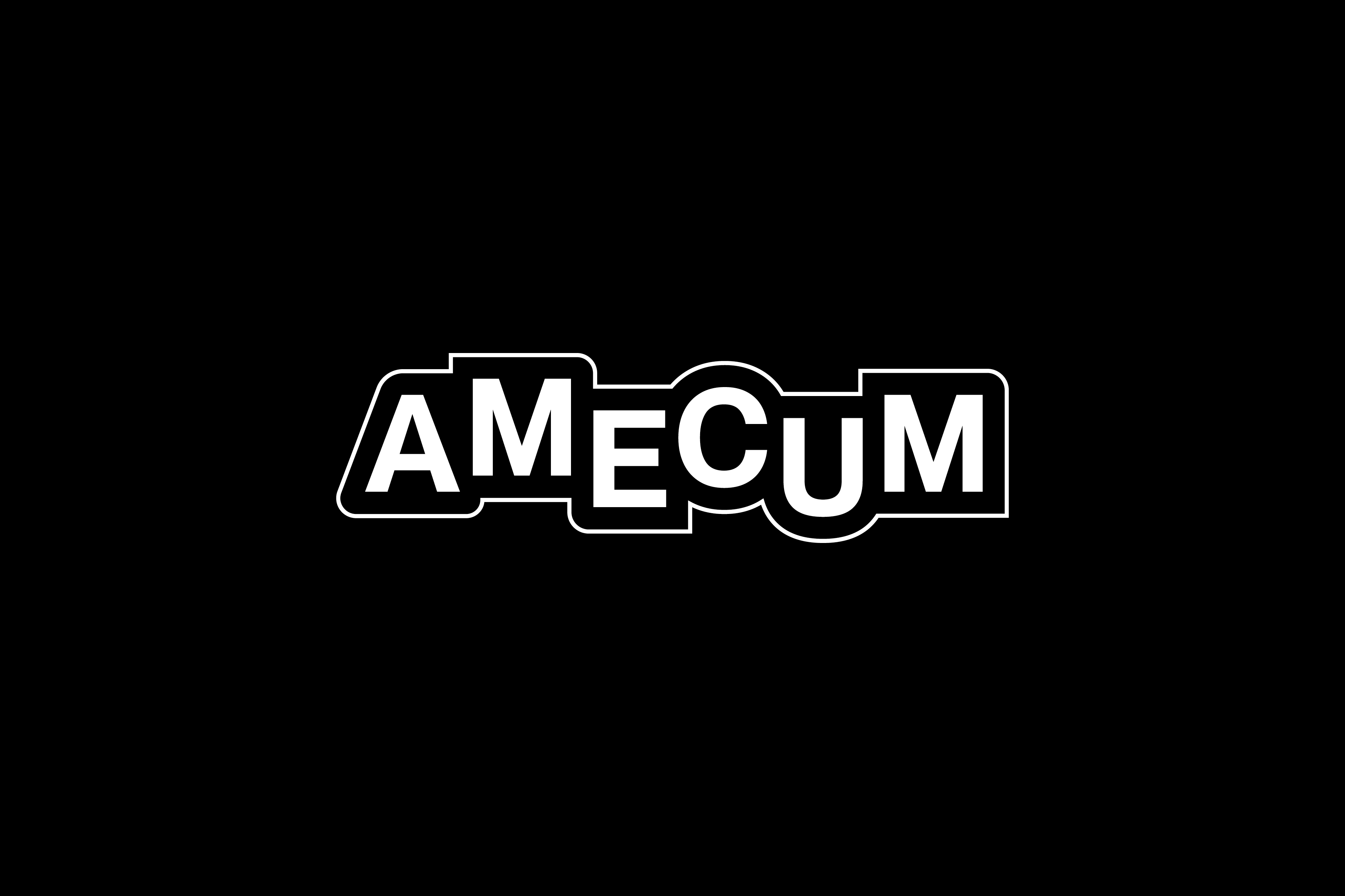
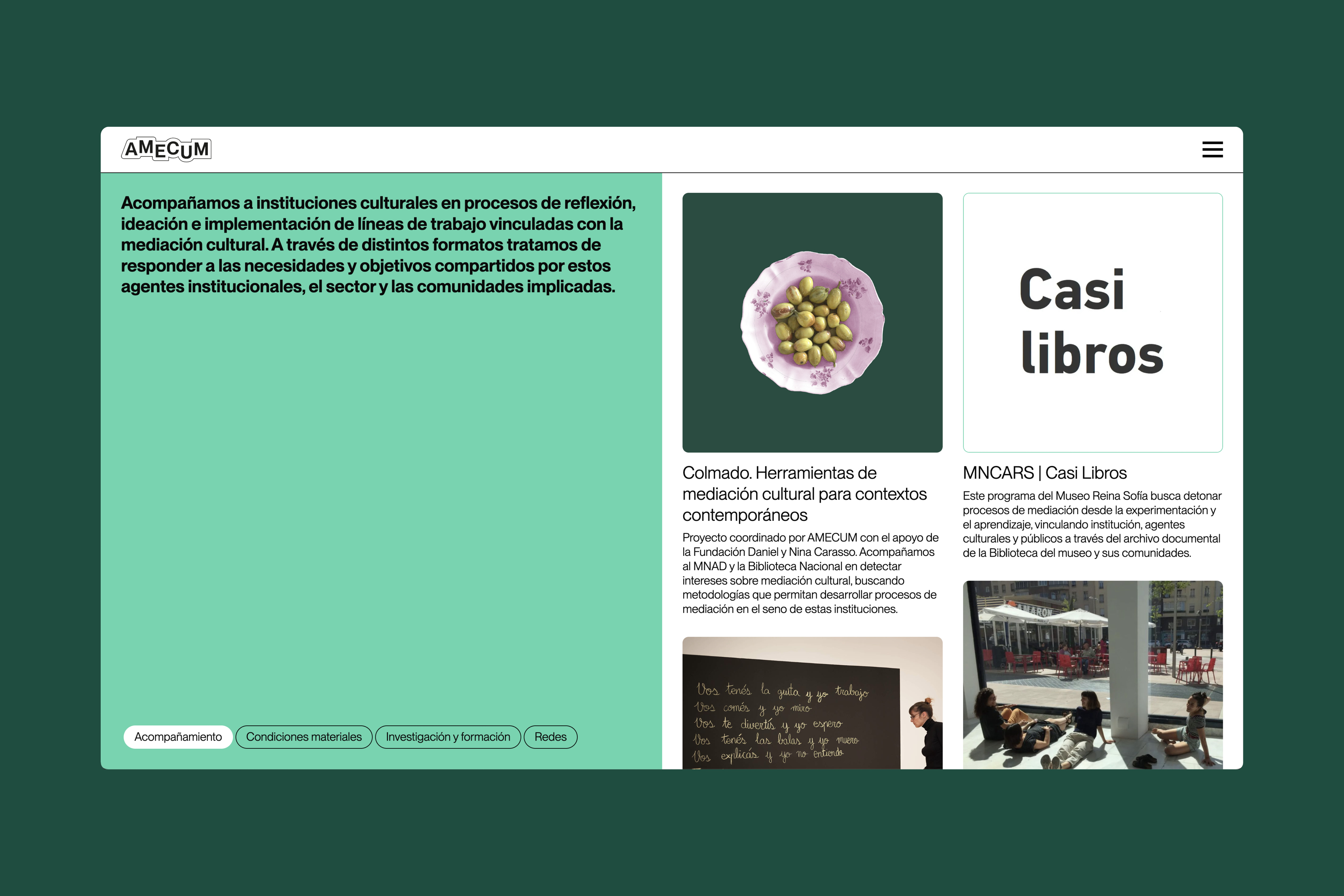
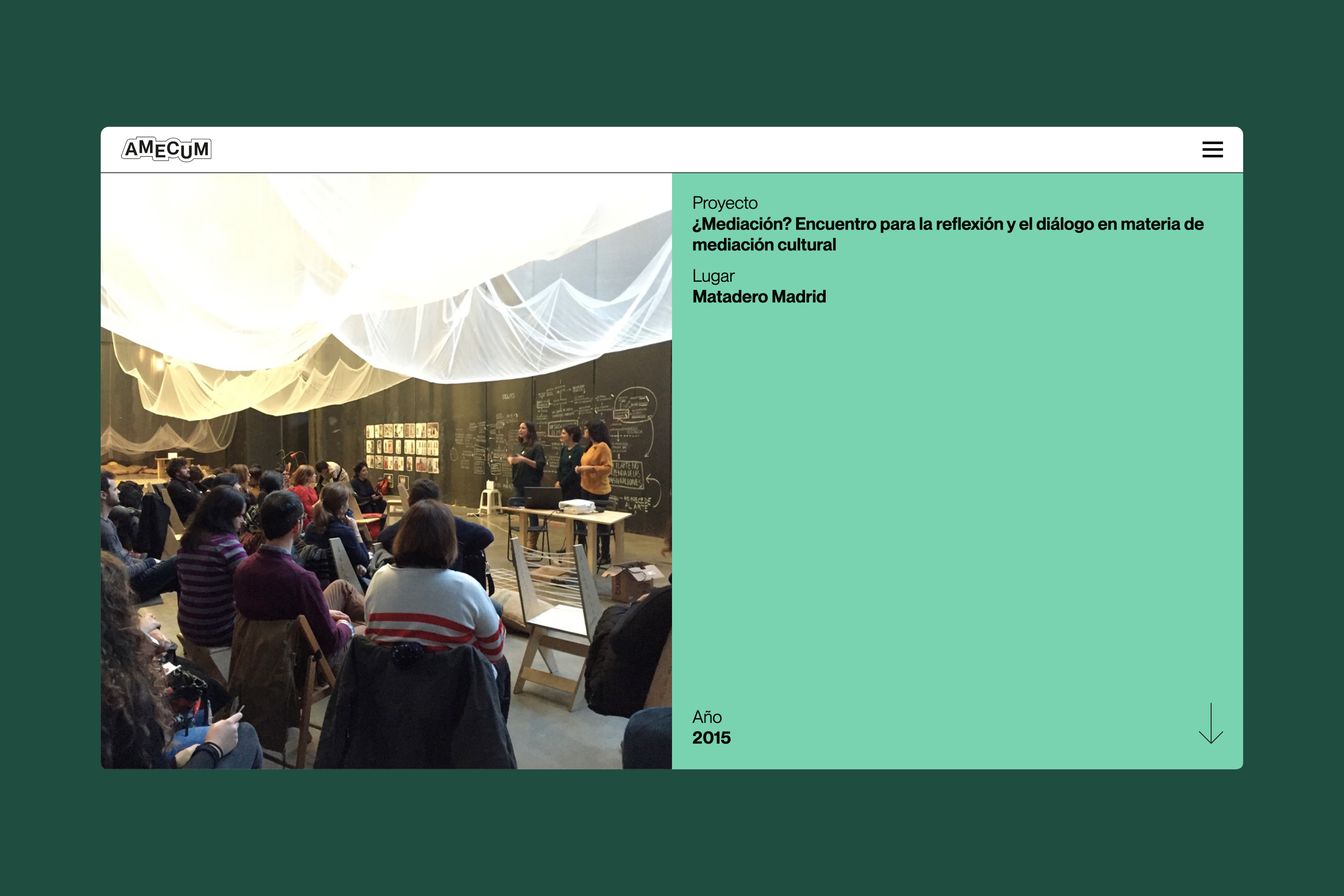
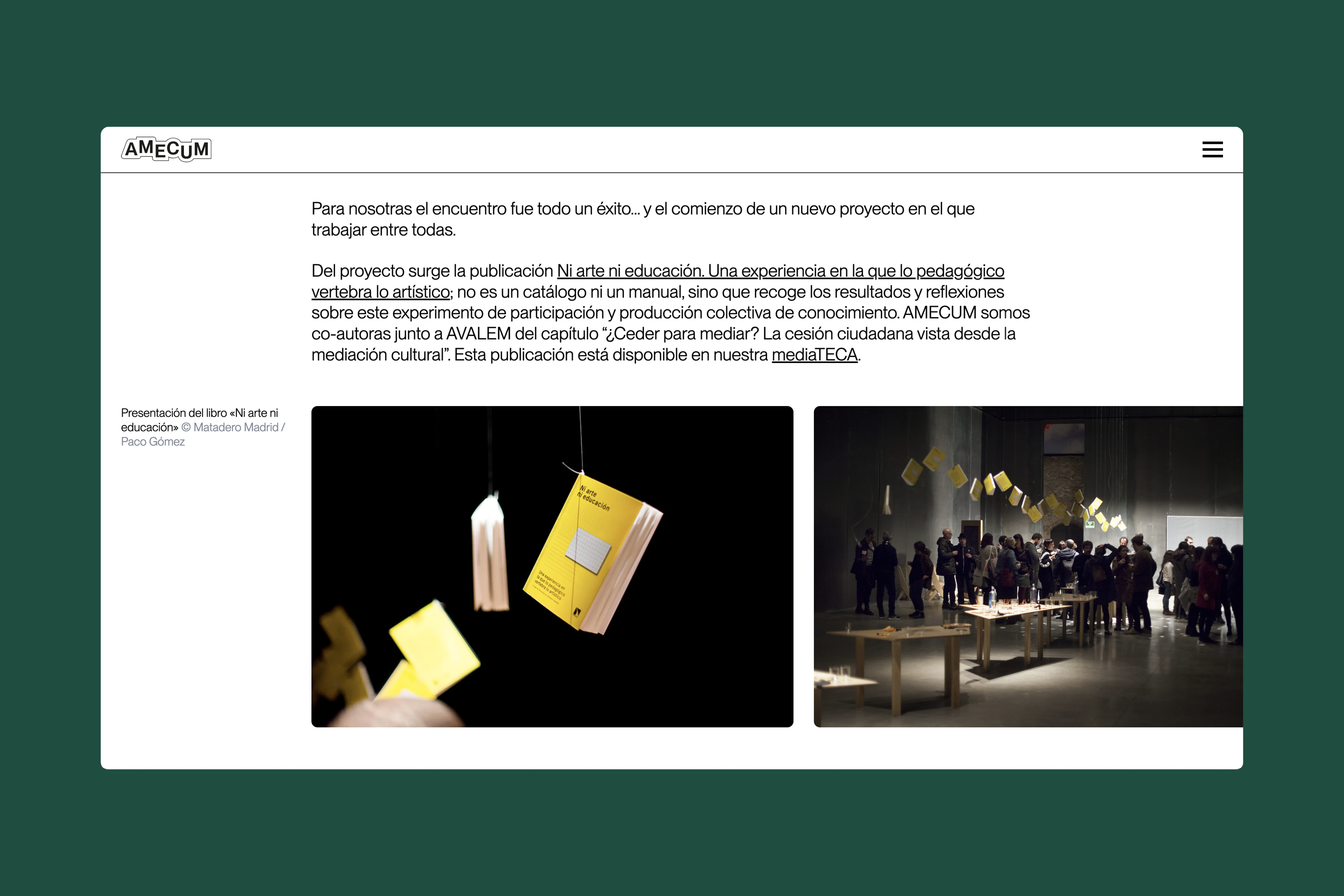
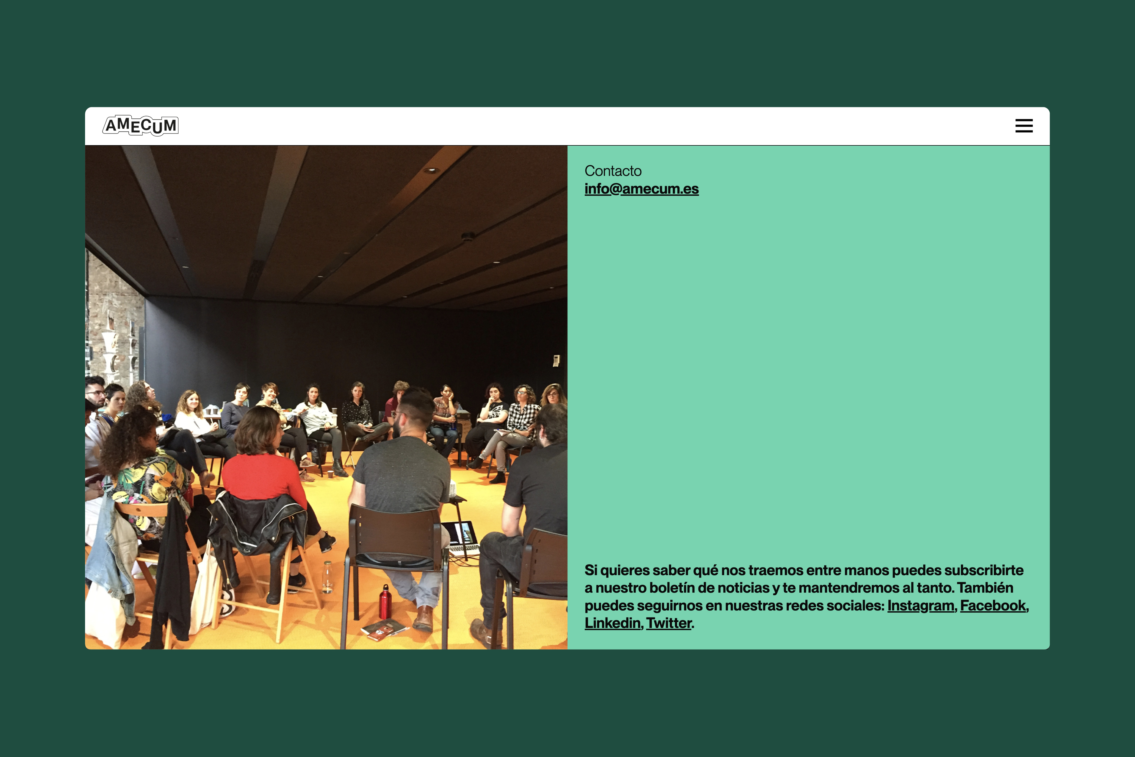
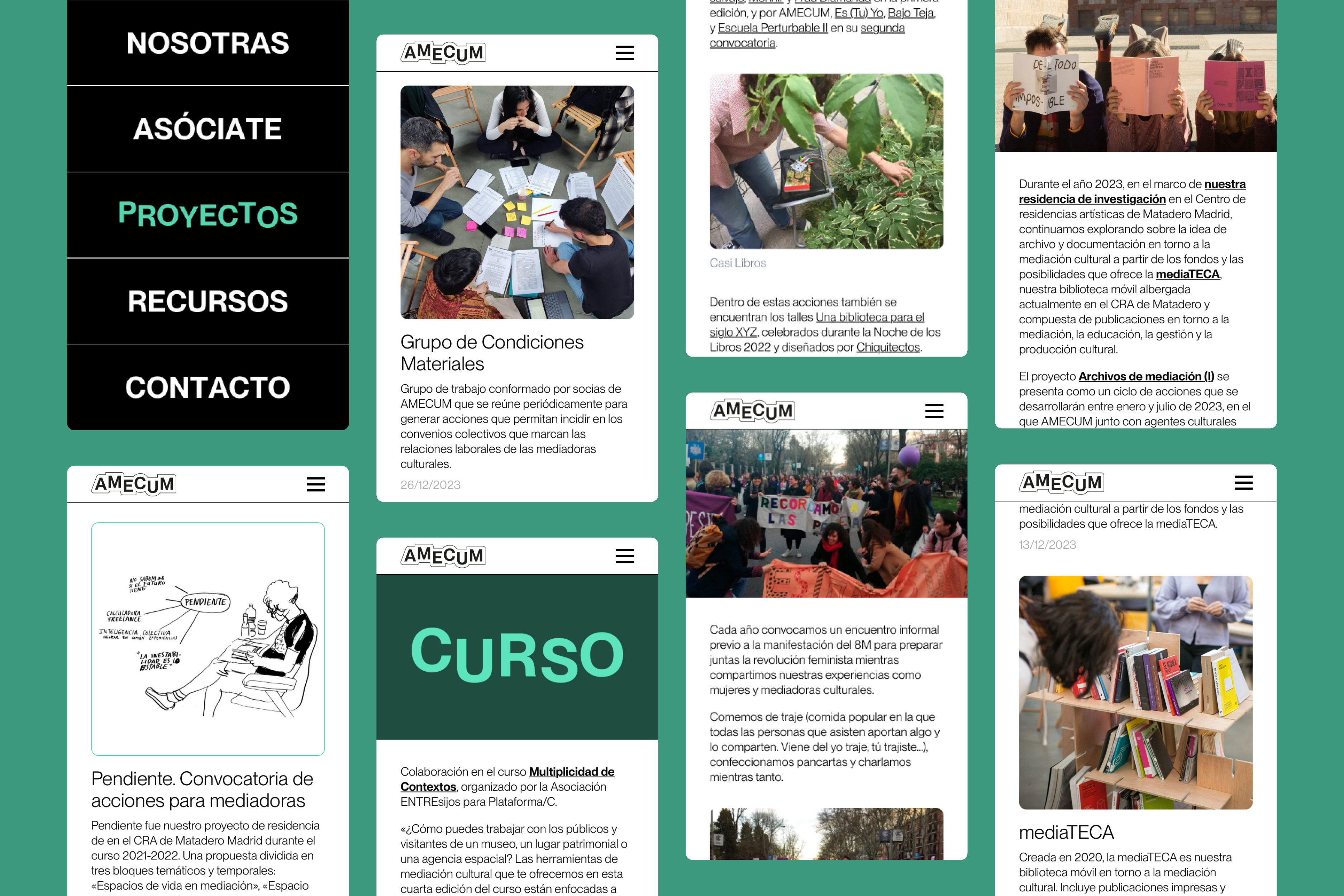
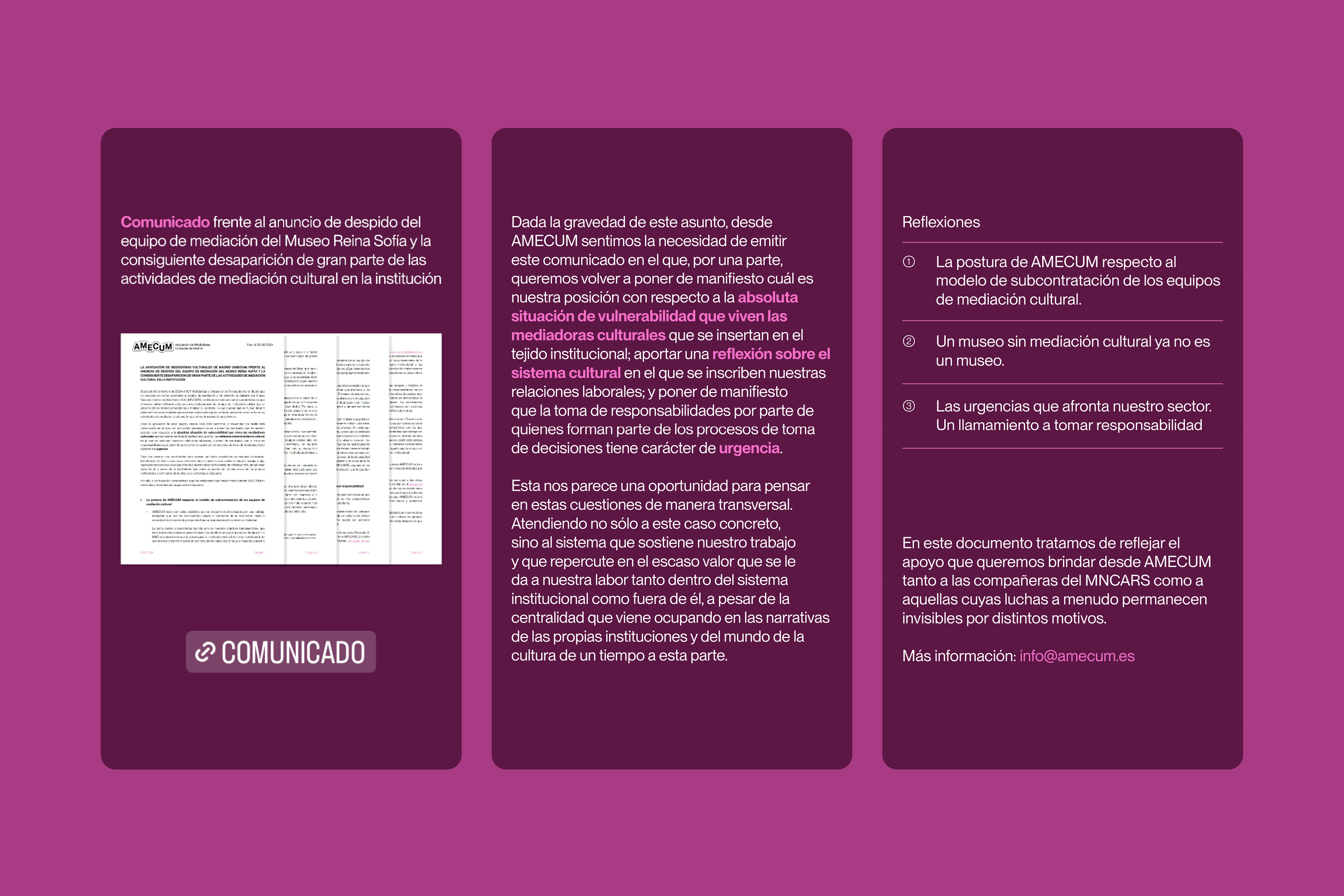
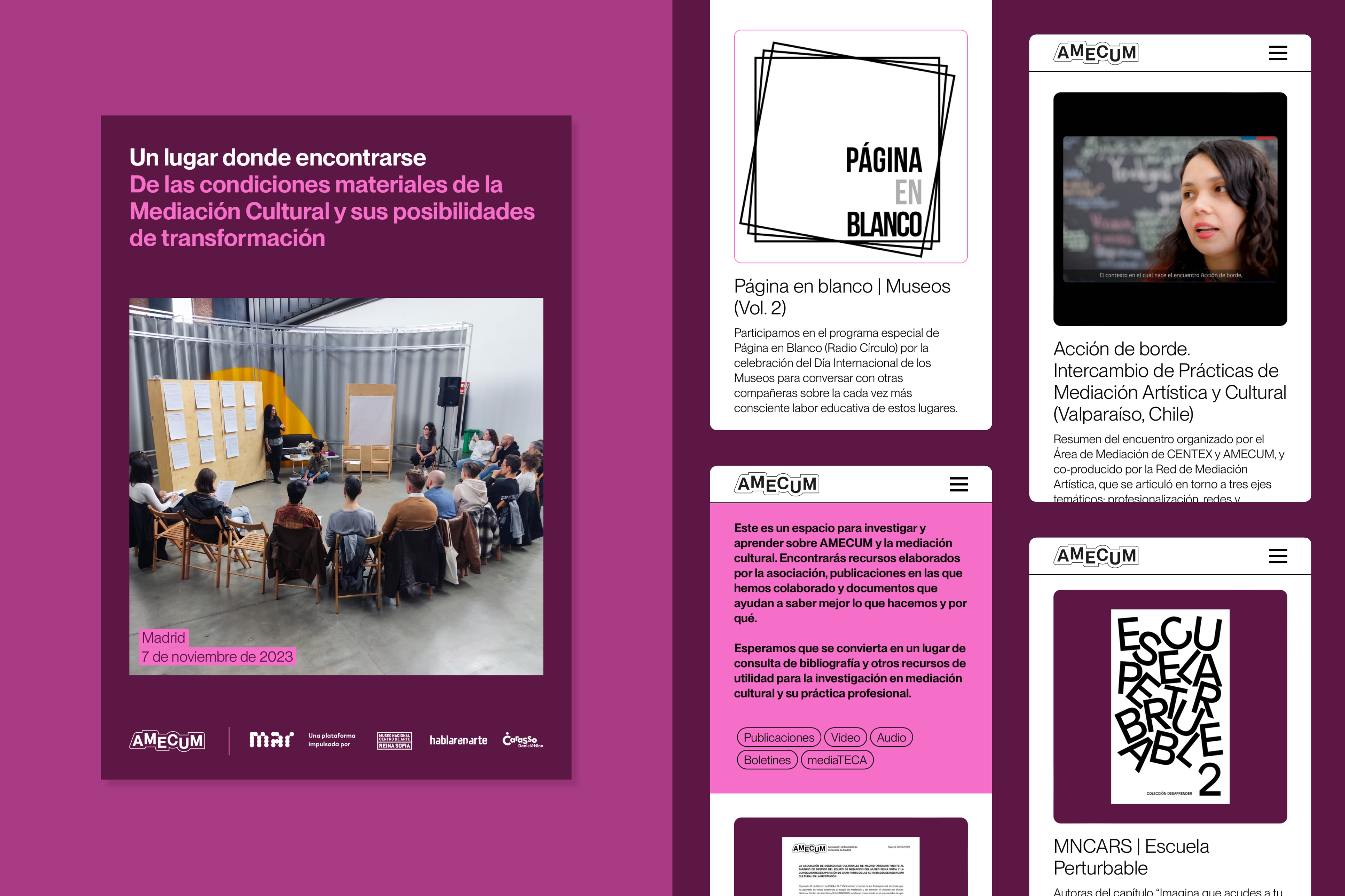
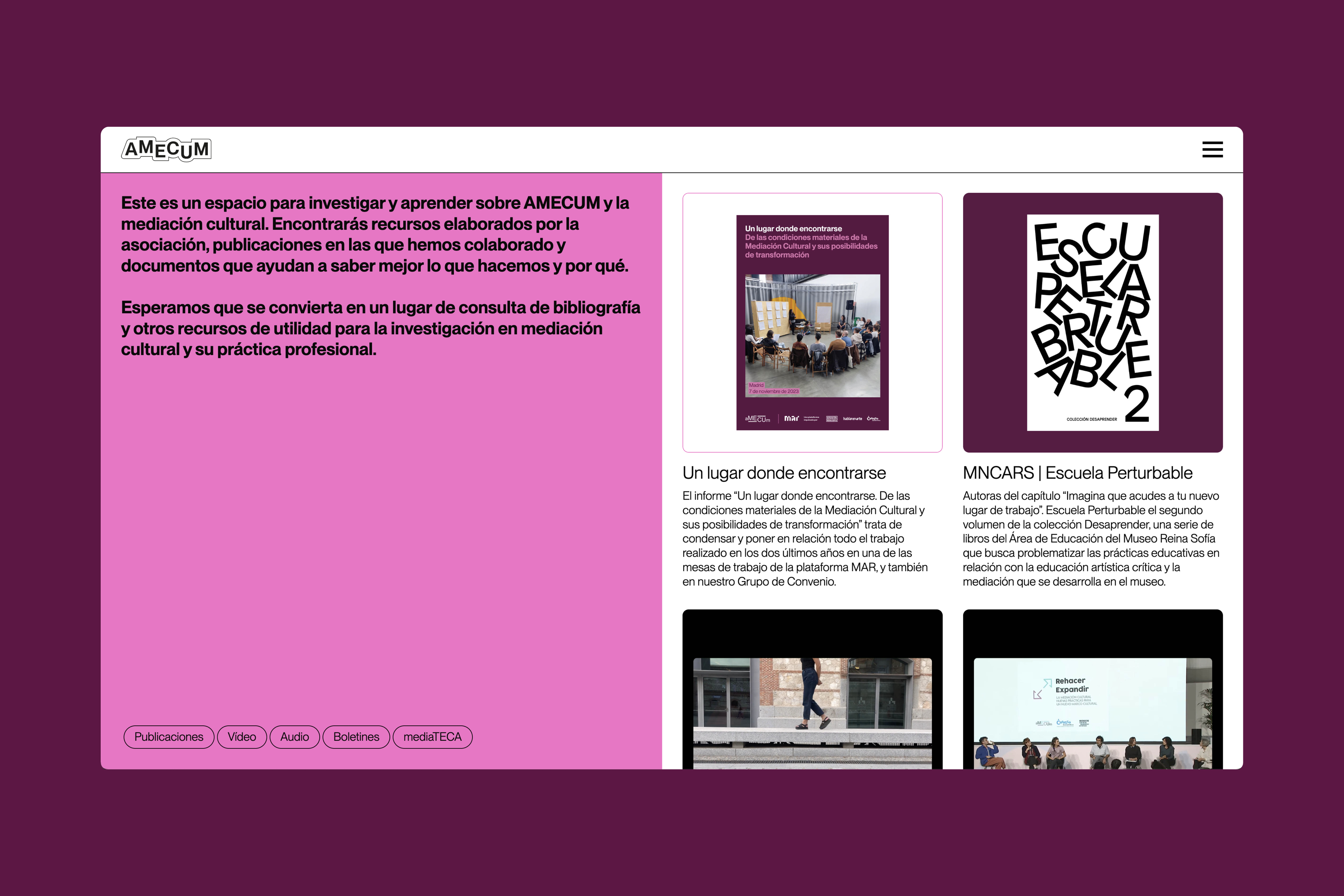
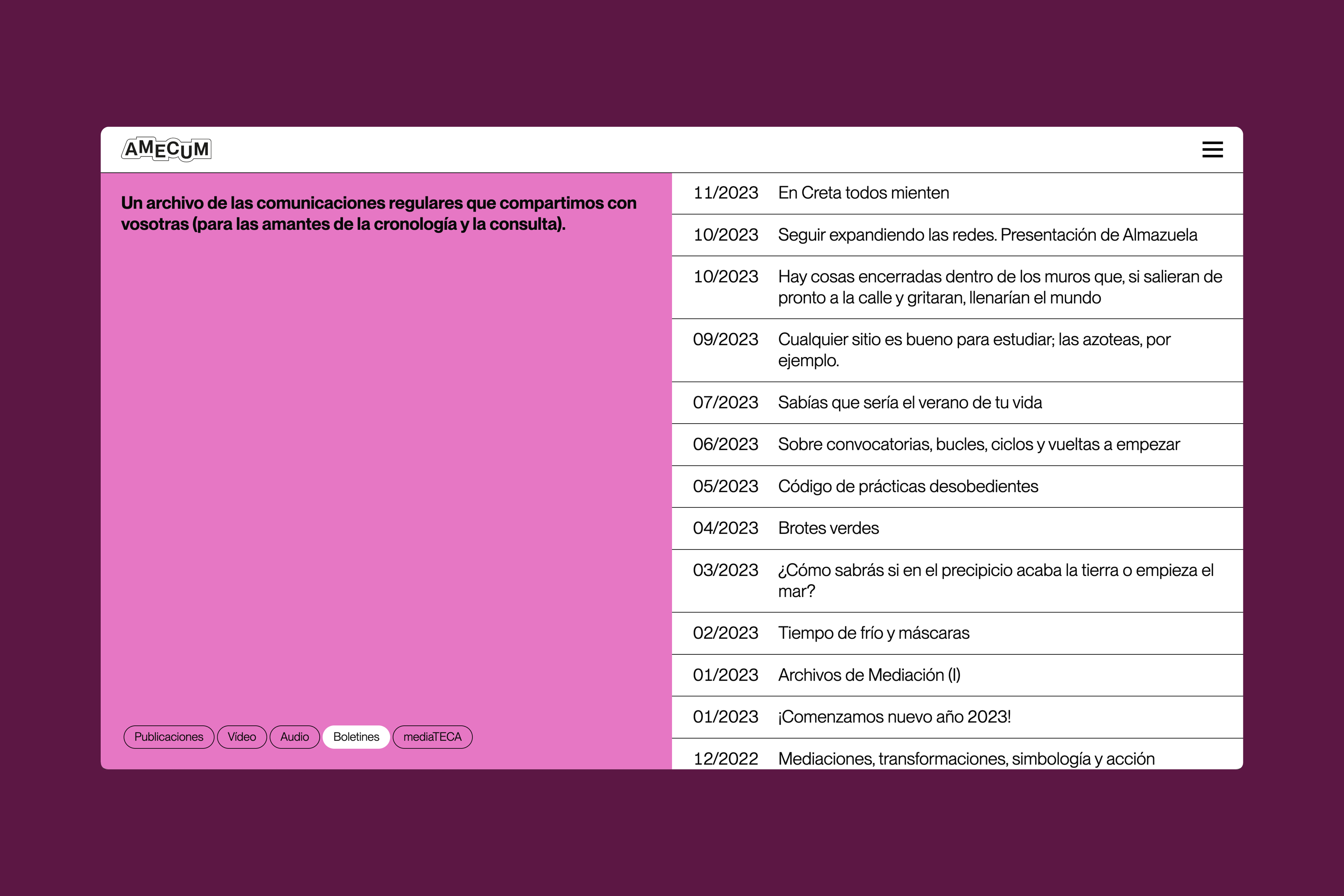

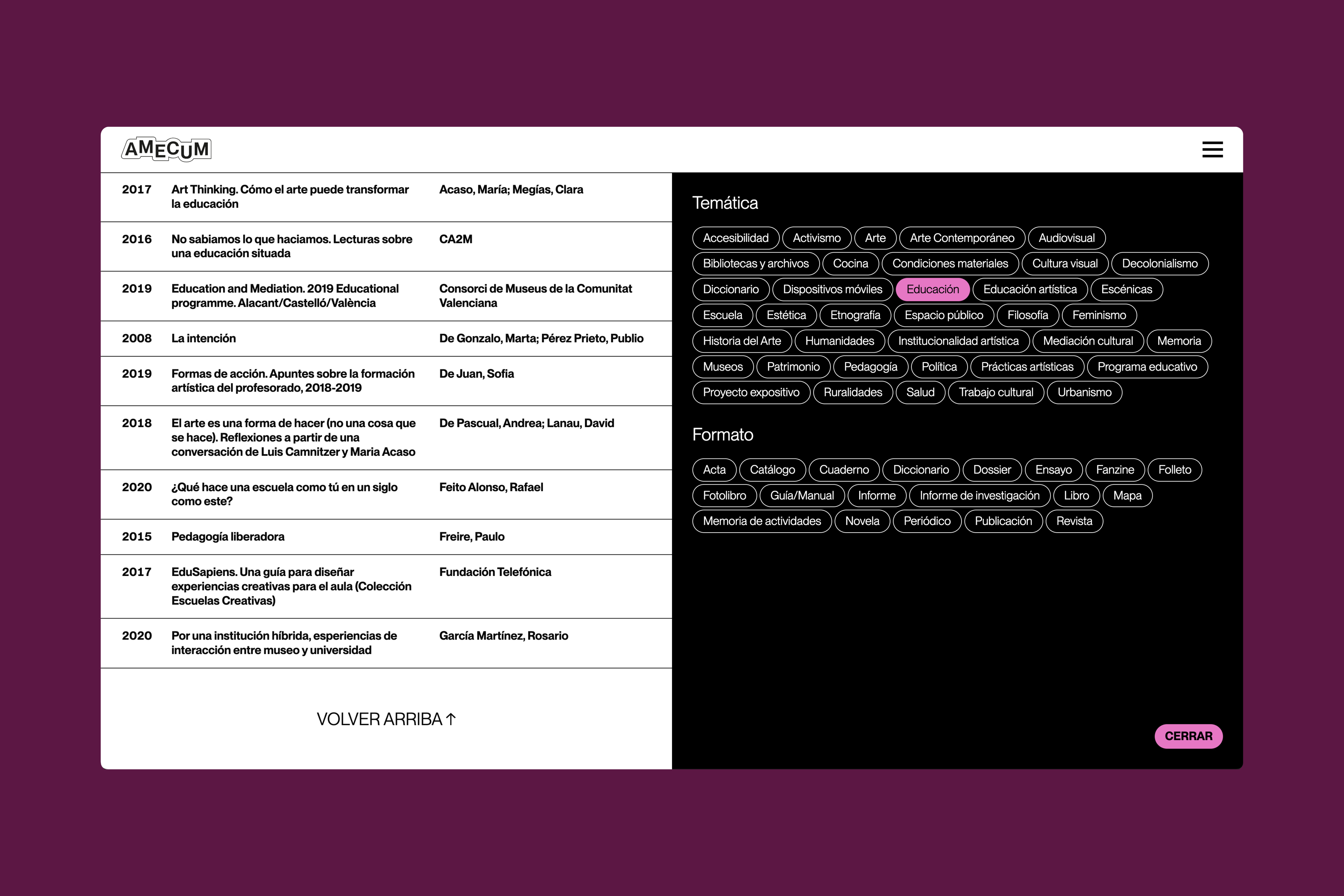
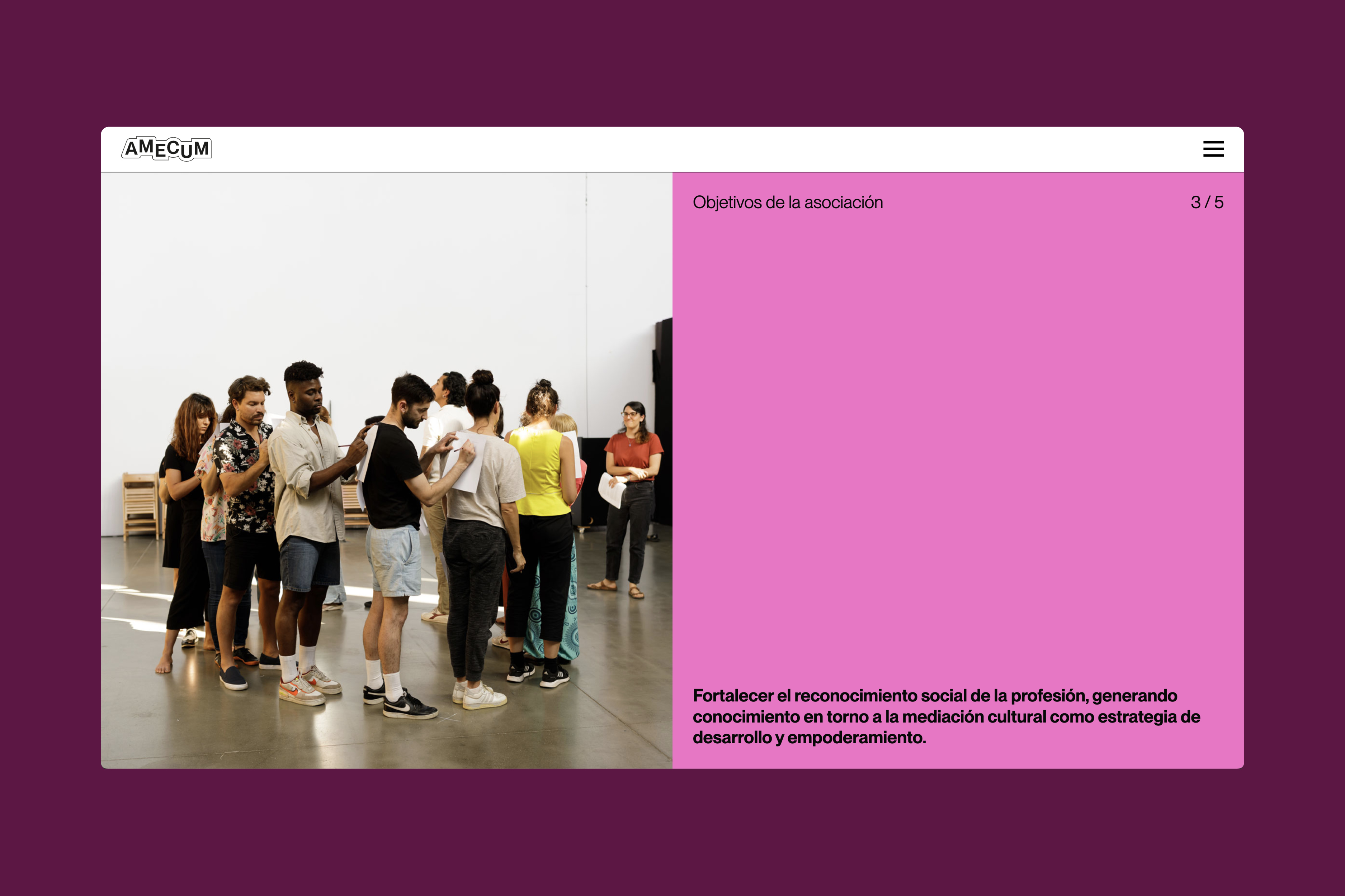
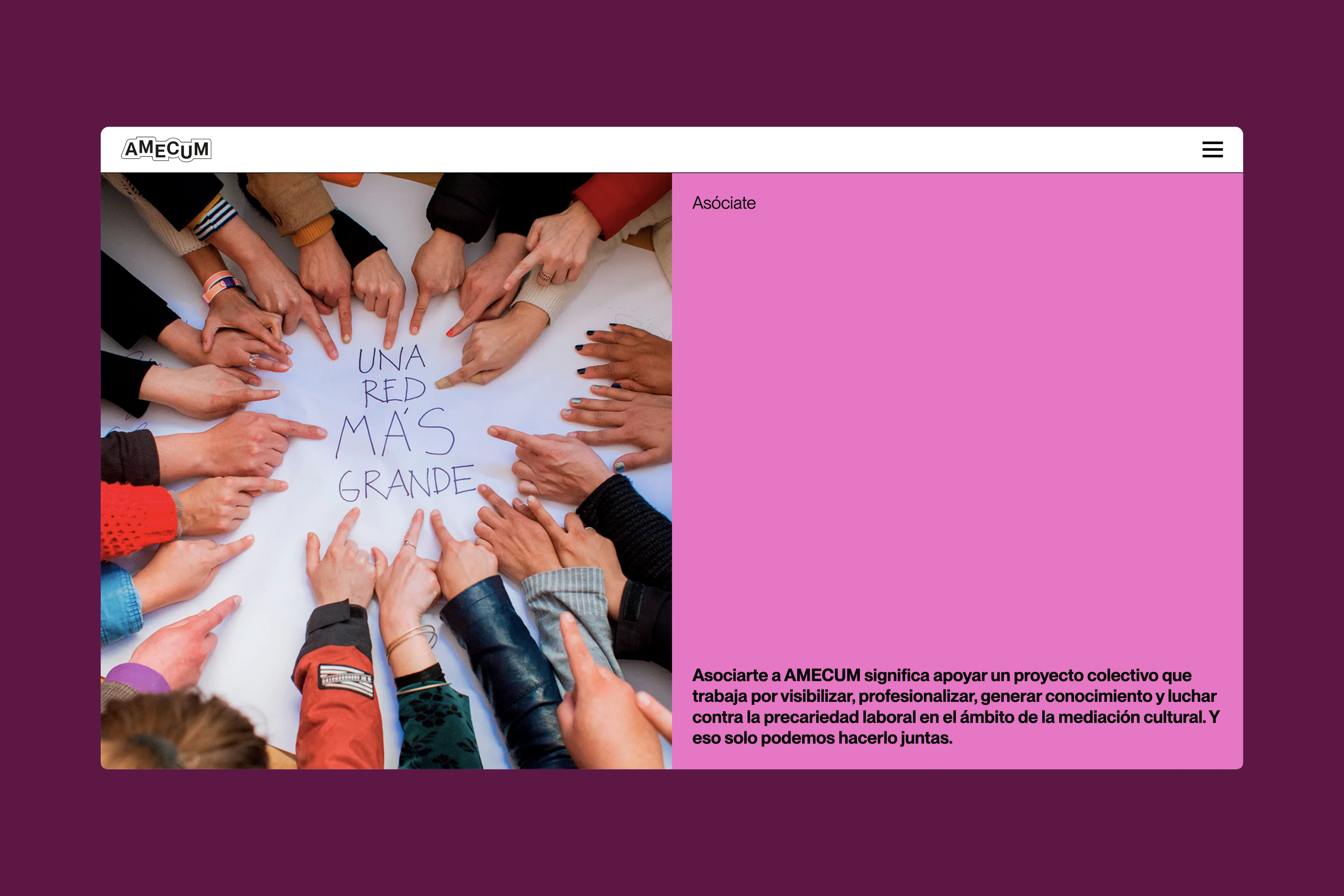
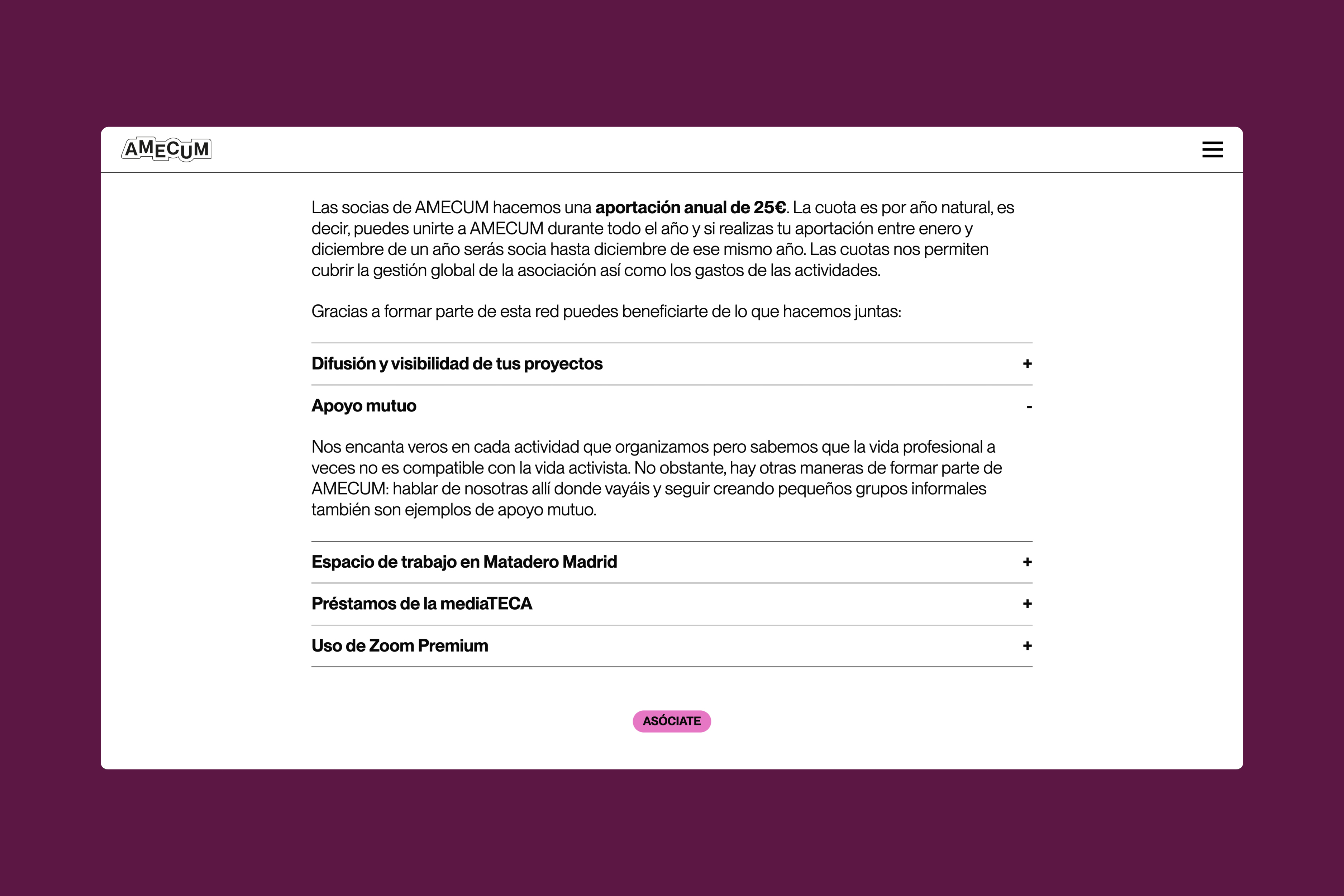
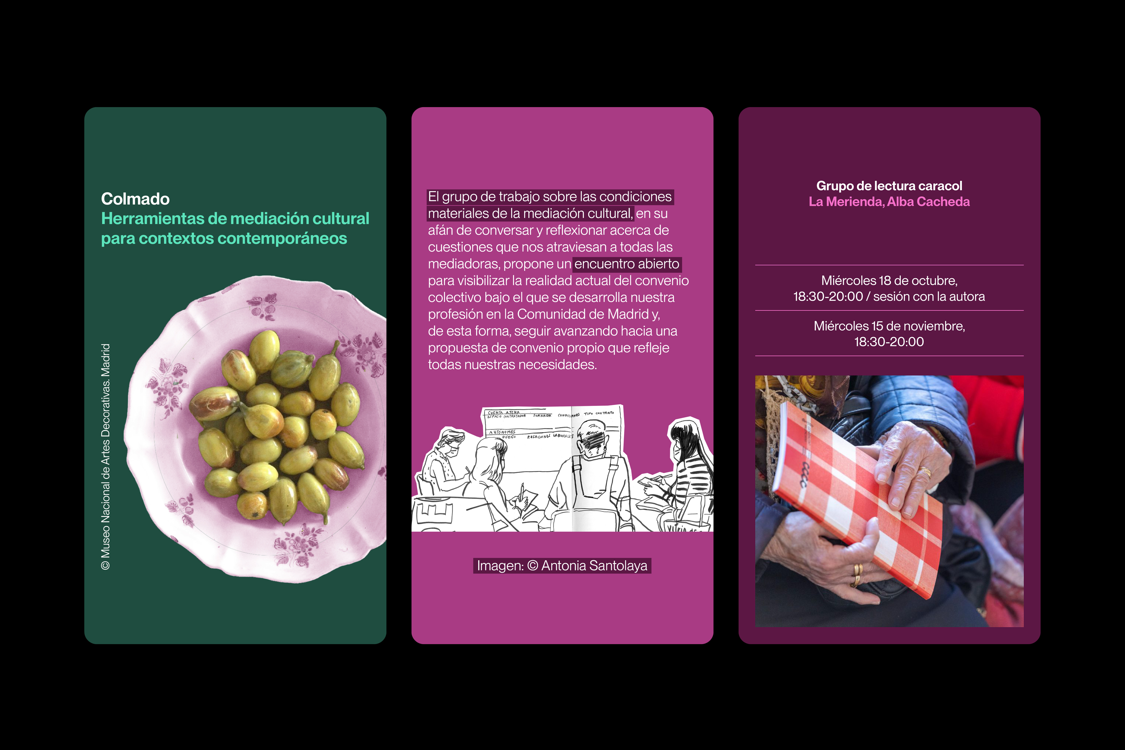


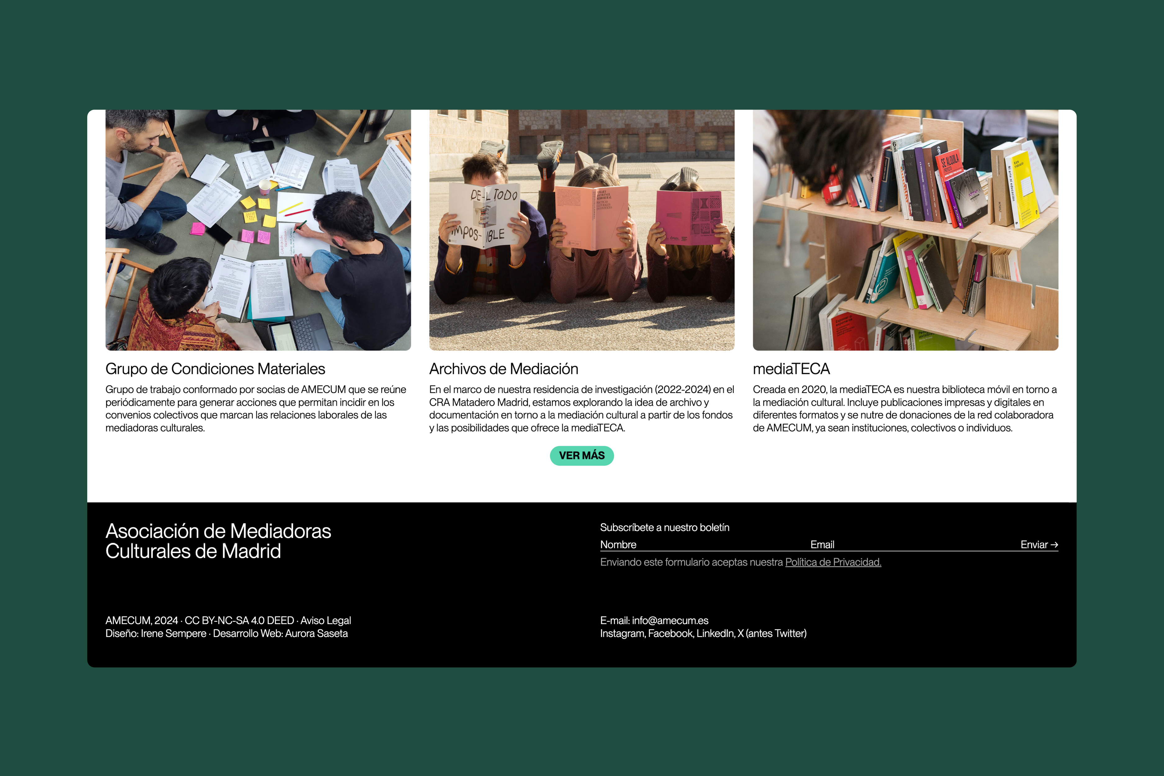
Logo, visual identity and website for AMECUM, the Association of Cultural Mediators of Madrid. The new website incorporates features such as search filters in the projects and resources sections, as well as a digital version of the mediaTECA catalog—a mobile library for cultural mediation built with publications donated or shared by the association’s international network of collaborators. The logo reflects the diversity of profiles that make up AMECUM and the process-based, experimental nature of cultural mediation practice. / Web development: Aurora Saseta. <2023>
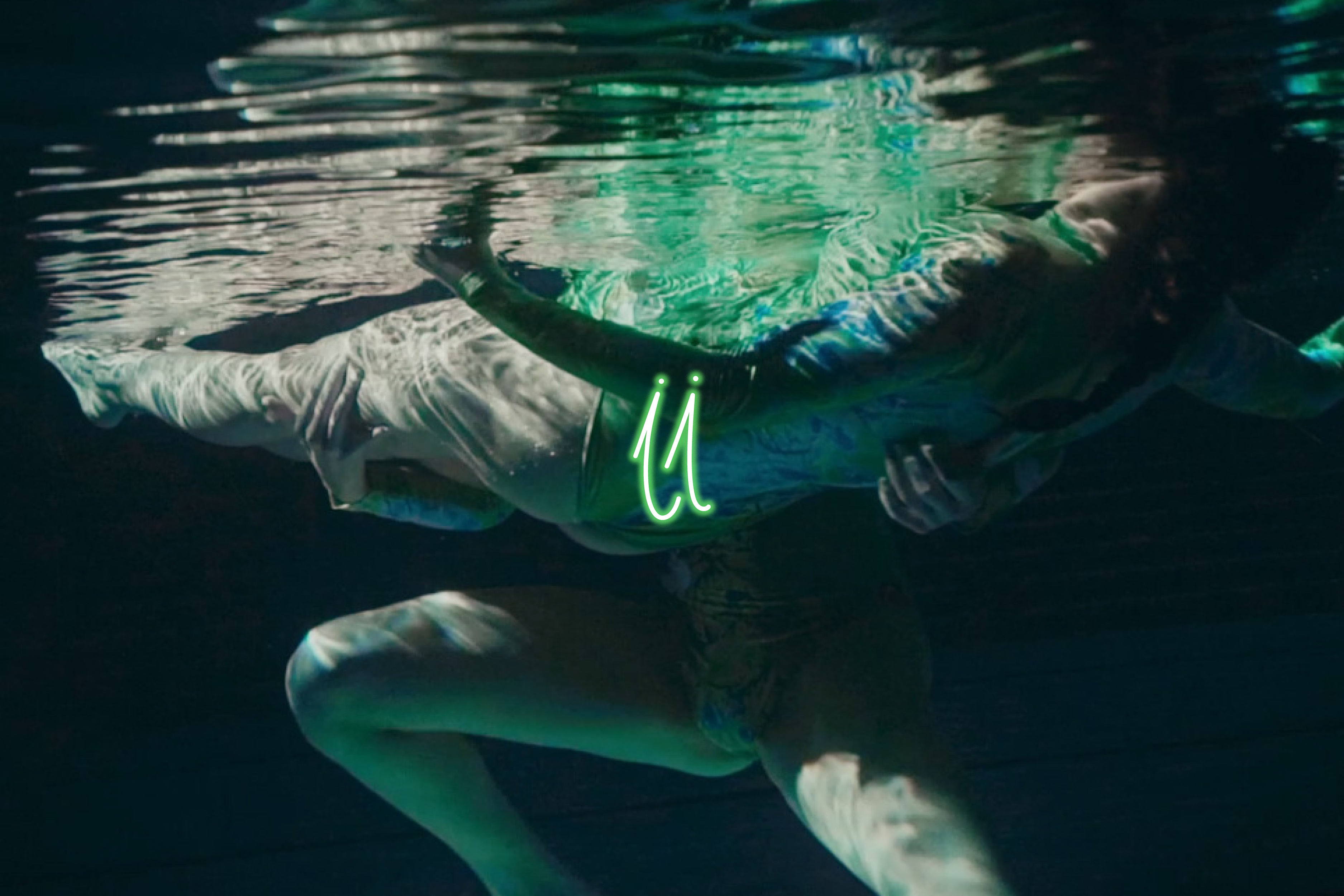
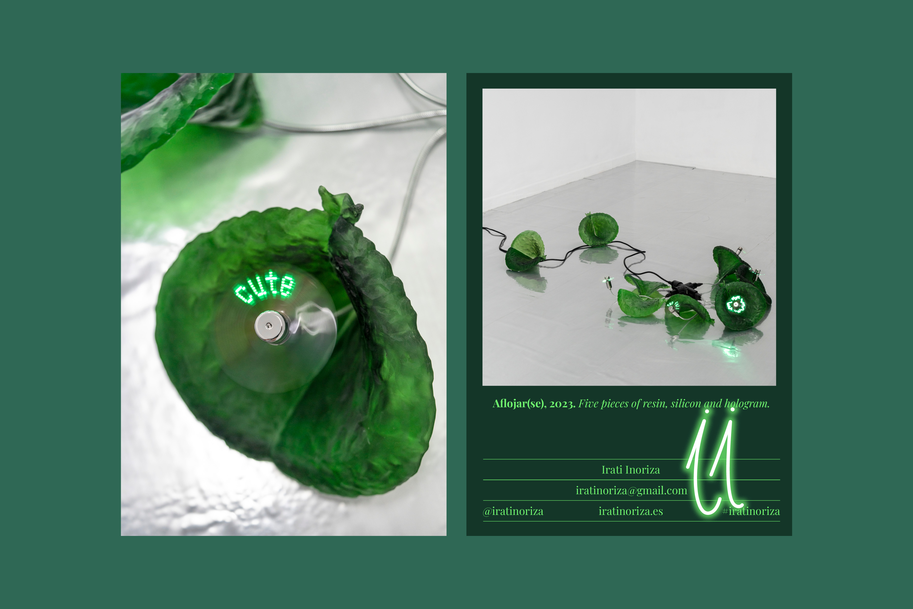
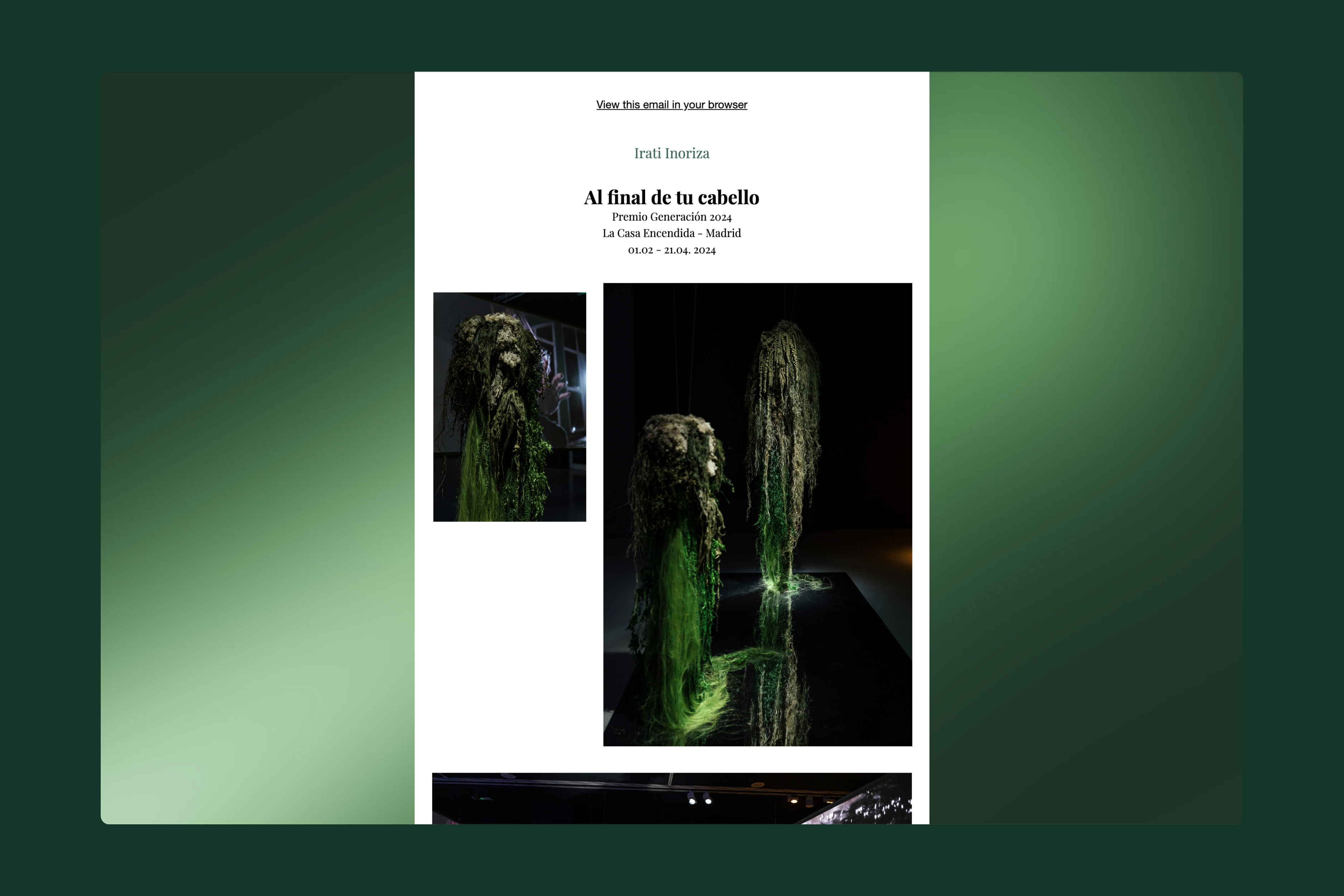
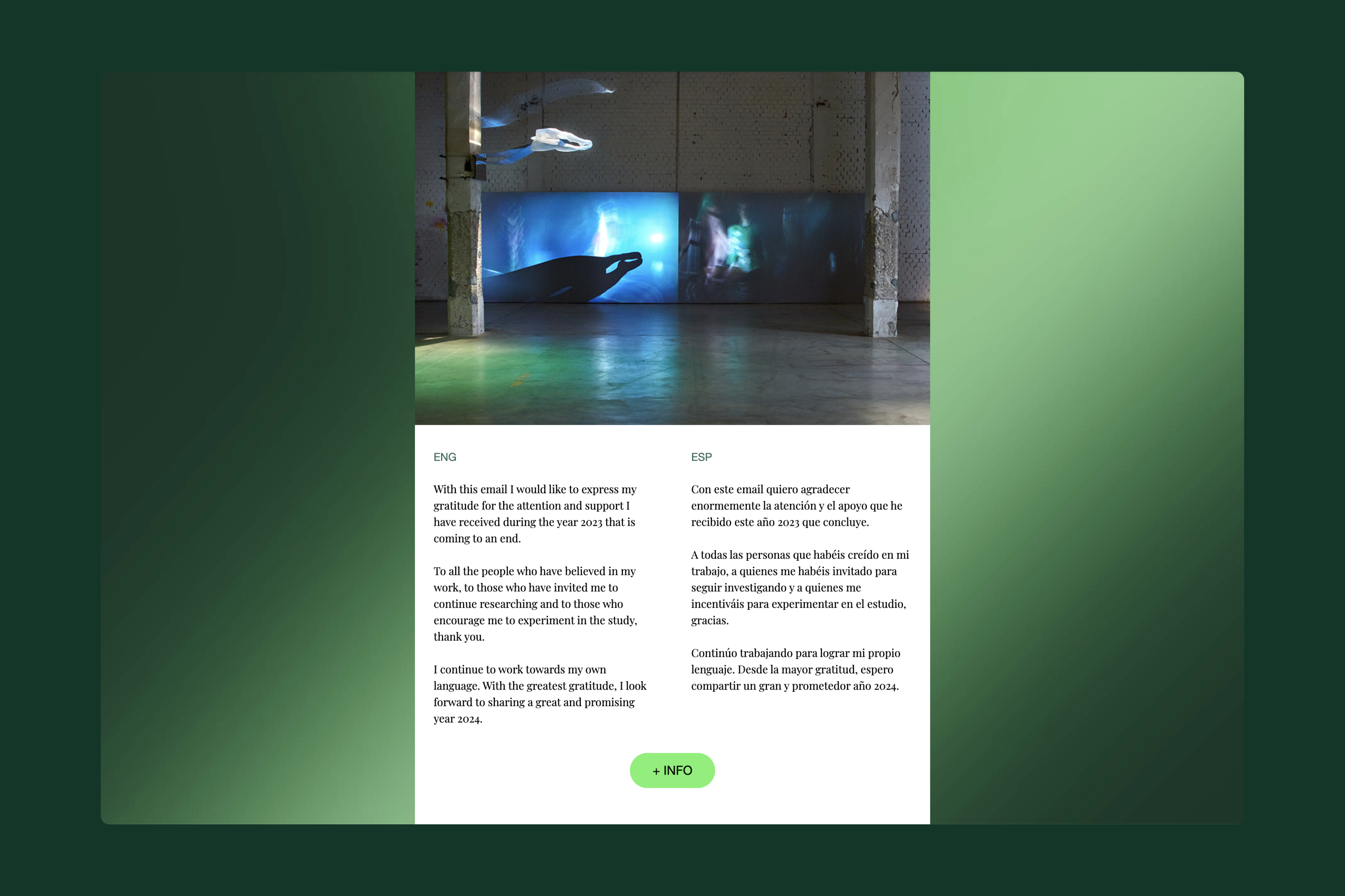
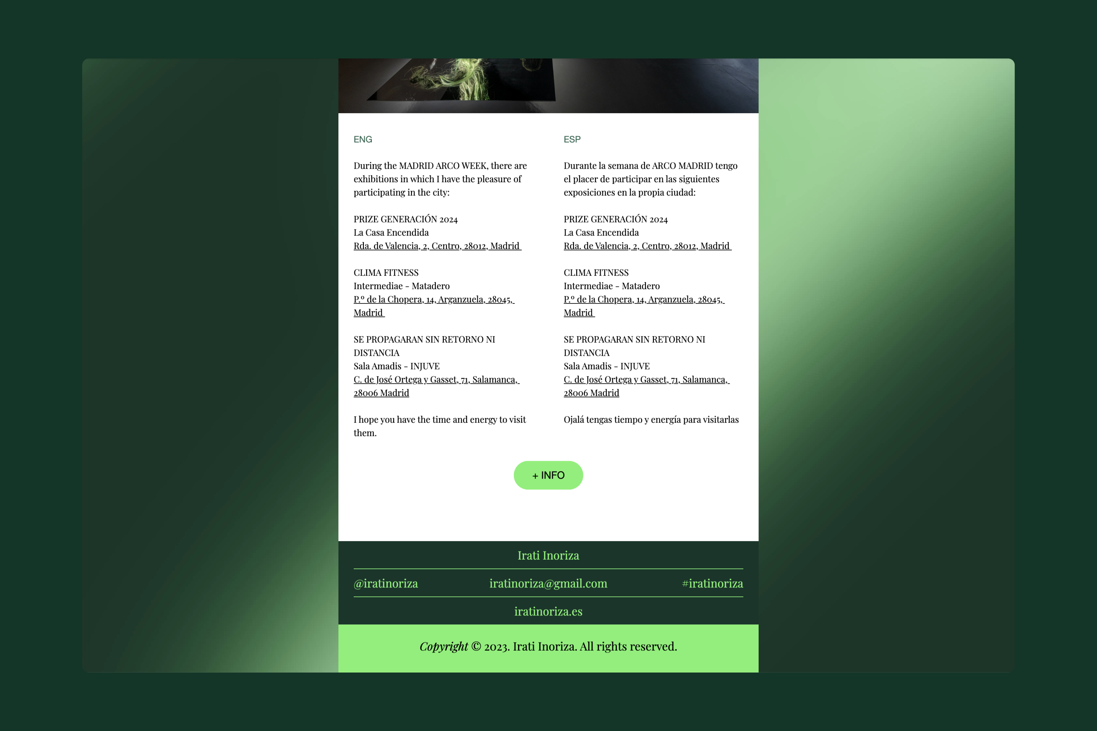
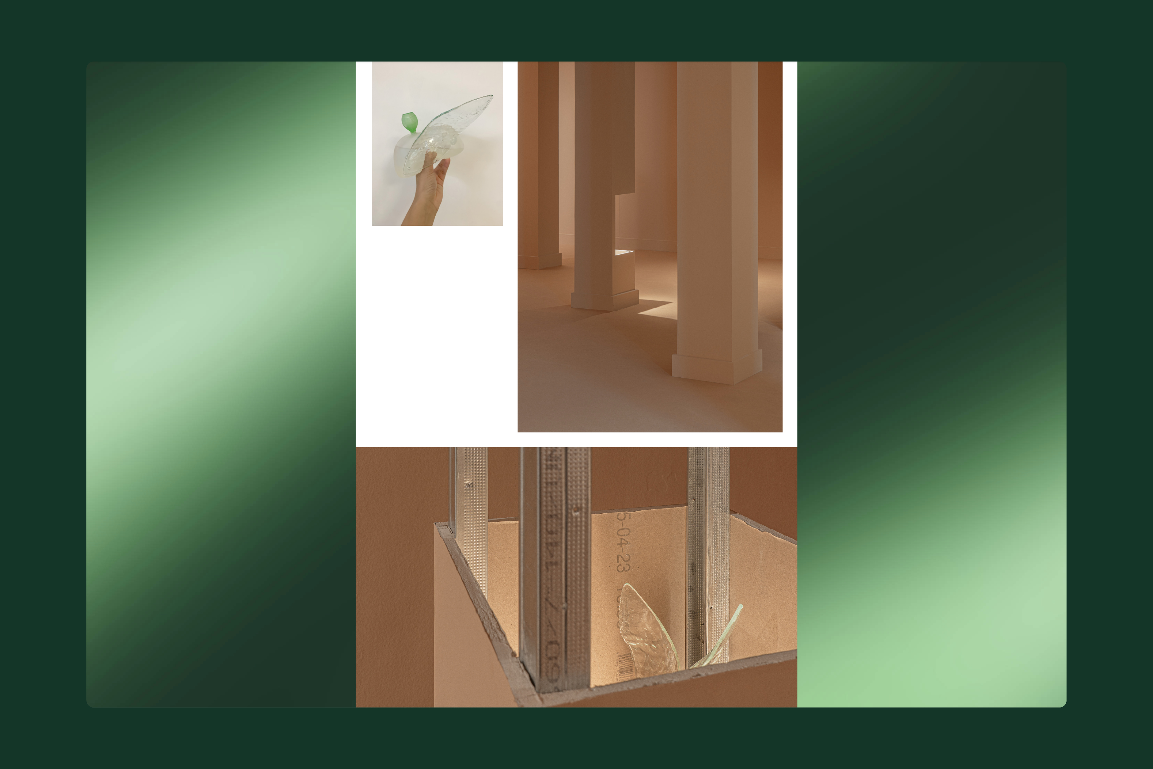
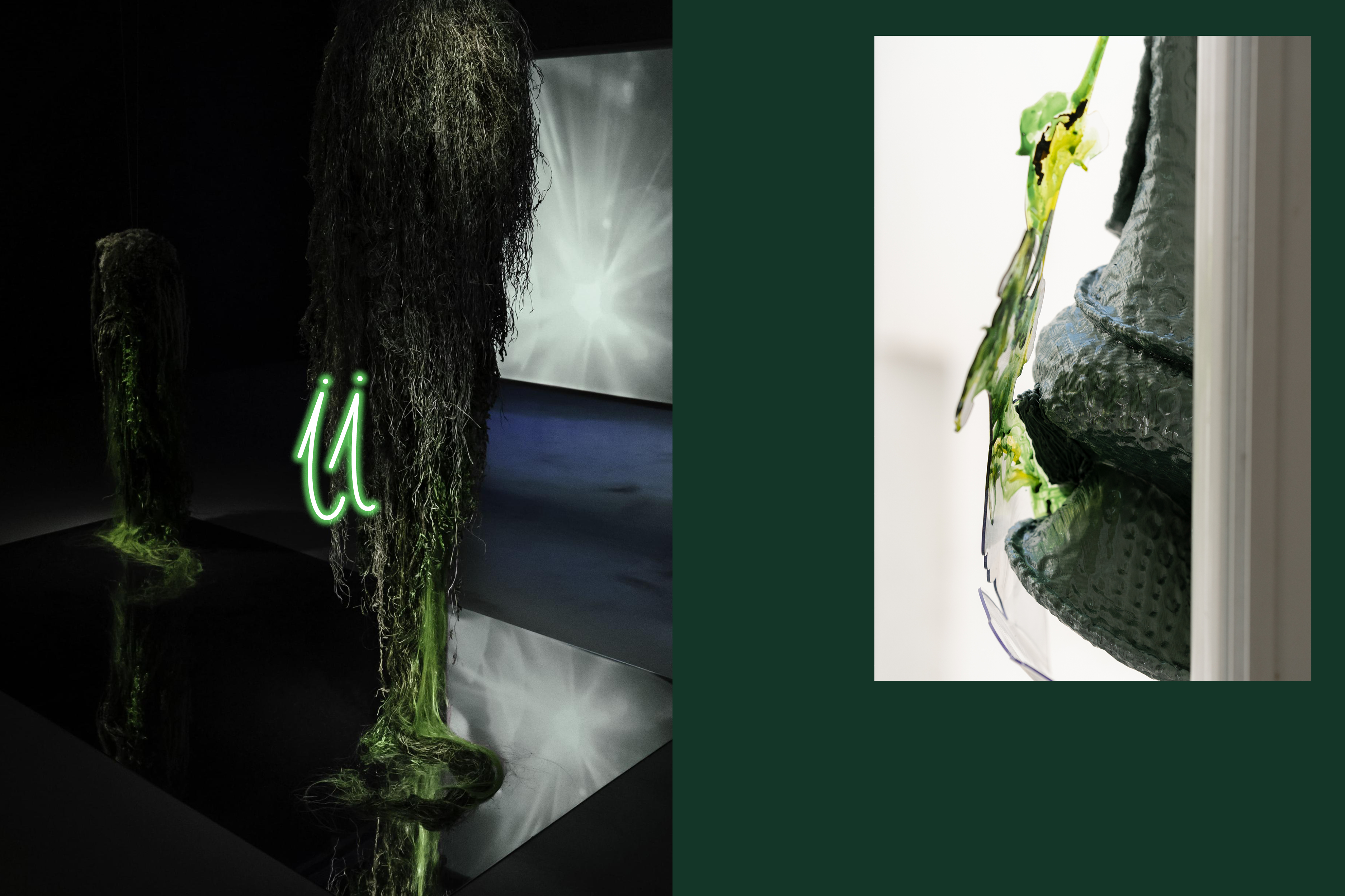
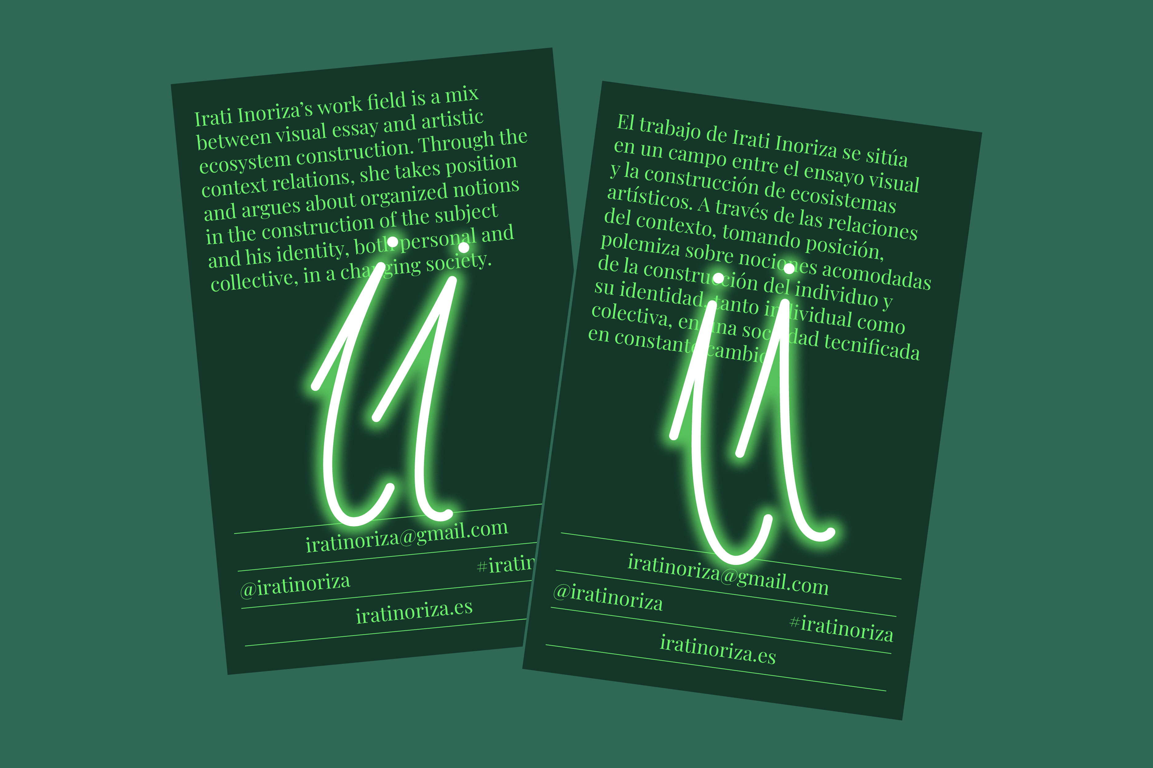
Design of a newsletter and printed cards for Irati Inoriza. The “ii” symbol recreates a visual gesture the artist often uses to share her projects and processes on Instagram—drawing and writing directly on images with a neon-effect marker. The color palette draws from recurring tones present throughout Irati’s work. / Newsletter templates developed in Mailchimp. <2023>
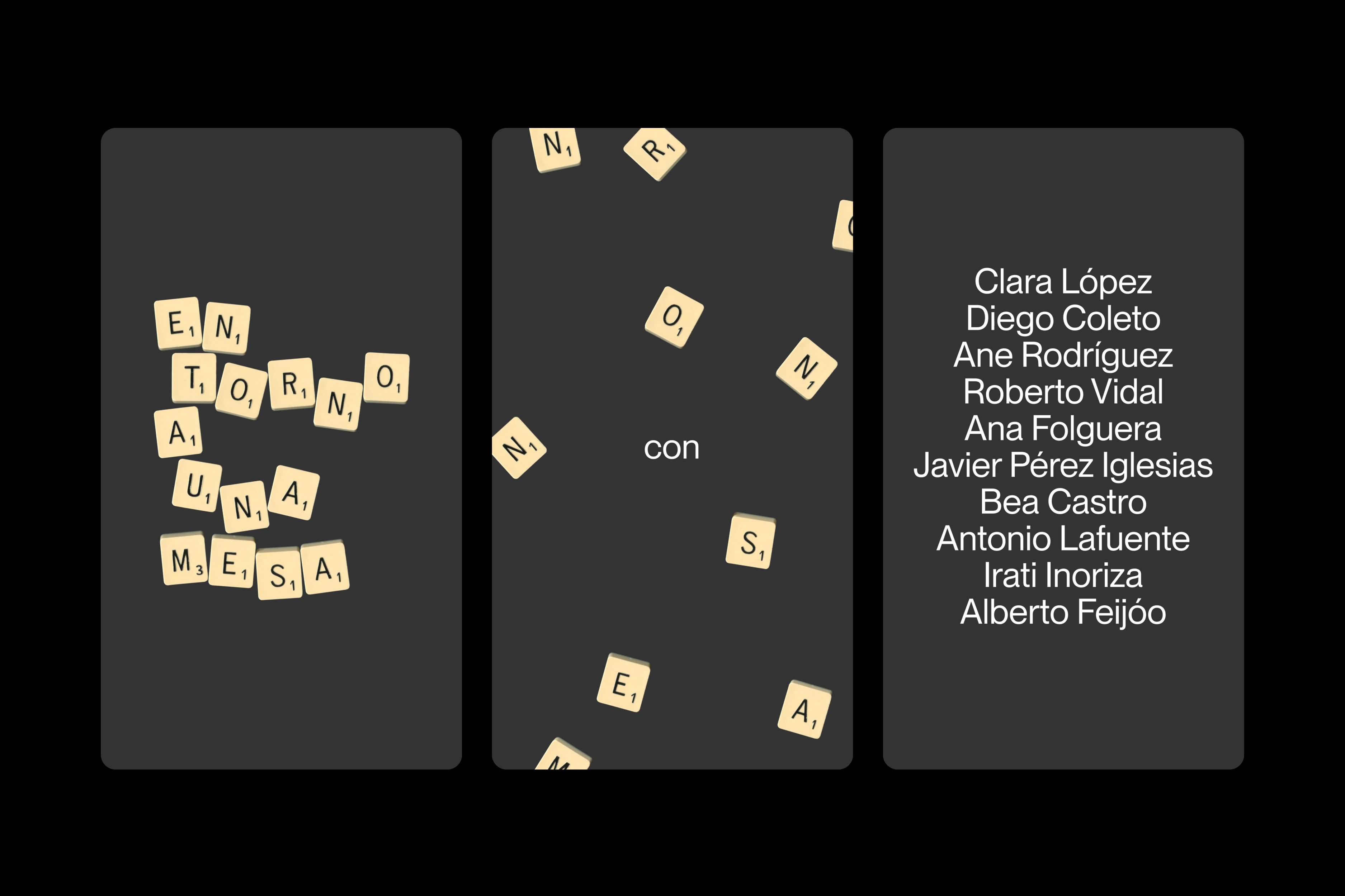
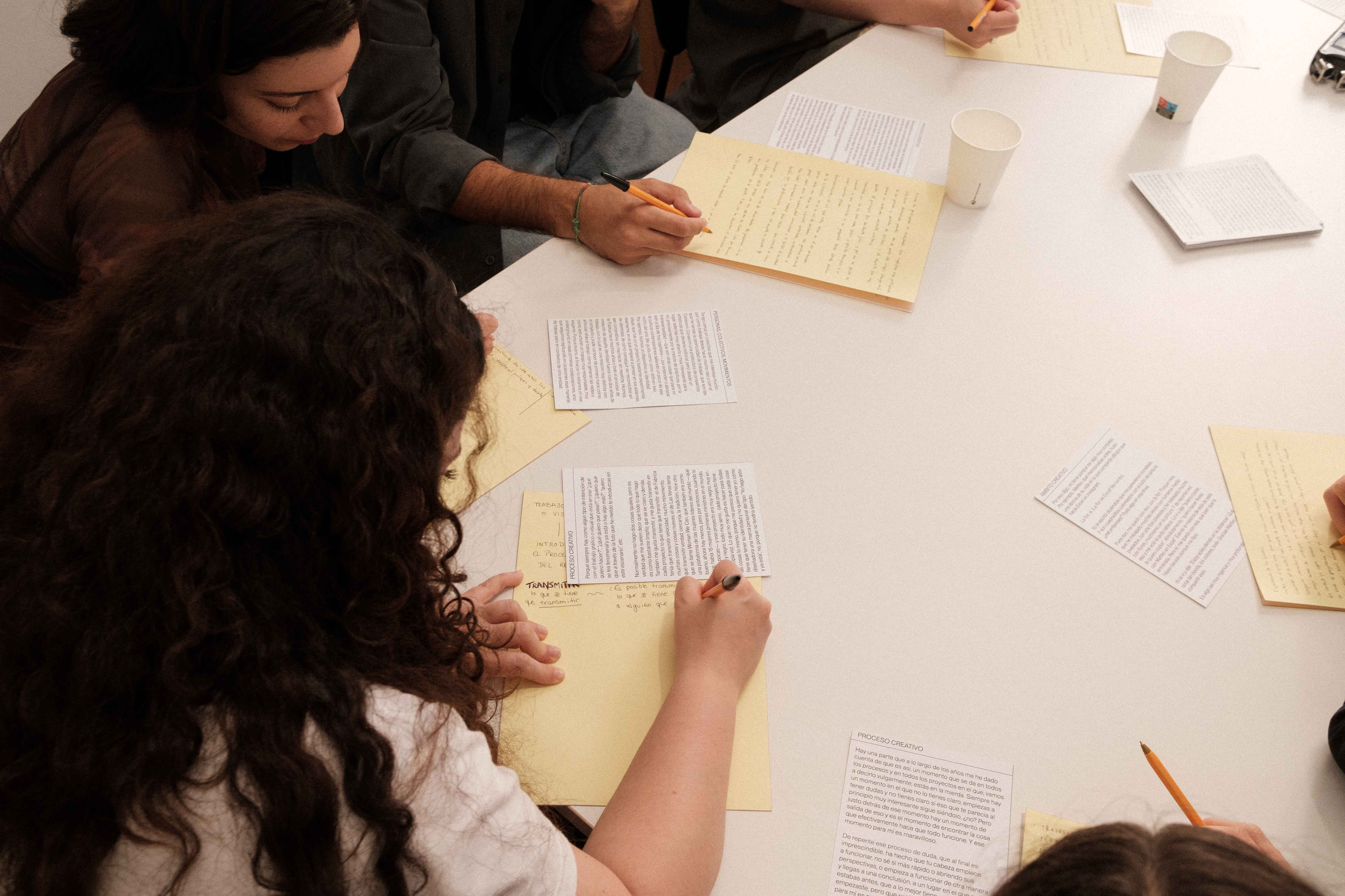
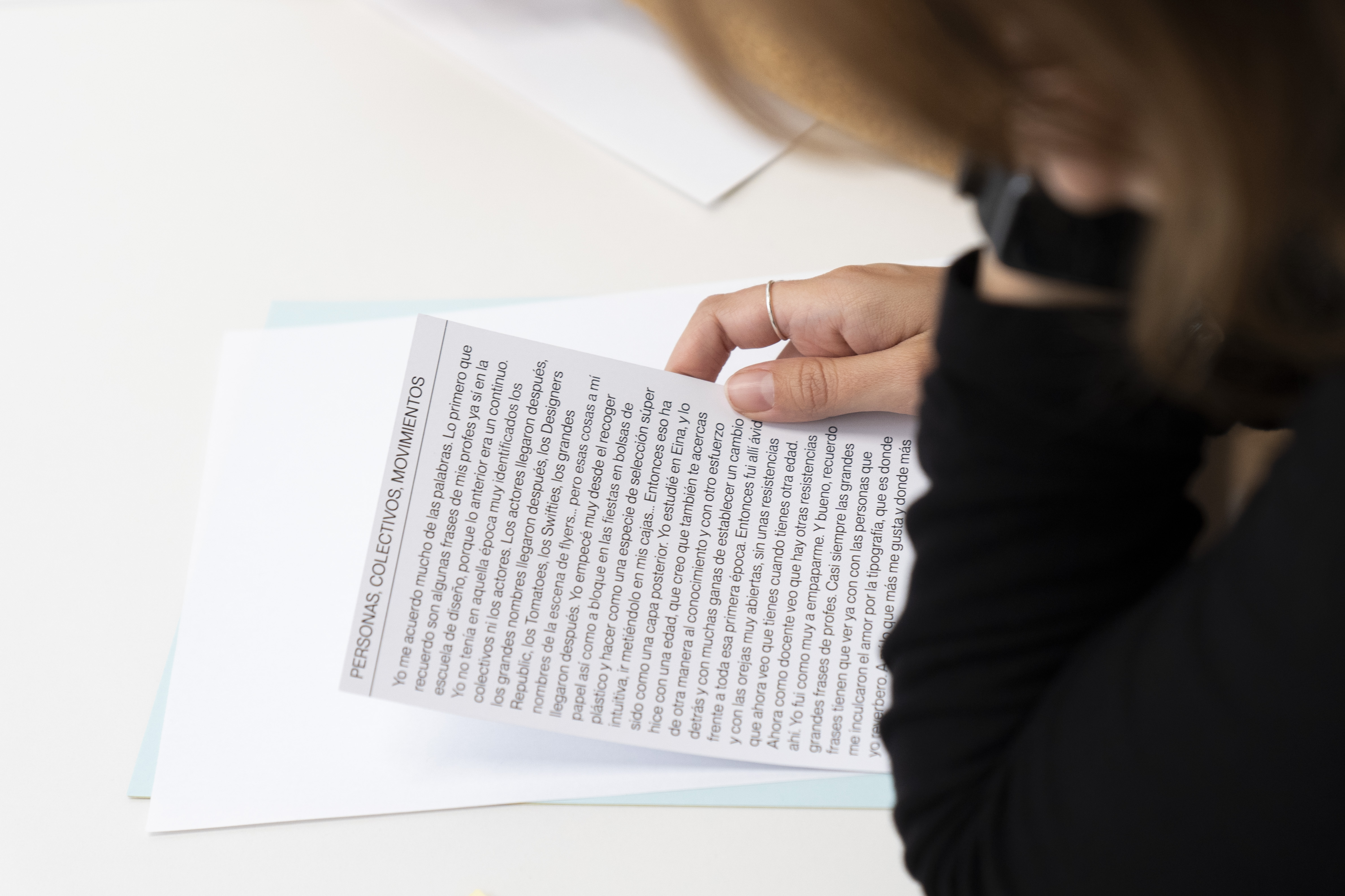
Textual and visual communication materials for the fourth edition of Mesa de Mezclas: En torno a una mesa. A series of ten interviews to better understand people whose creative practice, in the present moment, has something or much to do with making things with others. / Sound design: Alberto García Aznar. <2023>
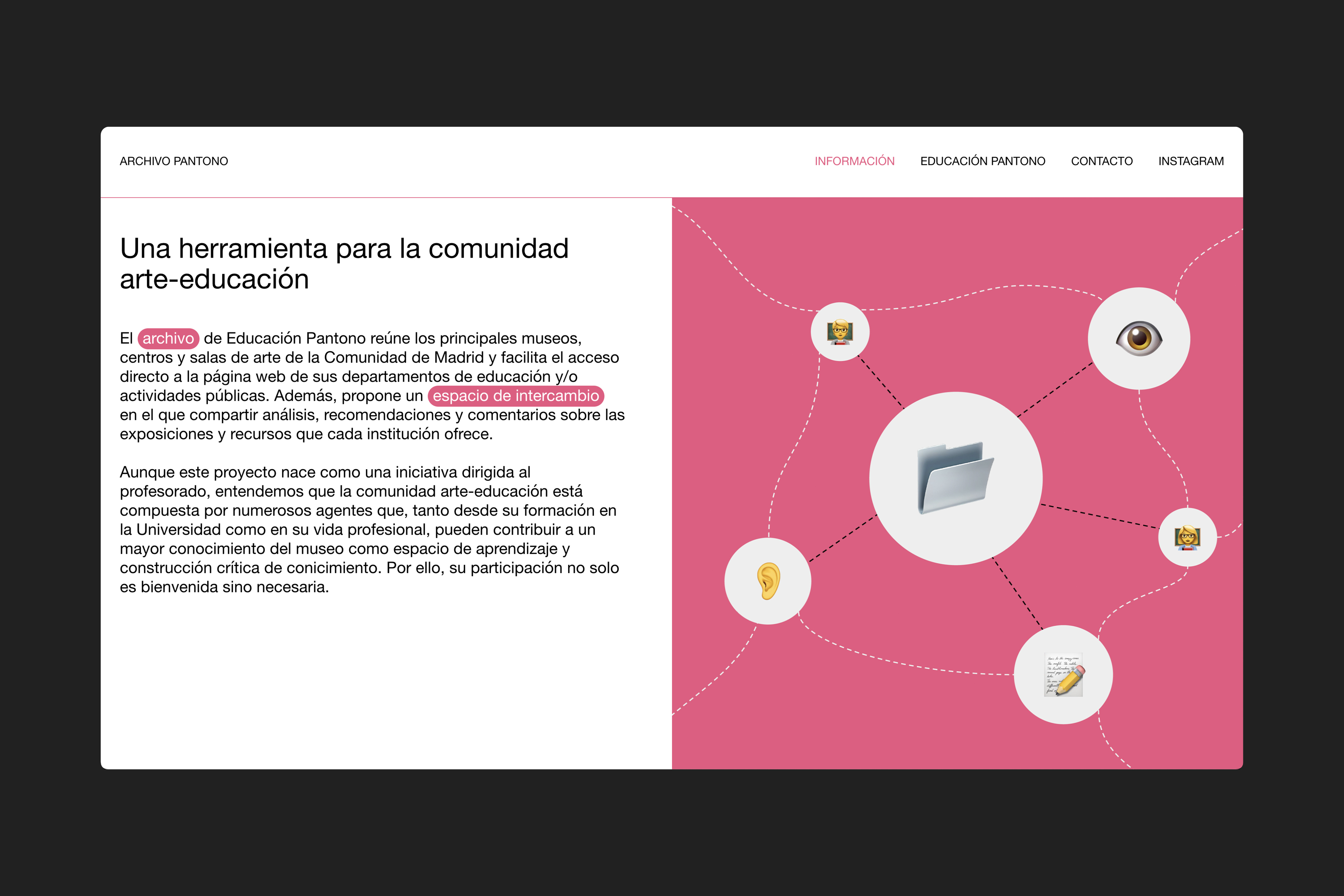
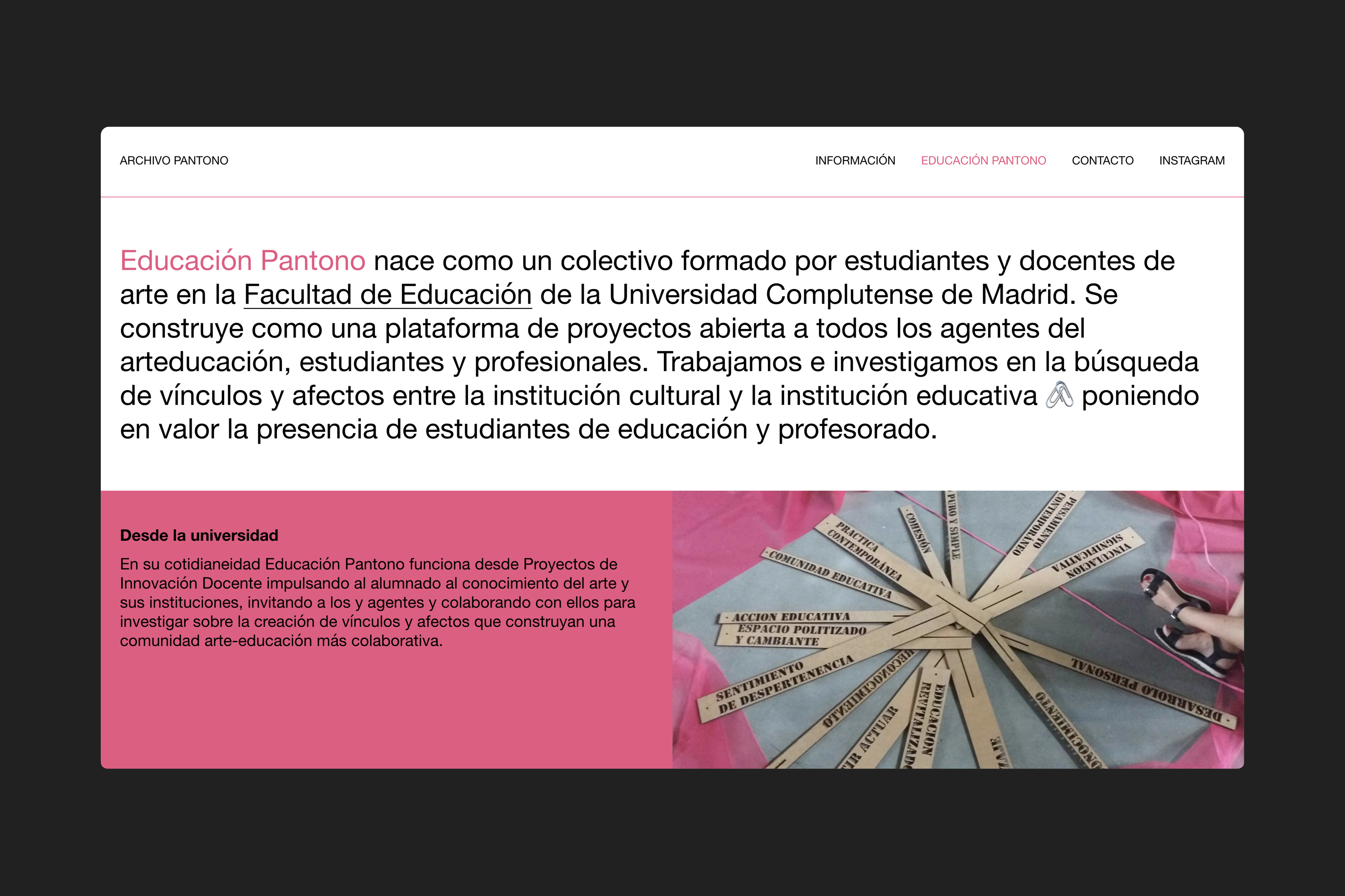
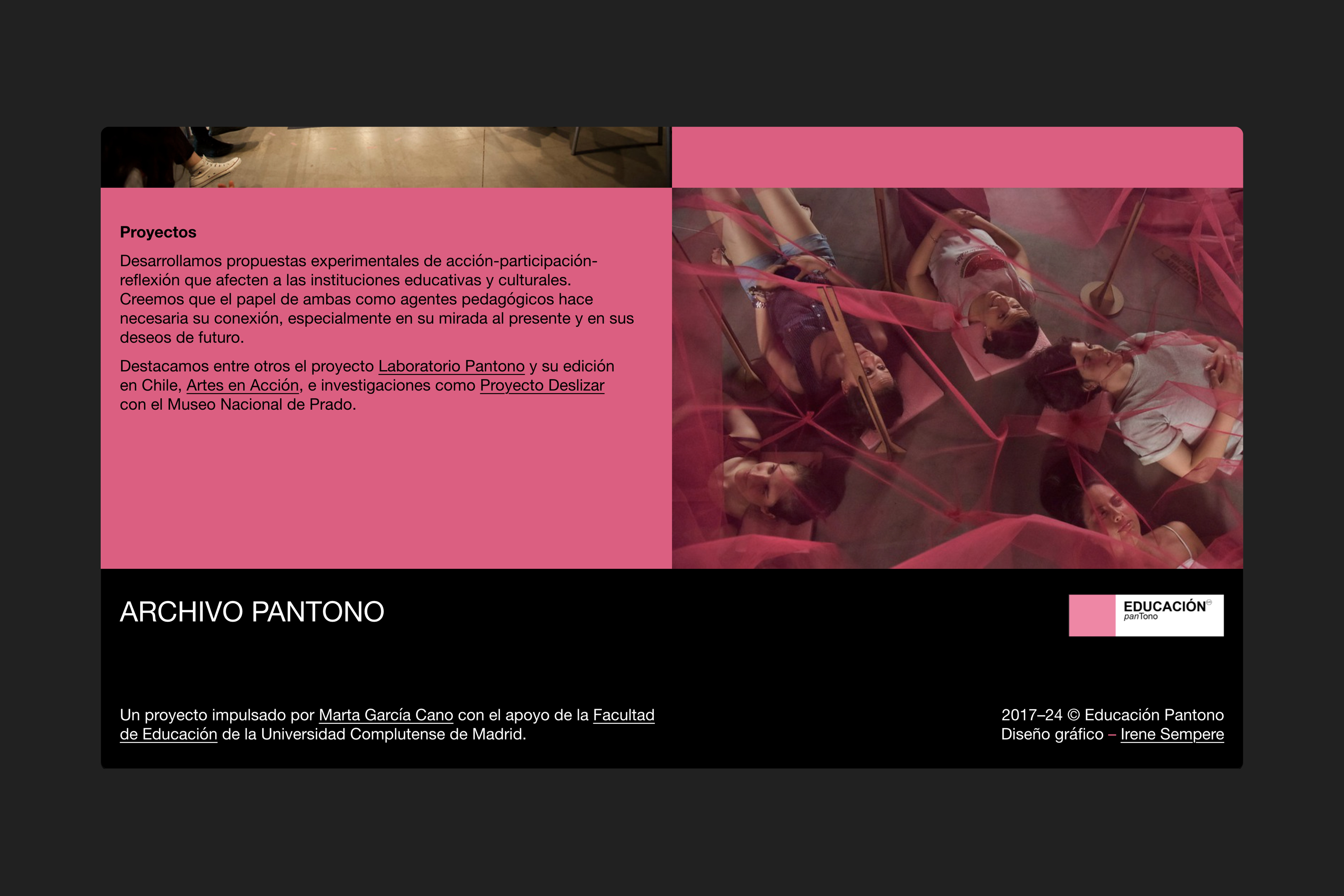
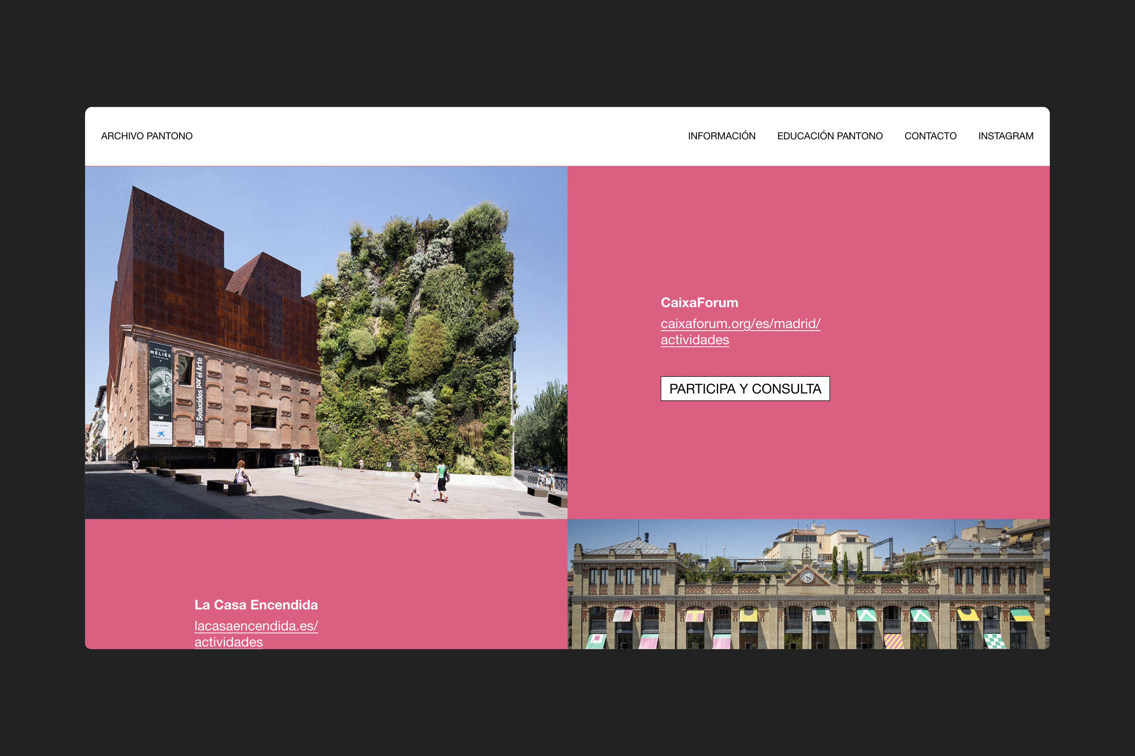
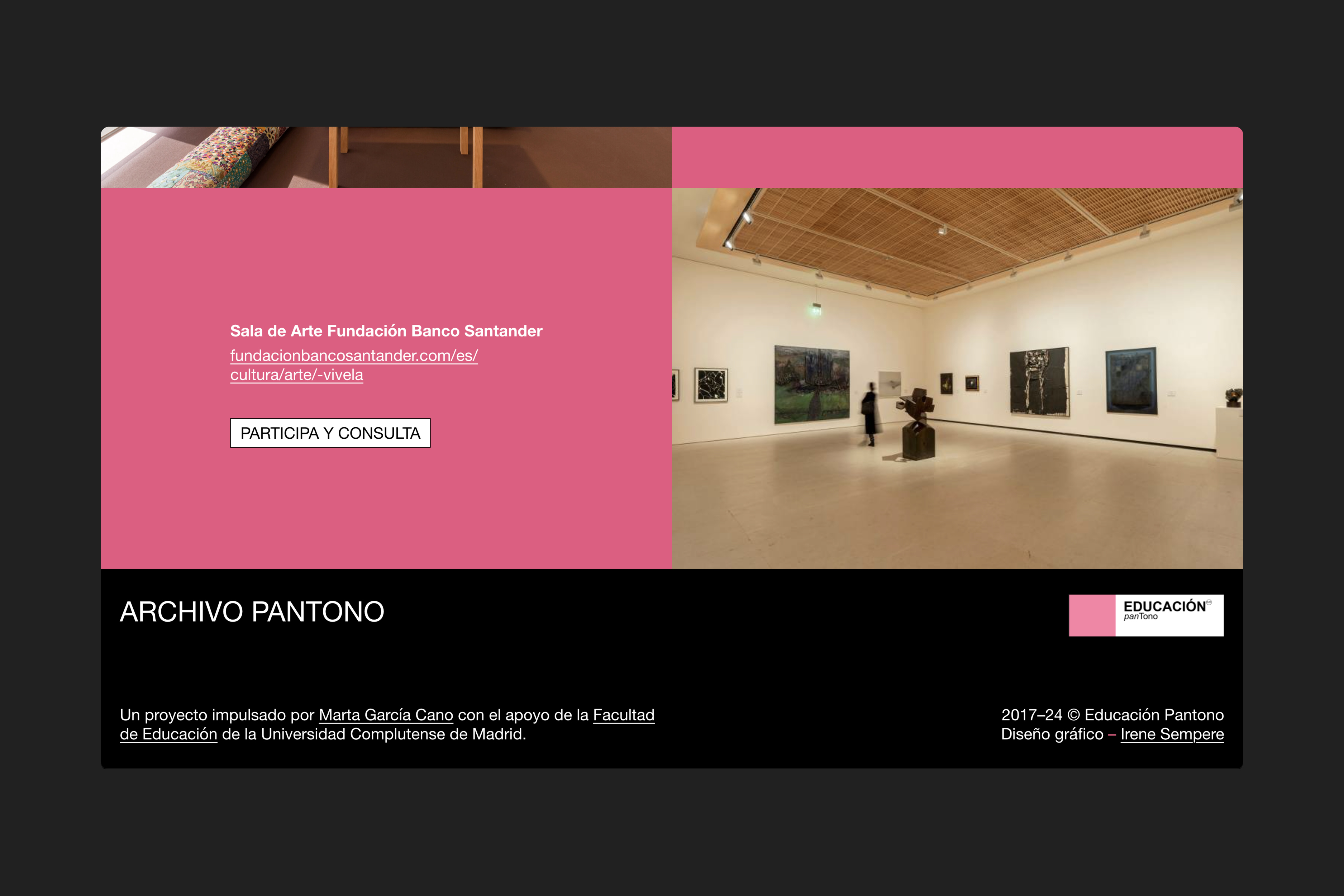
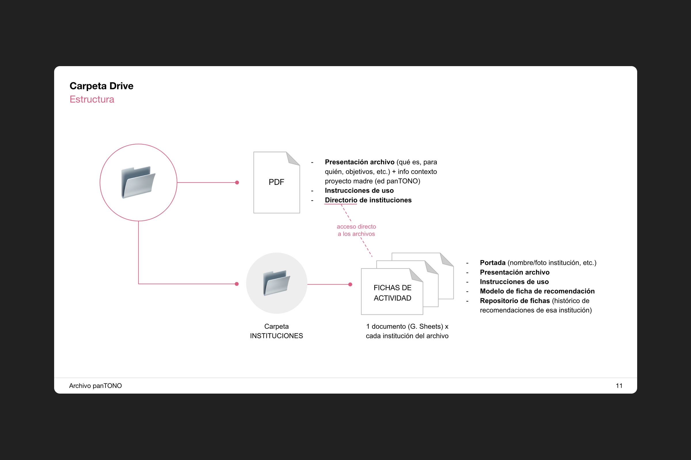
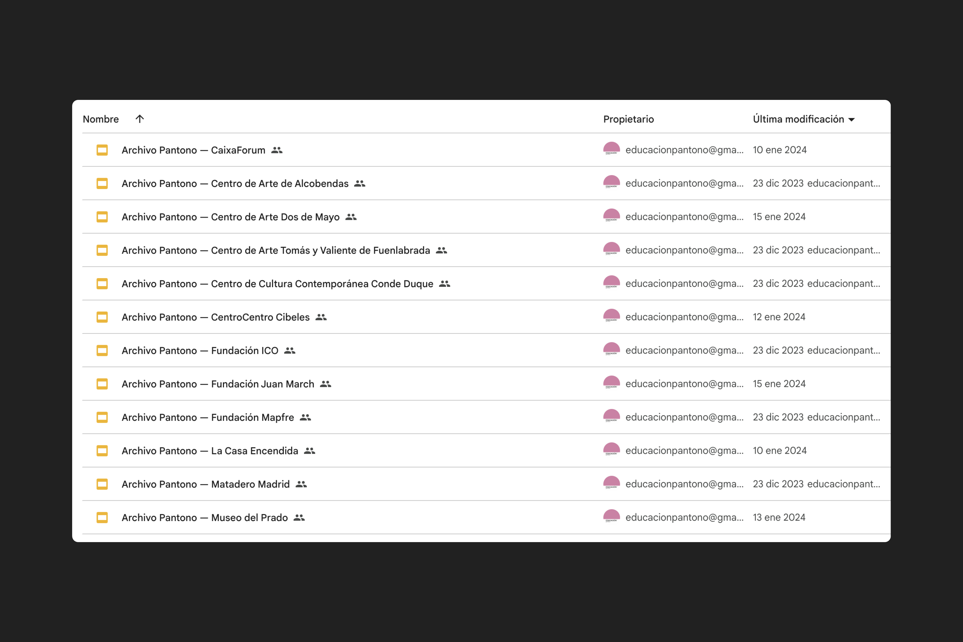
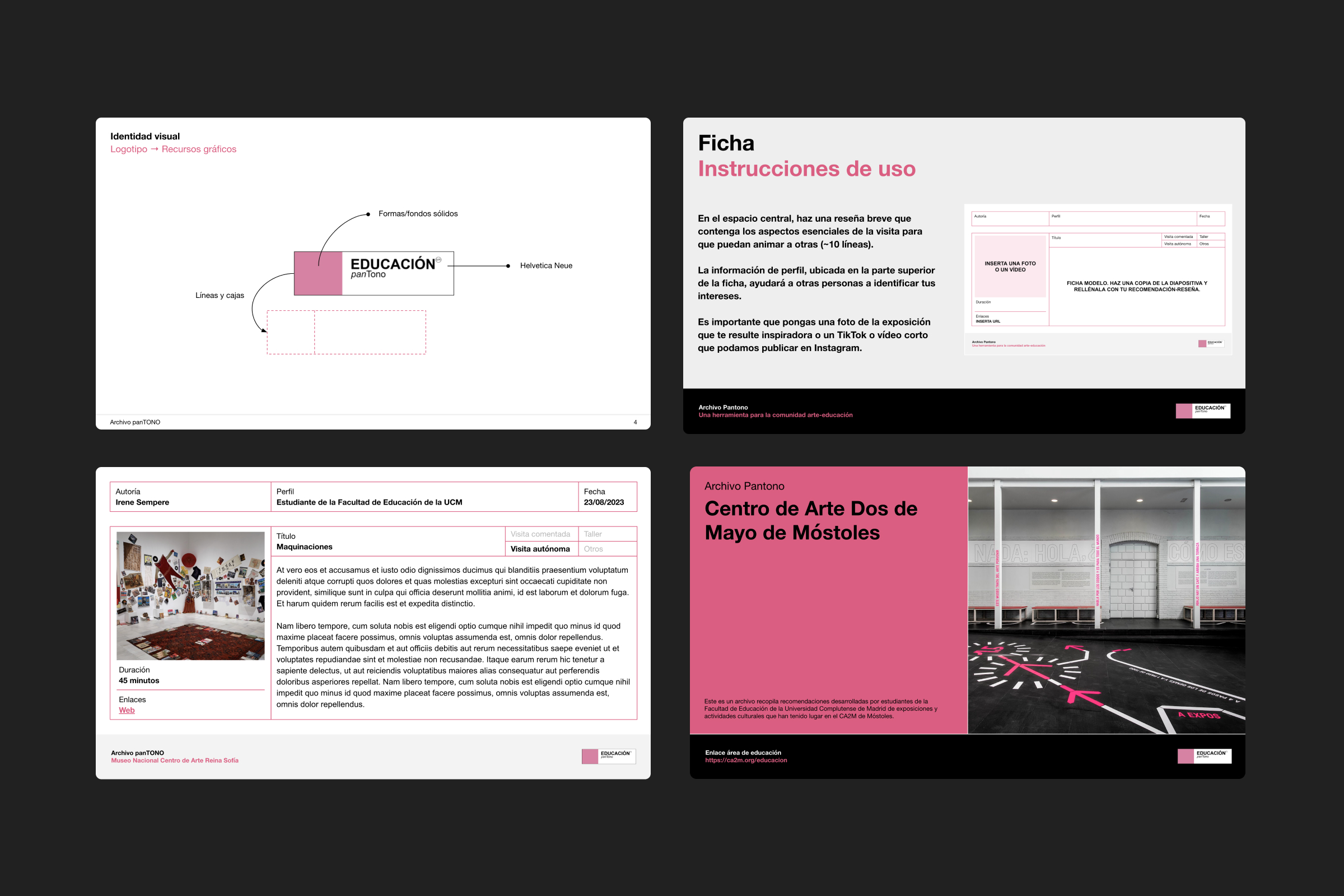
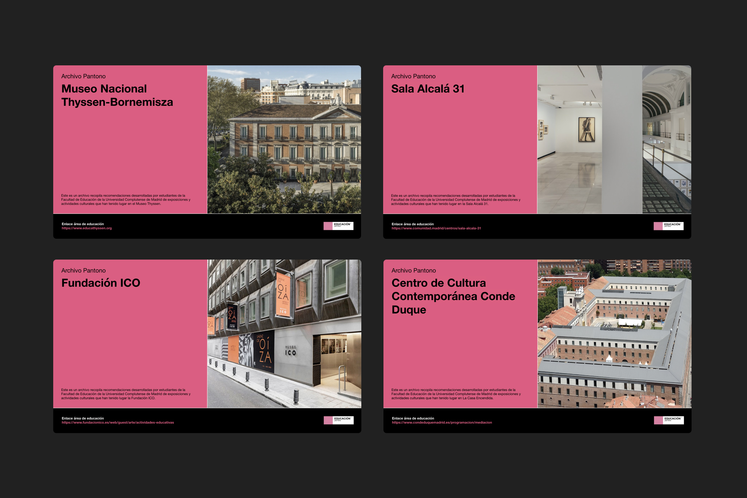
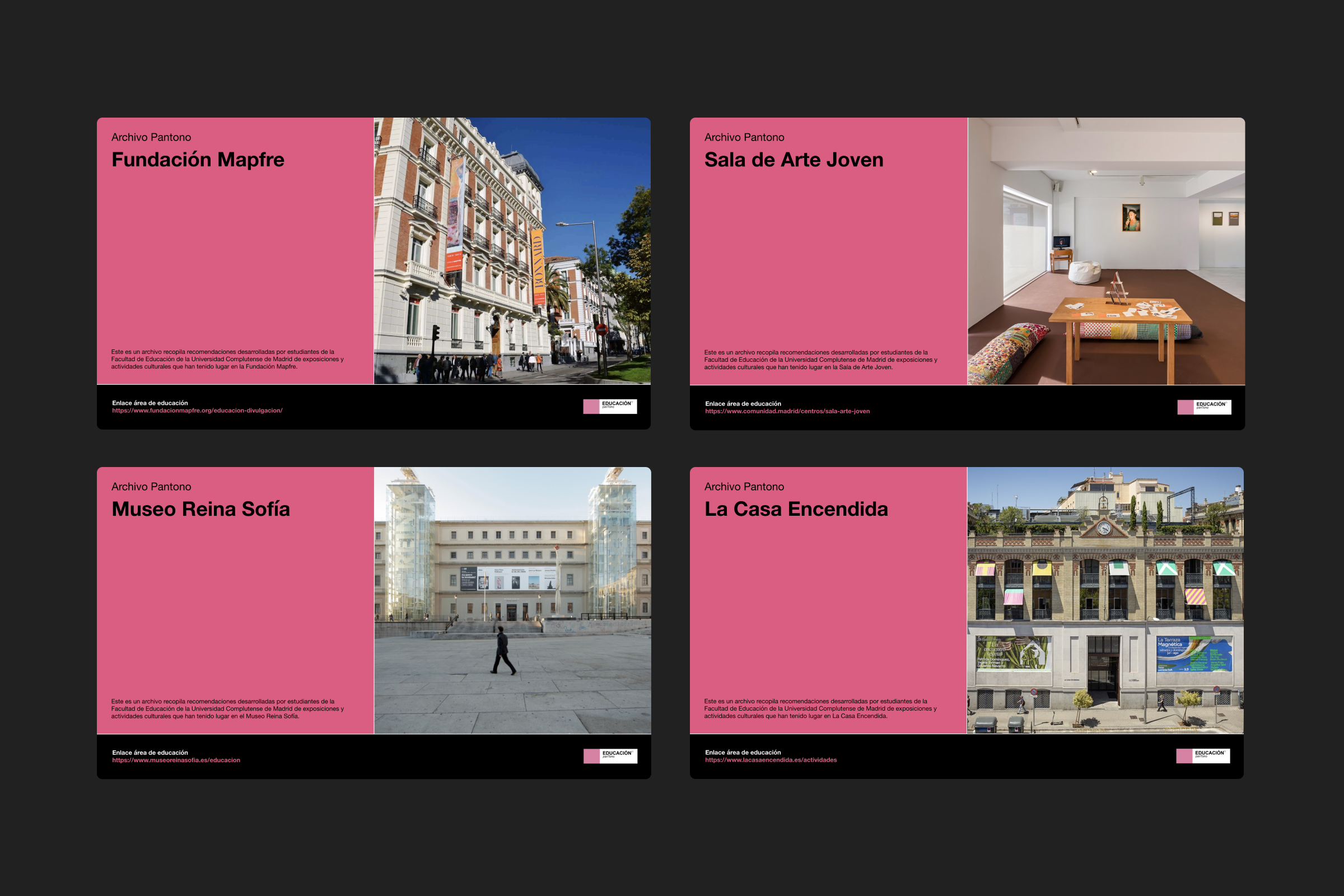
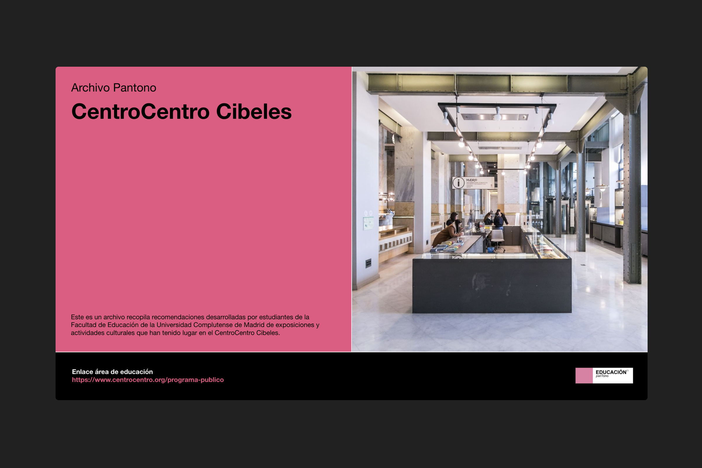
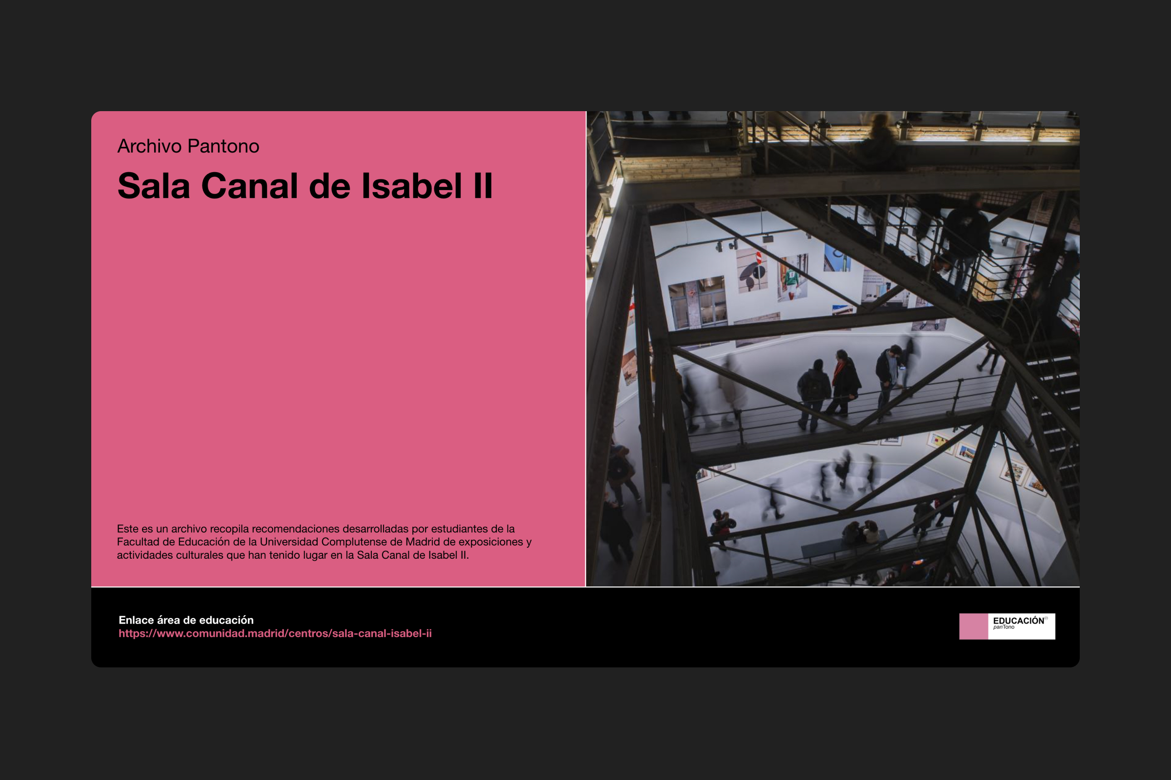
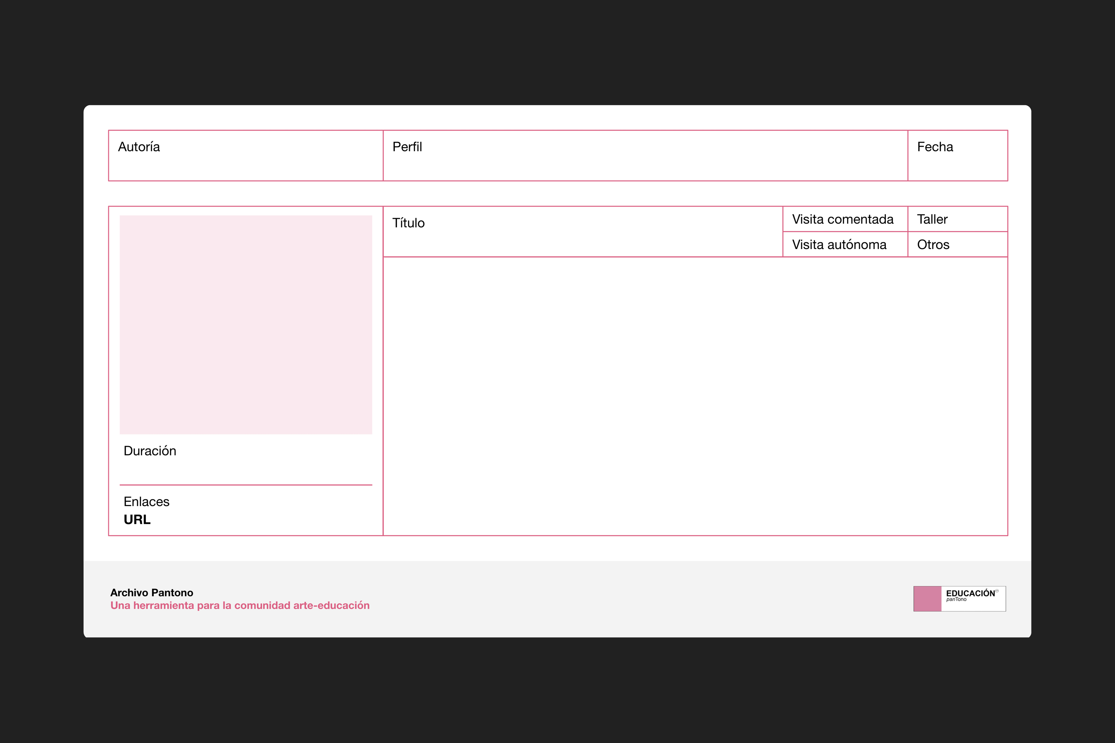
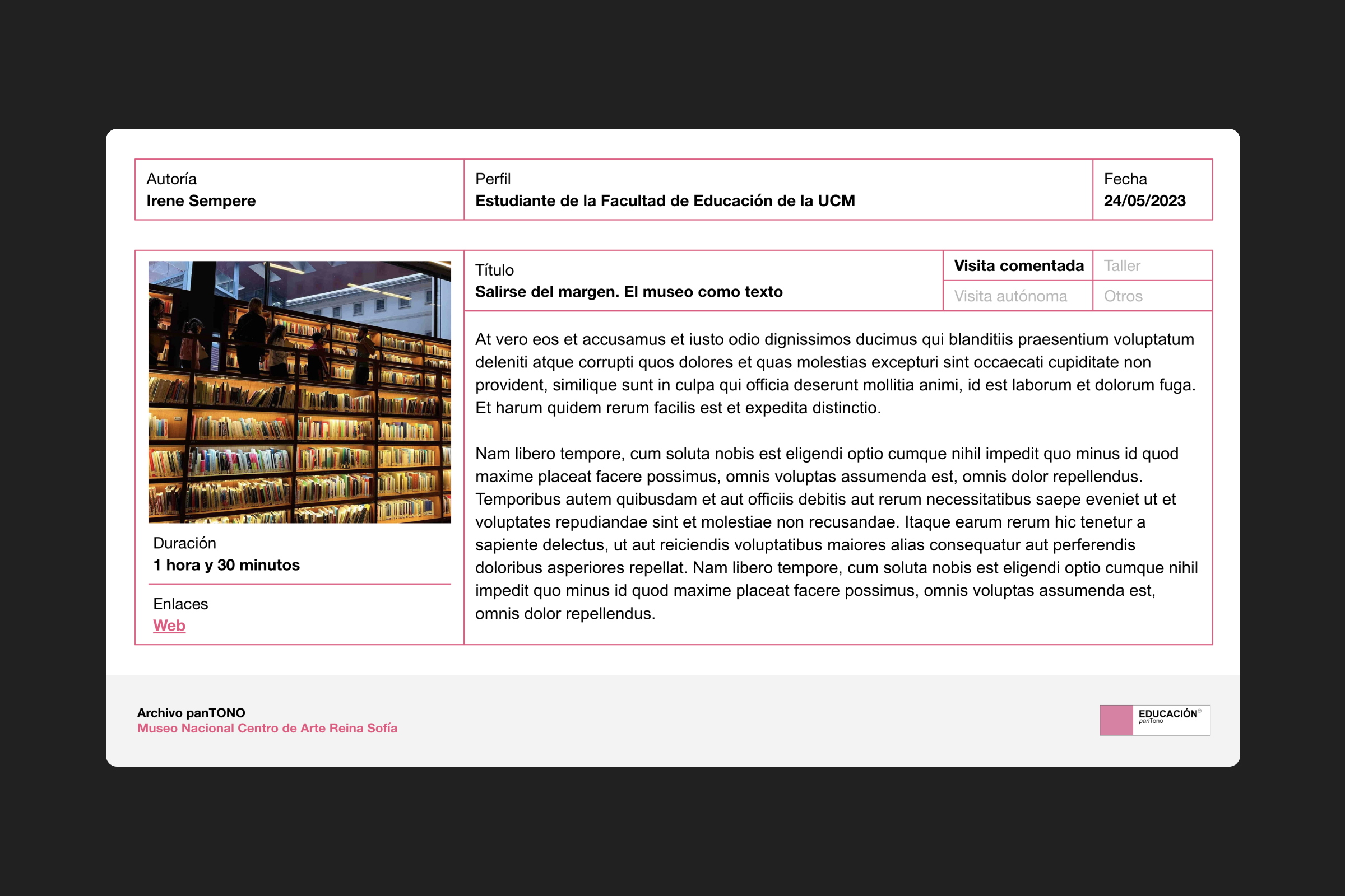
Conceptualization, visual system and website for Archivo Pantono, a digital tool designed for educators and the broader art-education community. It showcases the main museums, centers, and art galleries in the Community of Madrid, offering a platform for sharing recommendations on exhibitions, public activities, and learning resources provided by each institution. The archive is developed on Google Drive, while the website is built using LayTheme. / Educación Pantono is a project led by Marta García Cano, with support from the Faculty of Education at Universidad Complutense de Madrid. <2023>
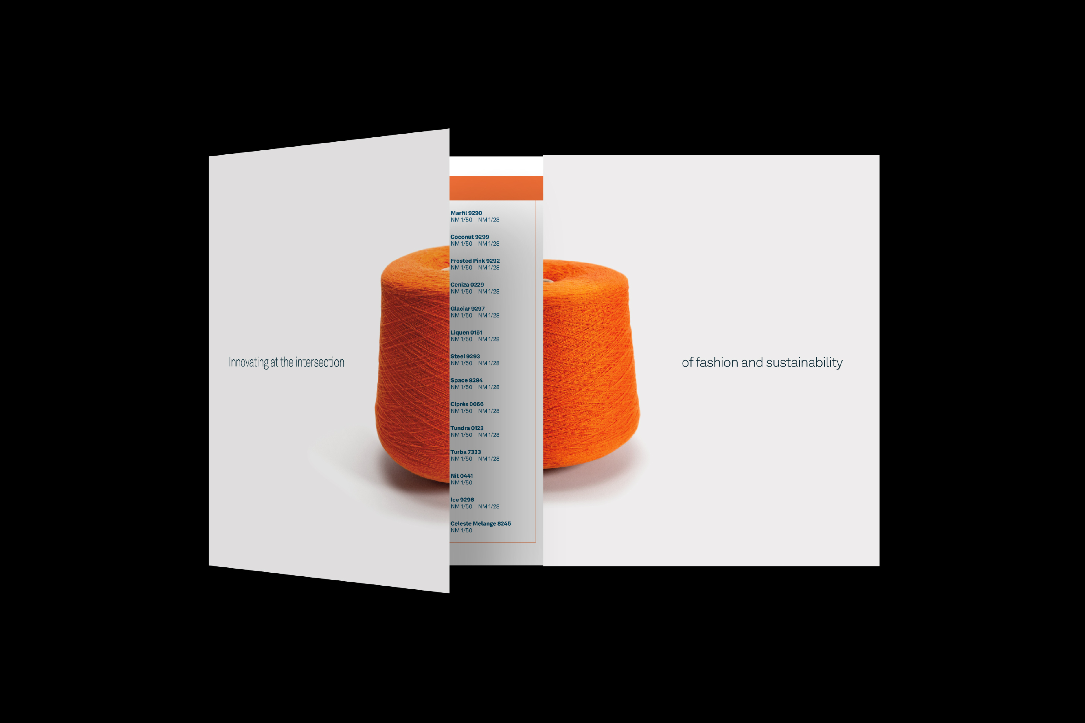
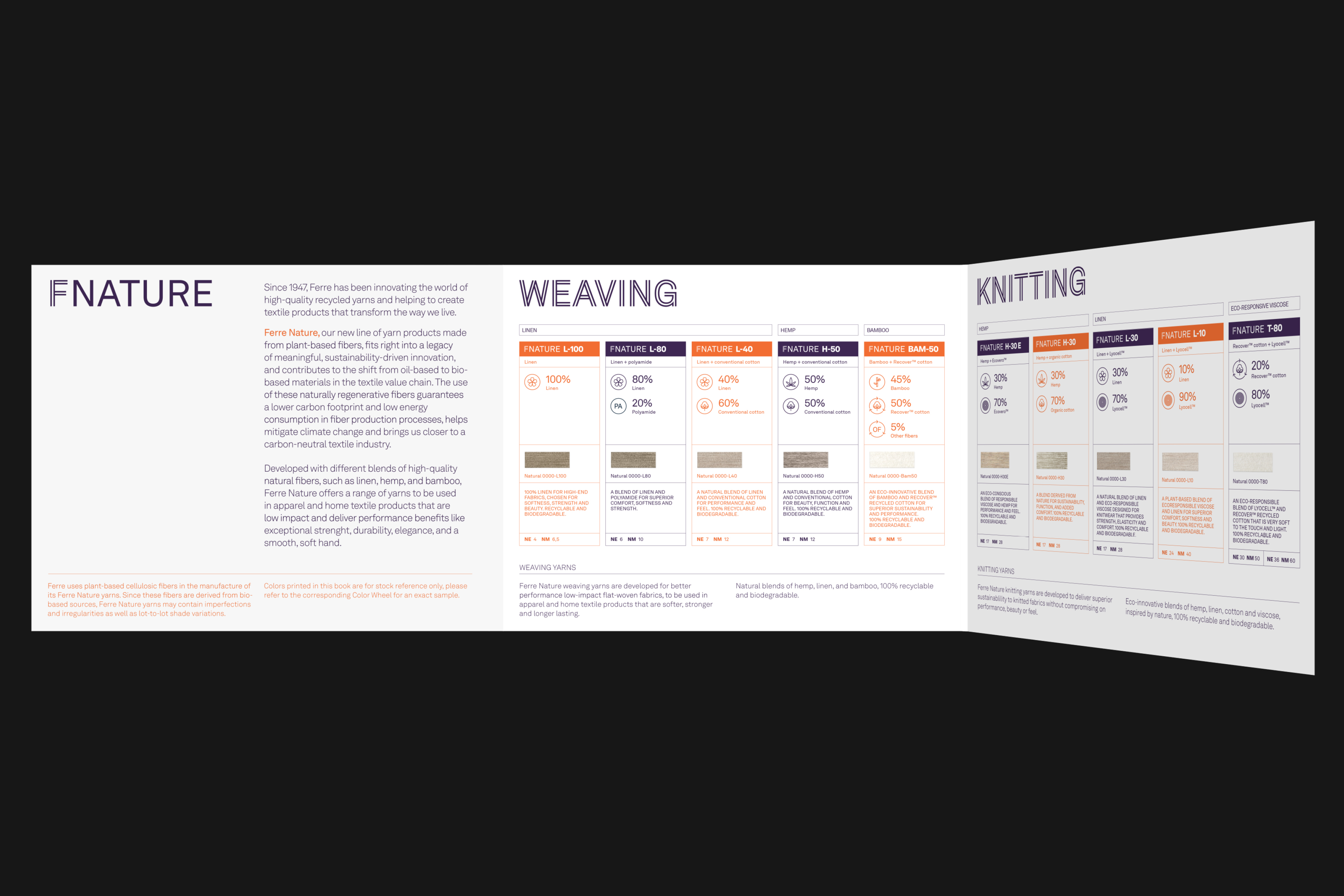
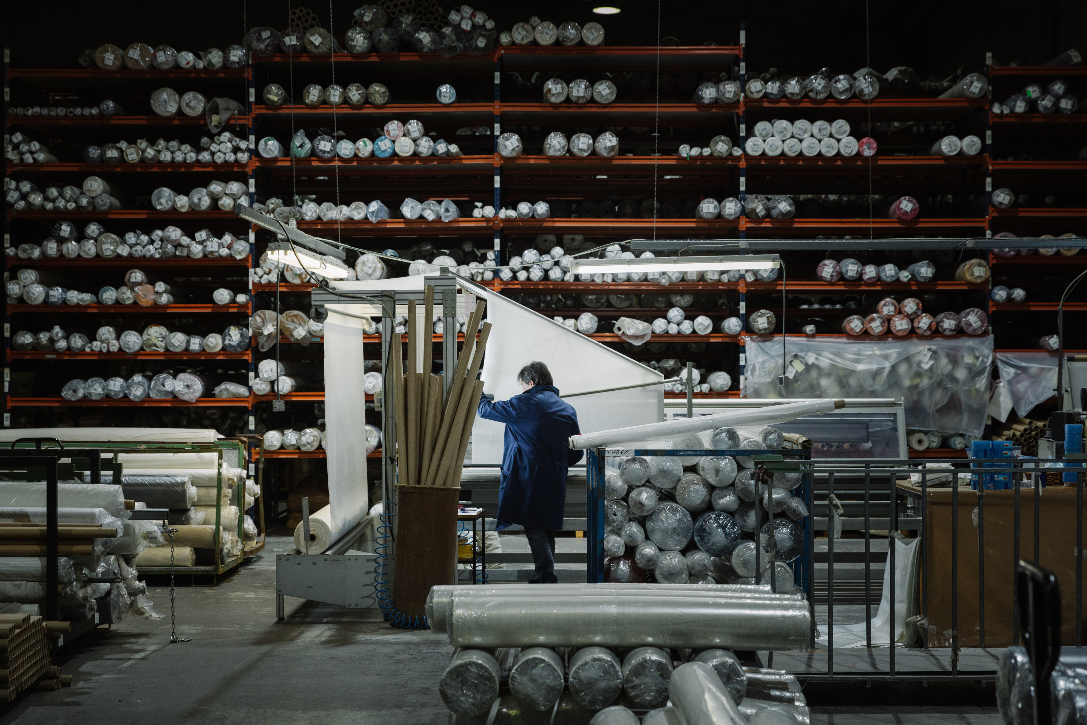
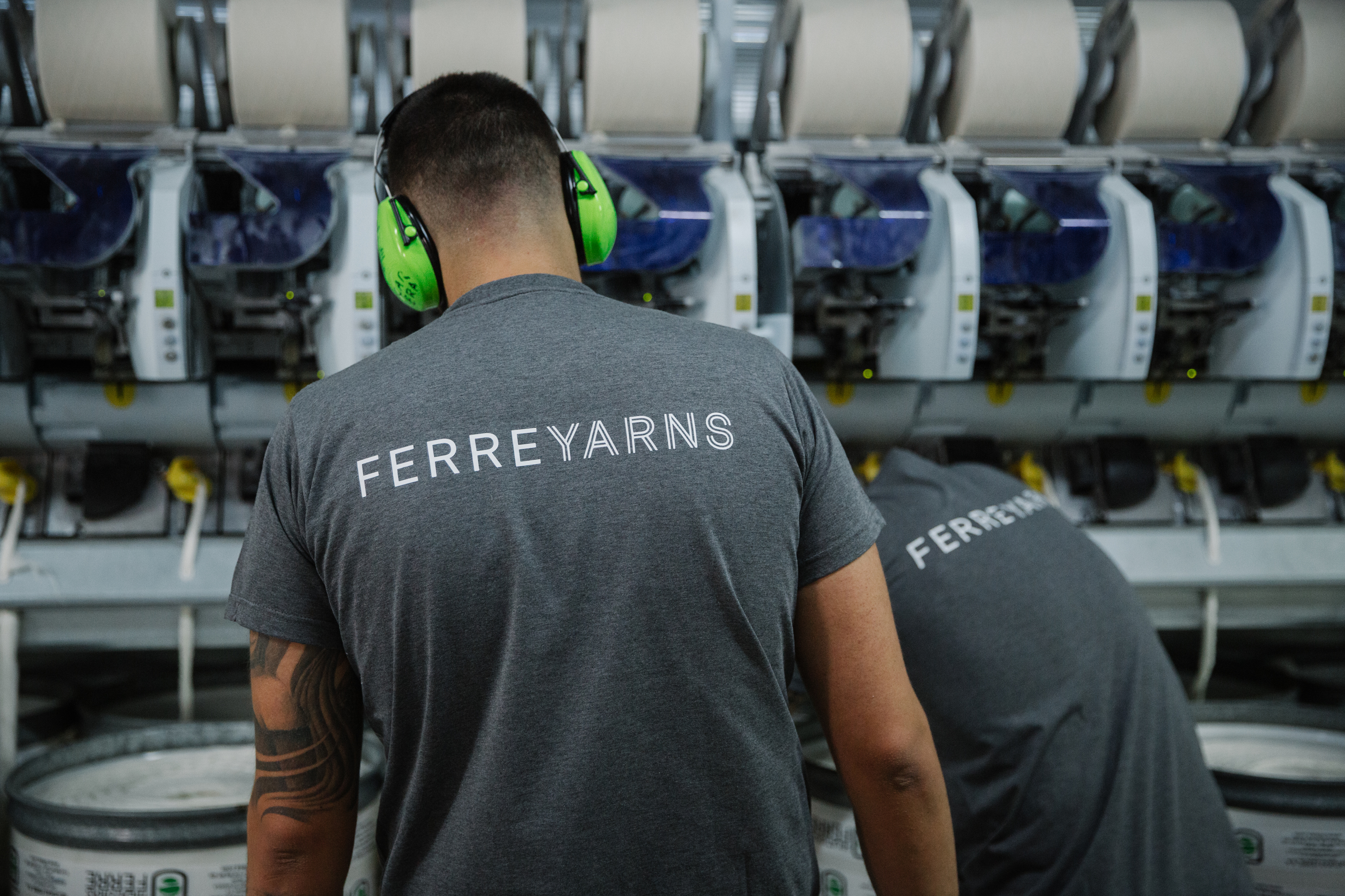
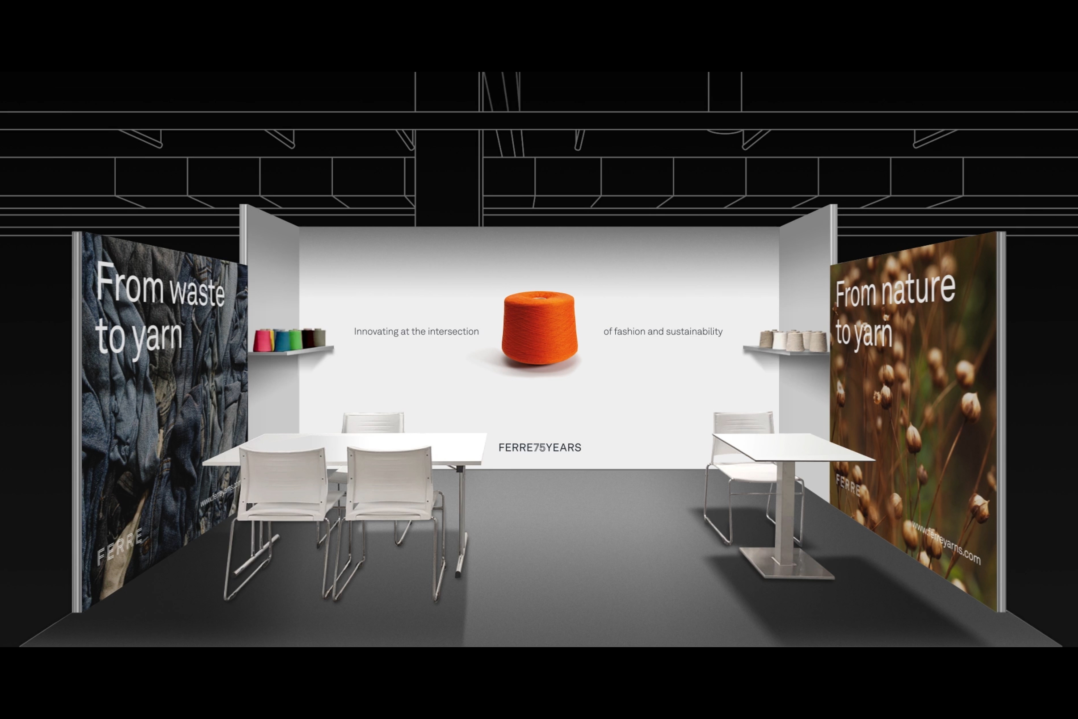
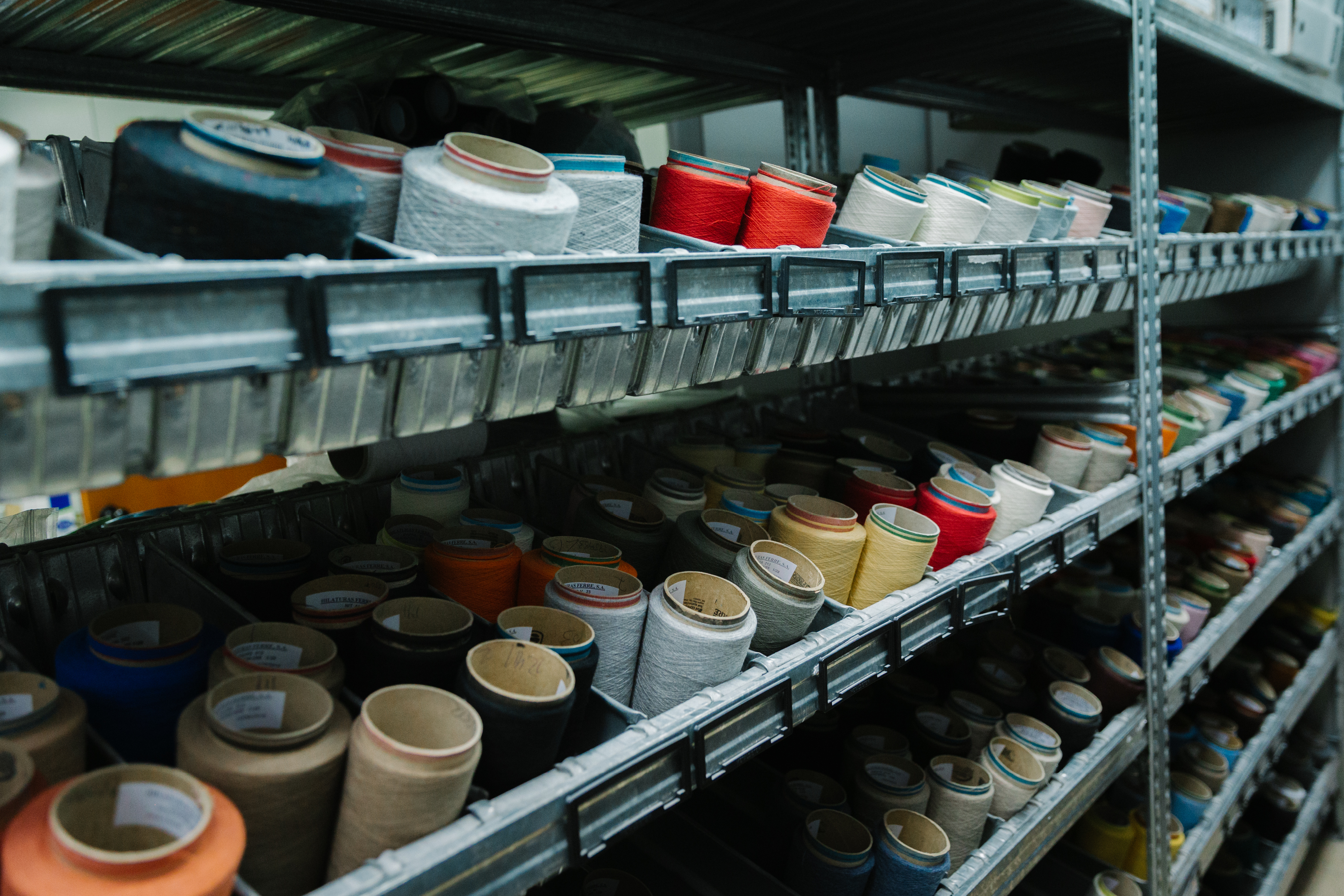
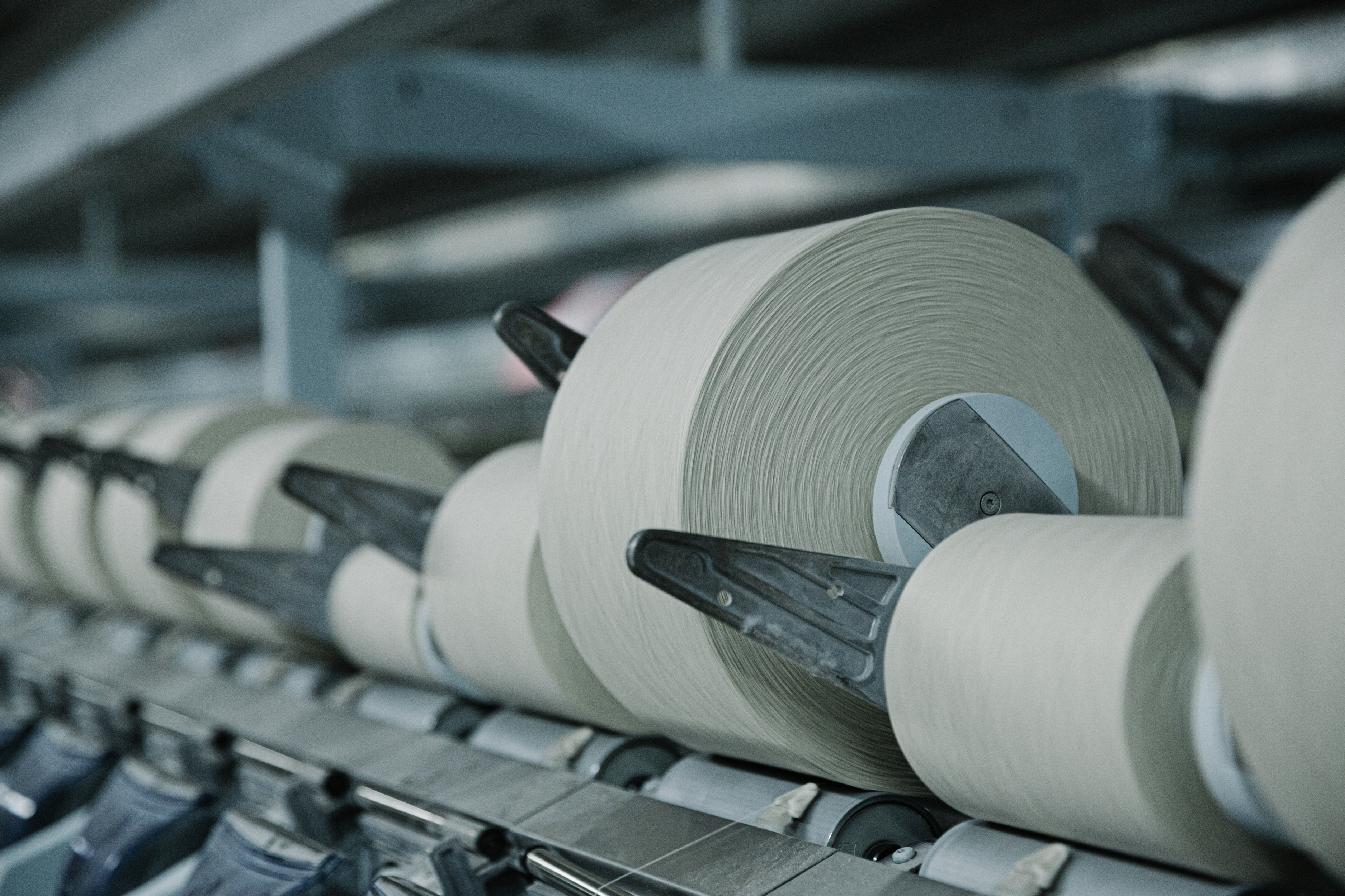
Brand strategy, visual identity, art direction, and marketing collateral for Ferre, a pioneering company in the production of sustainable and recycled yarns. / Project developed at EPS. Photography and video: espíritu escalera. <2020-2023>
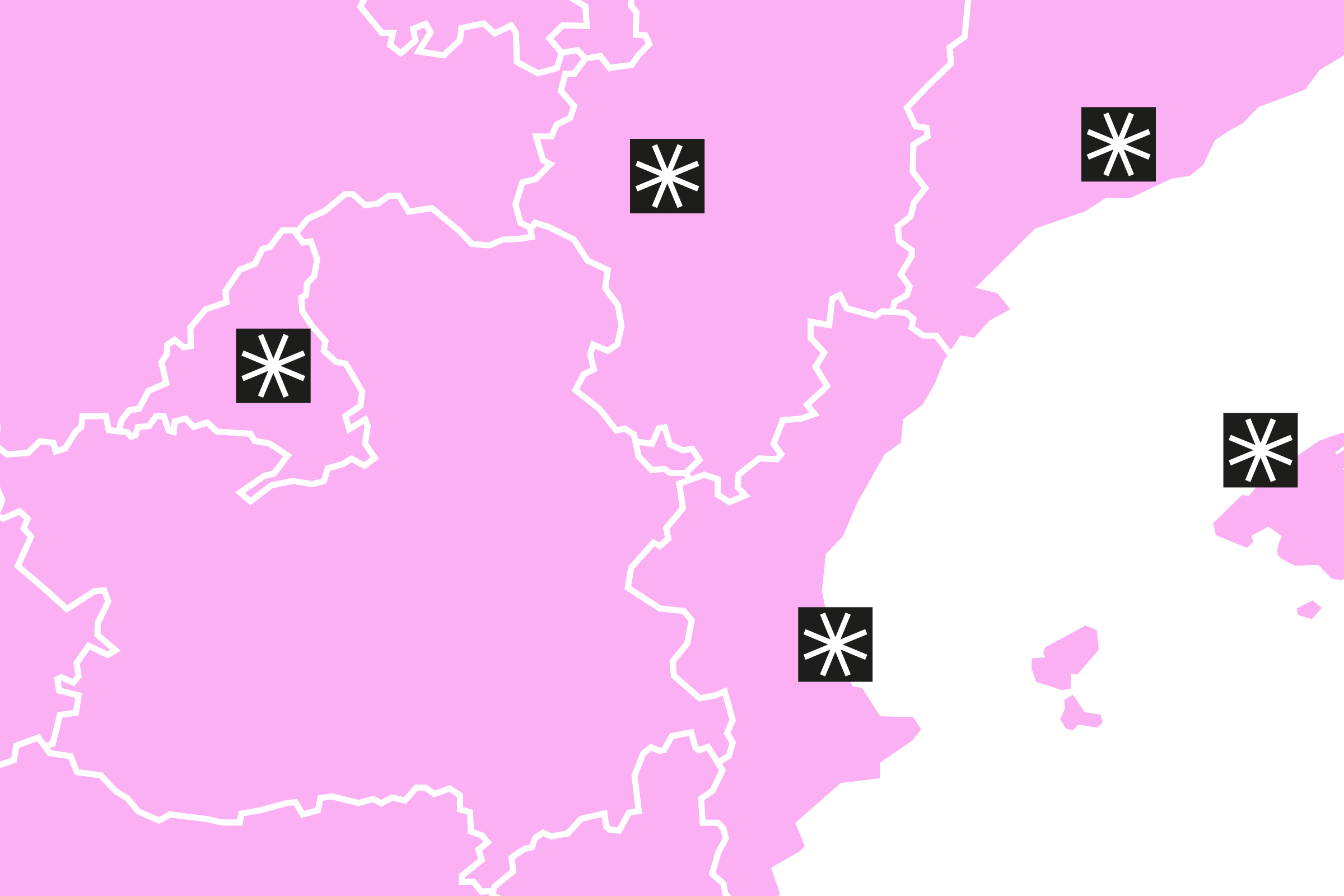
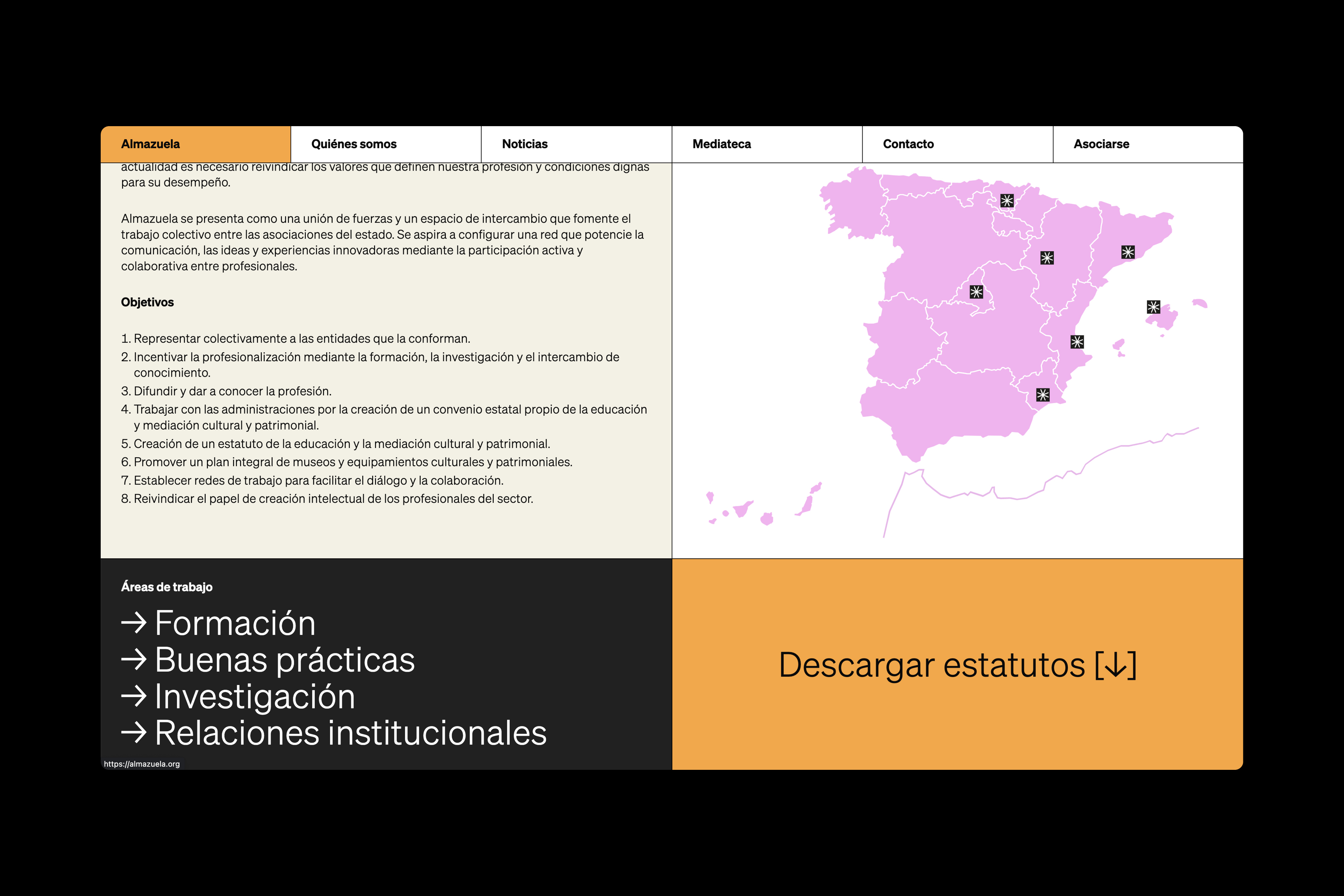
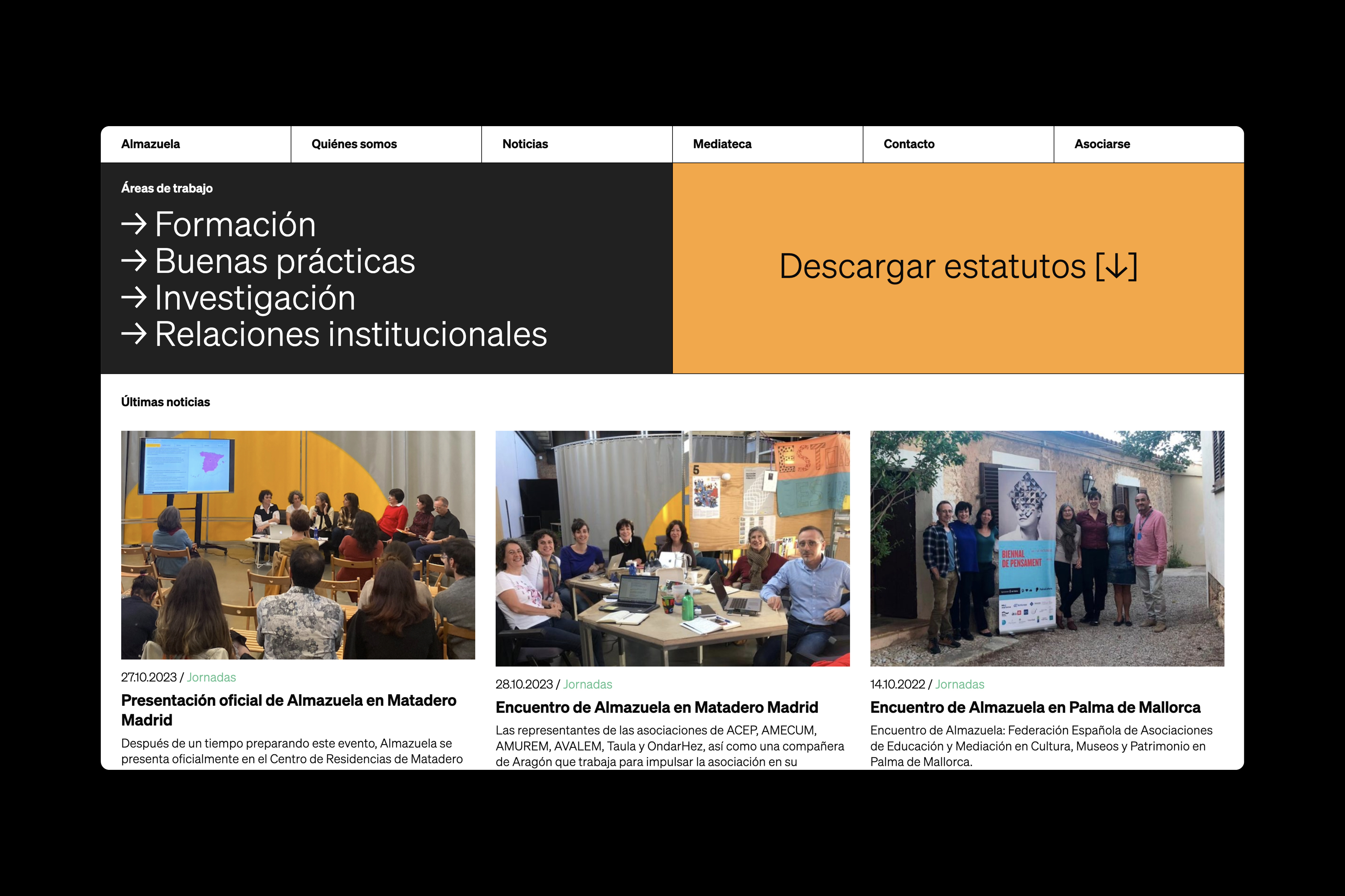
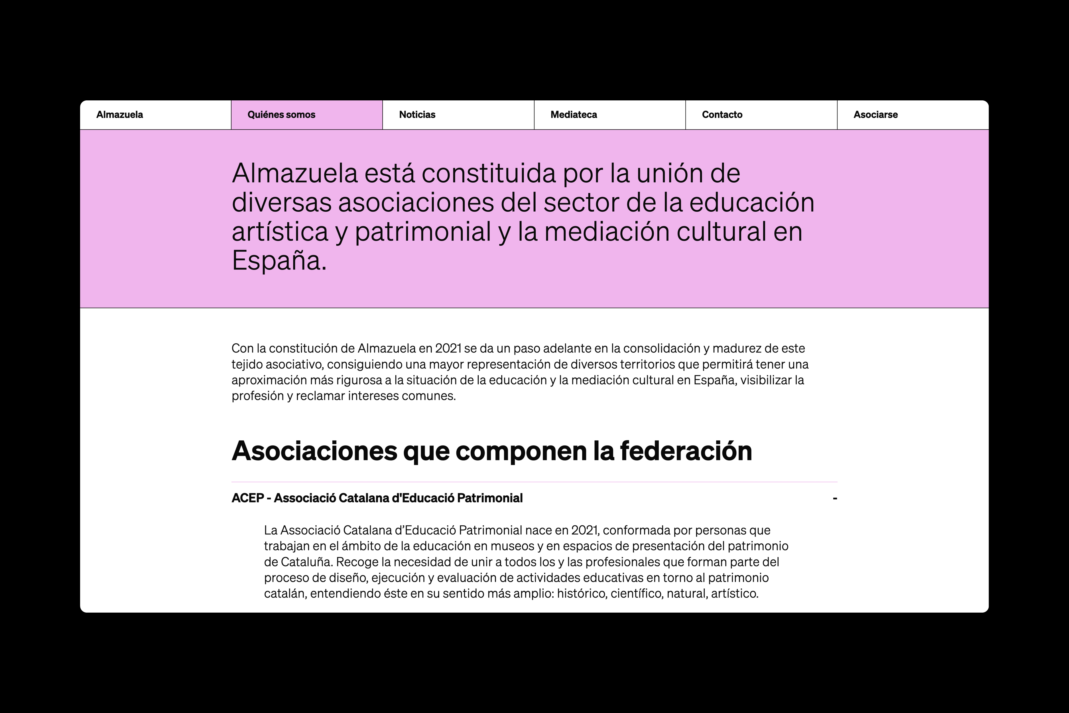
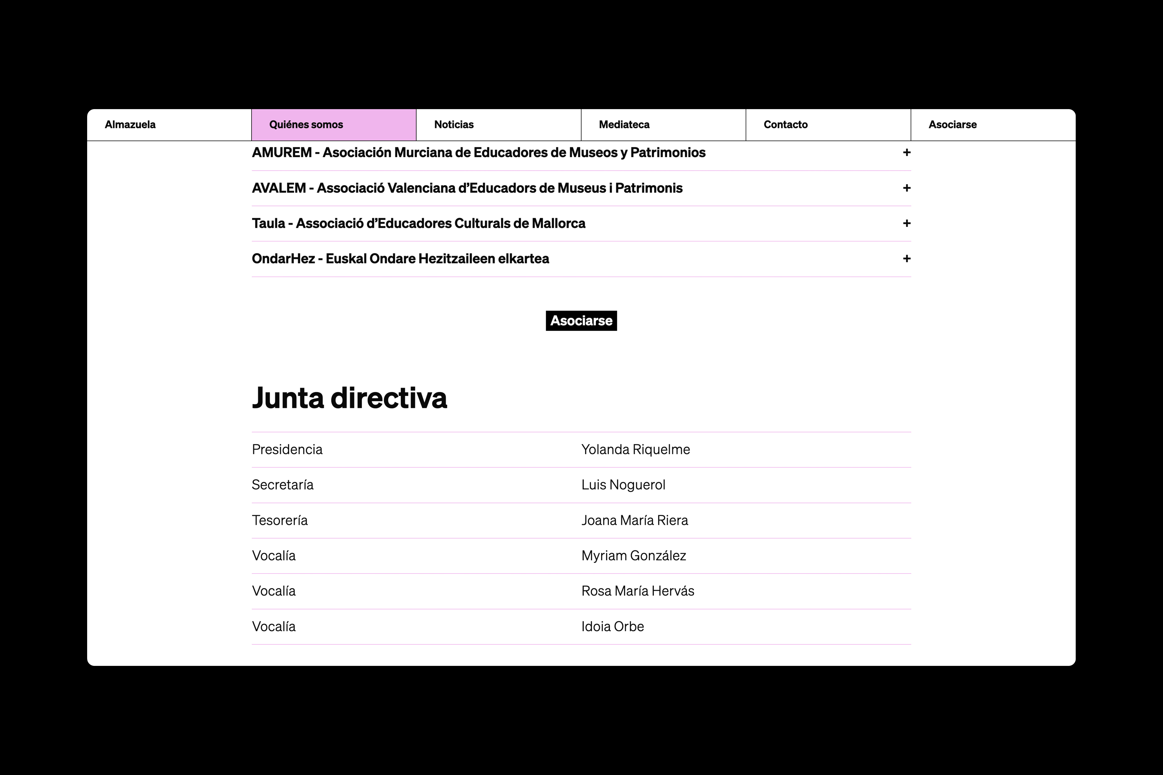
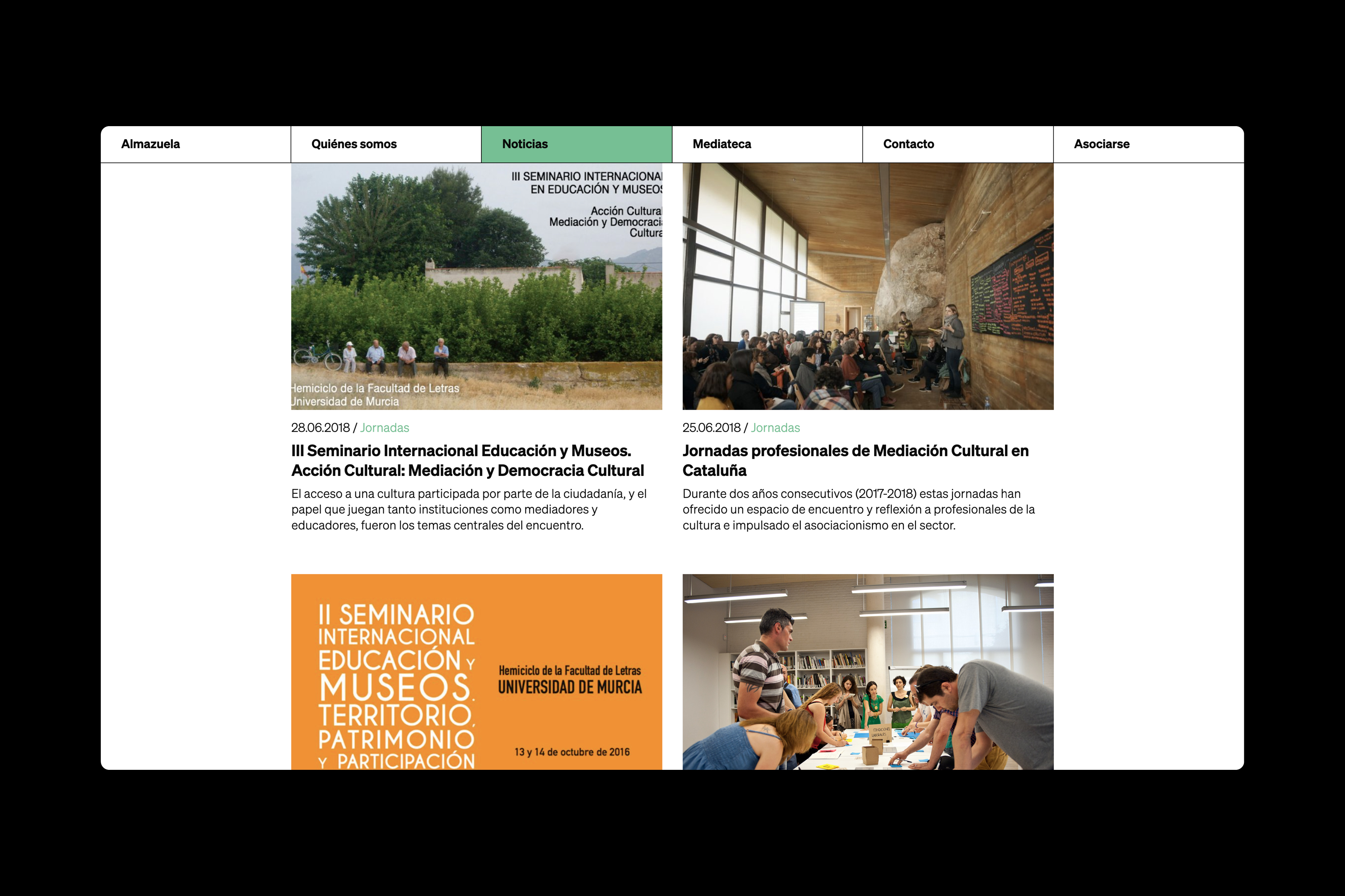
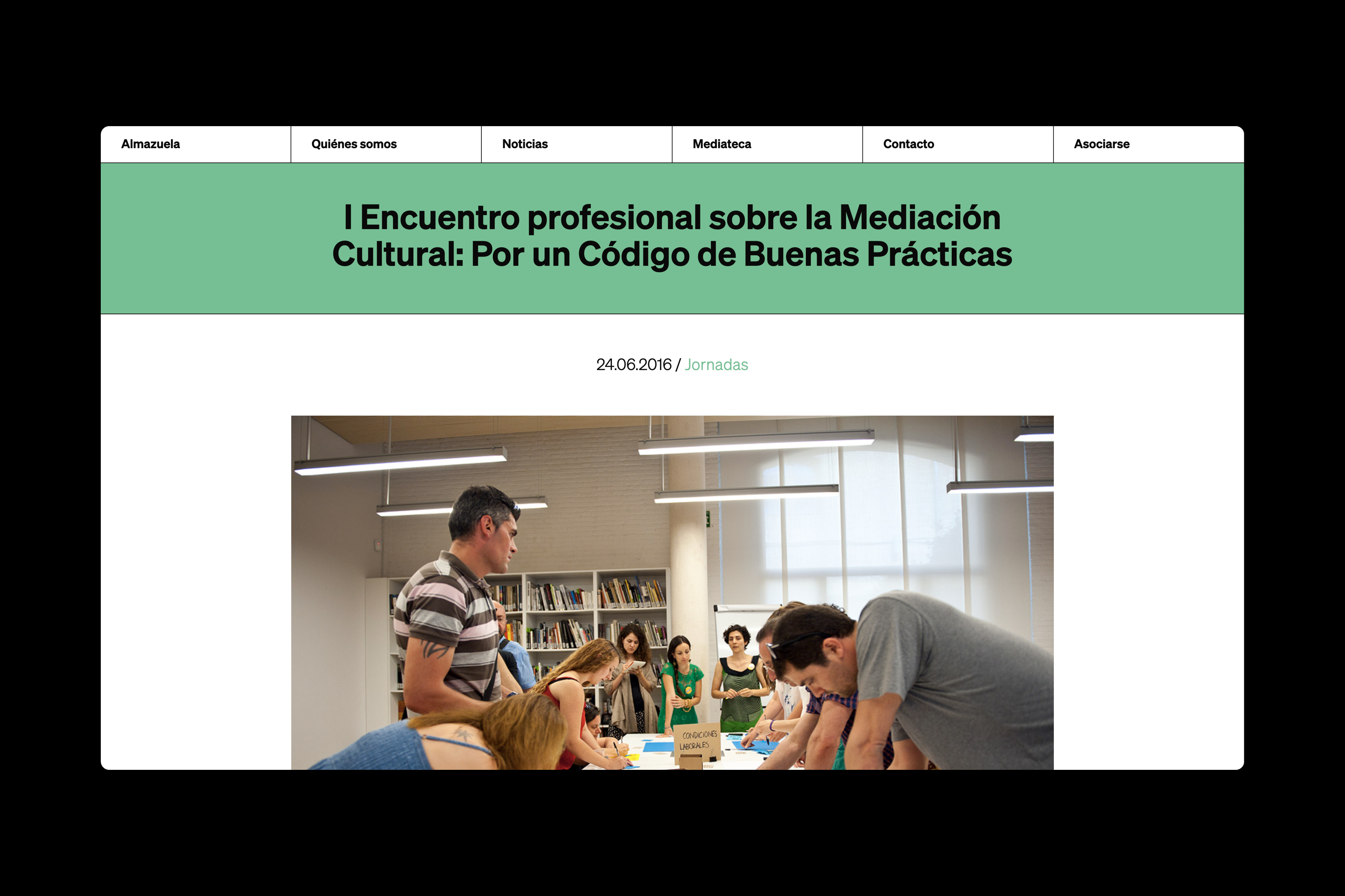
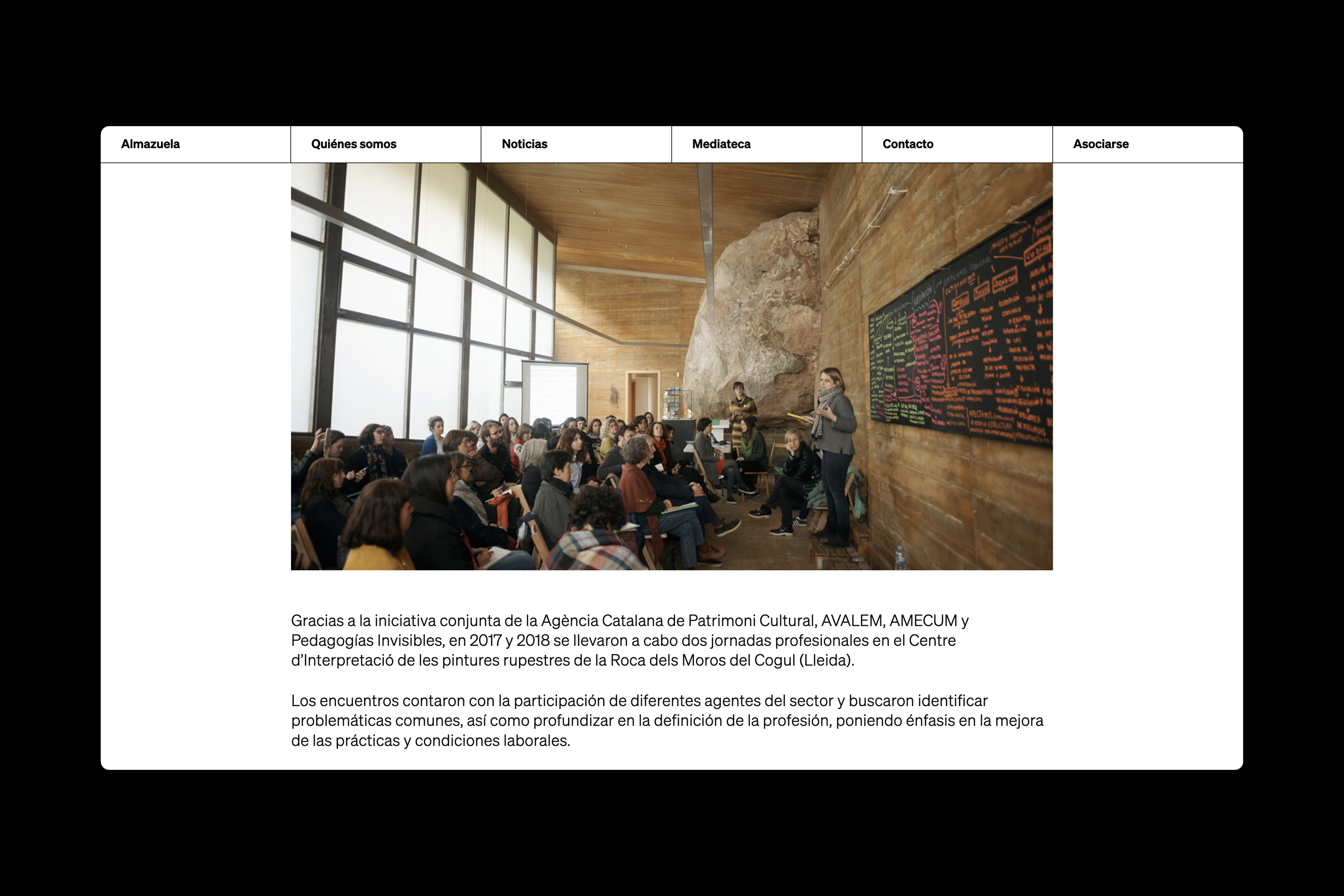
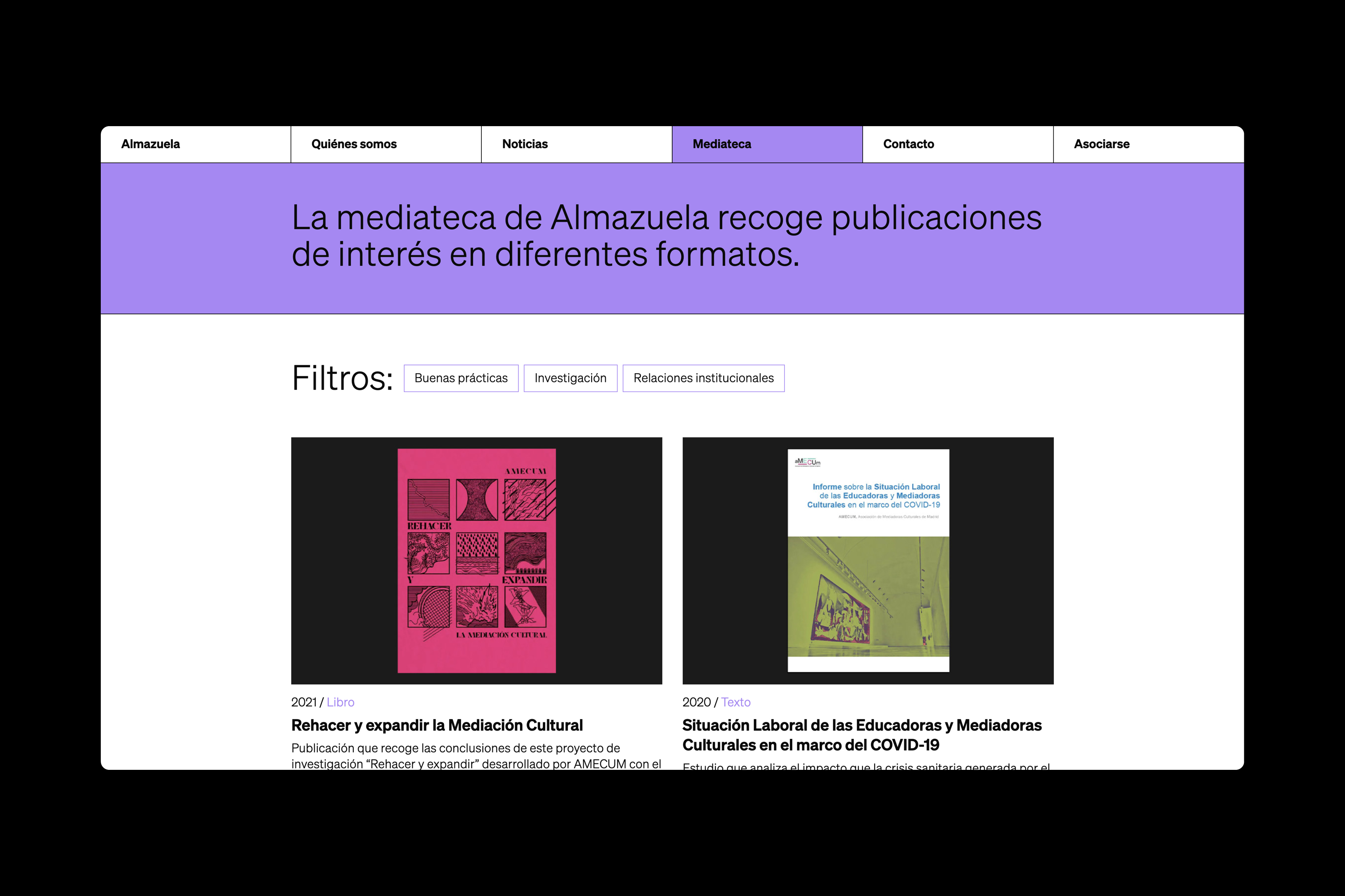
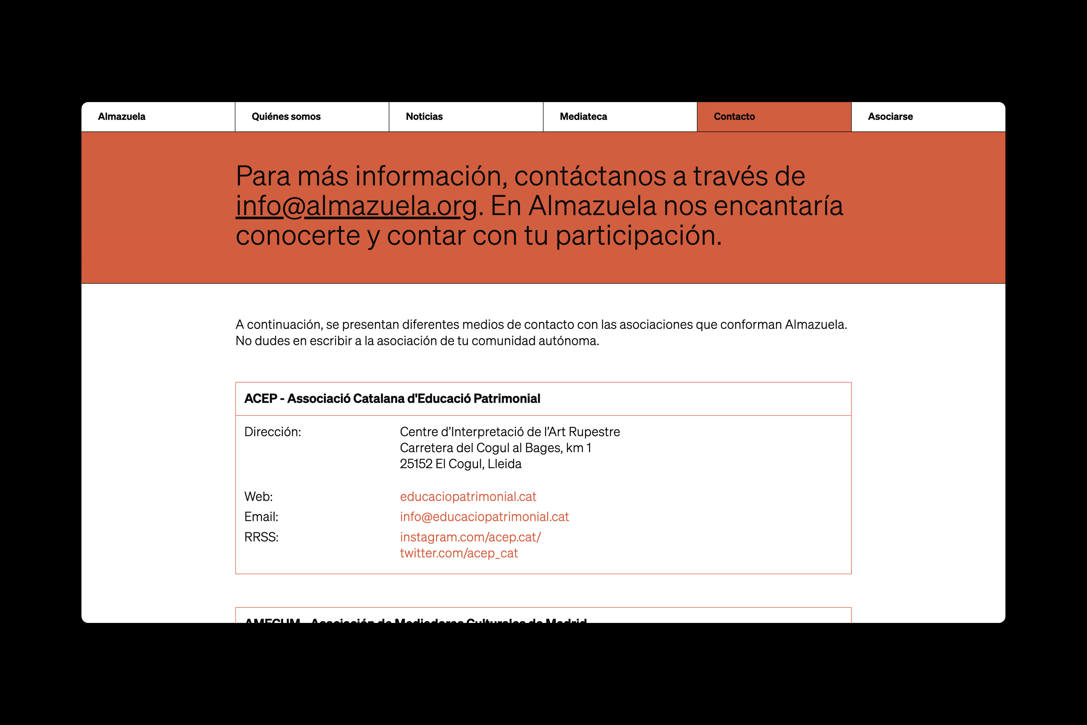
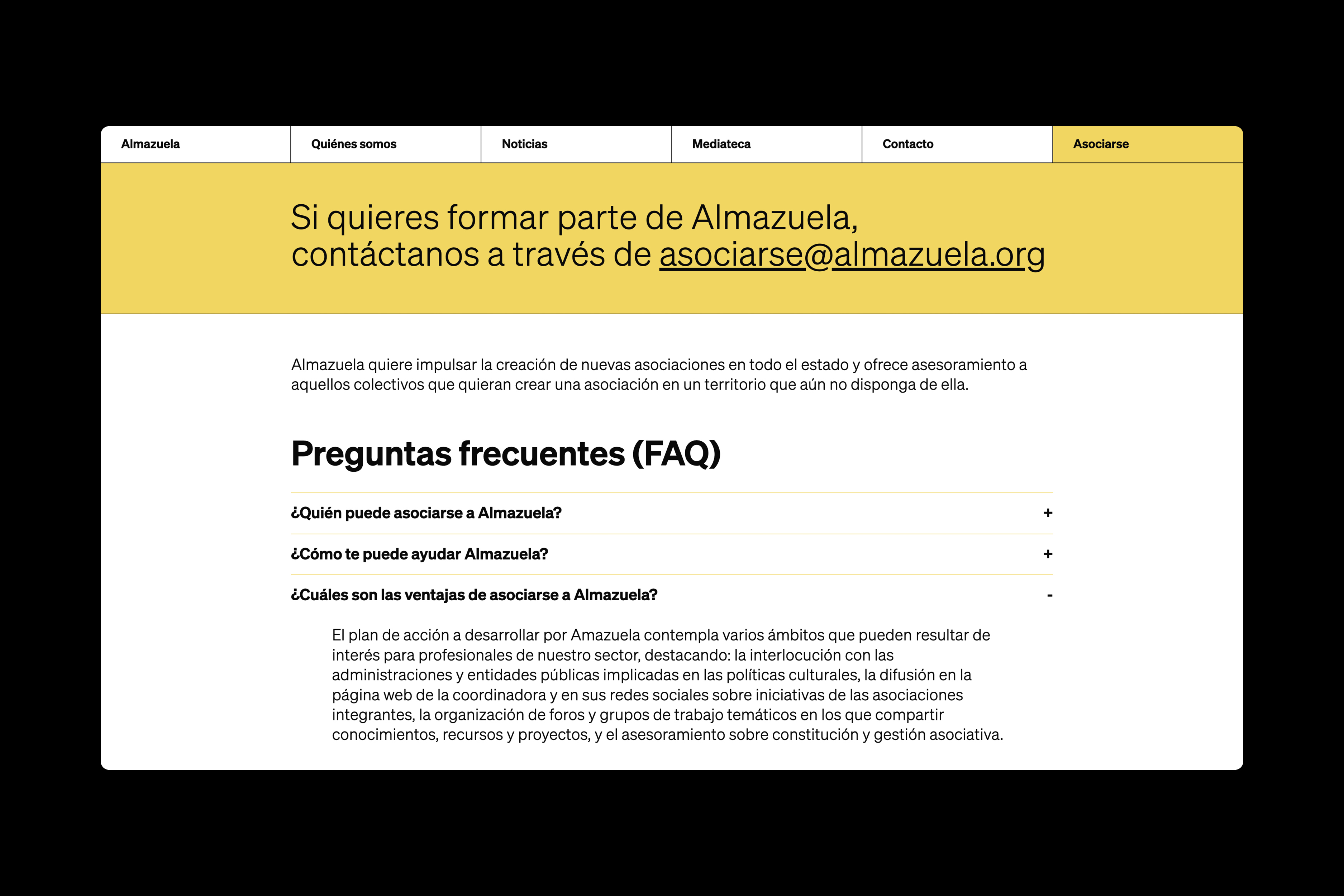
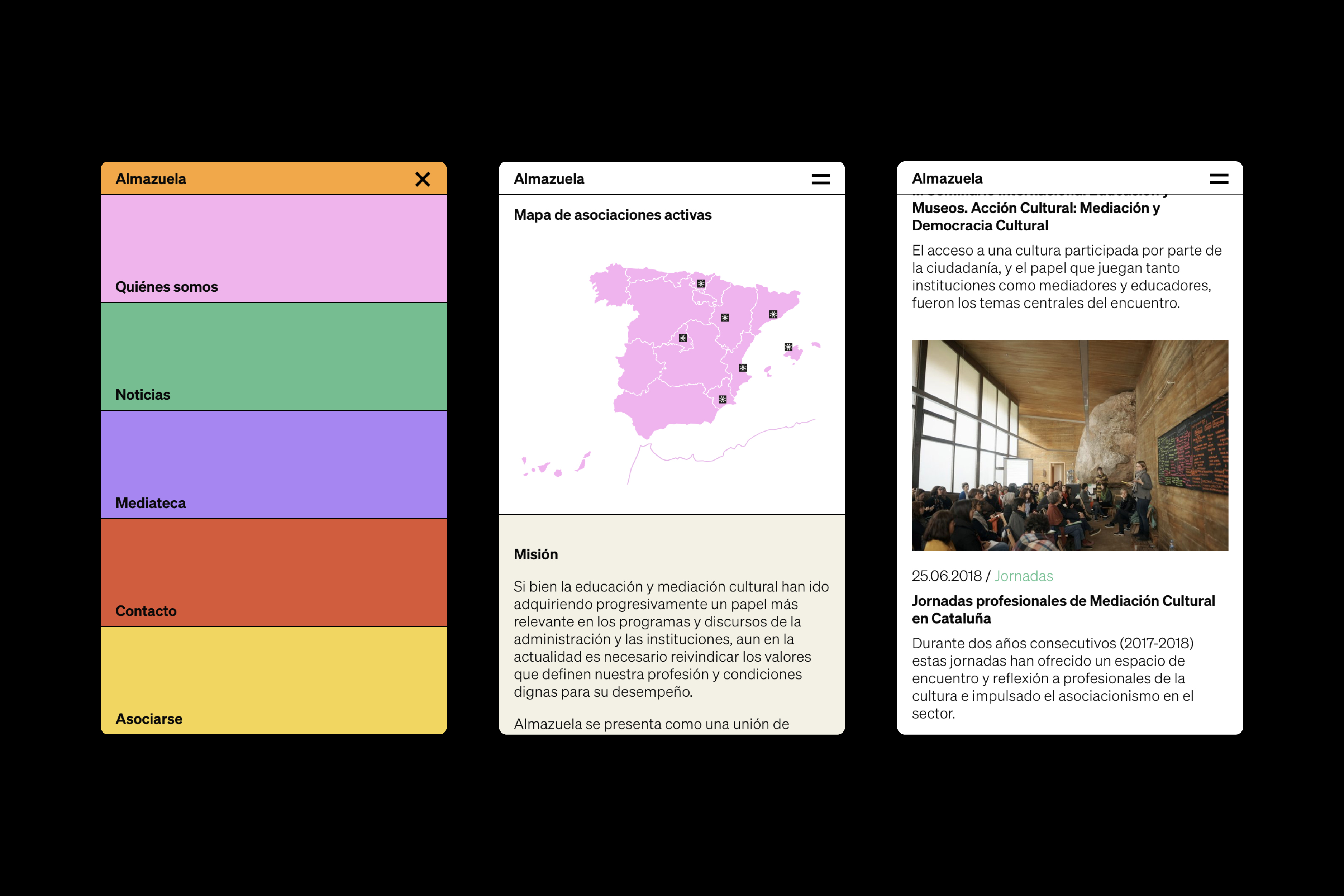
Visual identity and website for Almazuela, the Spanish Federation of Associations for Mediation and Education in Culture, Museums, and Heritage. The project is inspired by almazuelas—handcrafted textile pieces made by stitching together more or less regular scraps of other fabrics—and the color palette is a distillation of the hues typically used in political maps to distinguish different territories, also marked by thin strokes. The result is a modular identity that reflects the working methods of the associations that make up Almazuela (weaving networks to reach shared goals) and their expansive vocation. / Web development: Aurora Saseta. <2023>
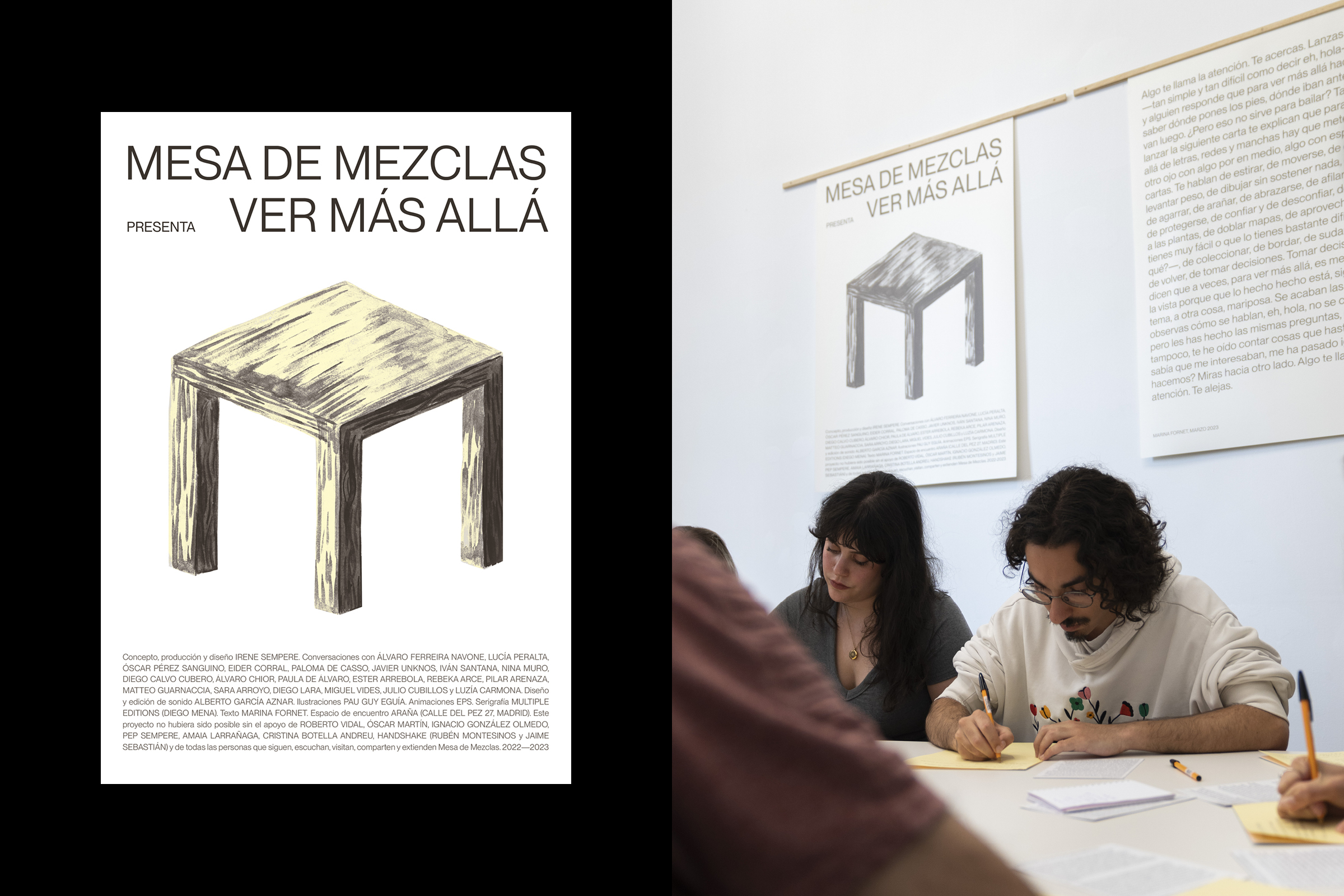
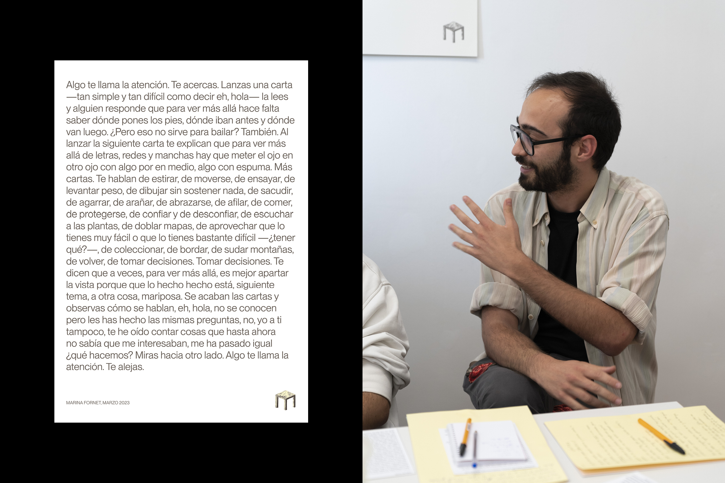
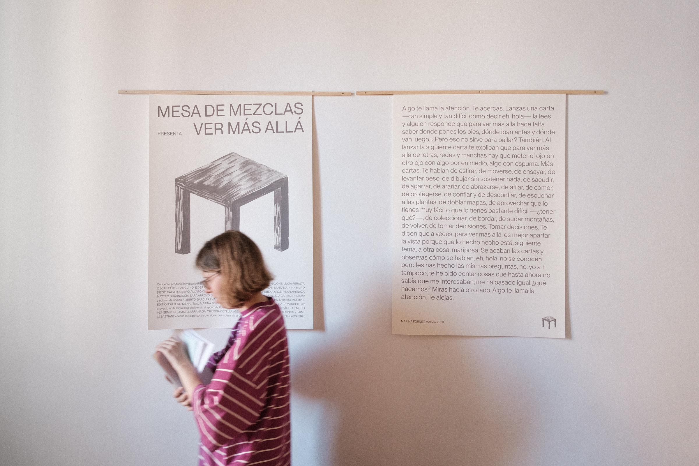
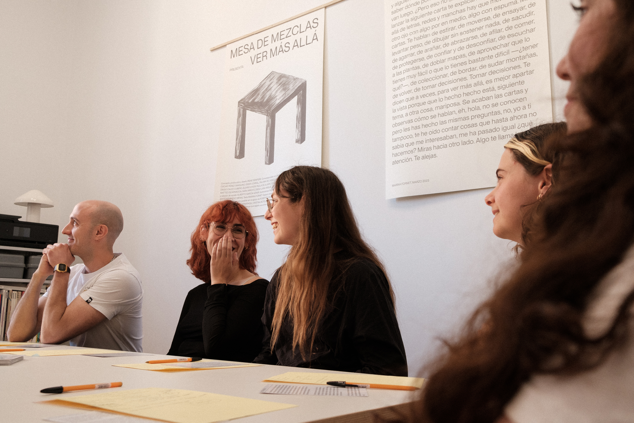
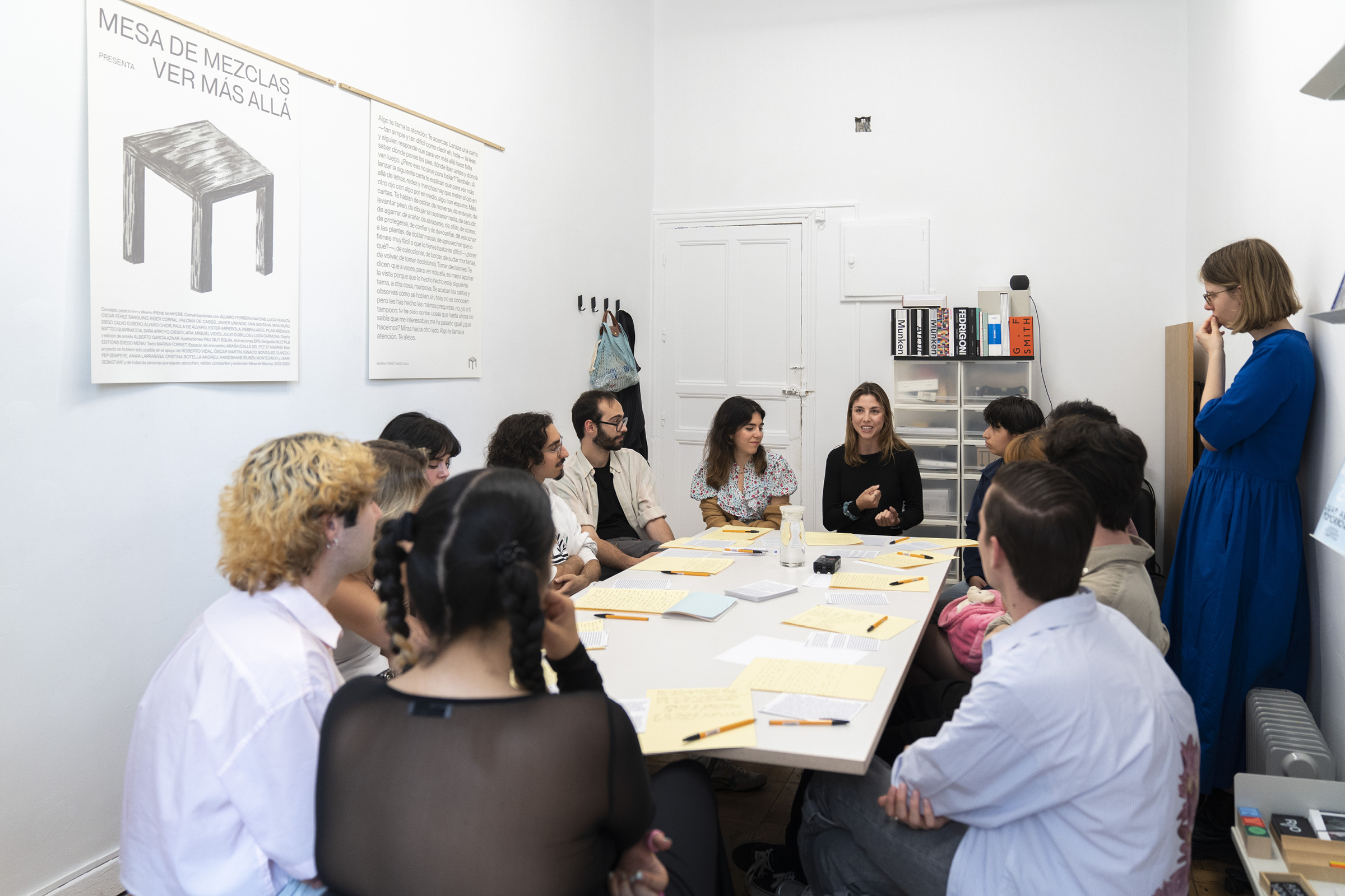
Posters for the Mesa de Mezclas meetings held at ARAÑA in April 2023, as part of the public presentation of the project Ver más allá. This third edition of MdM was presented in three formats: sound, exhibition, and editorial. Its 20 participants share the experience of having developed part of their creative practice in Spain and through graphic design. / Illustration: Pau Guy Eguía. Expository text: Marina Fornet. Screen printing: Multiple Editions. Photography: Paula Caballero, Nalia Arenas. <2023>
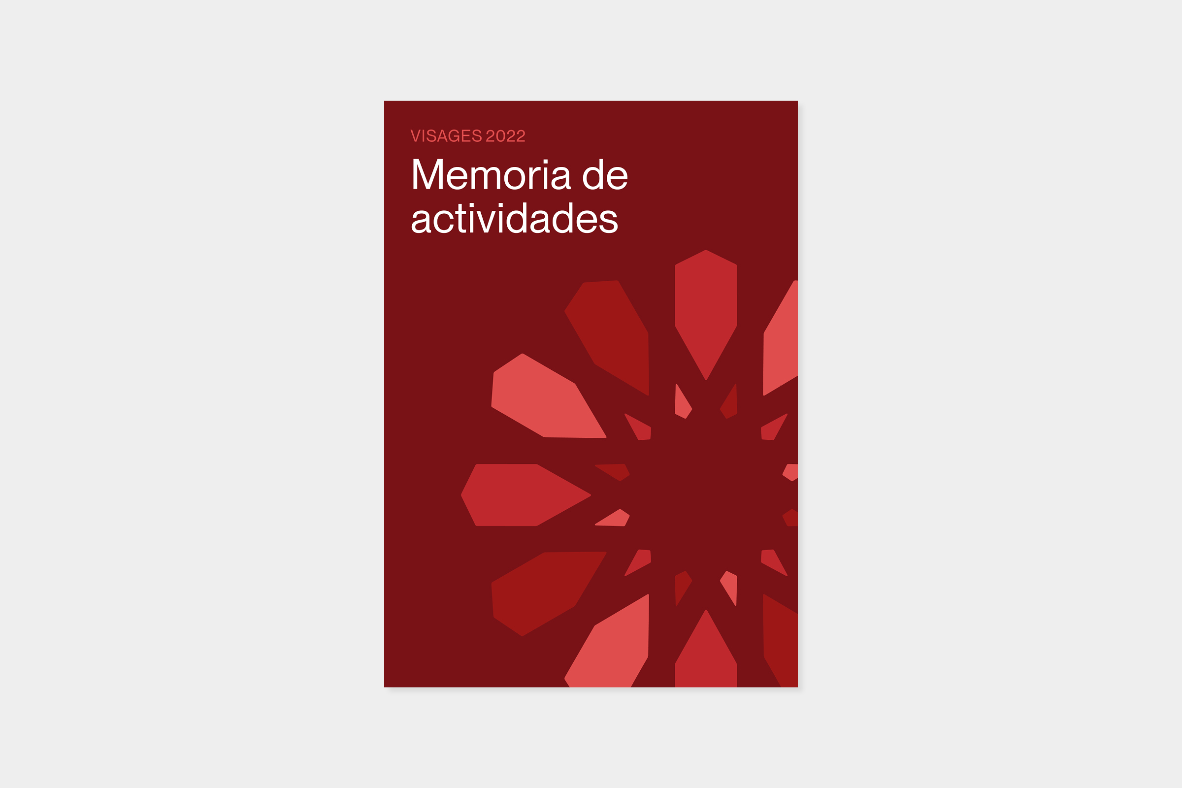
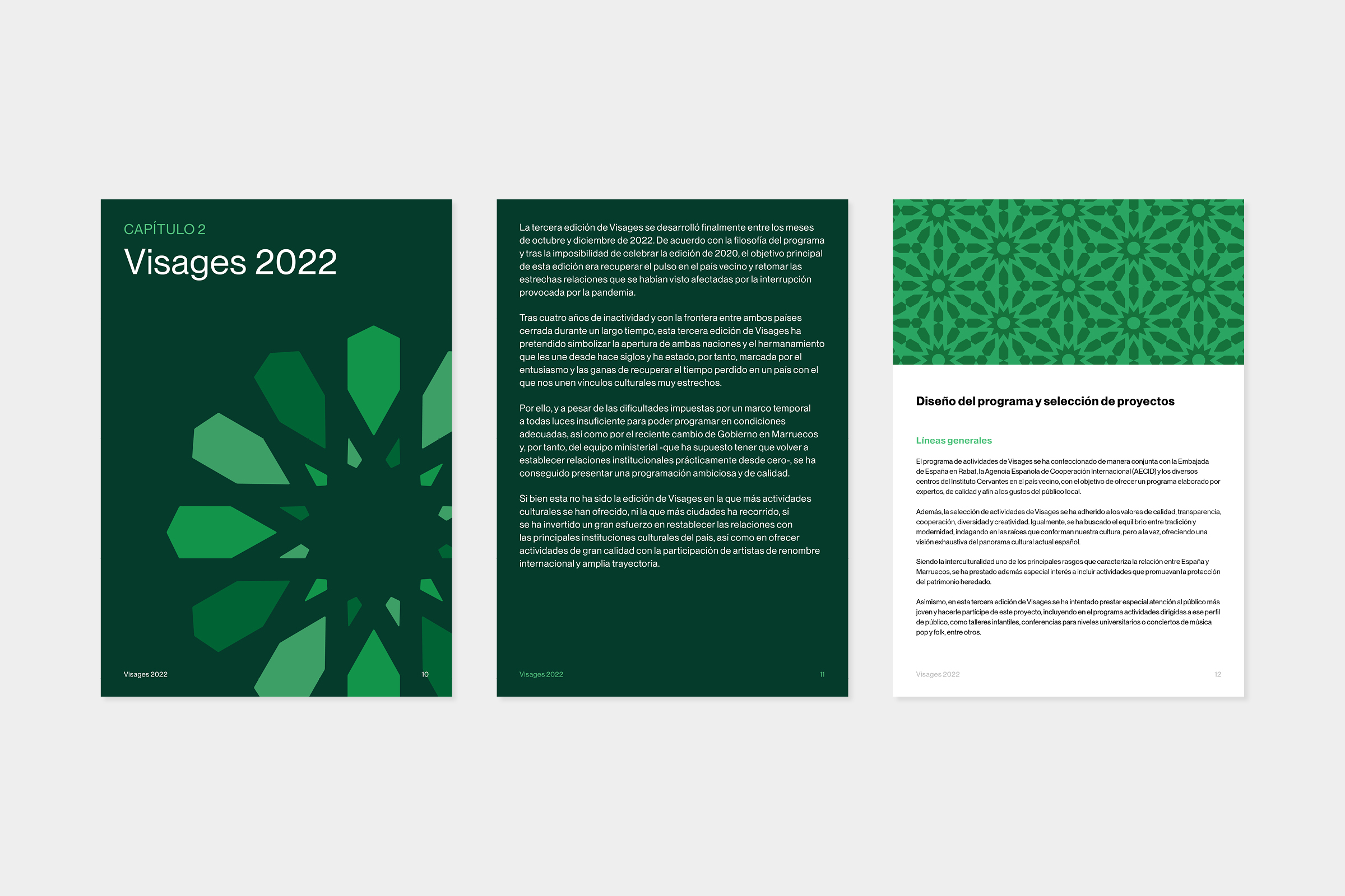
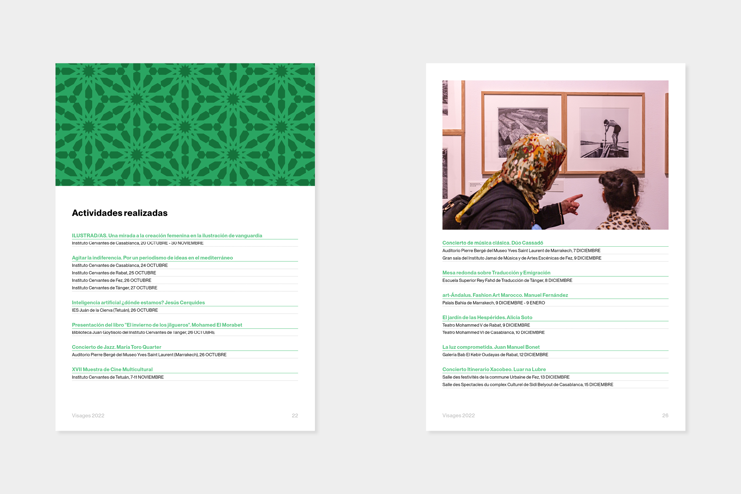
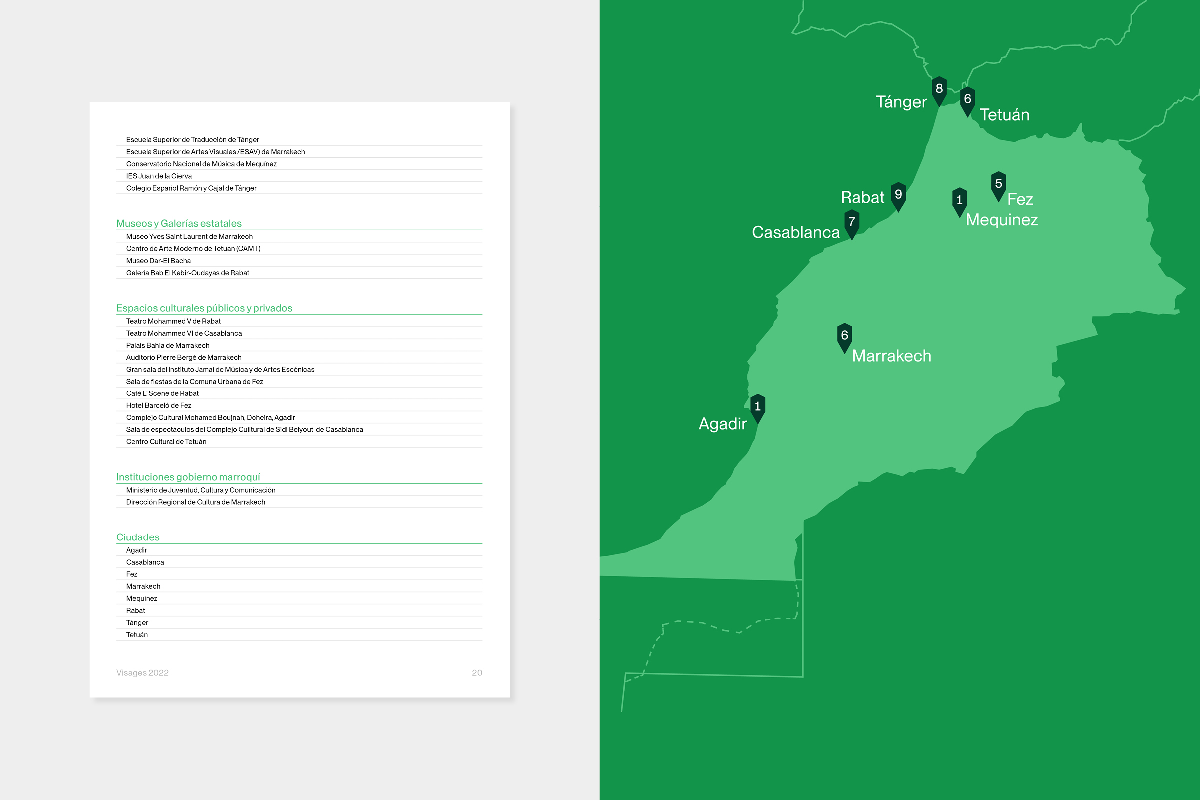
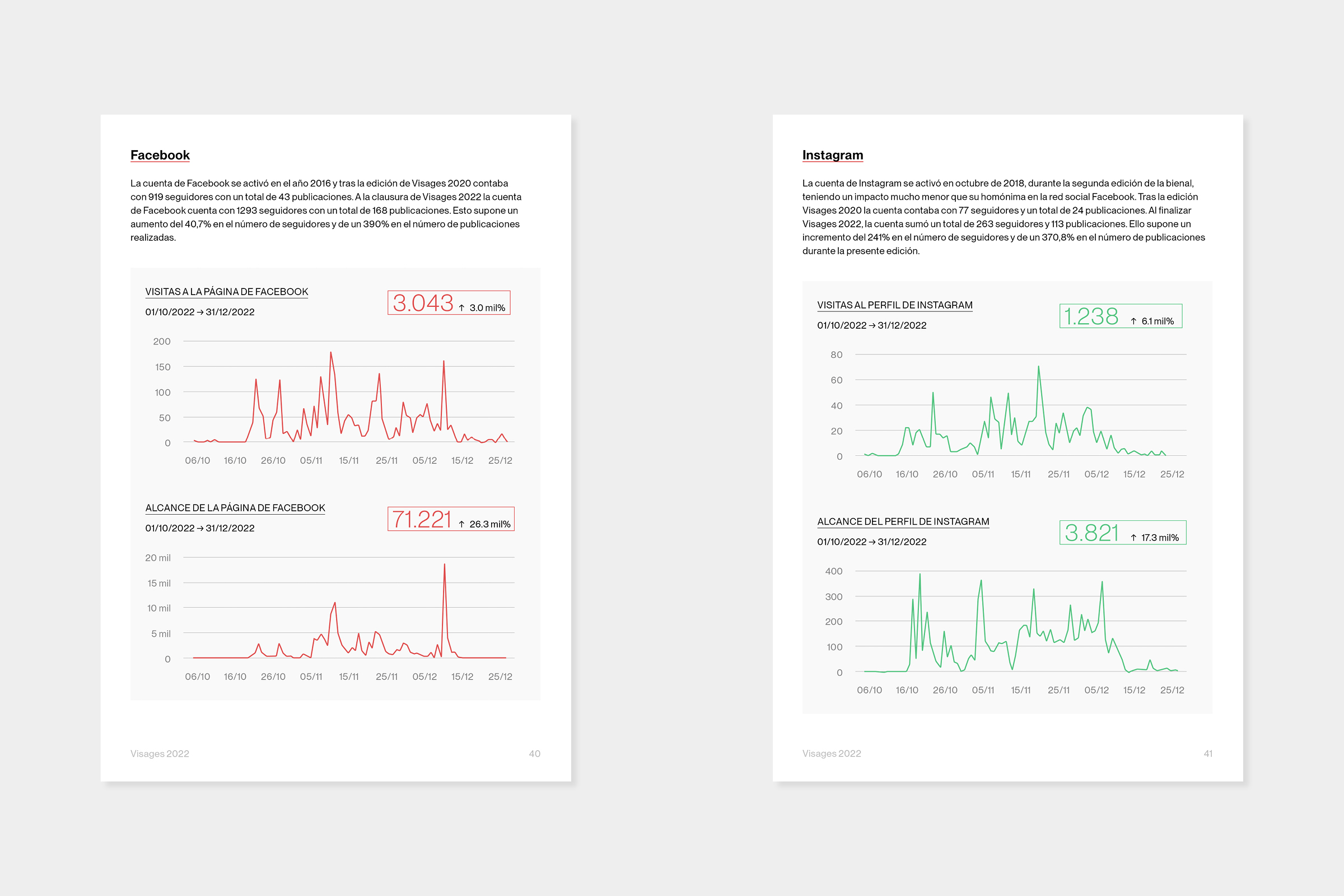
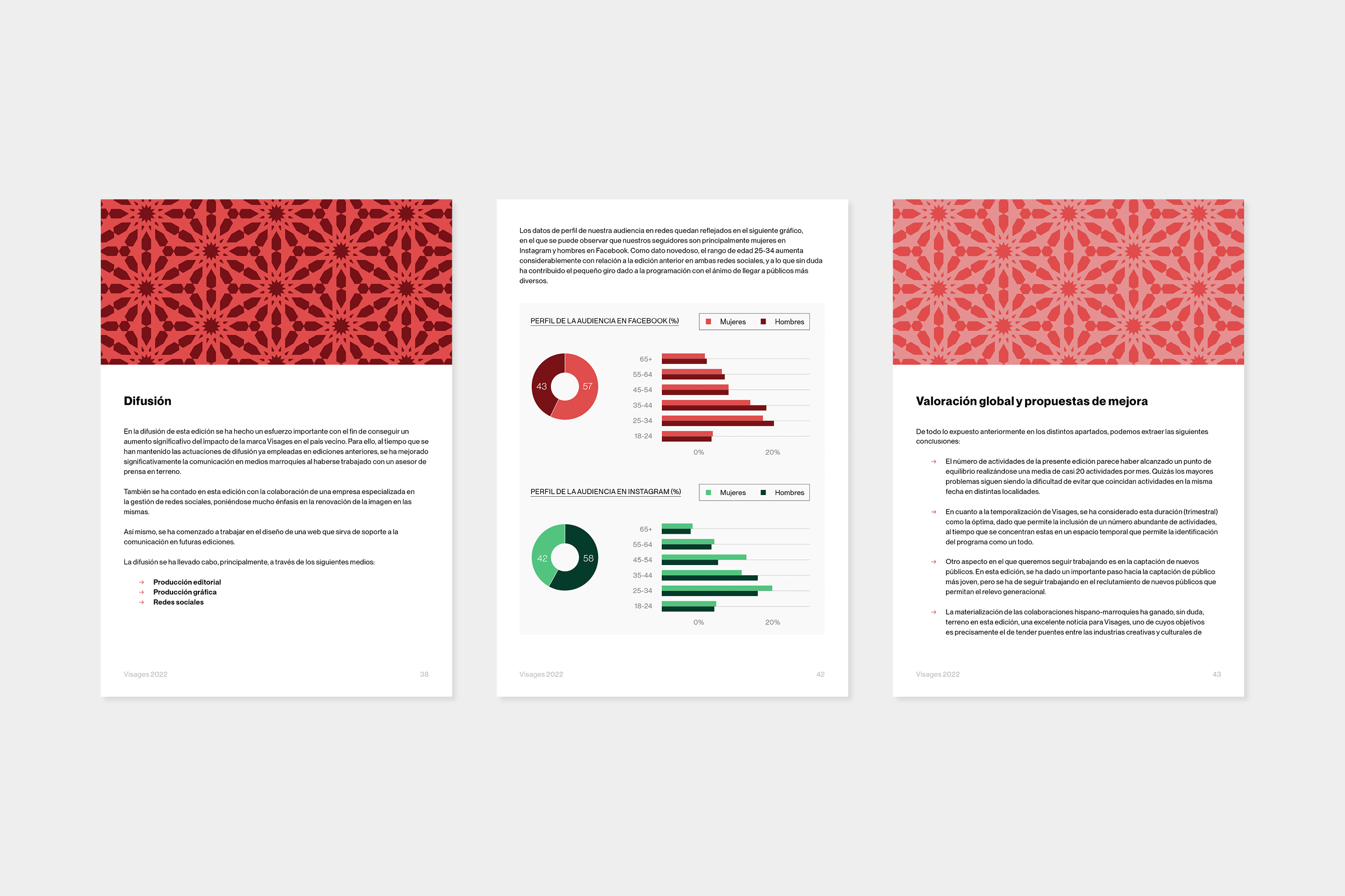
Report design for the third edition of Visages, a biennial program for the exchange and promotion of Spanish culture in Morocco, led by the Subdirectorate General for International Relations and the European Union of the Ministry of Culture and Sport of Spain. The visual identity builds on the festival’s logo, incorporating graphic motifs inspired by the ornamental plasterwork geometry typical of Arab architecture, which evolve throughout the document. The color palette draws from the Moroccan flag. <2023>
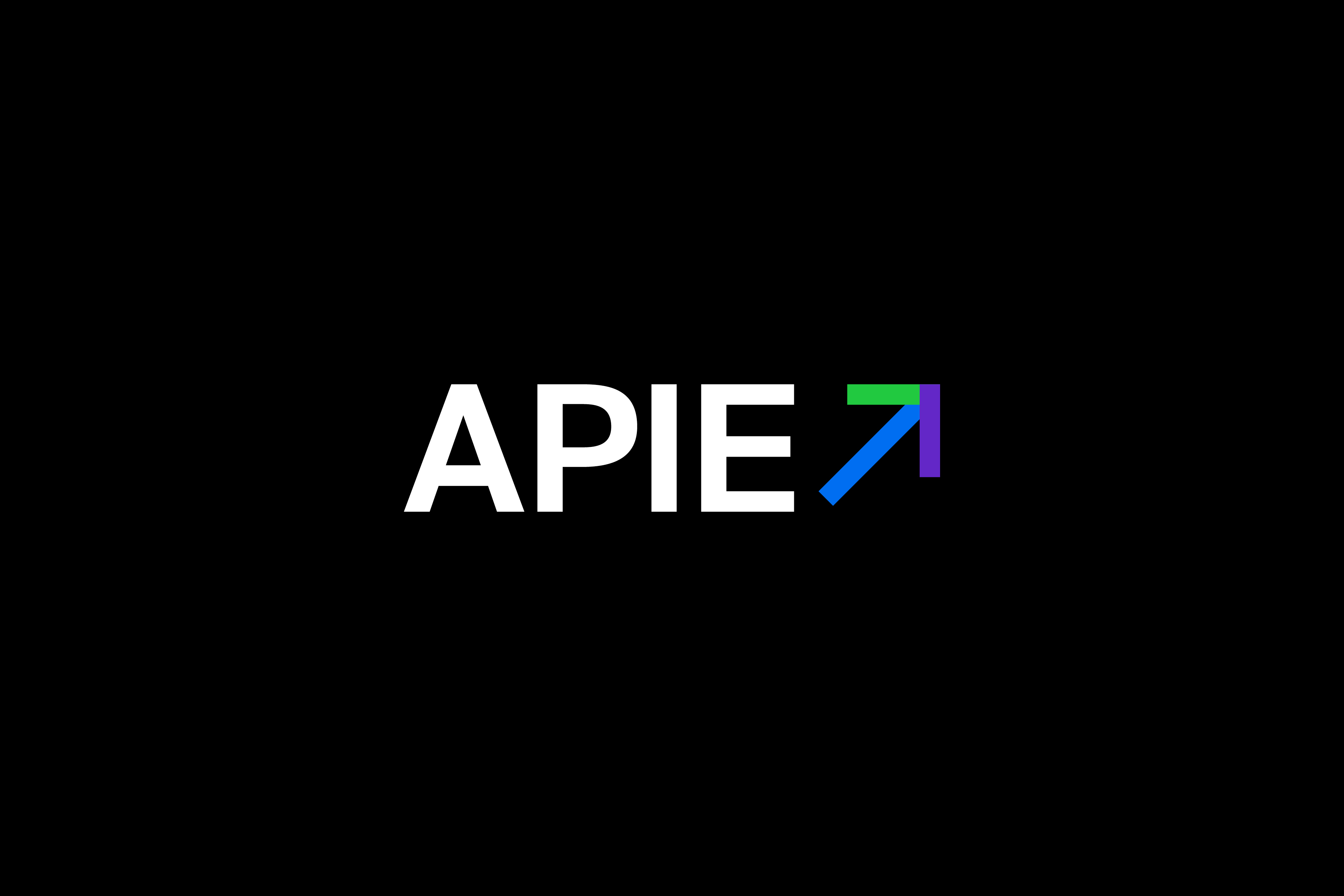
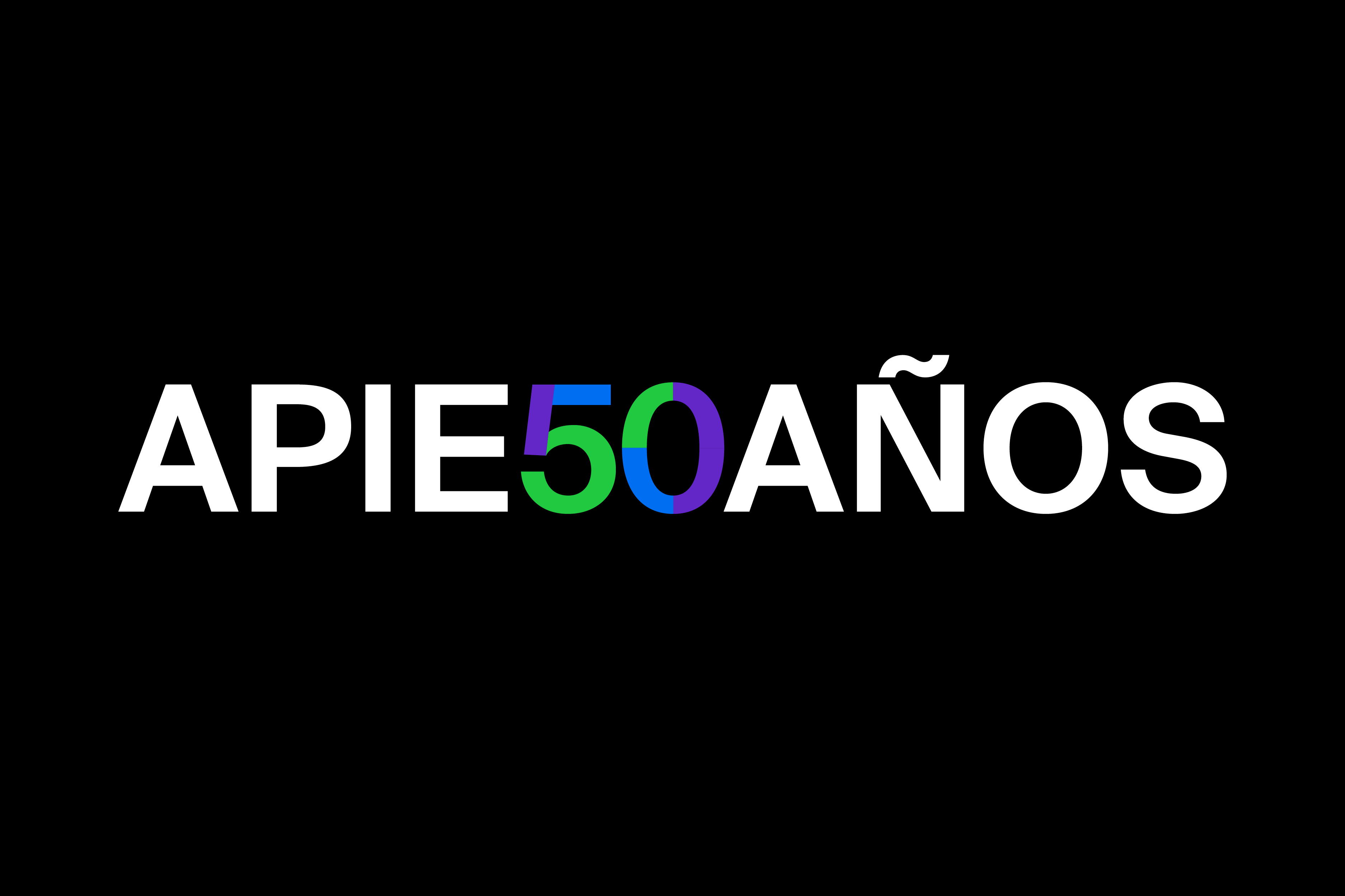
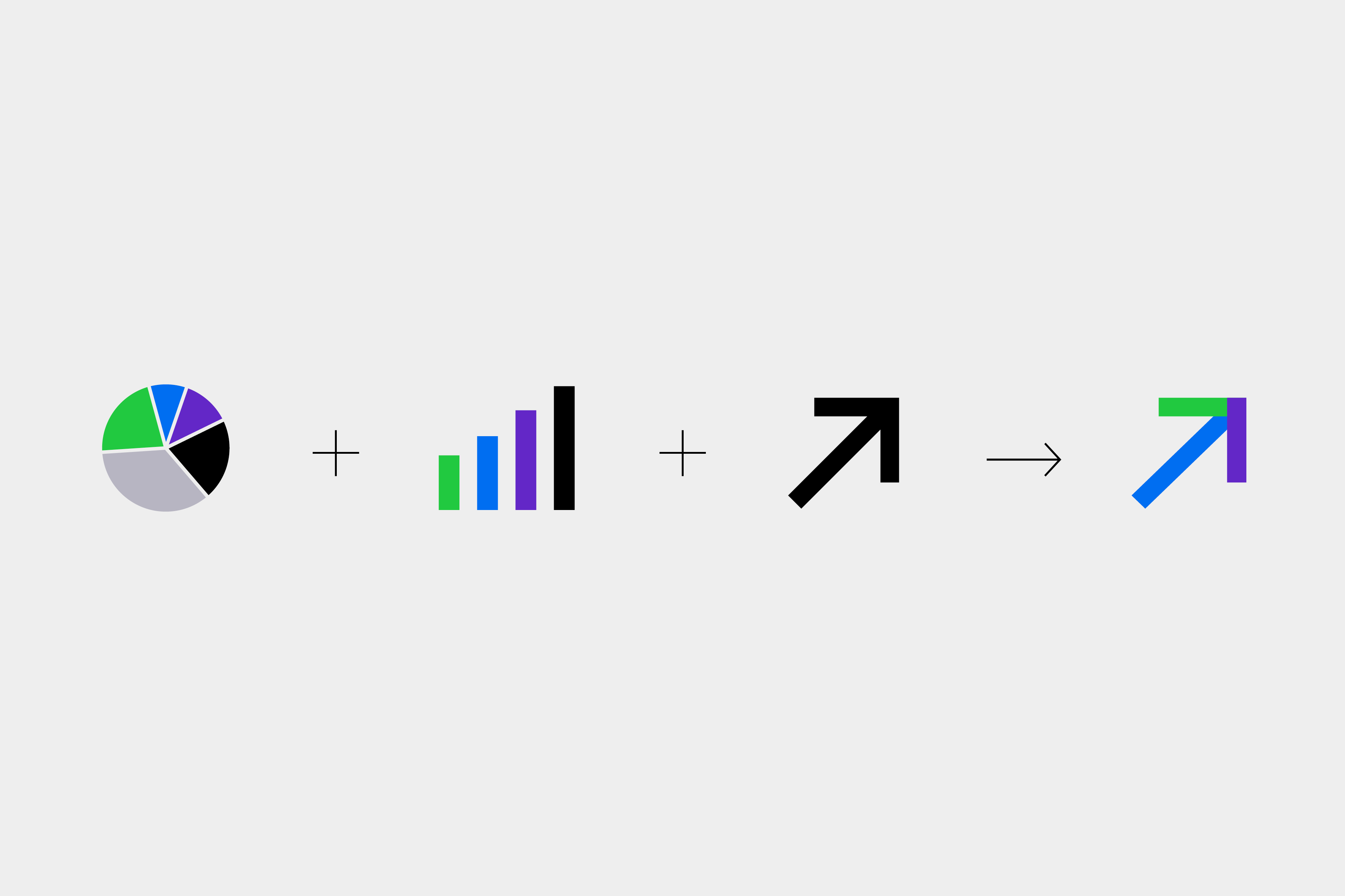
Logo redesign for APIE (Spanish Association of Economic Information Journalists) and creation of the commemorative logo for its 50th anniversary. Founded in 1973, APIE promotes ethics and excellence in economic journalism. The new identity reflects values such as integrity, transparency, and progress. Its symbol—a stylized arrow pointing upward and forward—can be used independently and as a graphic motif across various applications. It represents continuous improvement and the collective effort of journalists dedicated to high-quality economic reporting. / Project developed at EPS. <2023>
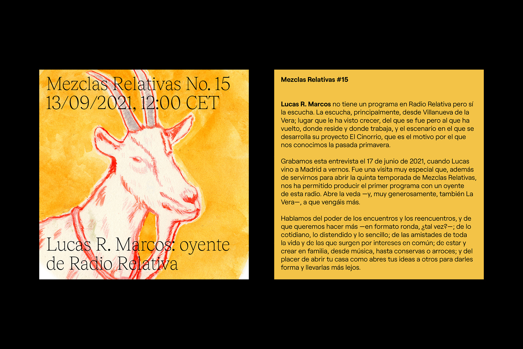
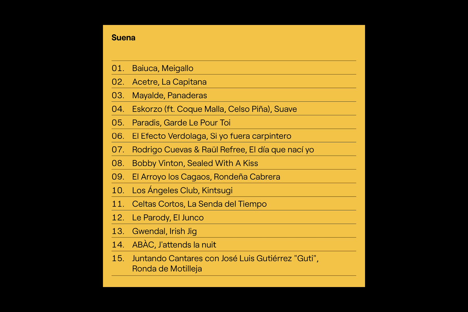
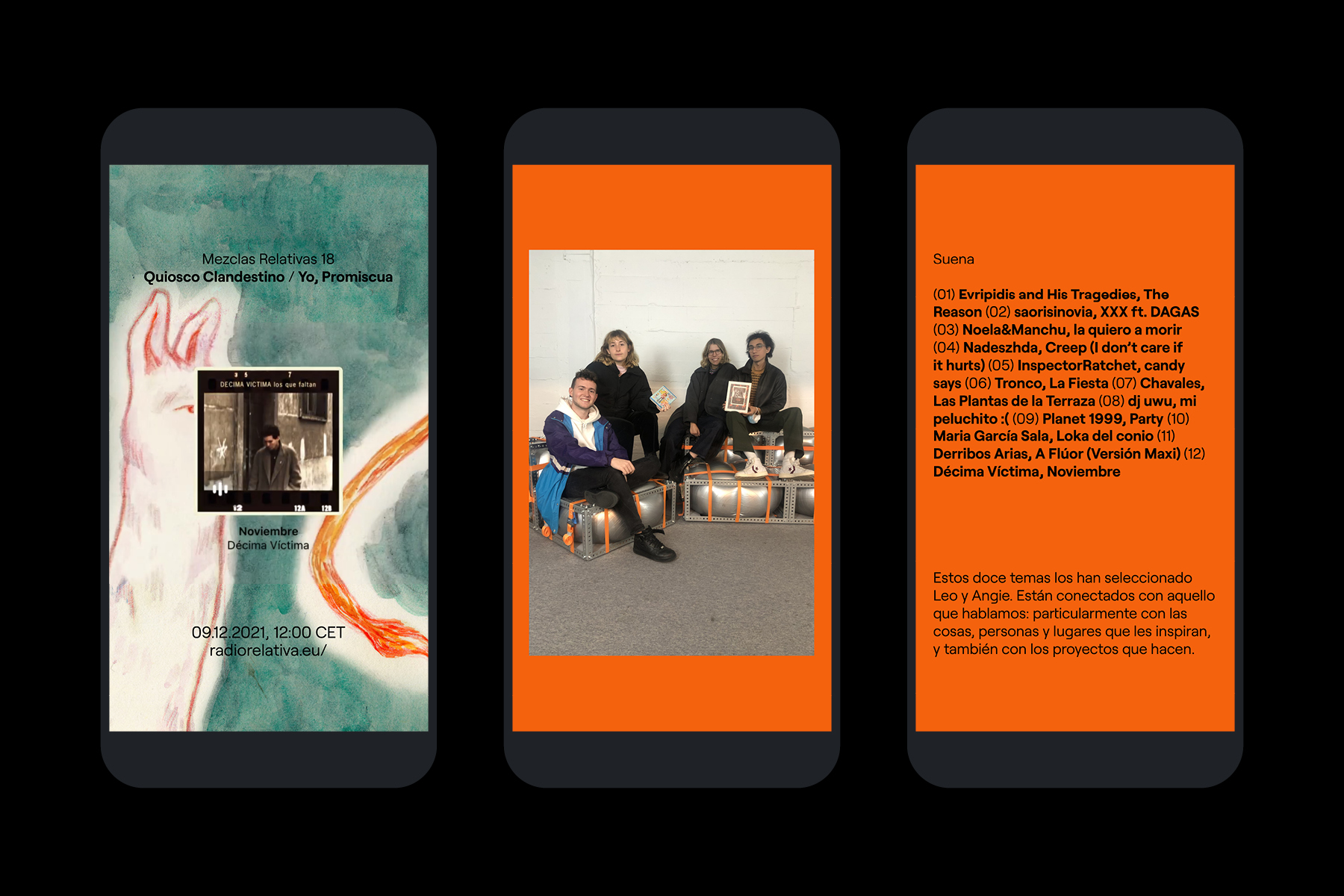
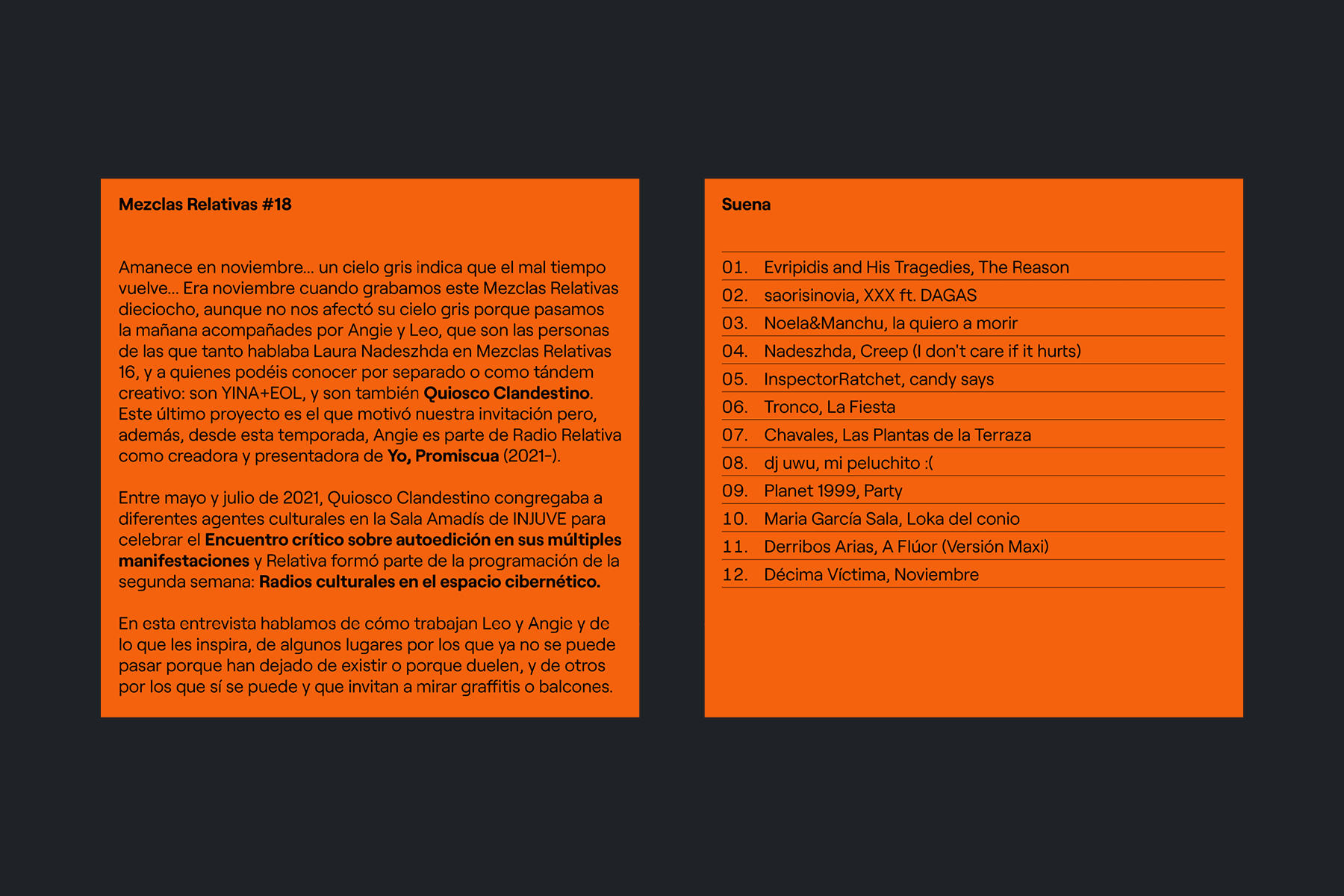
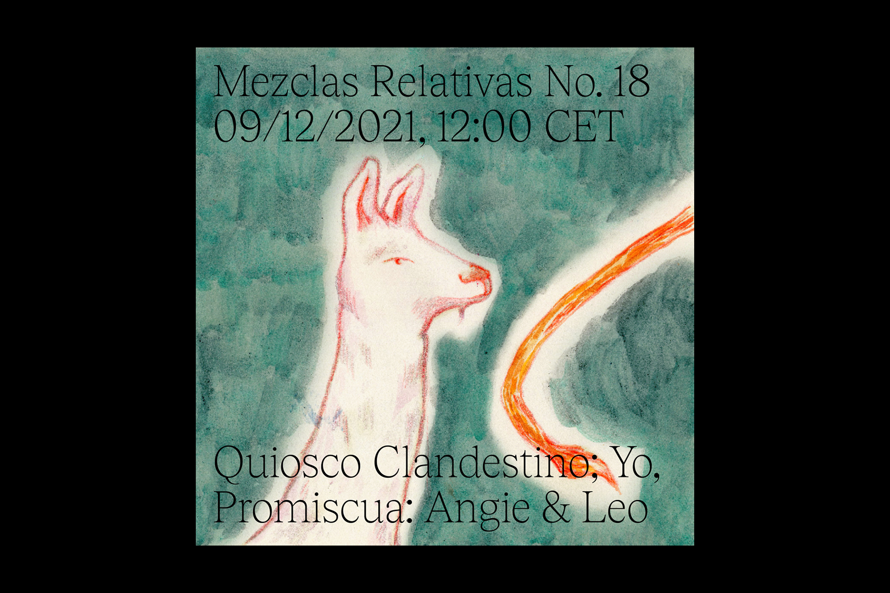
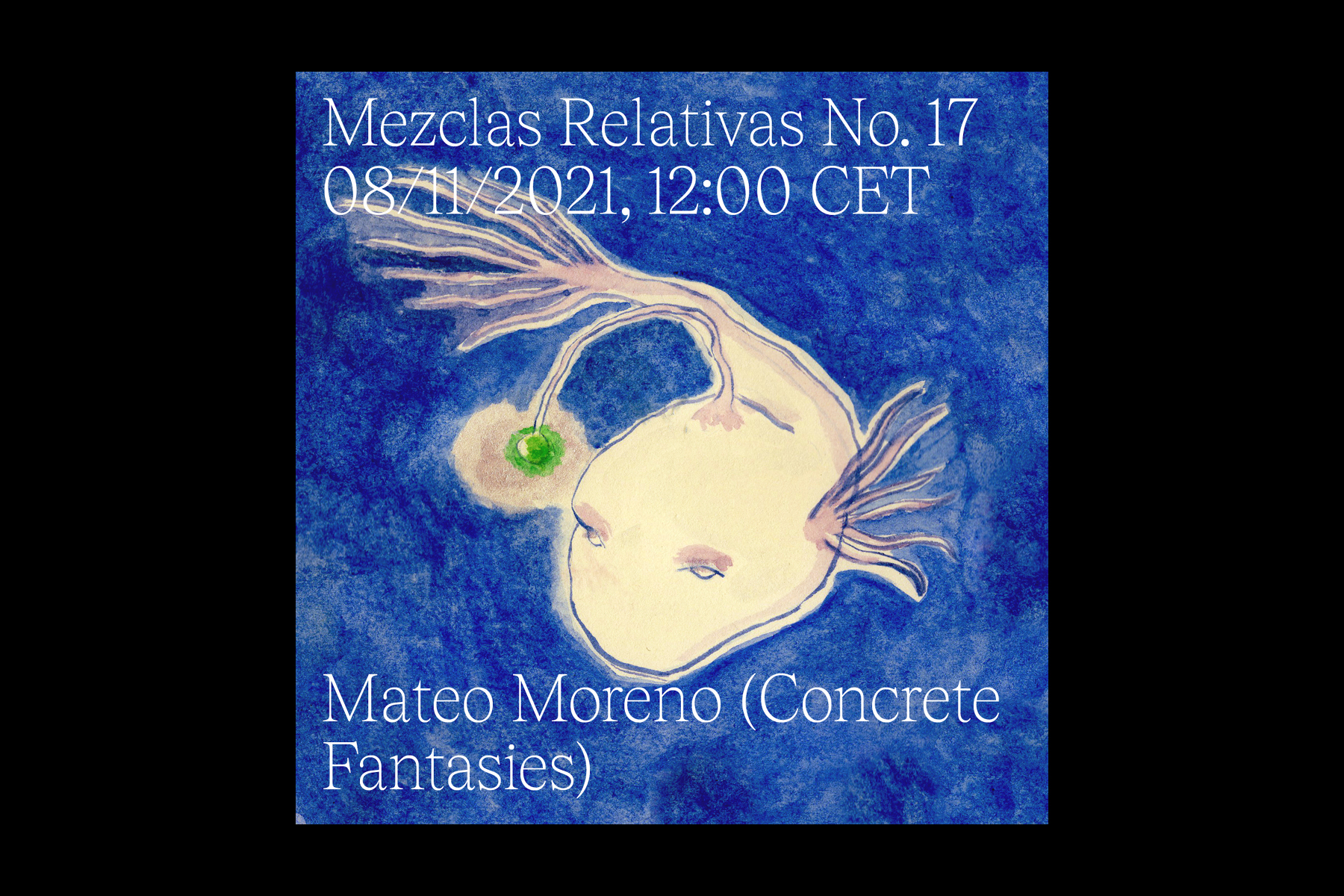
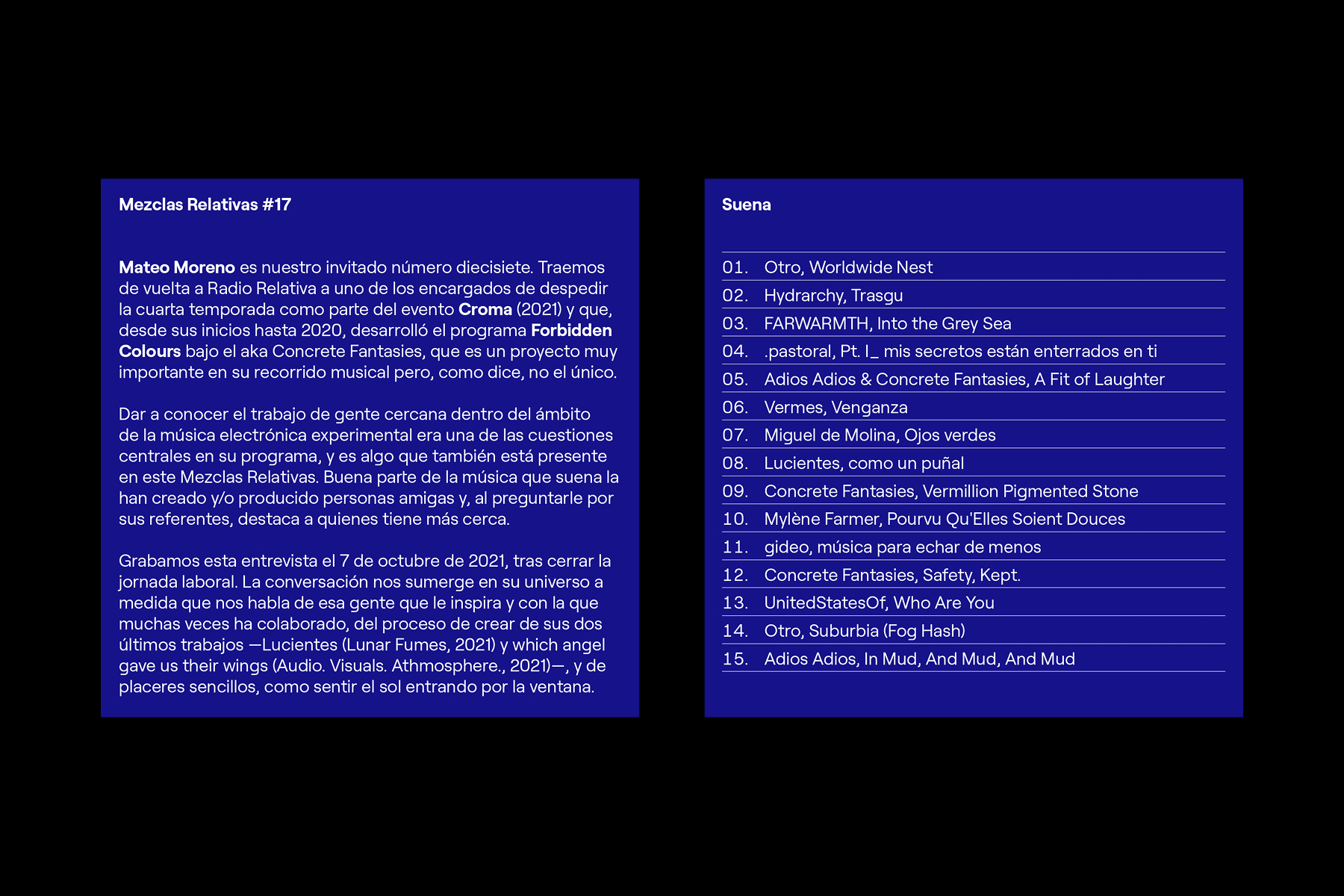
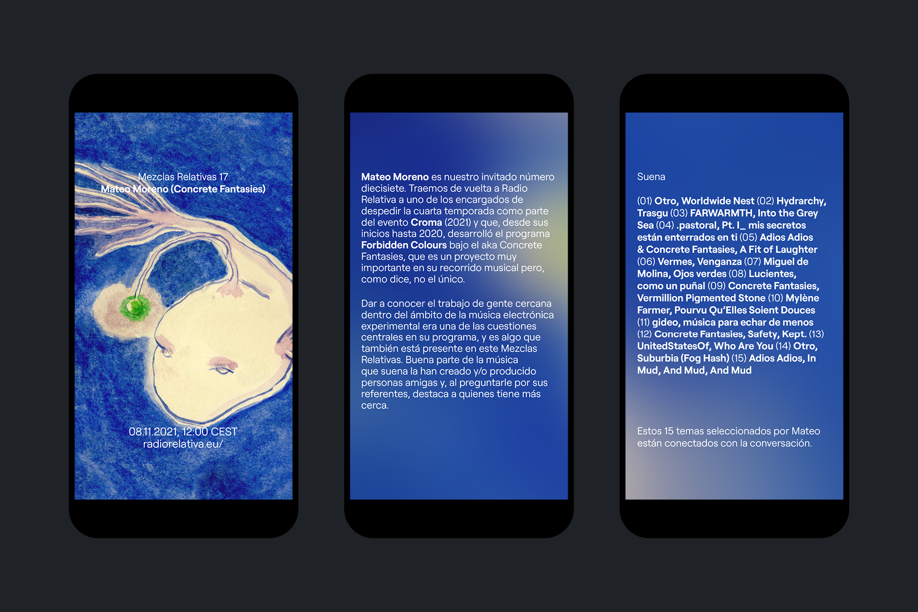
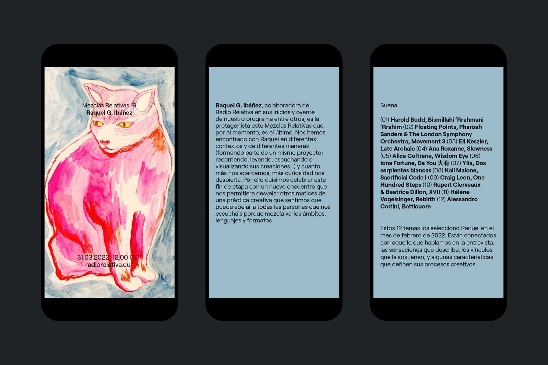
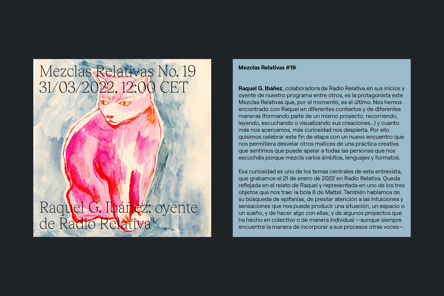
Textual and visual communication materials for the fifth season of Mezclas Relativas, a monthly radio show produced alongside Alberto García Aznar on Radio Relativa, which brings us closer to the creative projects and concerns of the people involved with this radio. / Illustrations: Pau Guy Eguía. <2022>
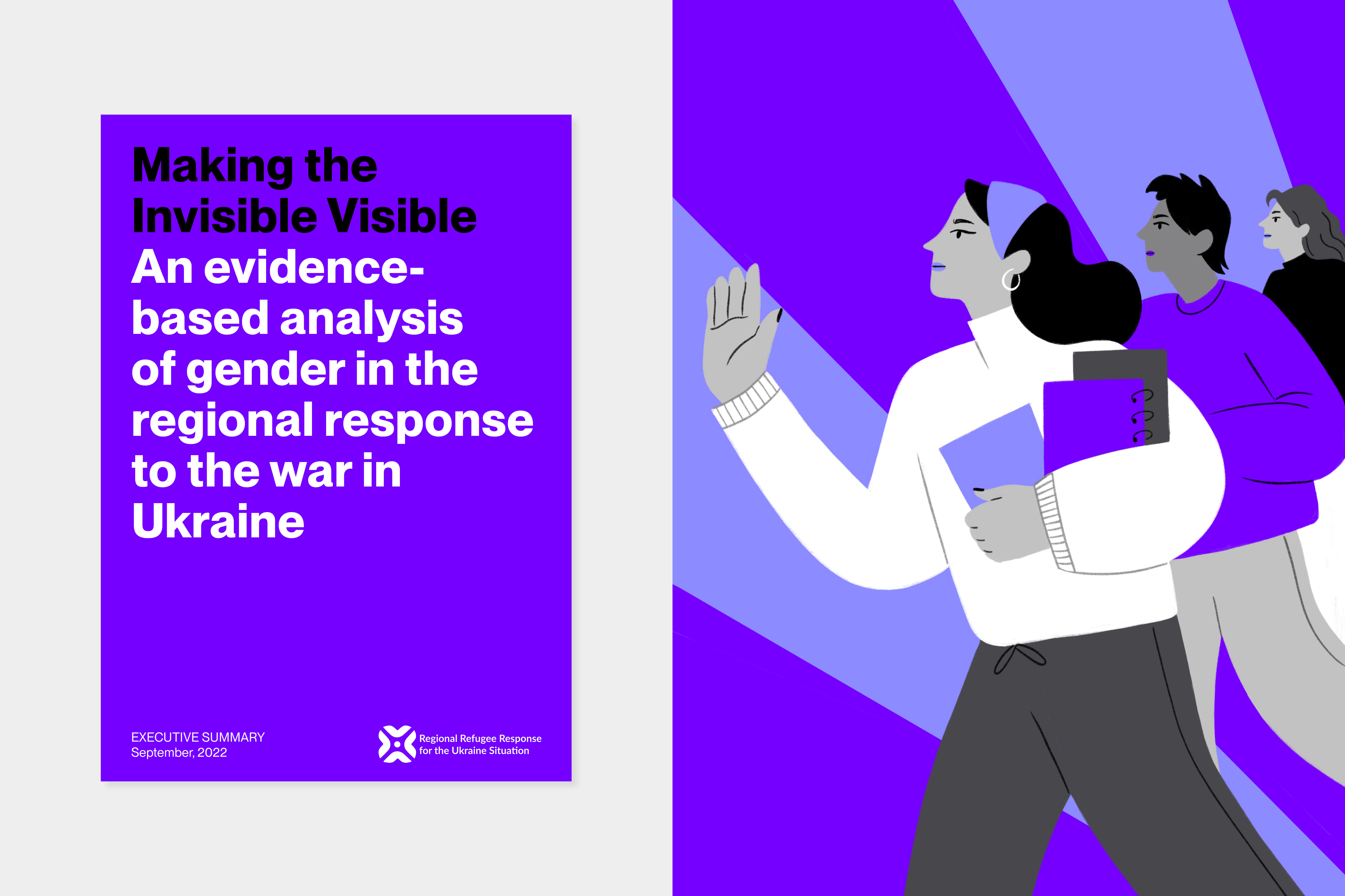
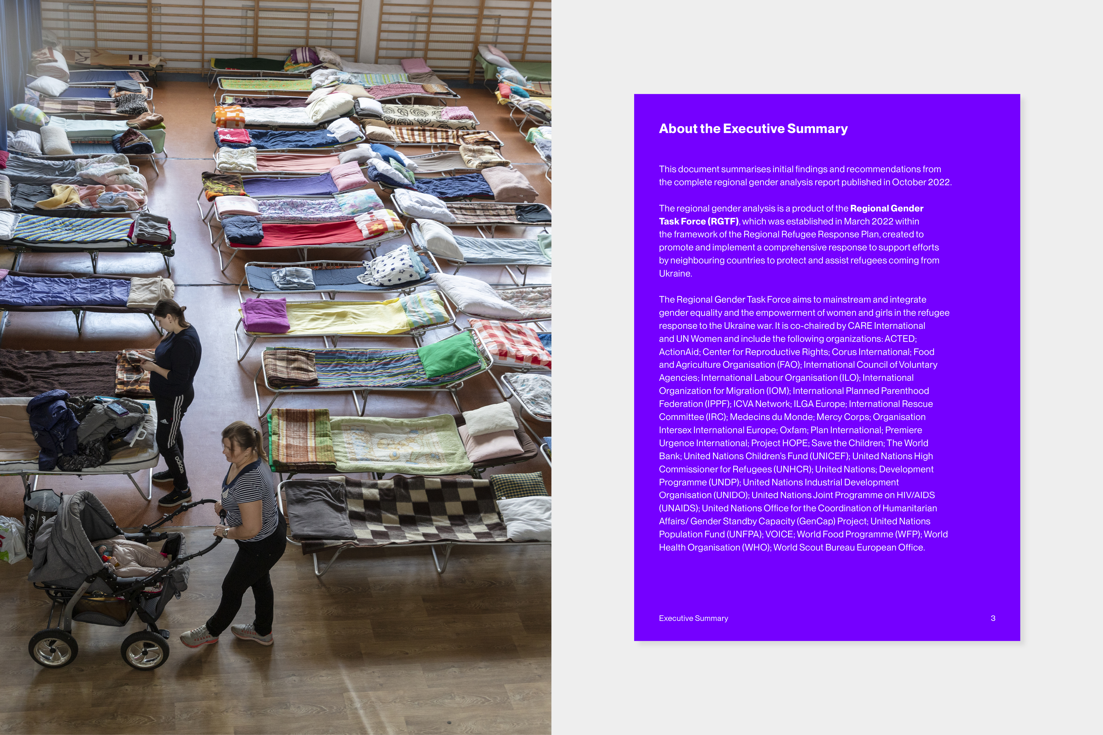
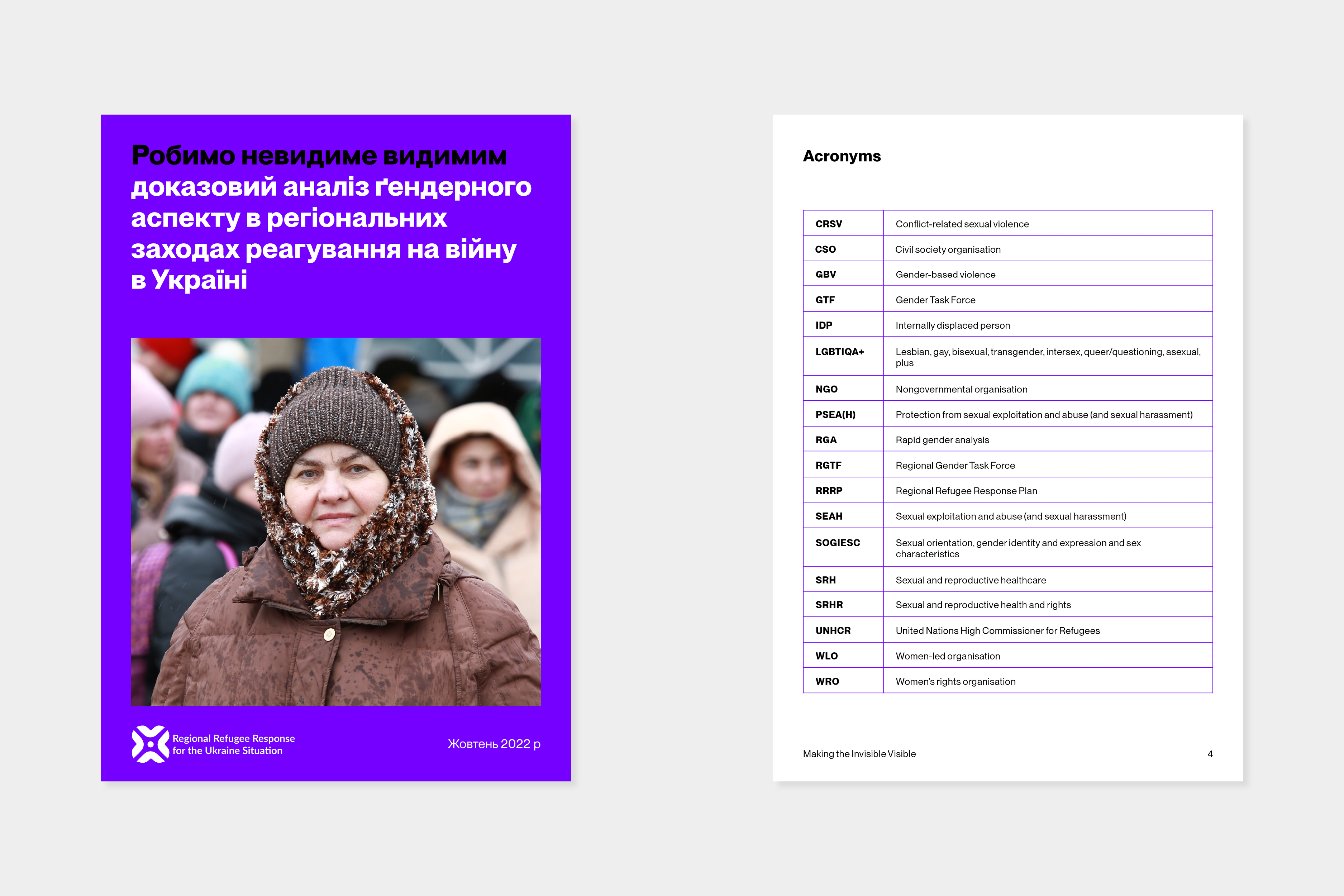
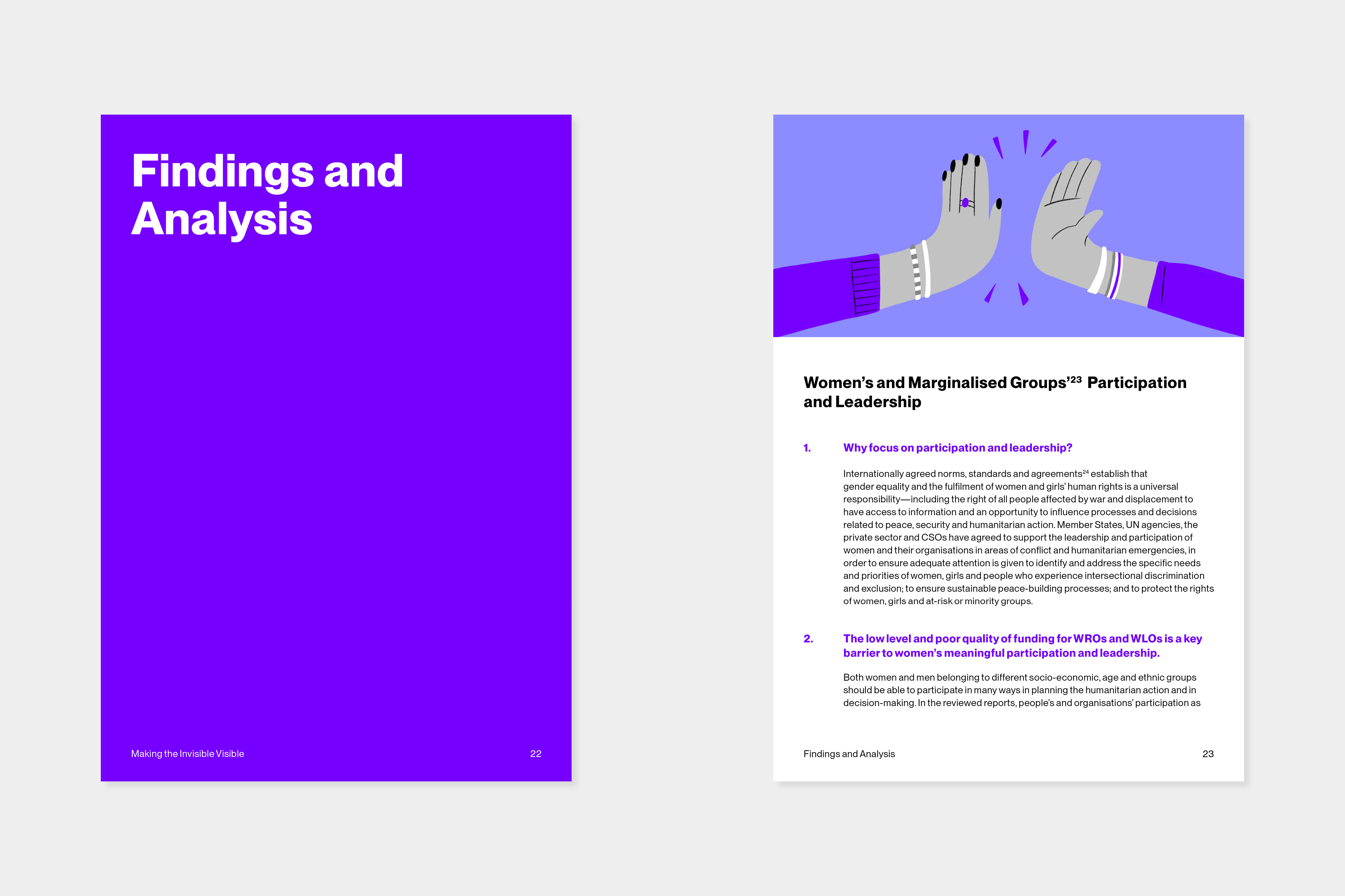
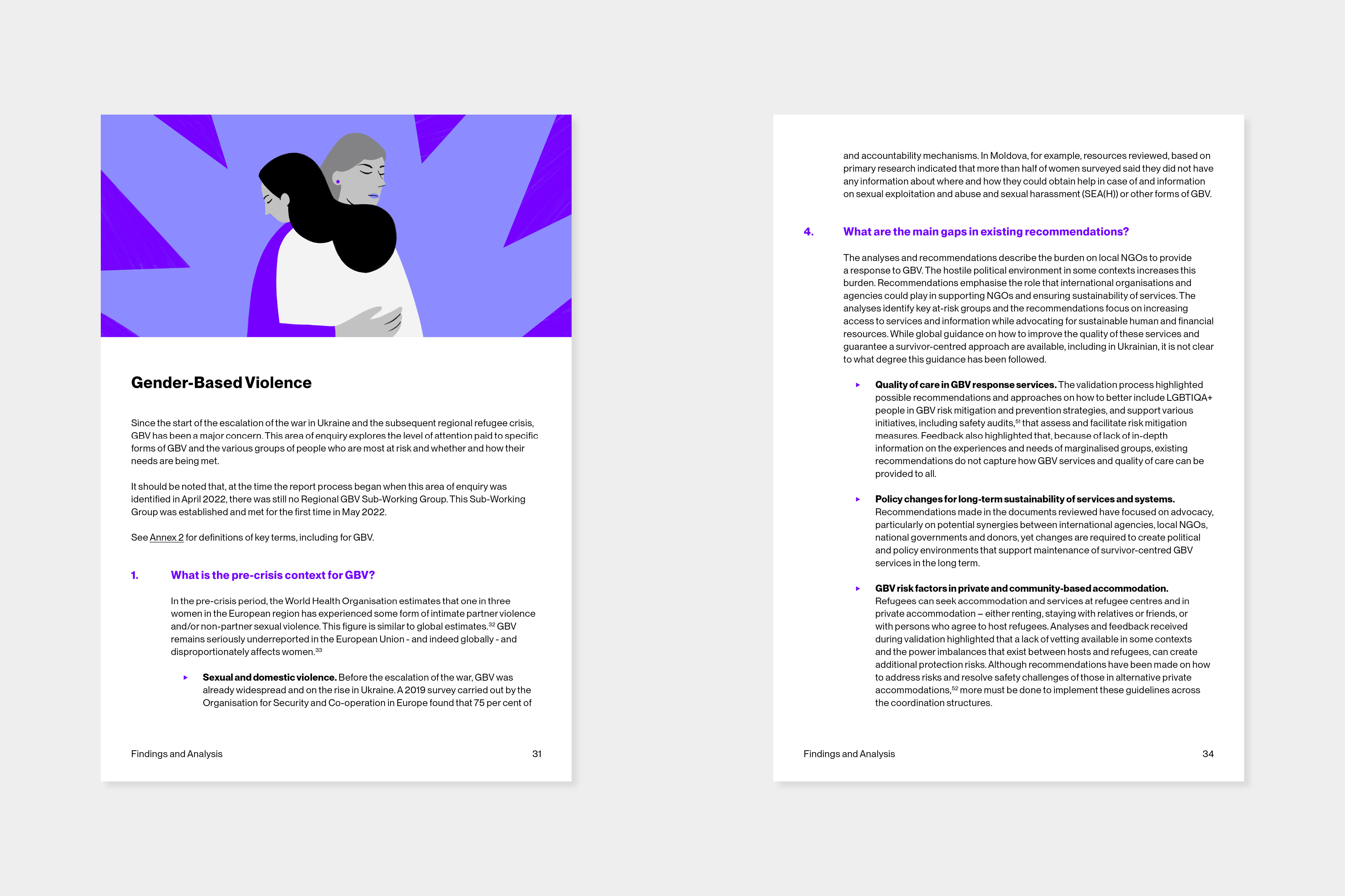
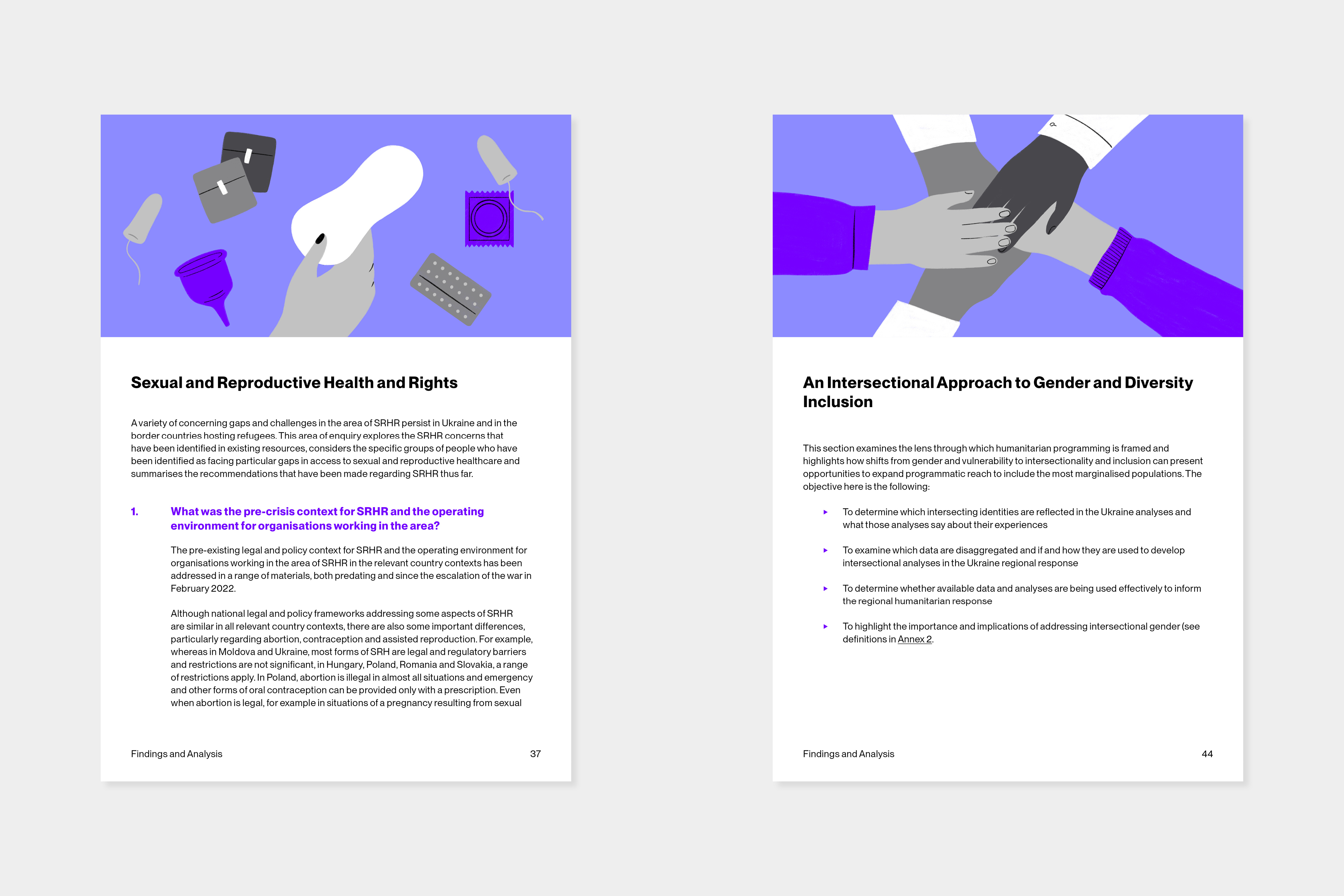
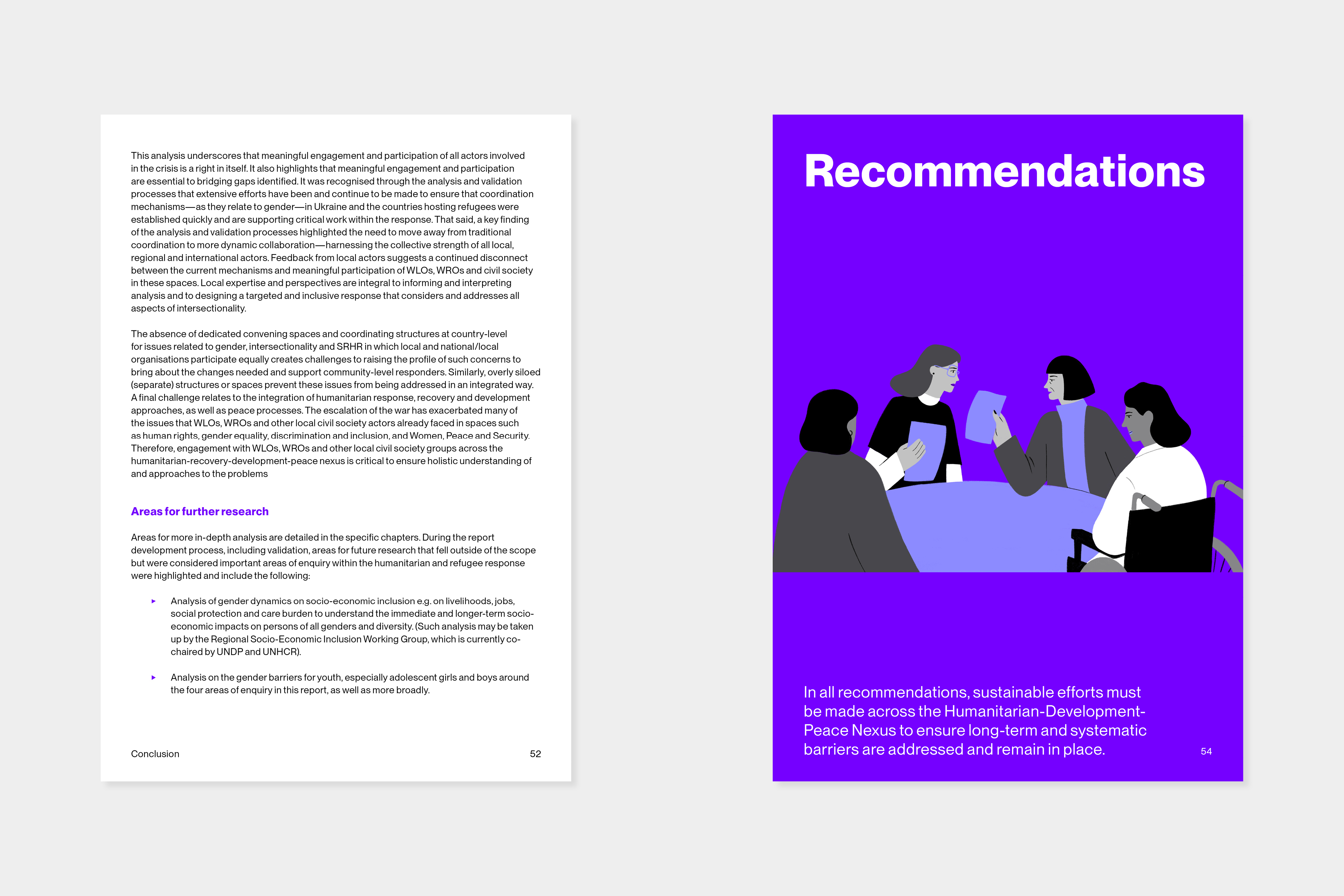
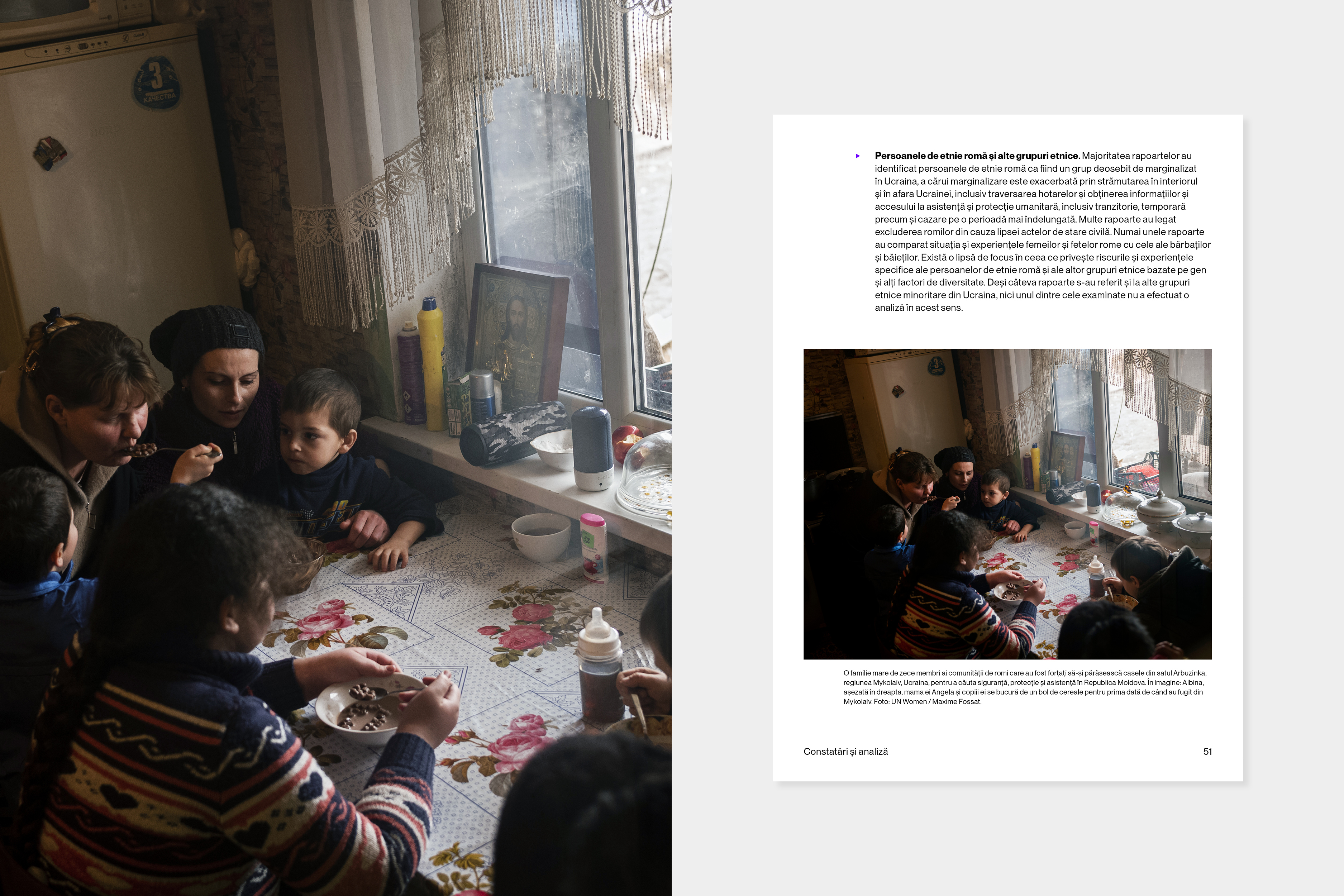
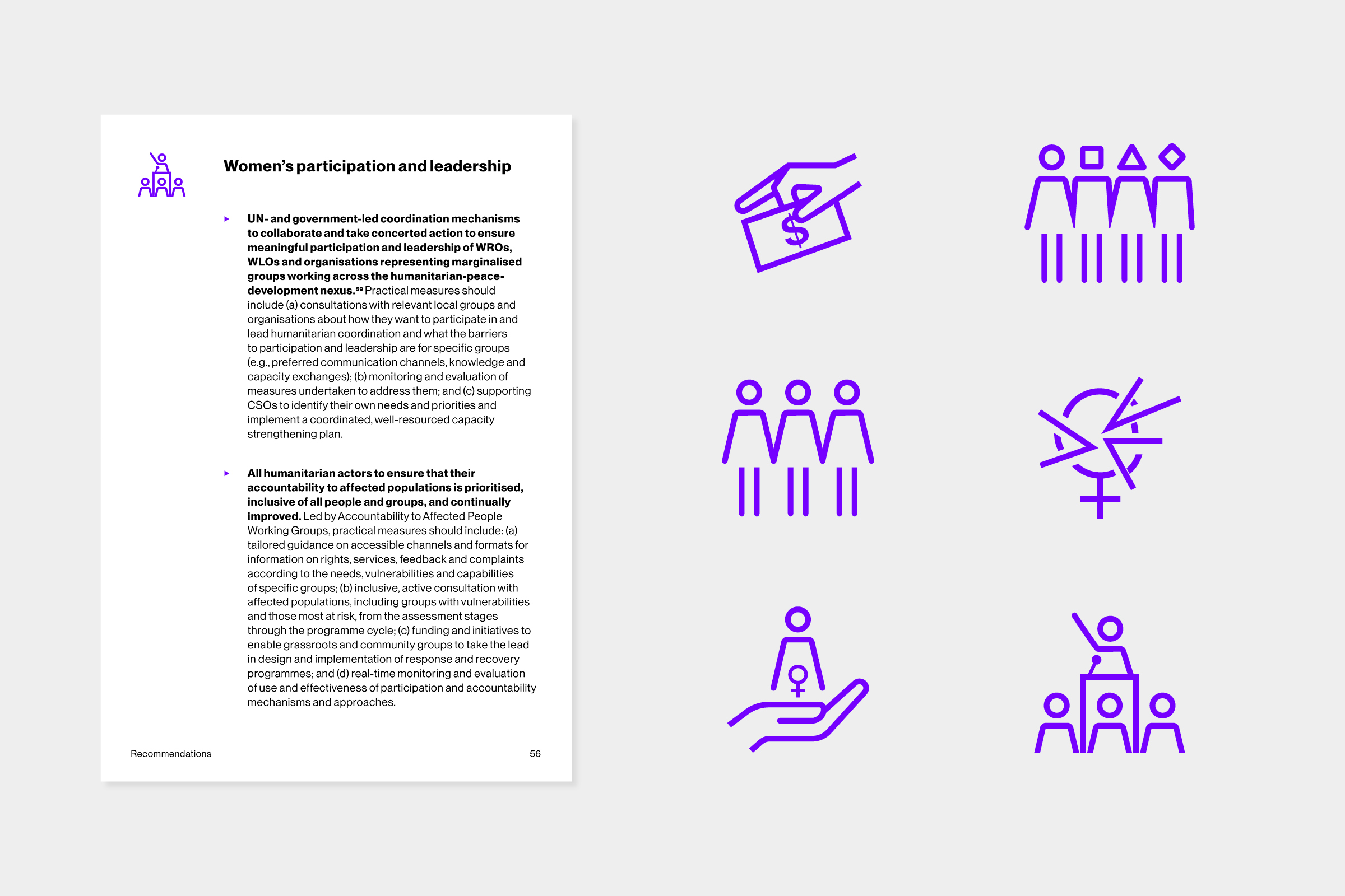
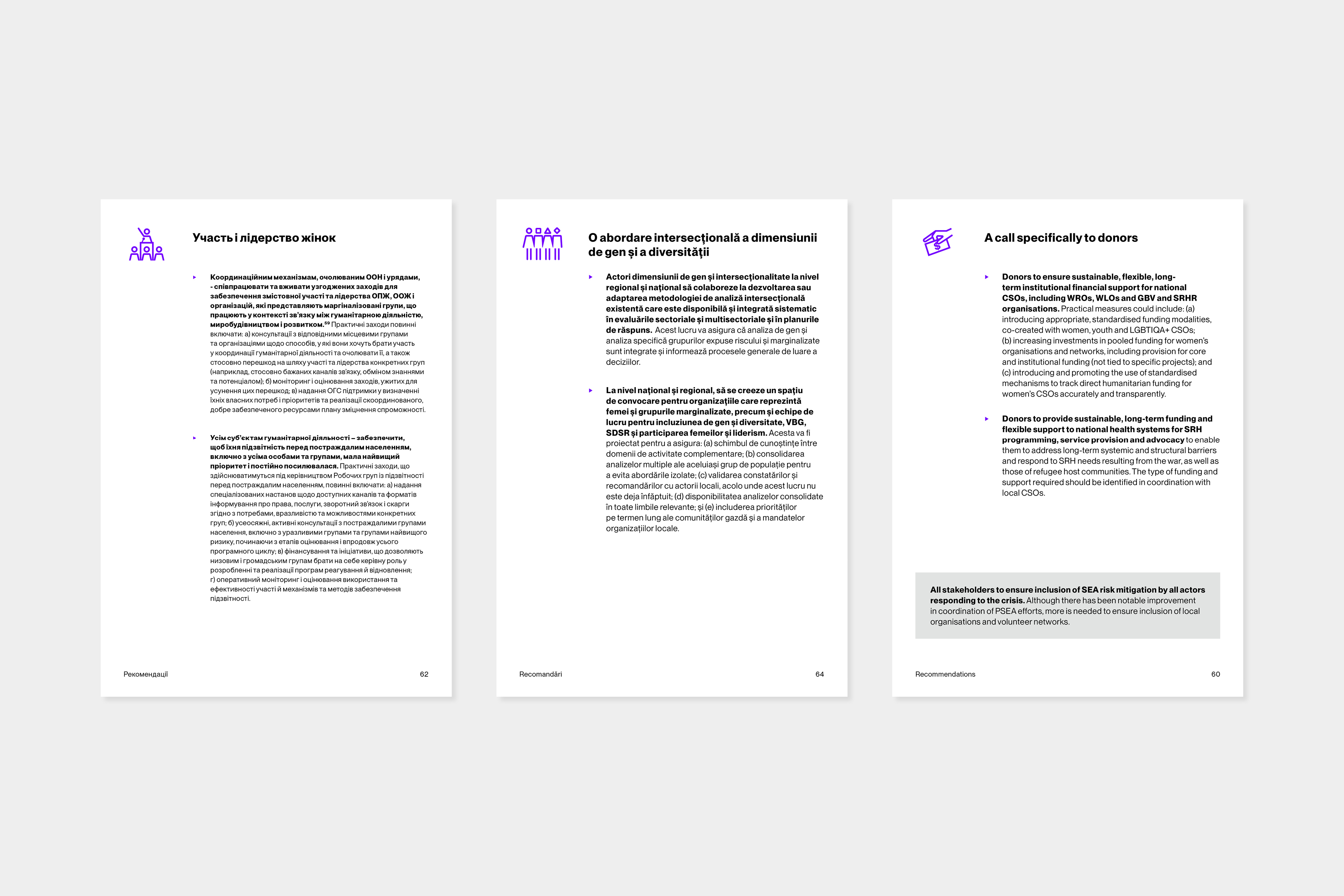
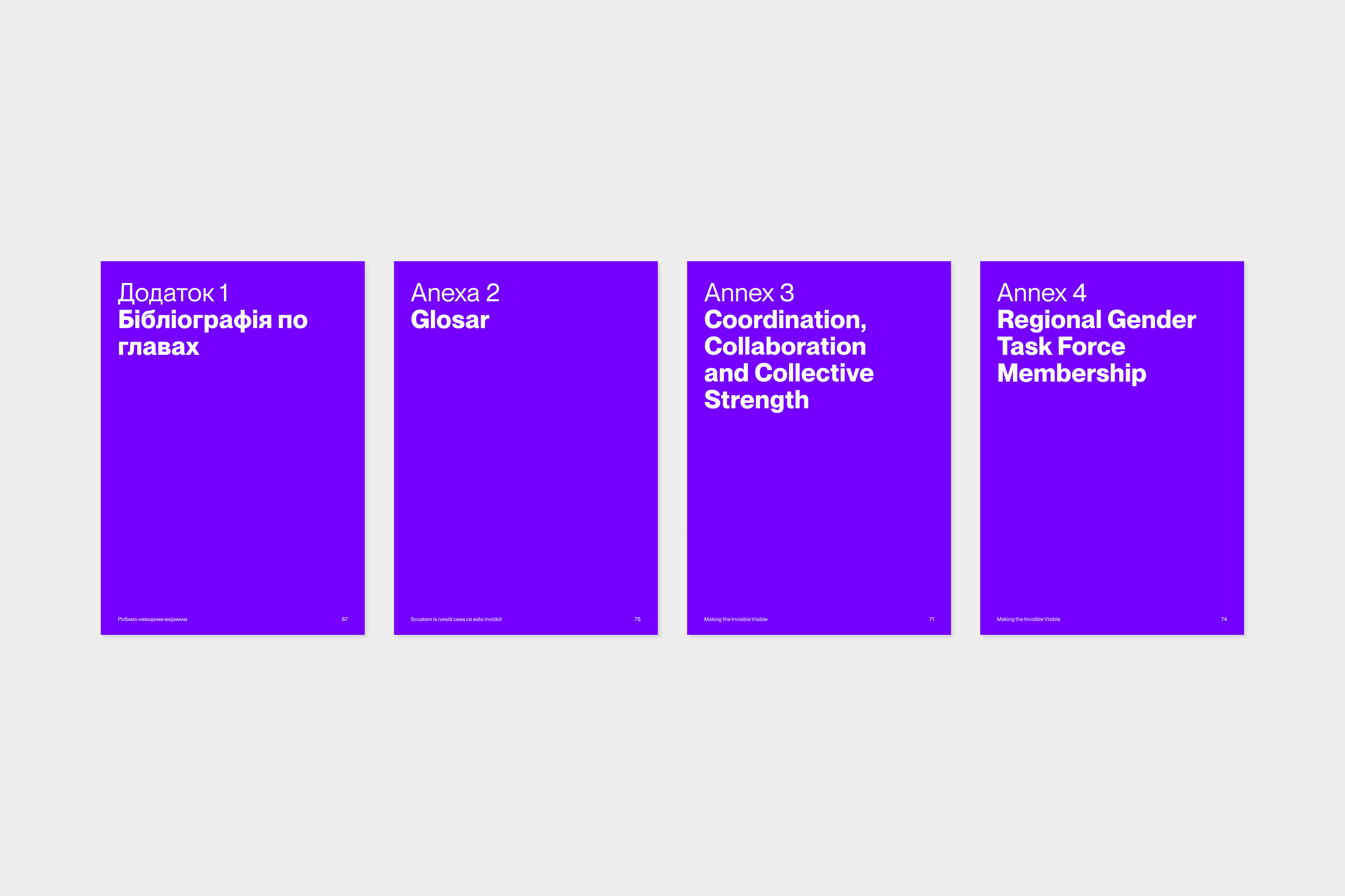
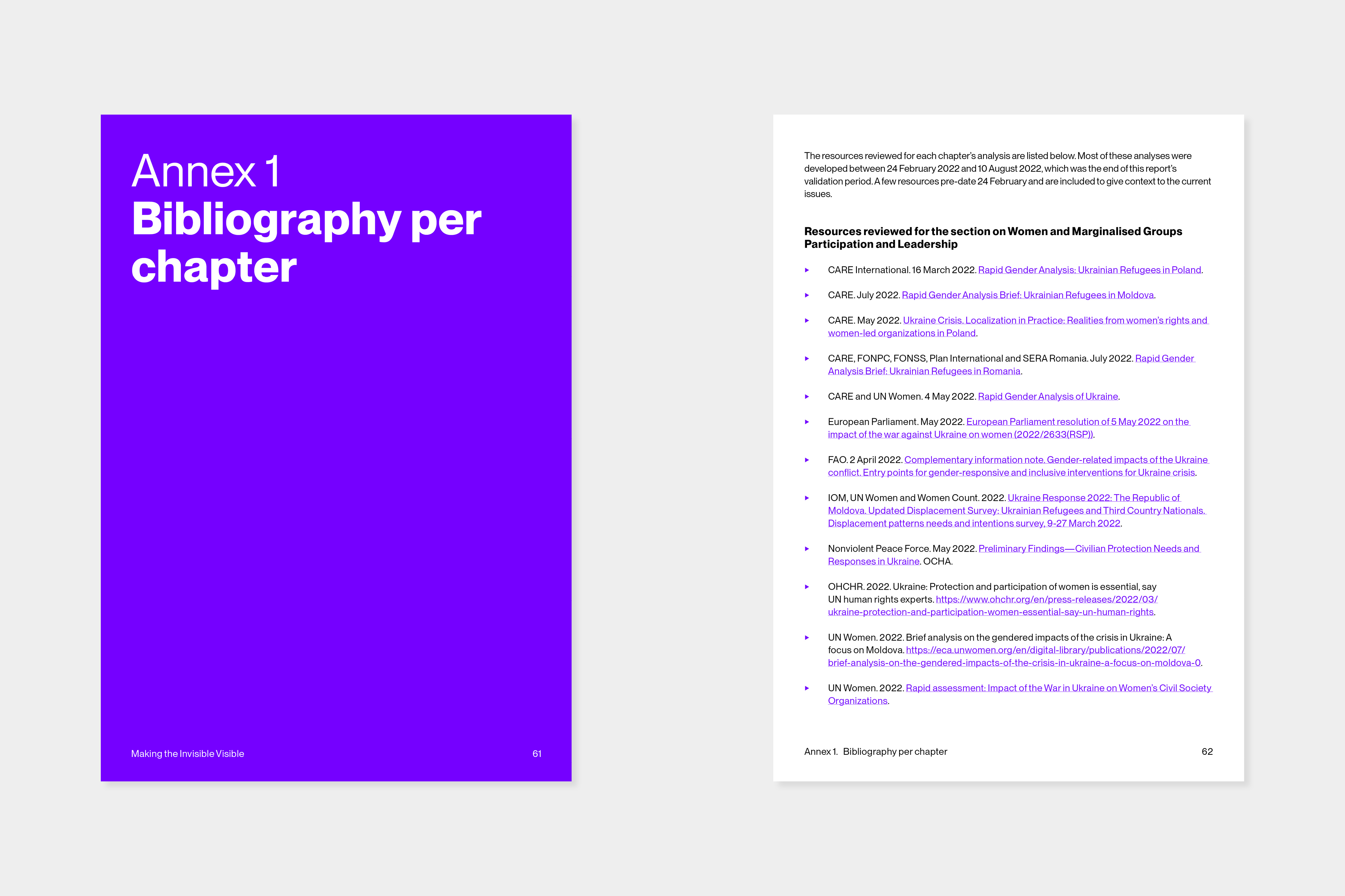
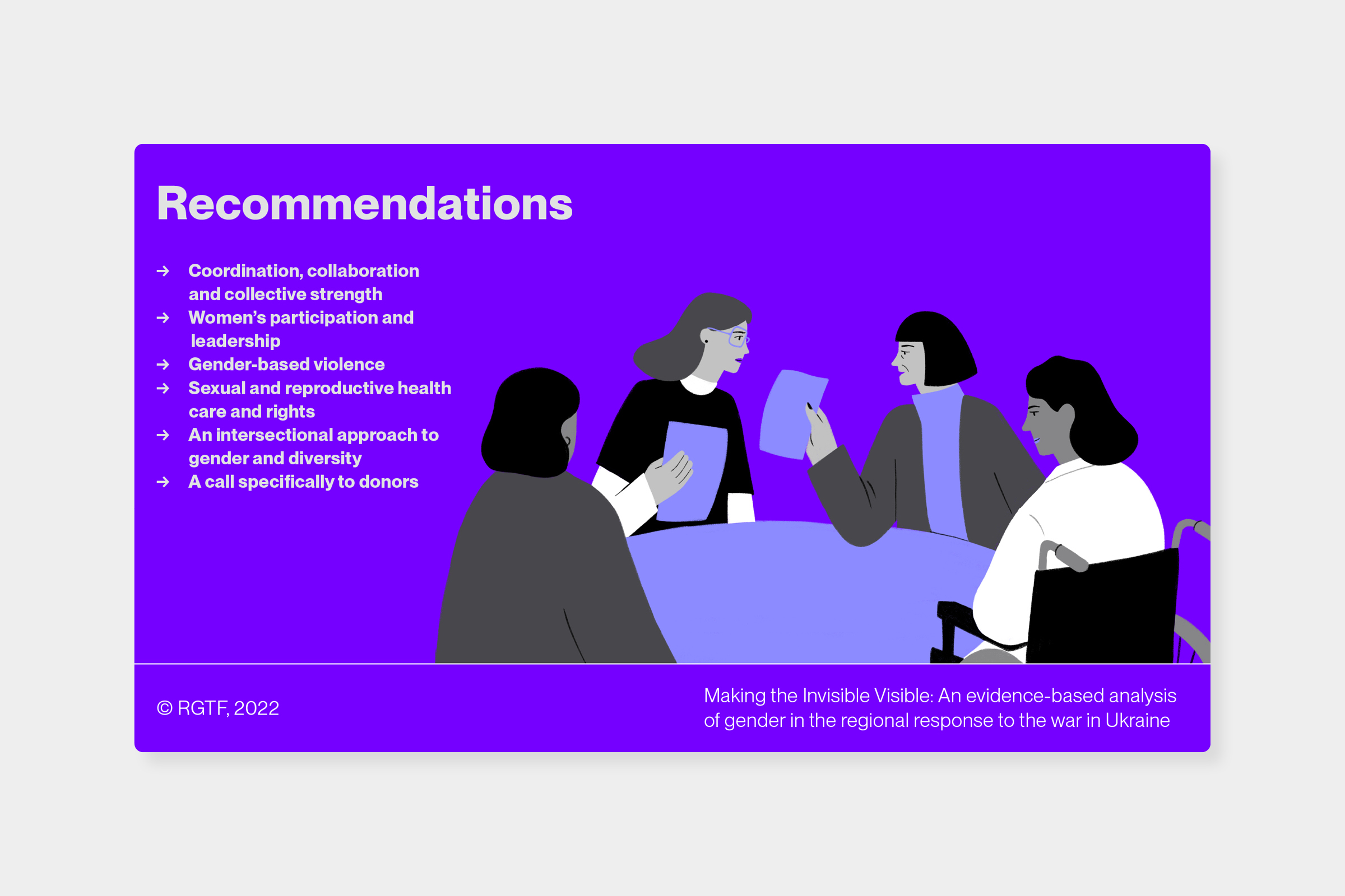
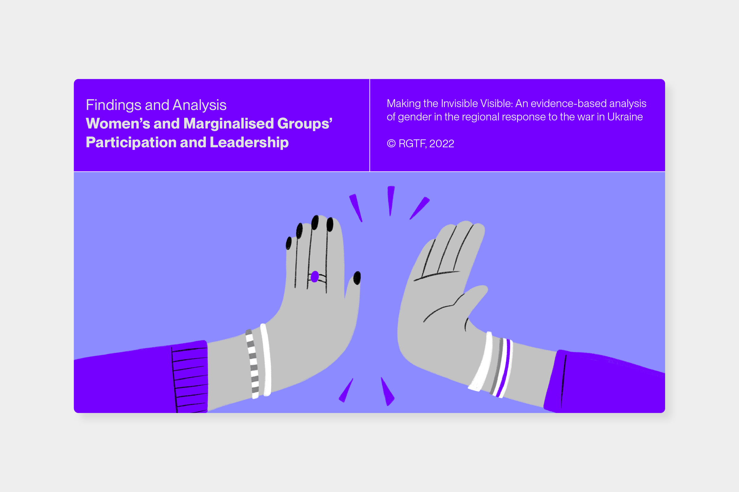
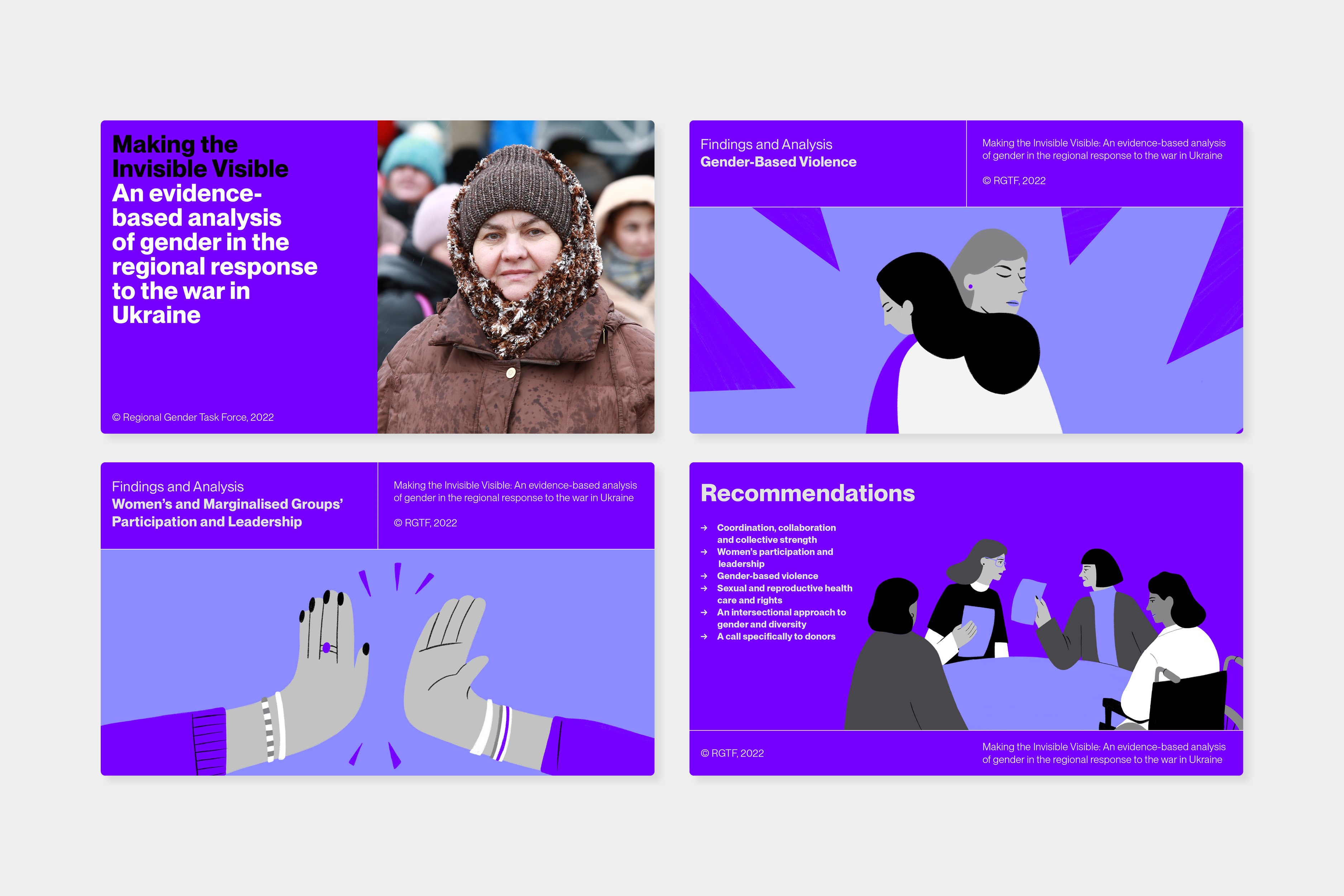

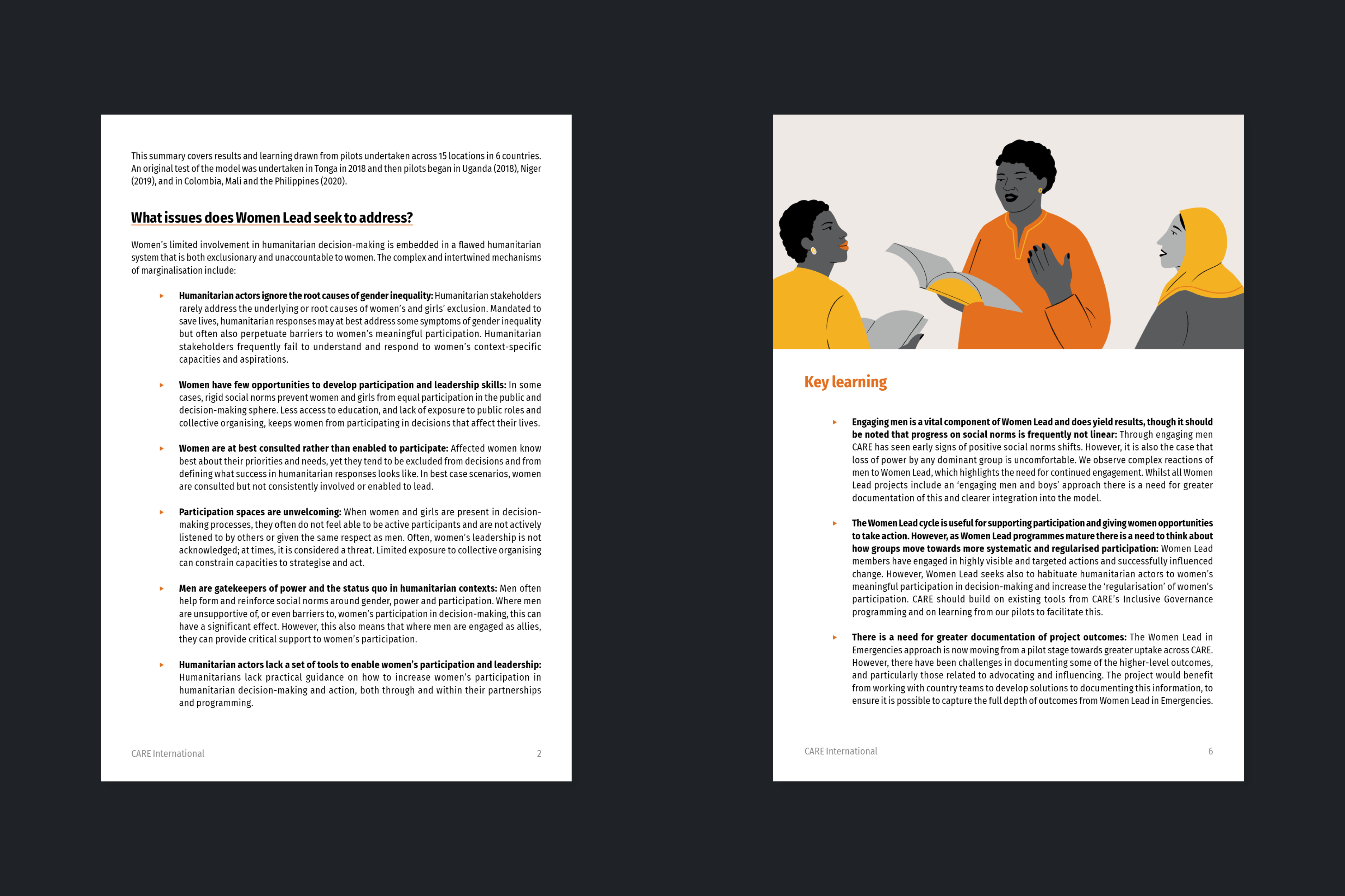
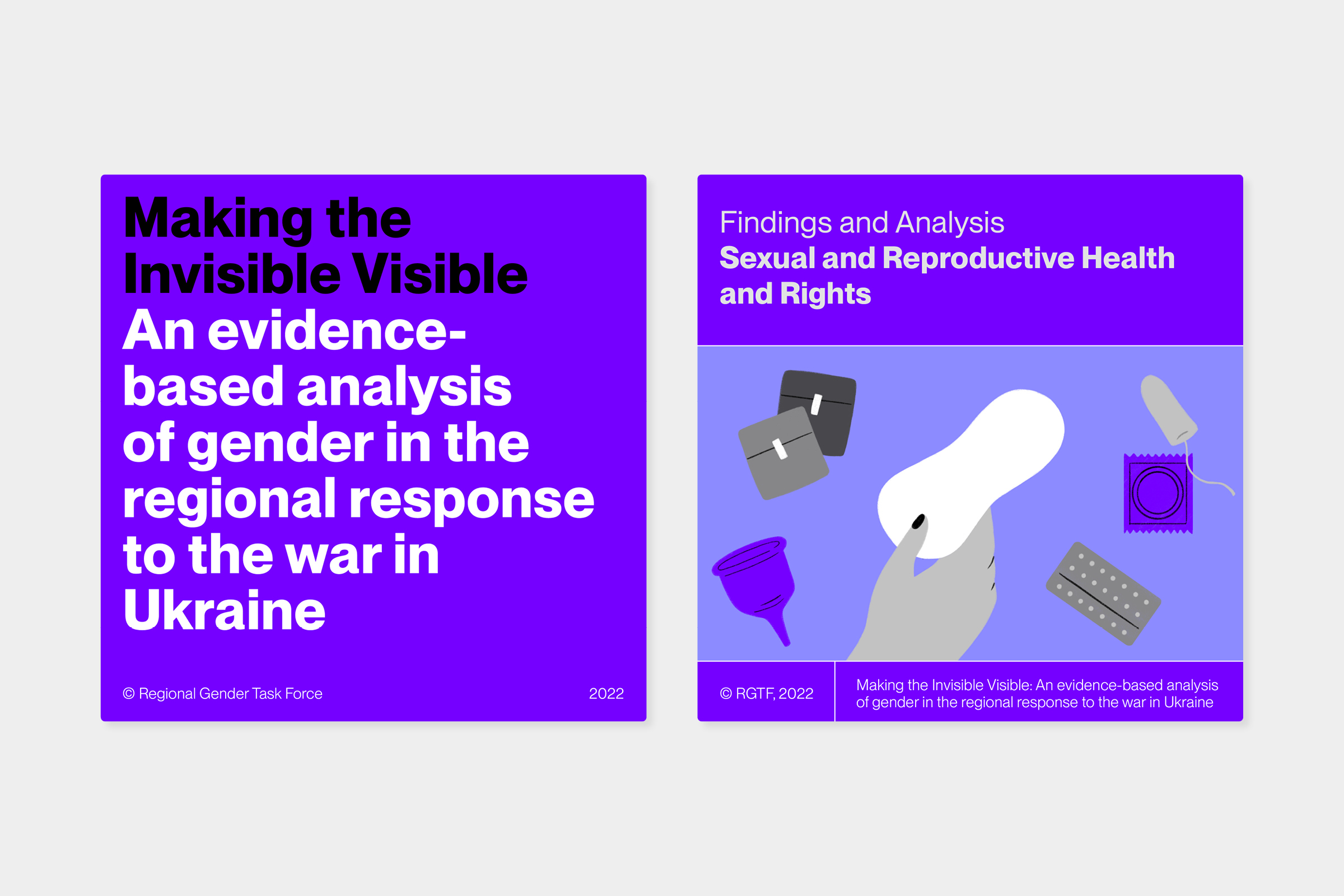
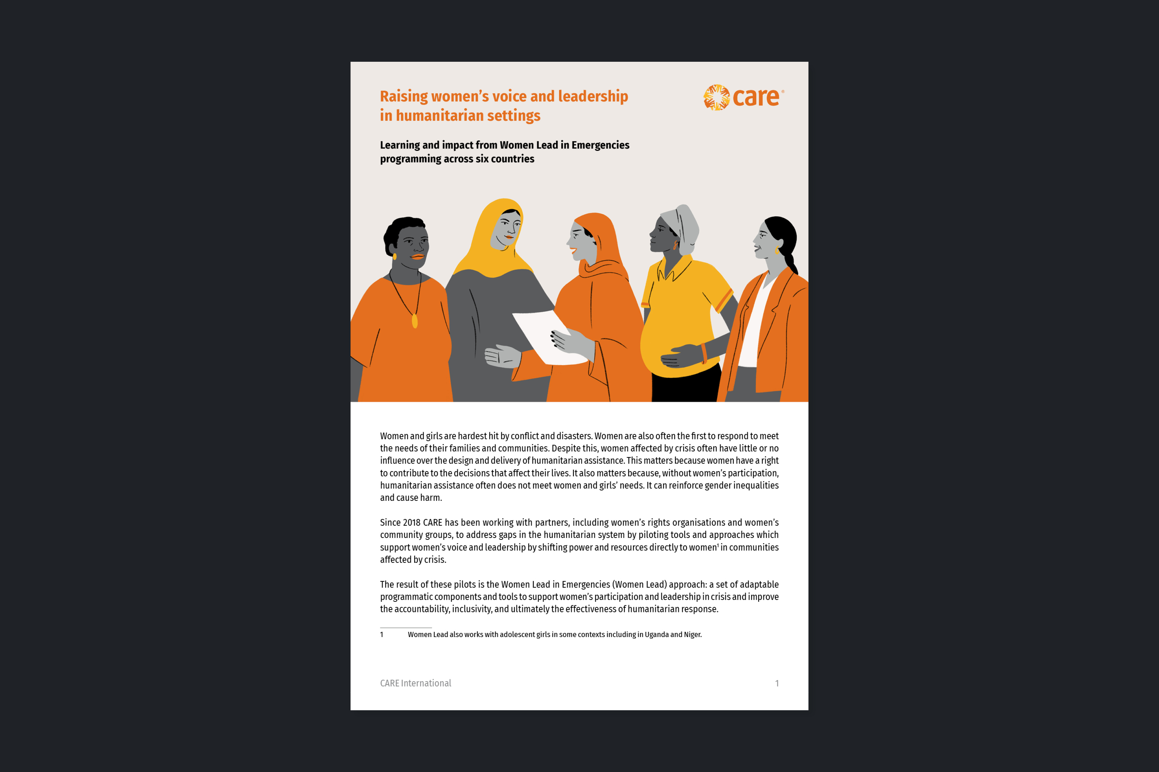
Creative direction and design of the report “Making the Invisible Visible: An evidence-based analysis of gender in the regional response to the war in Ukraine” for the Regional Gender Task Force, an inter-agency working group led by UN Women and CARE International. + Communication design for social media and presentations for media and collaborating and funding entities. / Custom icons: EPS. Illustrations: Yvonne Redín. Photography: CARE International. <2022>
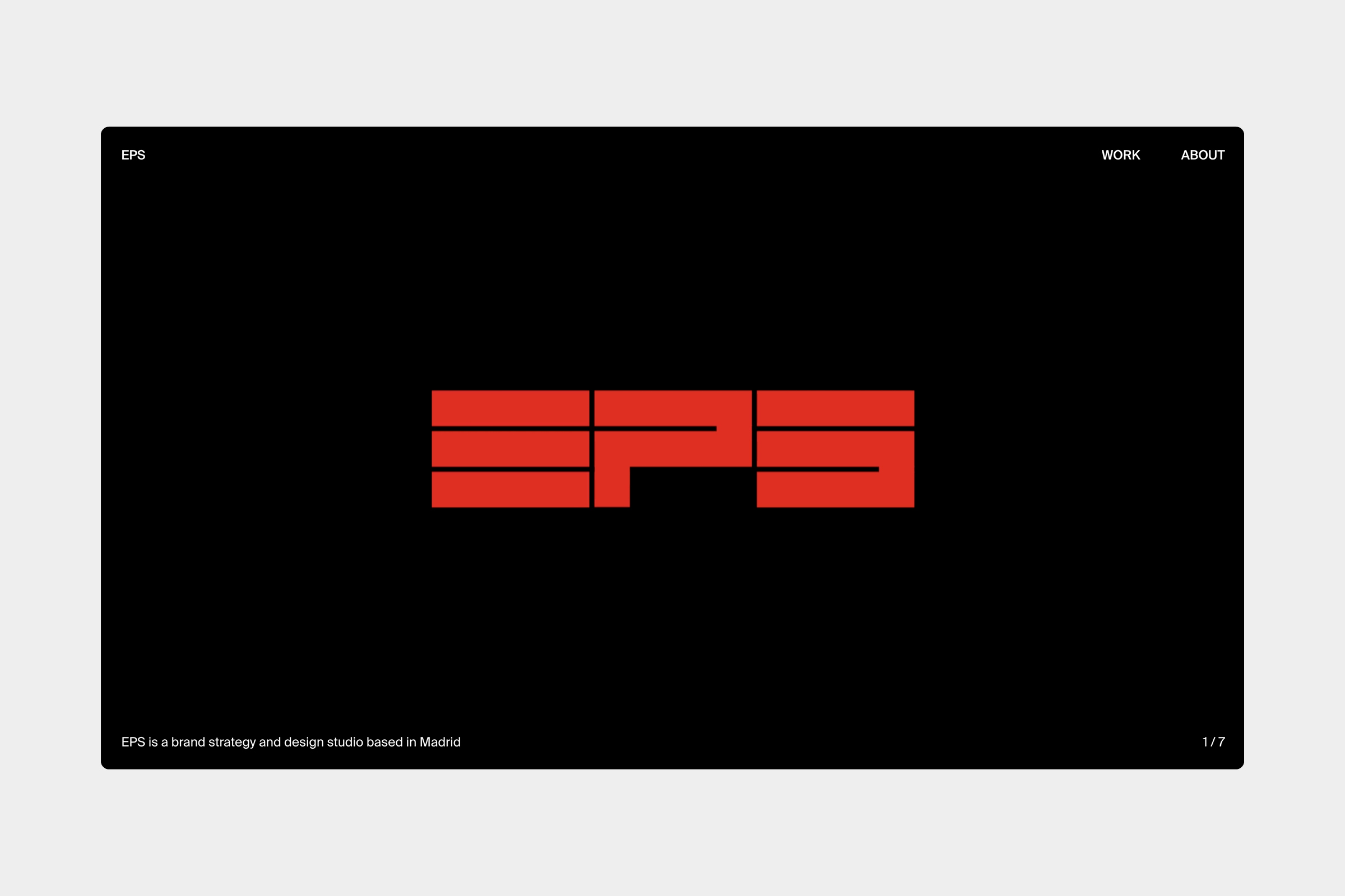
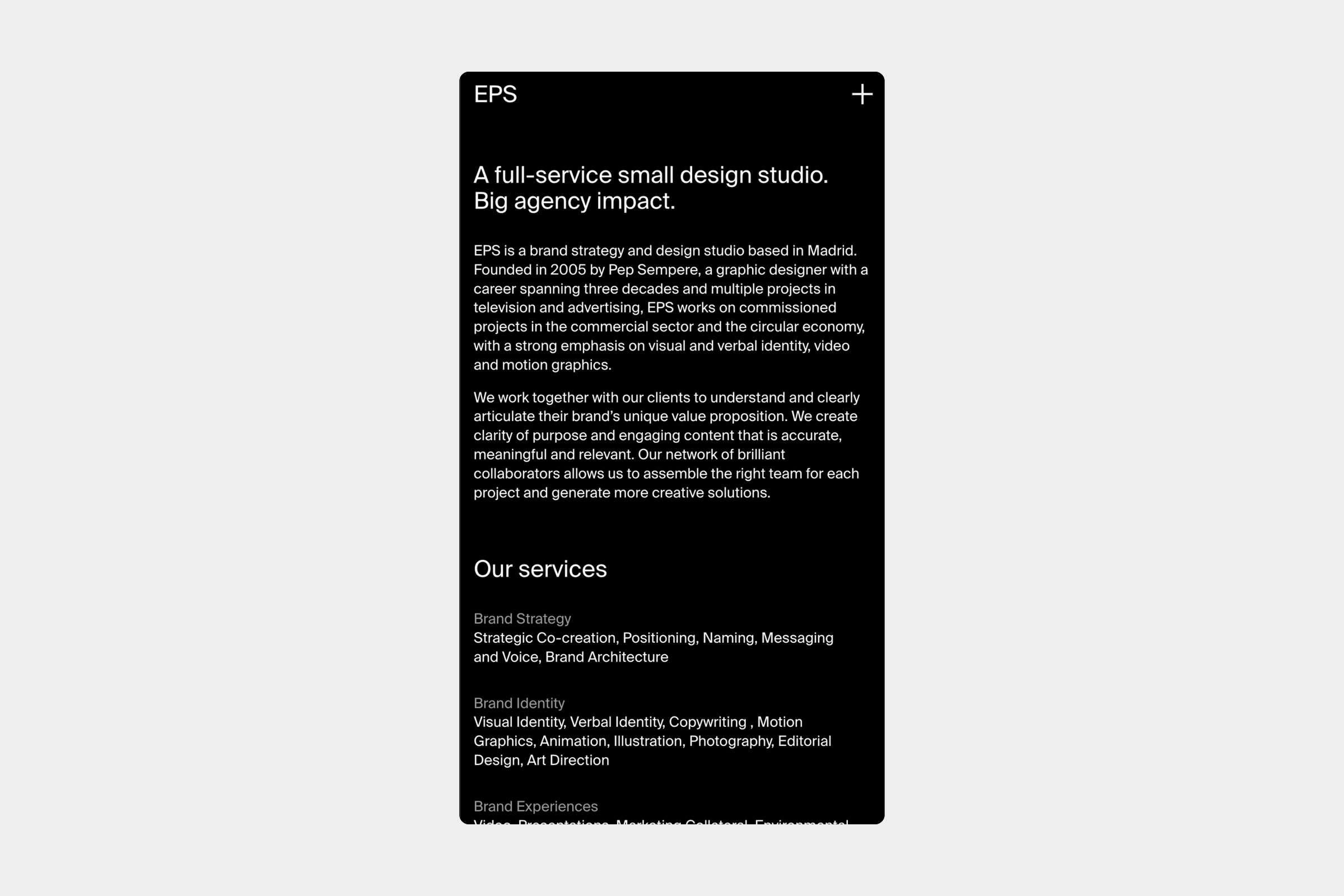
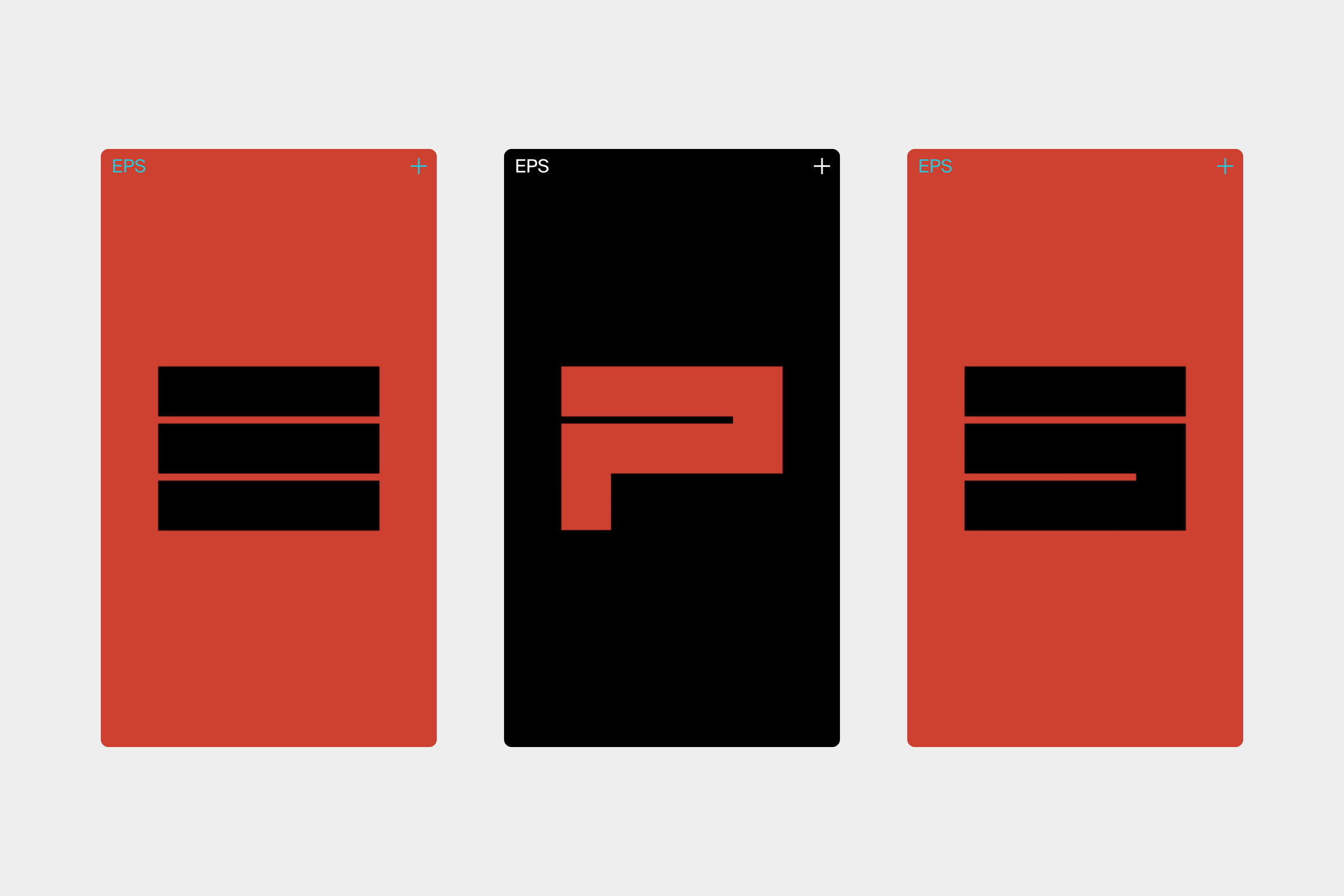
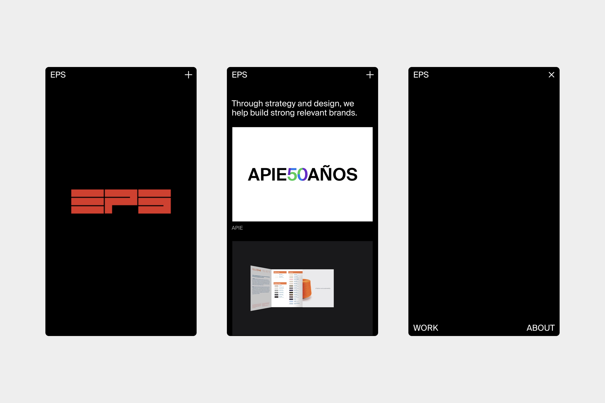
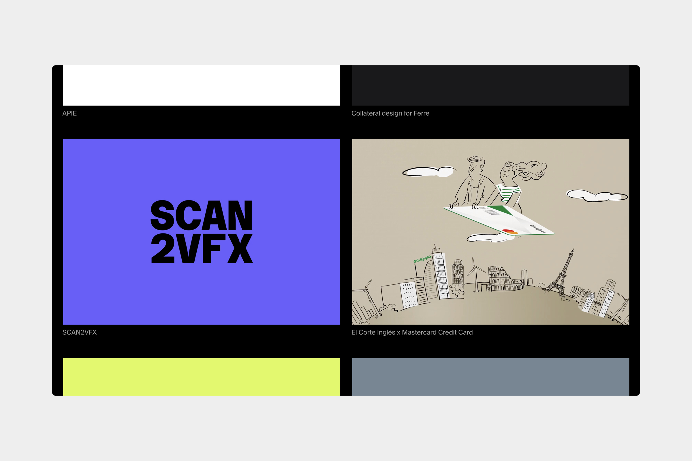
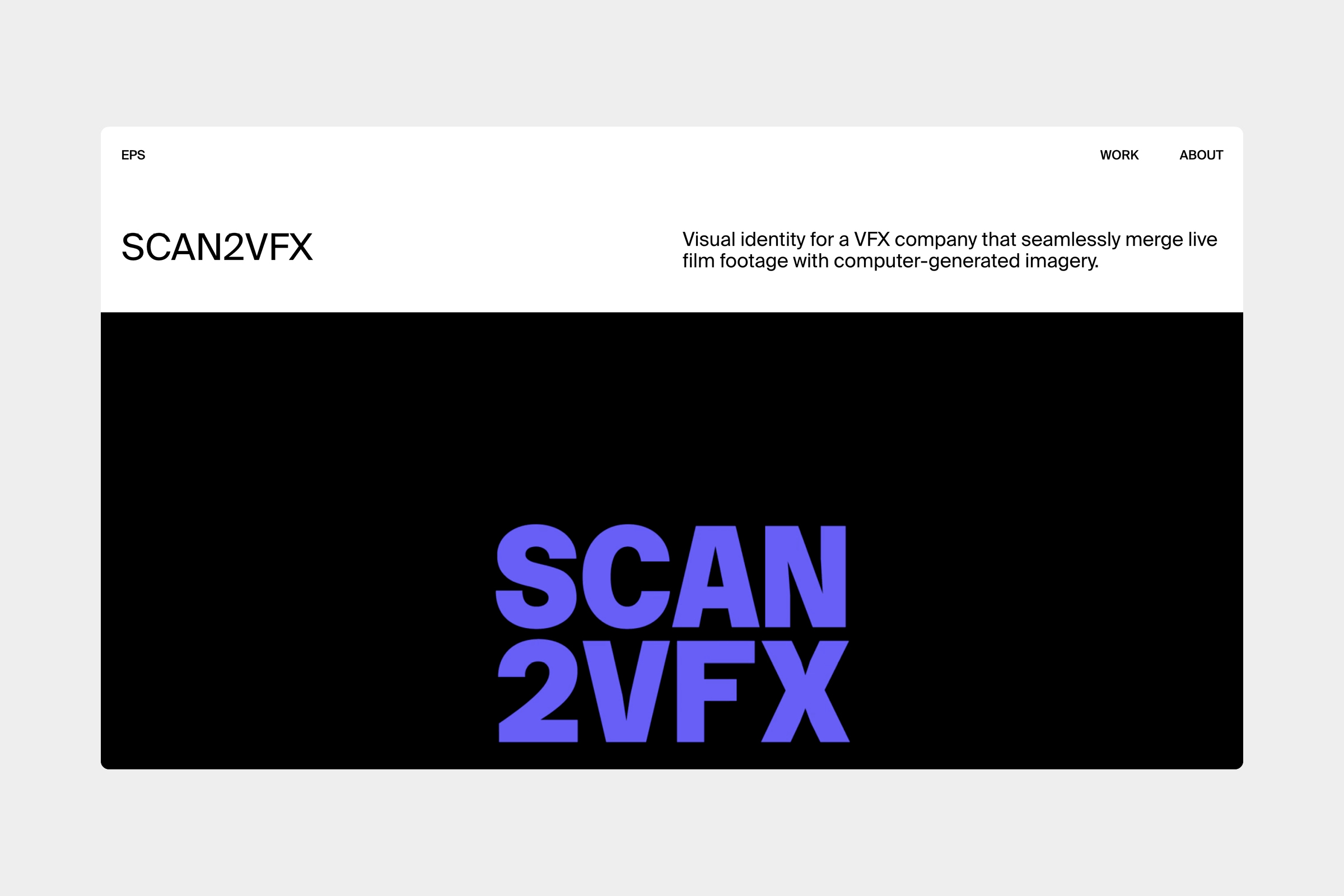
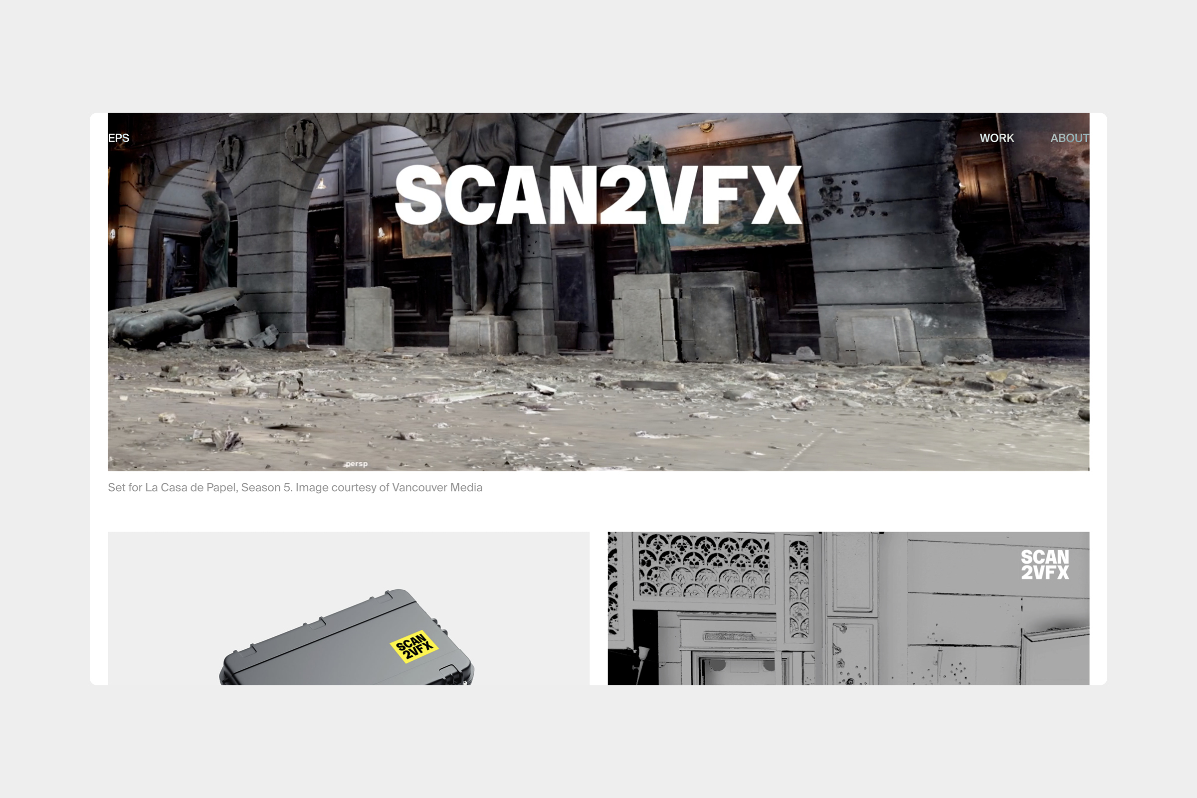
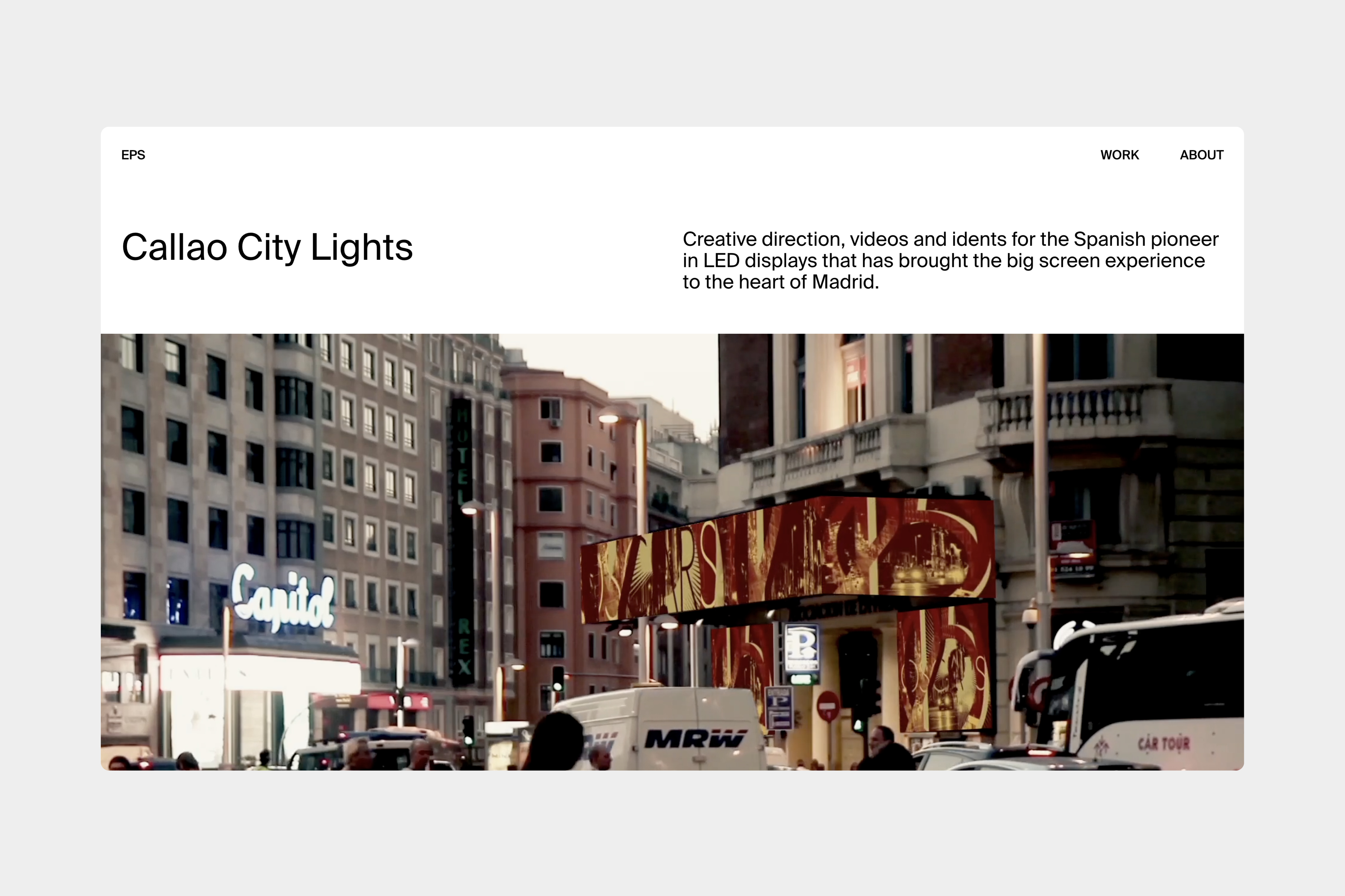
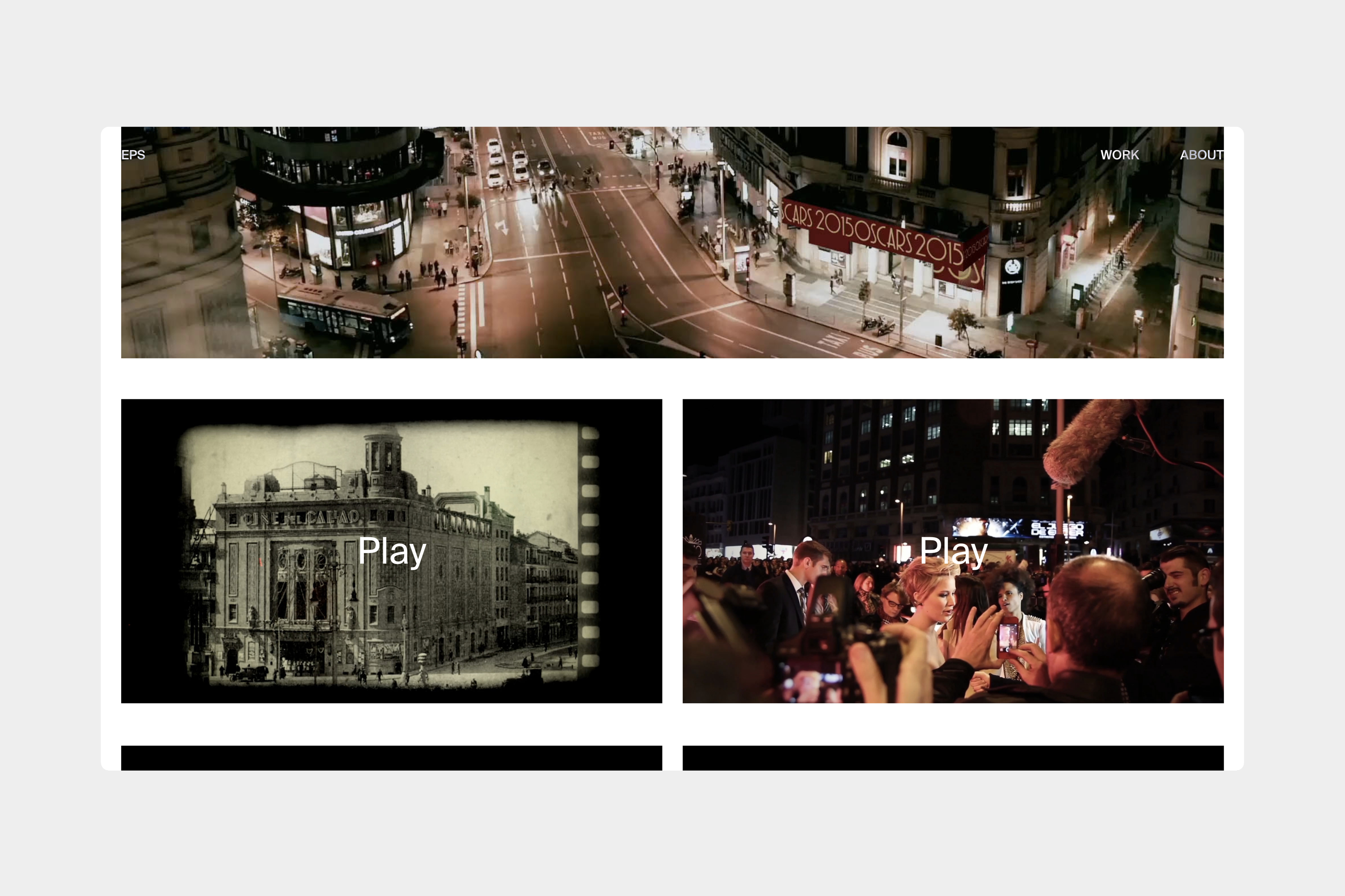
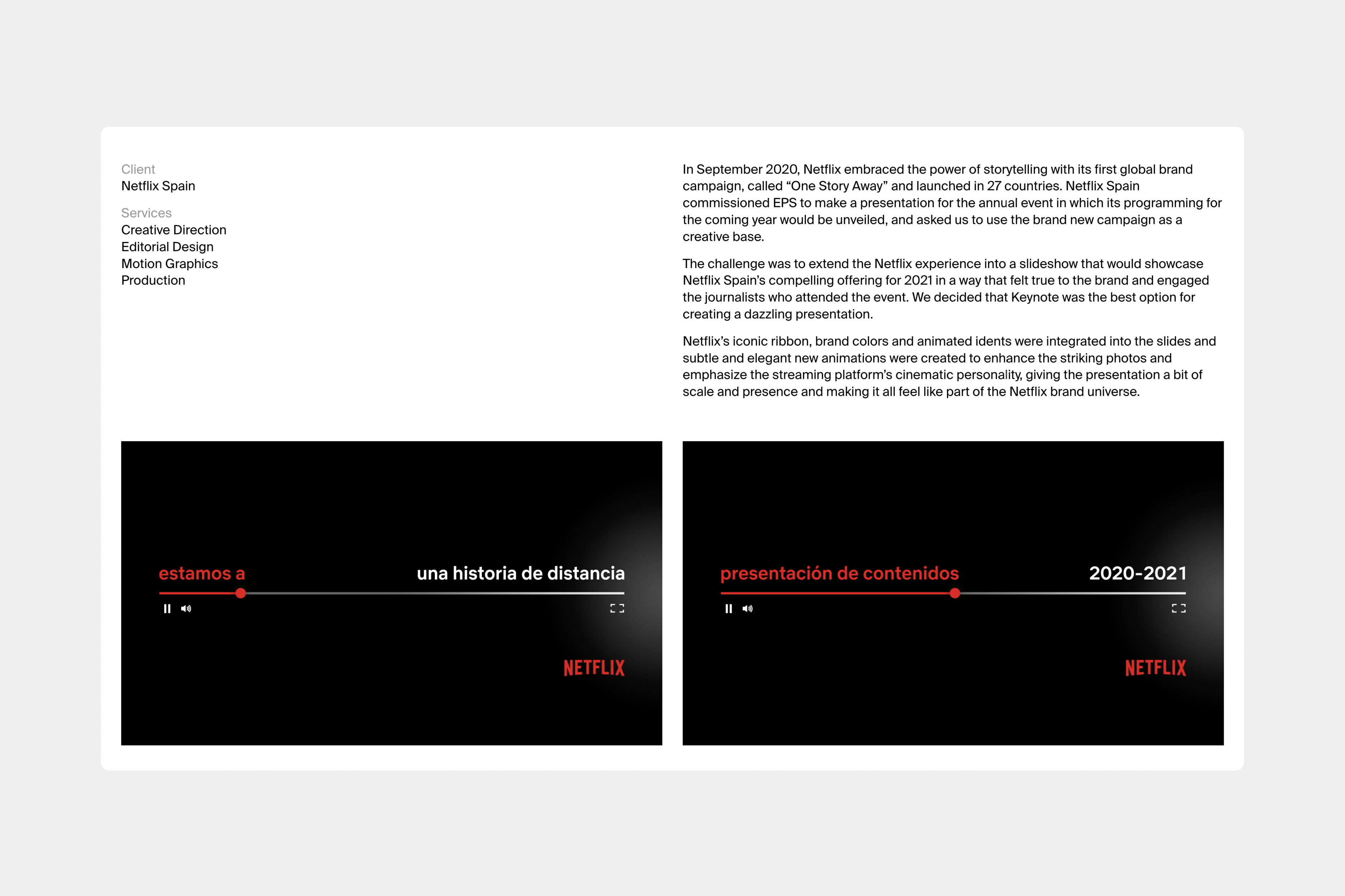
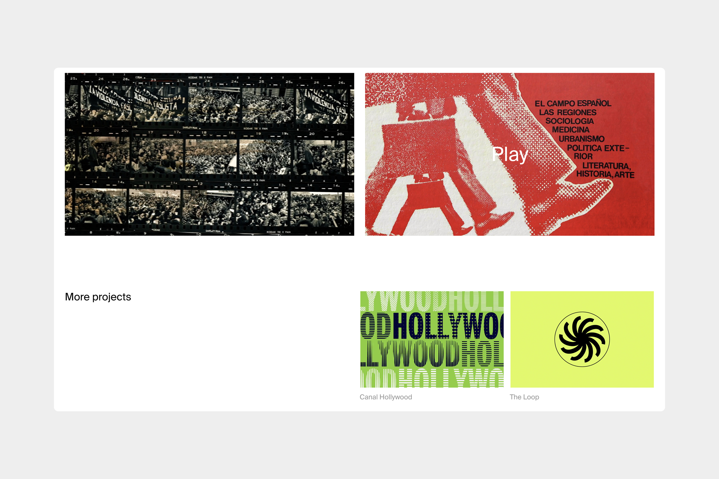
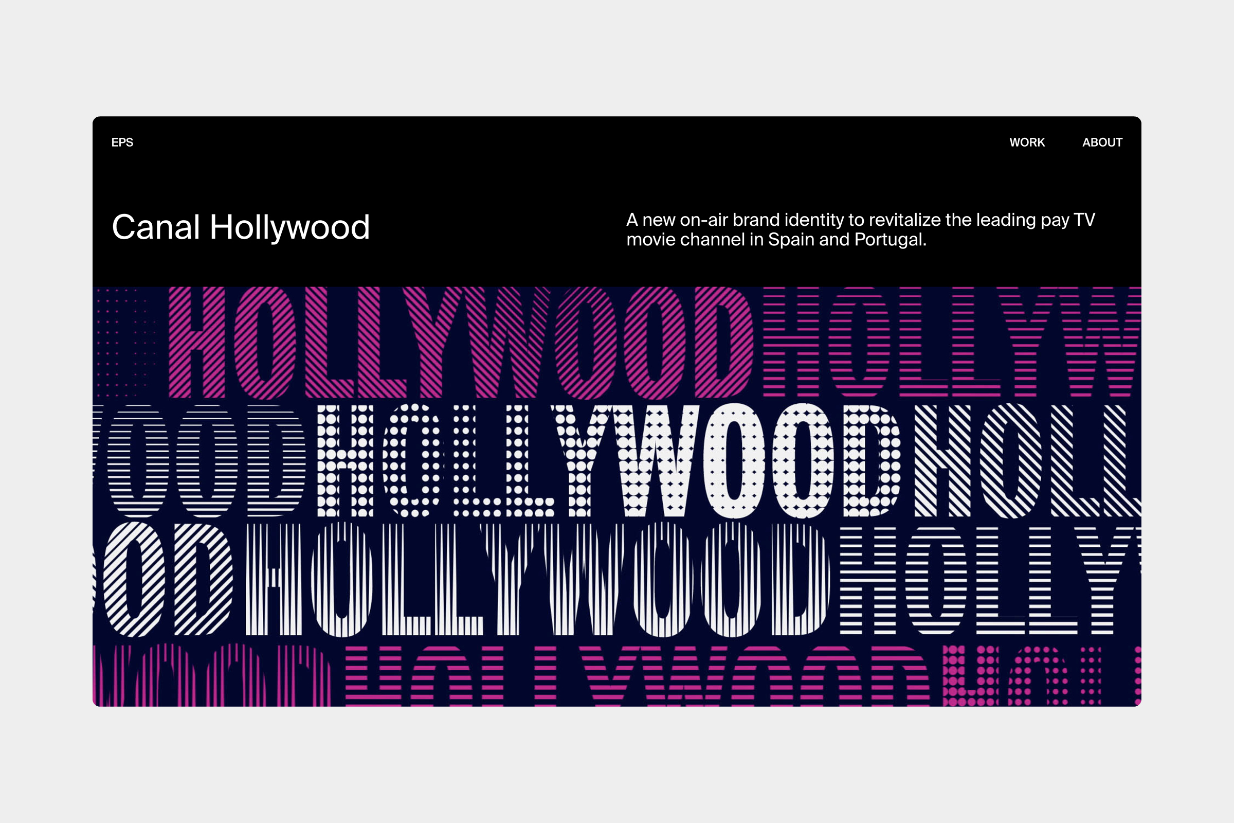
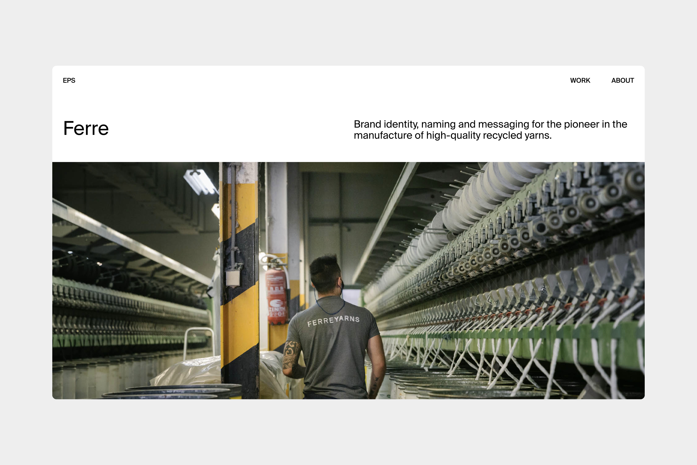
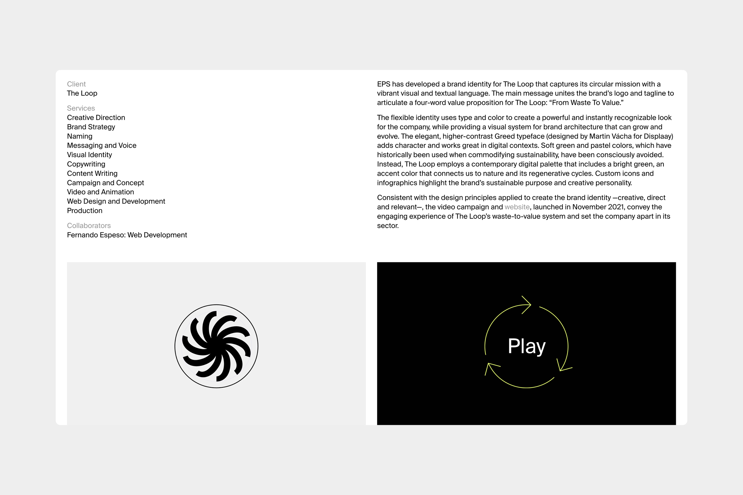
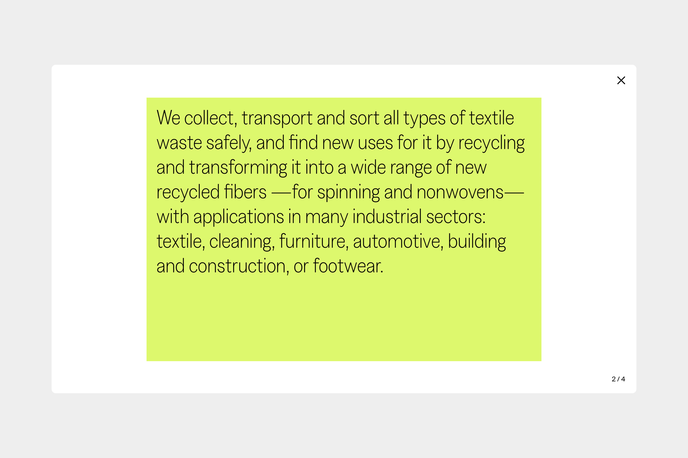
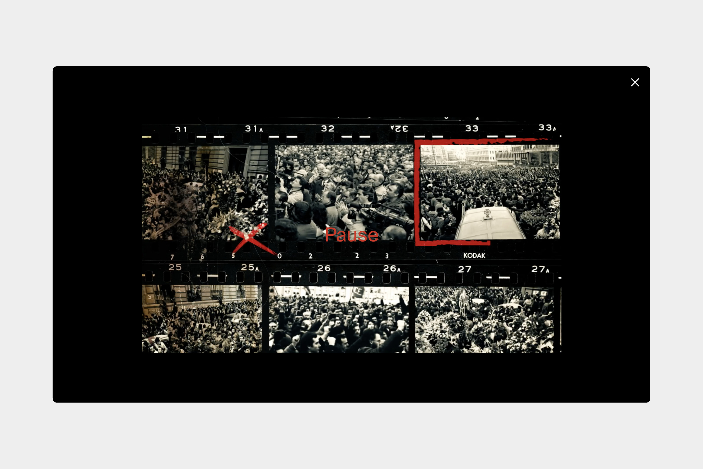
Design of the EPS website, which presents a selection of the studio's projects from 2005 to the present, placing equal emphasis on images, text, and movement to update the way of communicating the vast potential of connecting strategy, design, and creative content to help brands grow and evolve. / Web development: Aurora Saseta. <2021-2022>
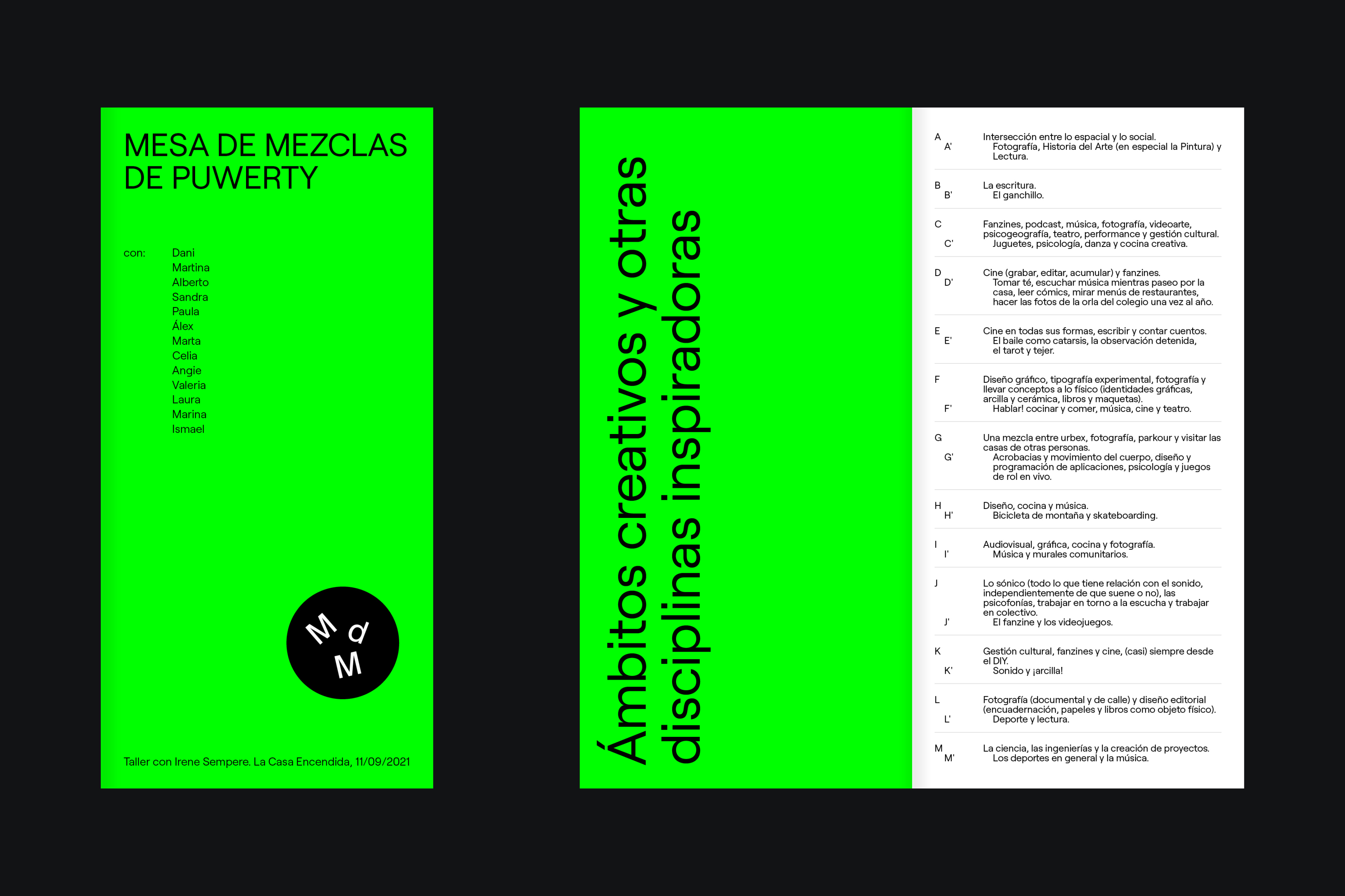
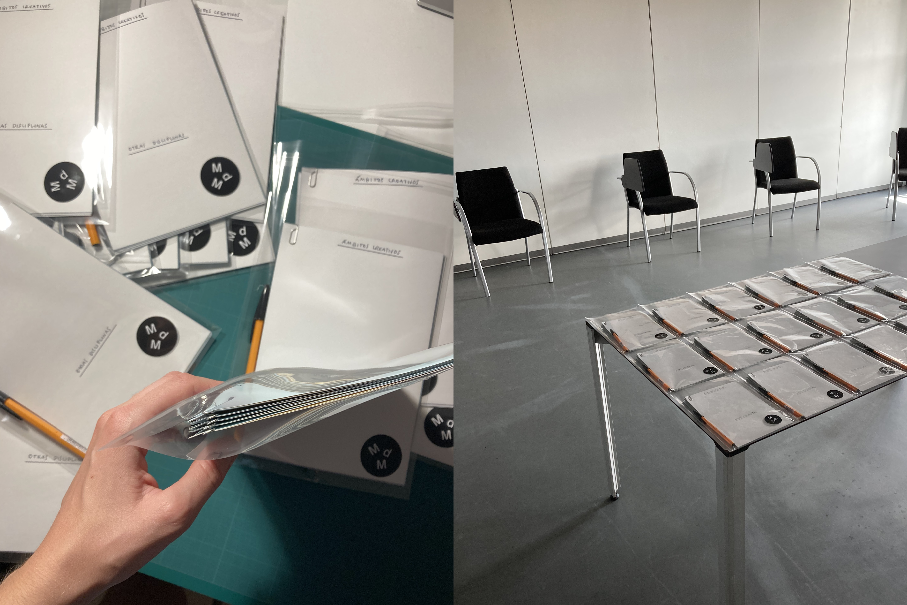
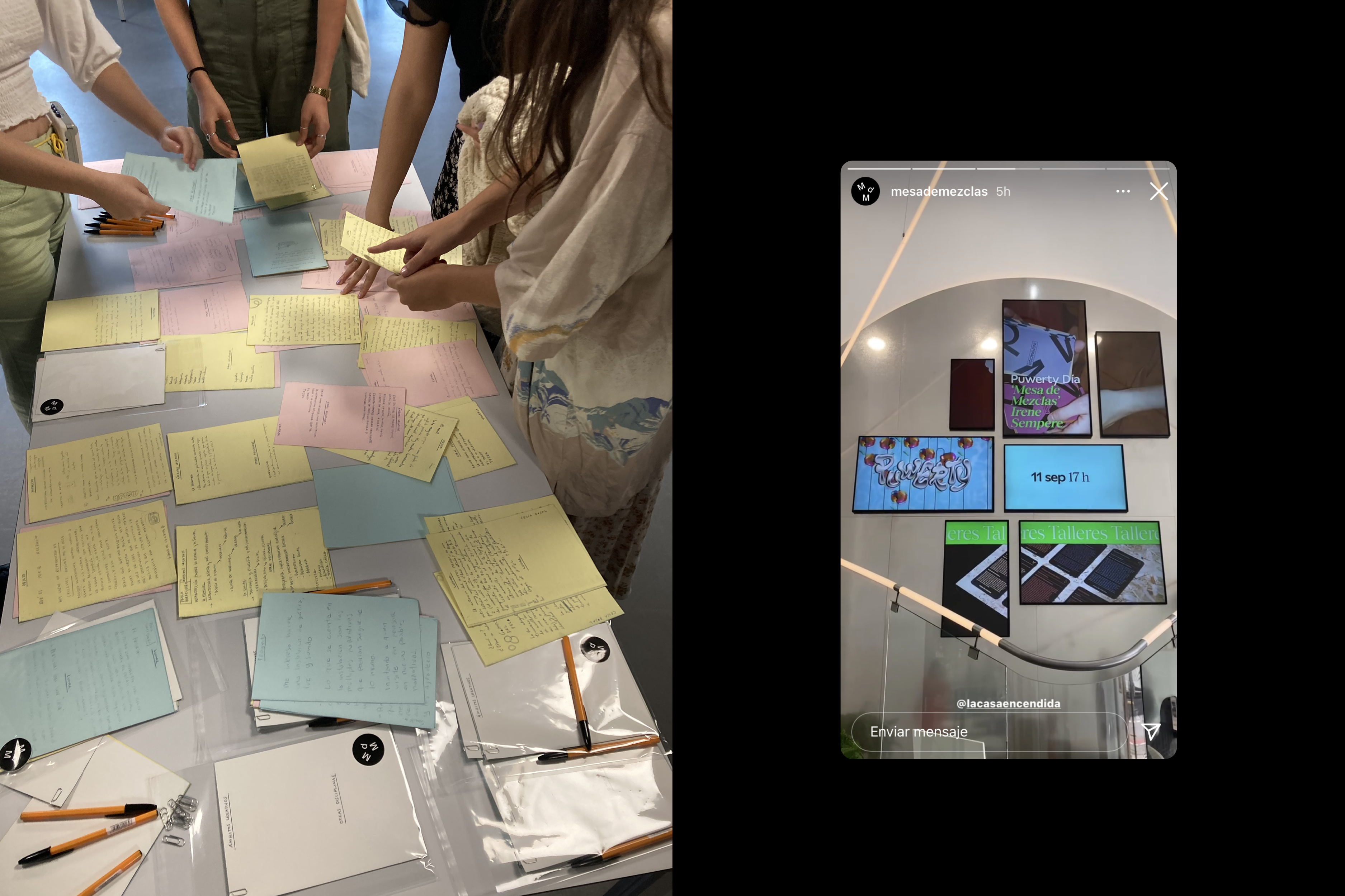
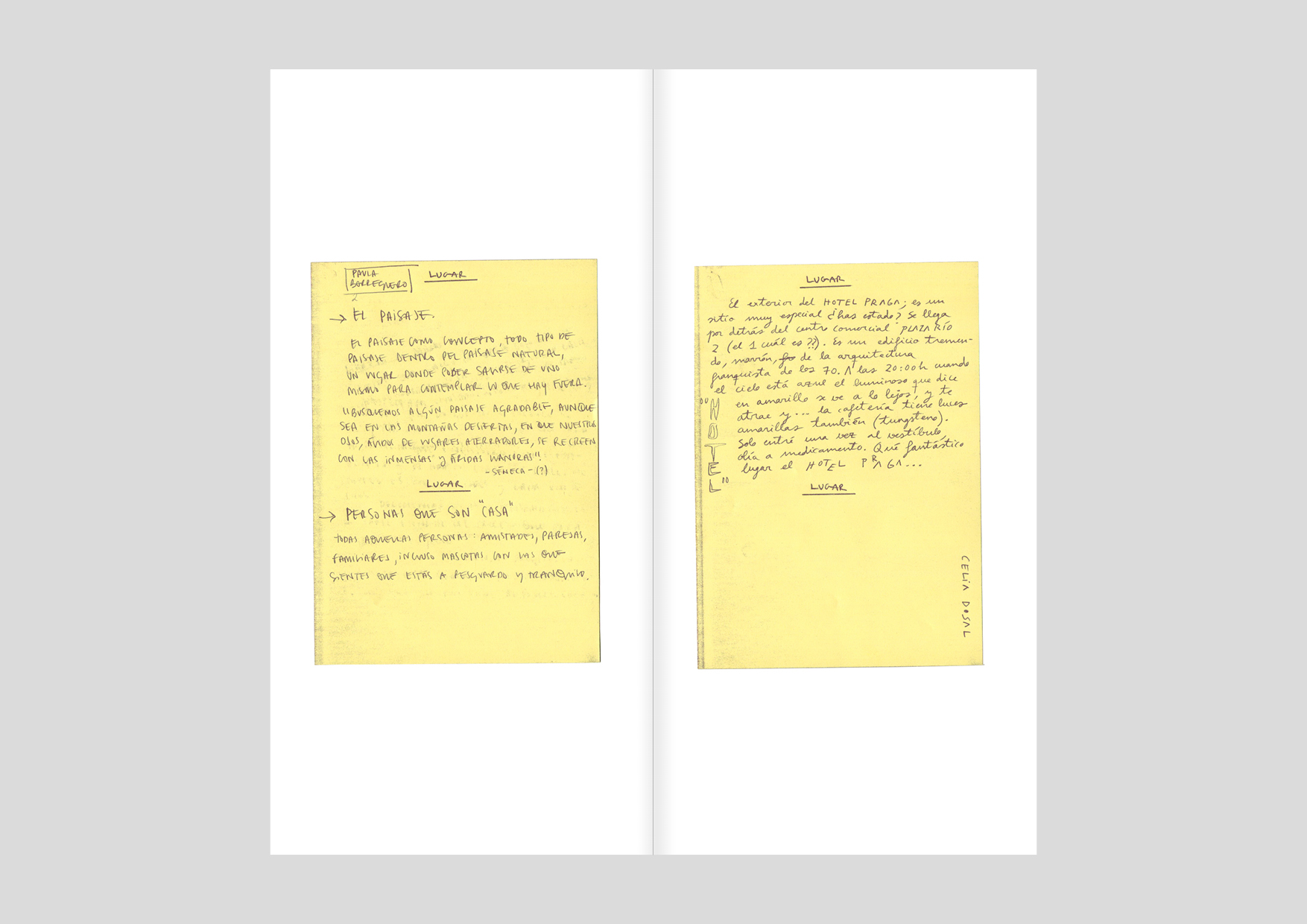
Edition and design of the digital publication “Mesa de Mezclas de Puwerty”, which compiles the projects and materials resulting from the collective writing and ideation workshop Mesa de Mezclas, held on 11/09/2021 during the 5th edition of the Puwerty, the youth culture festival at La Casa Encendida. <2021>
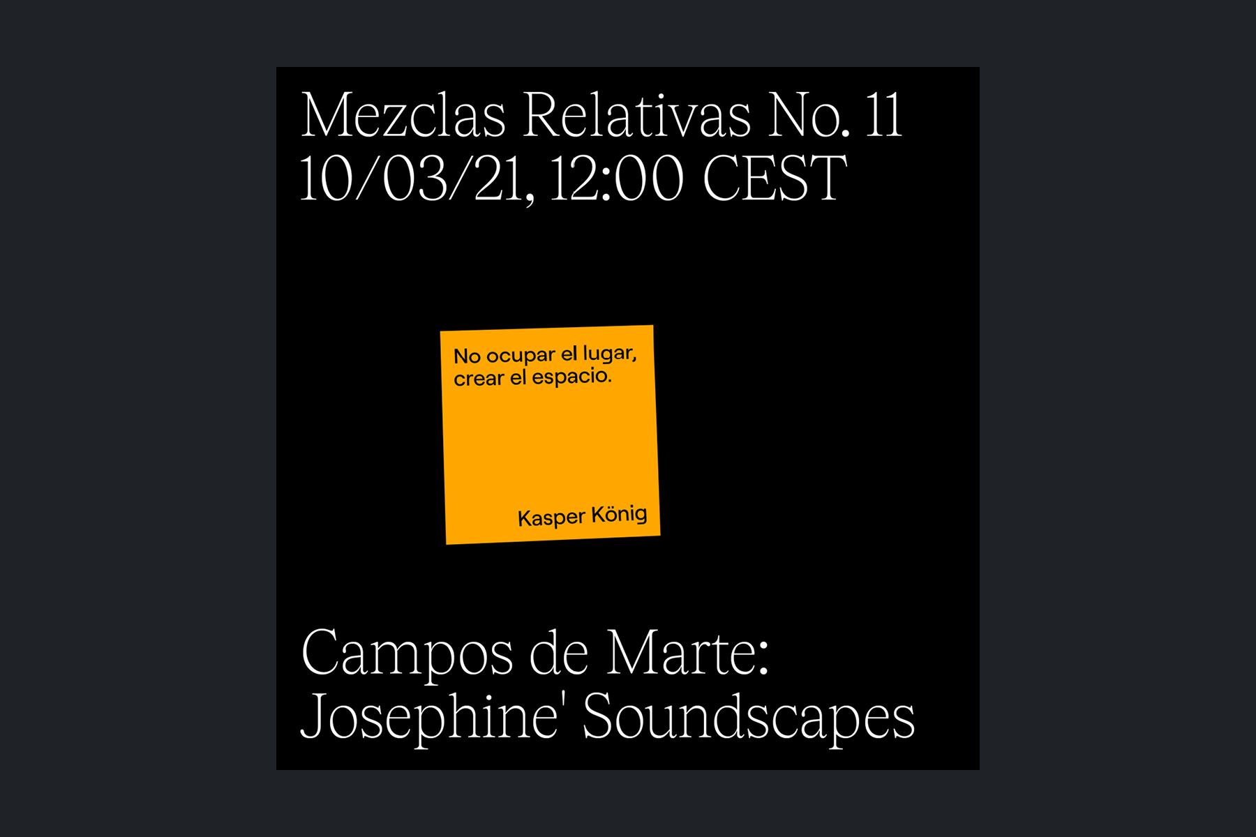
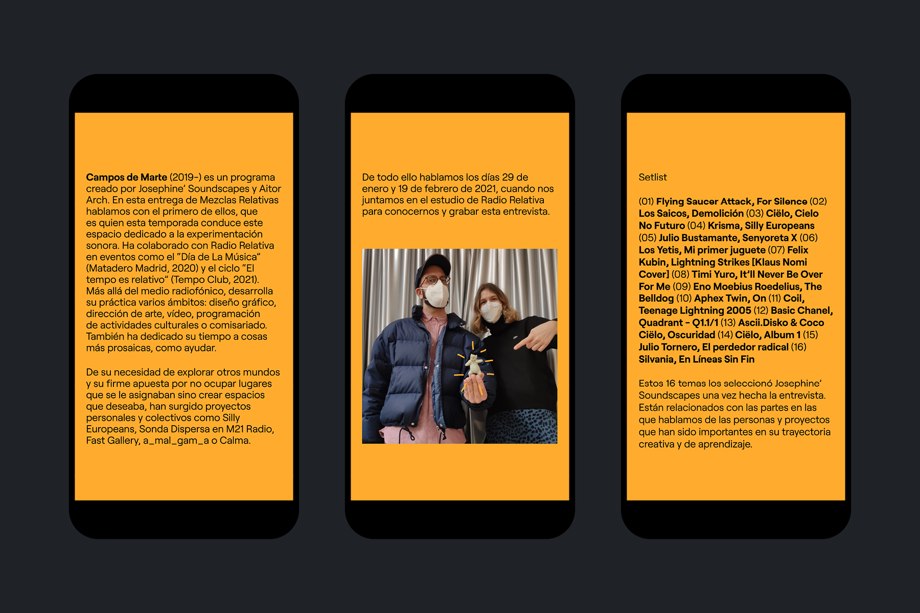
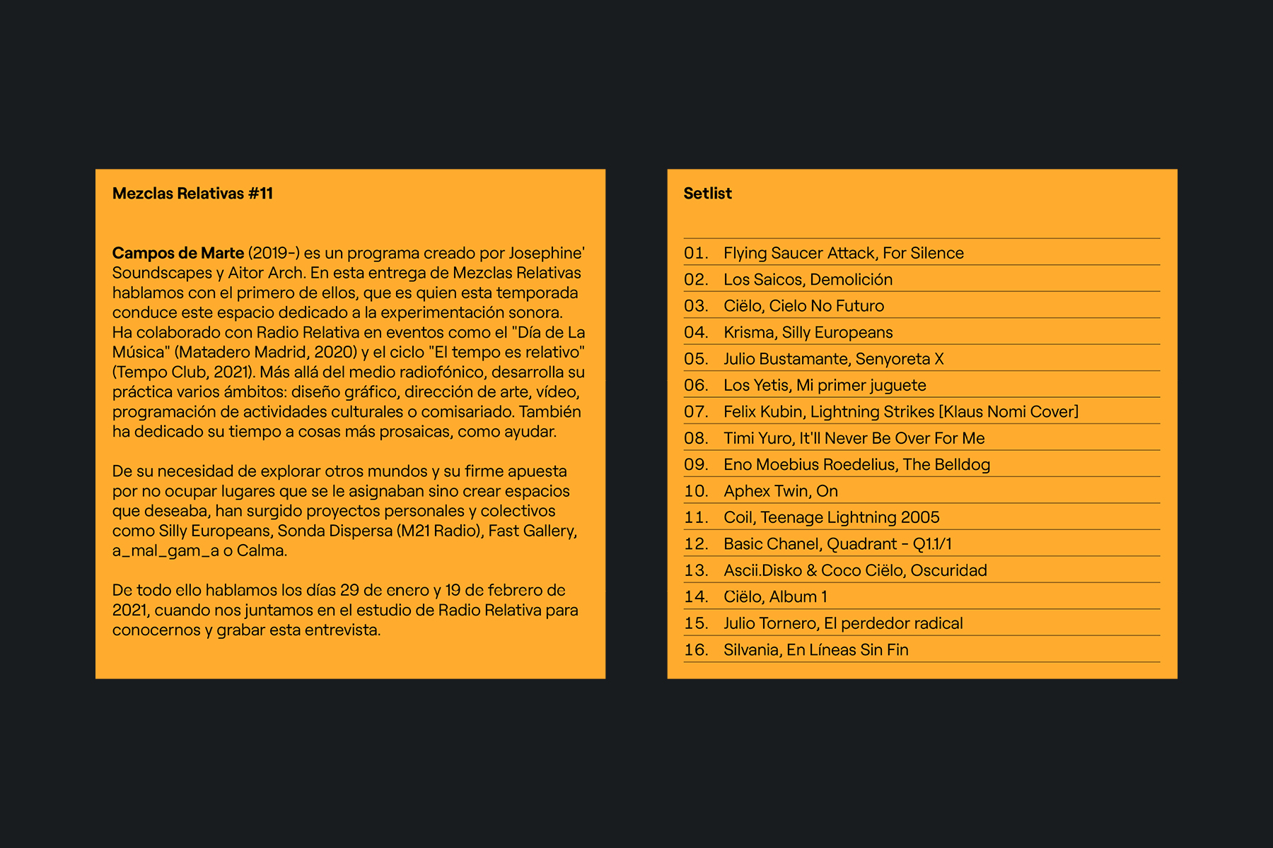
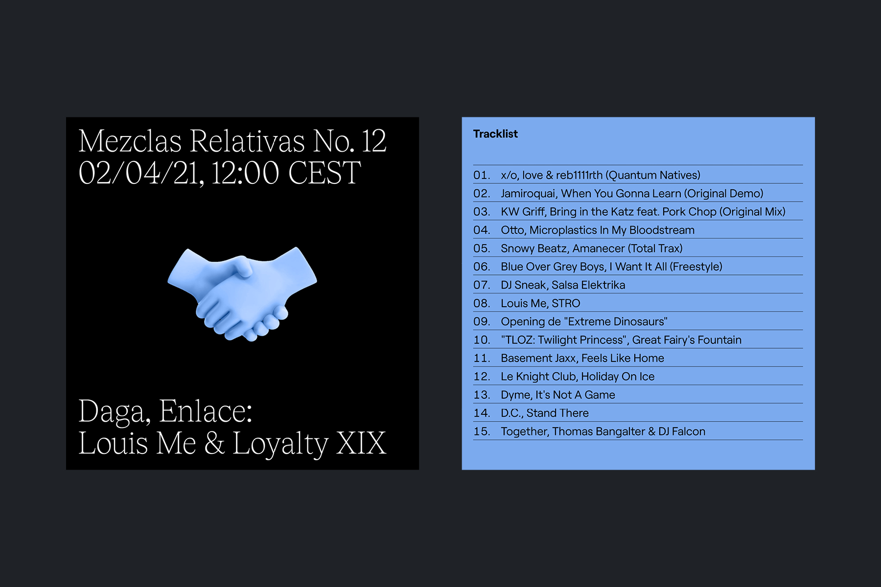
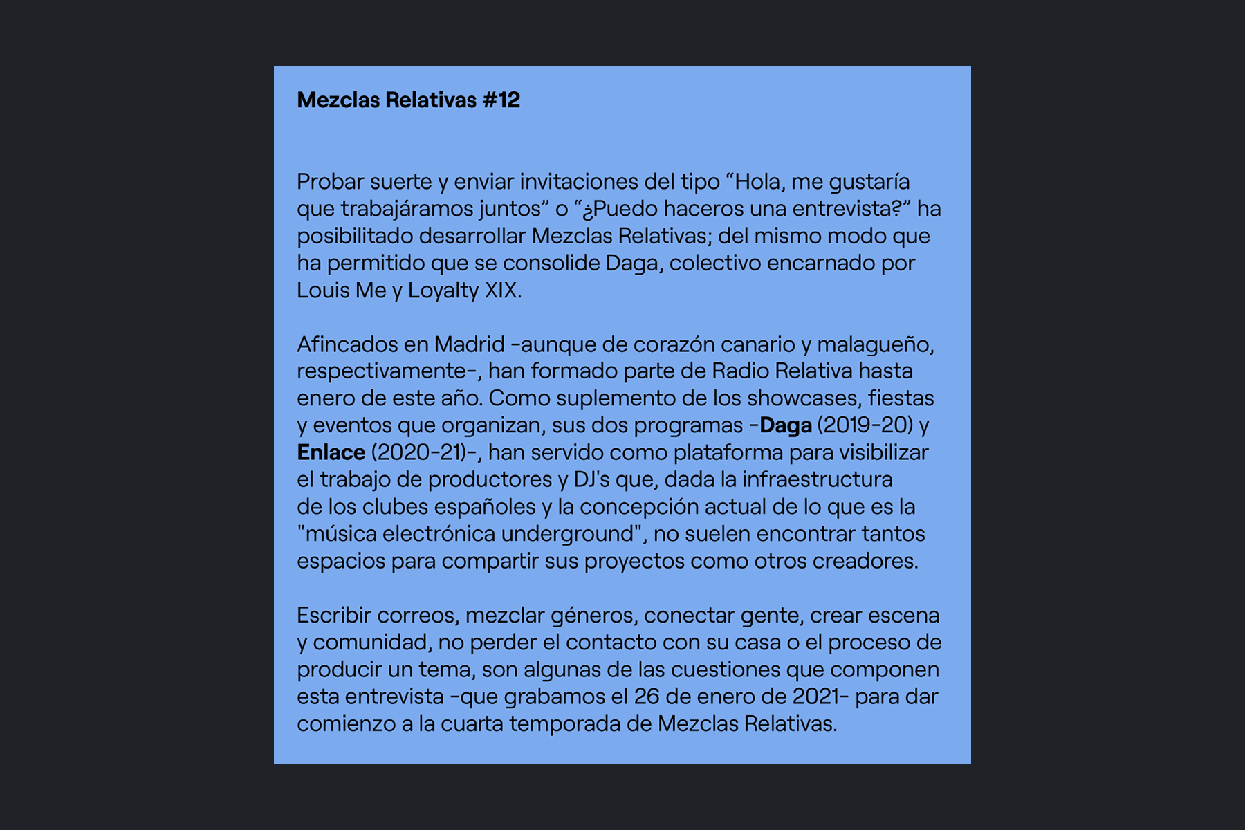
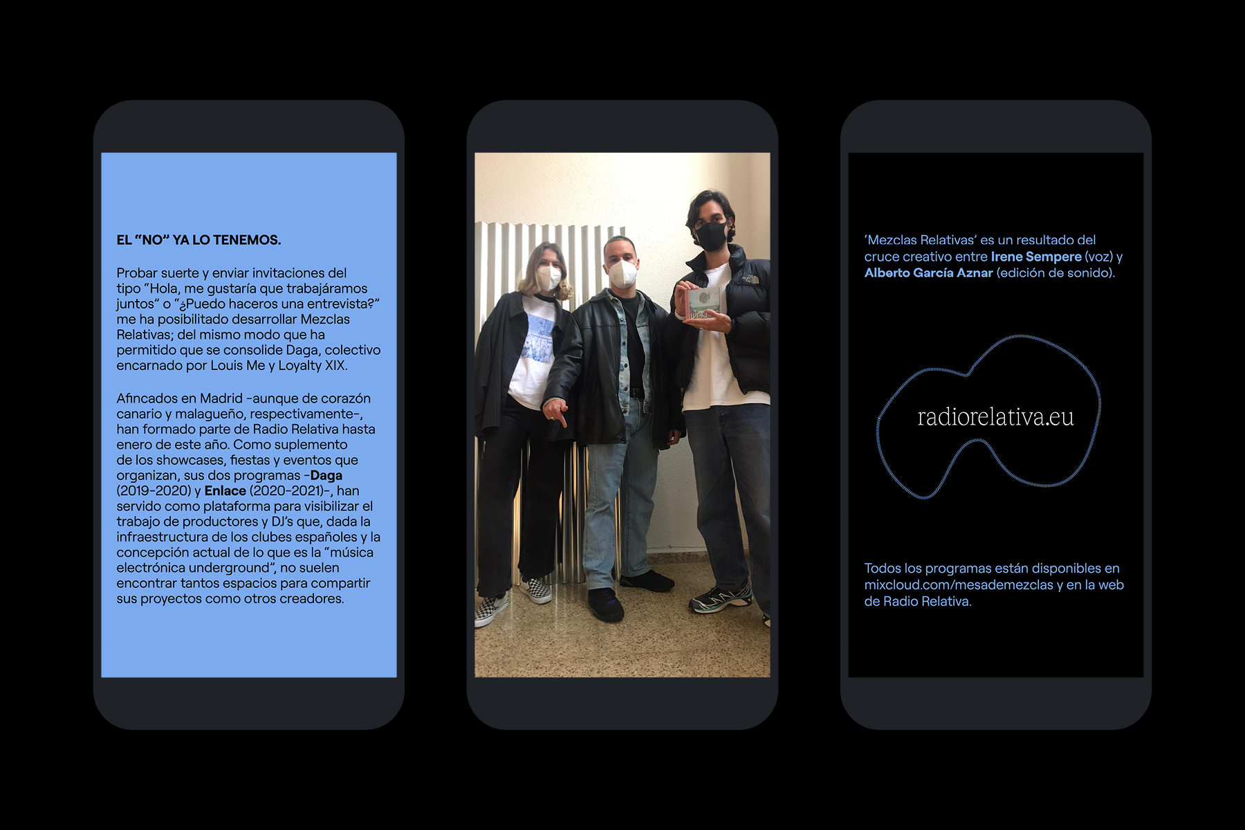
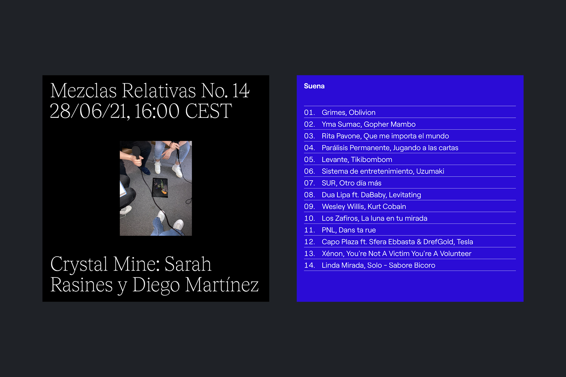
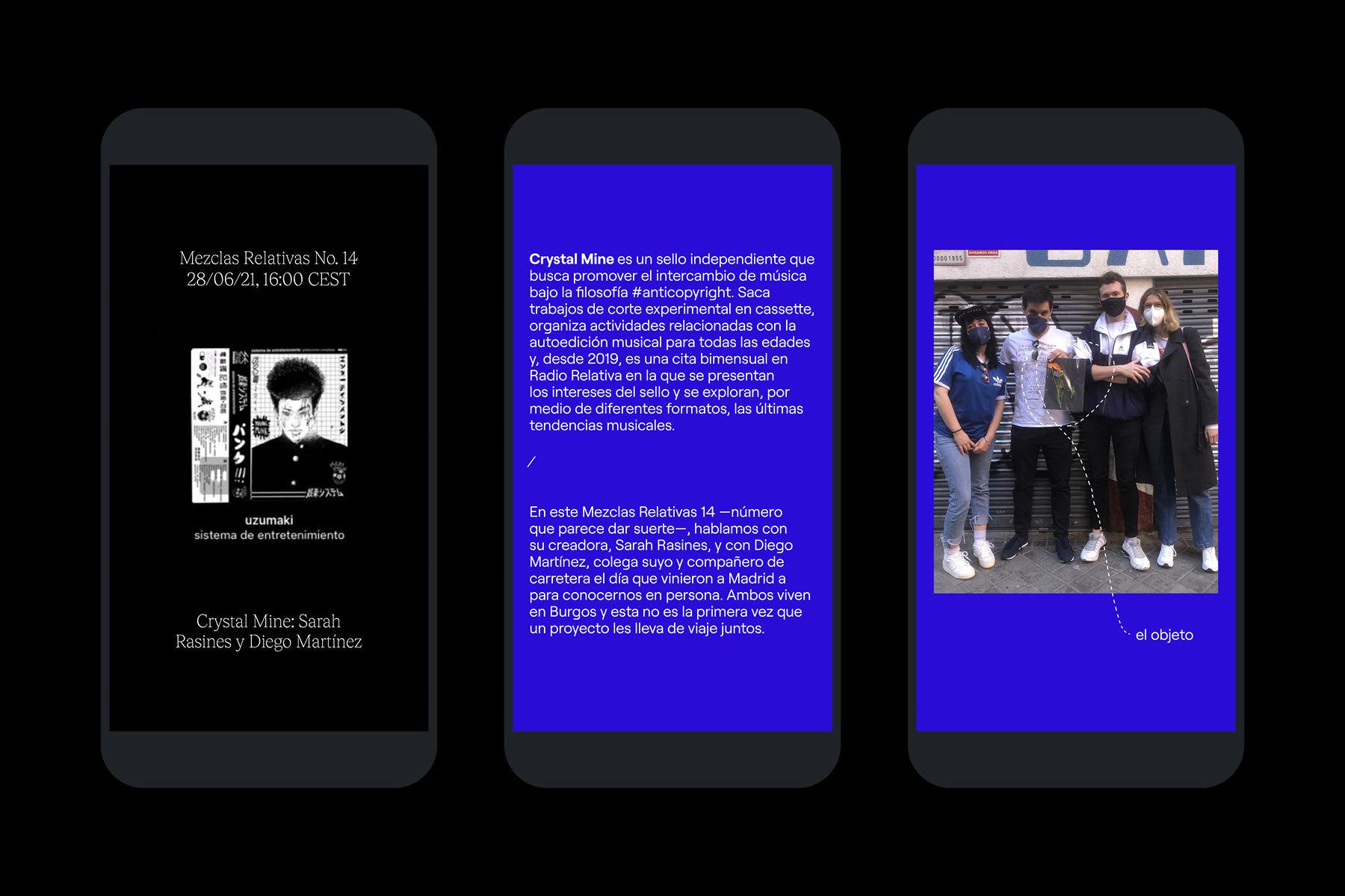
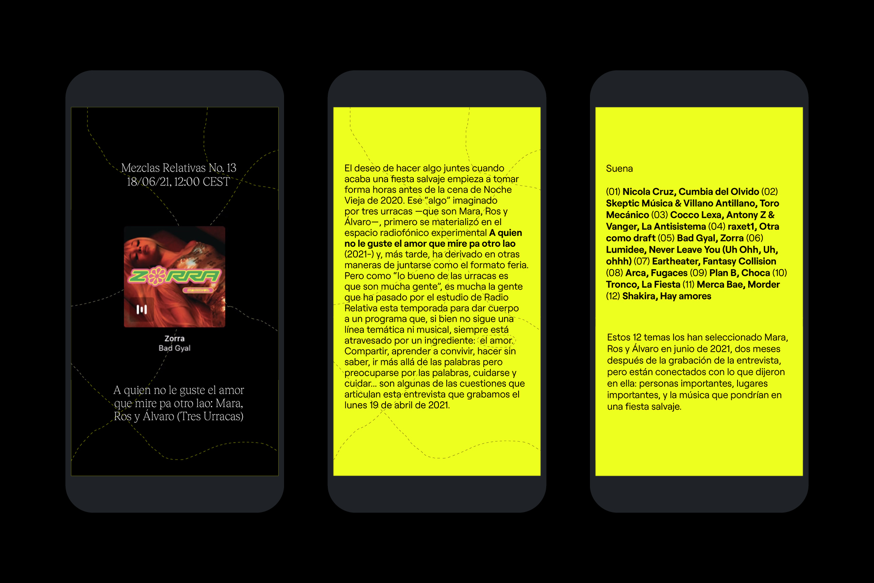
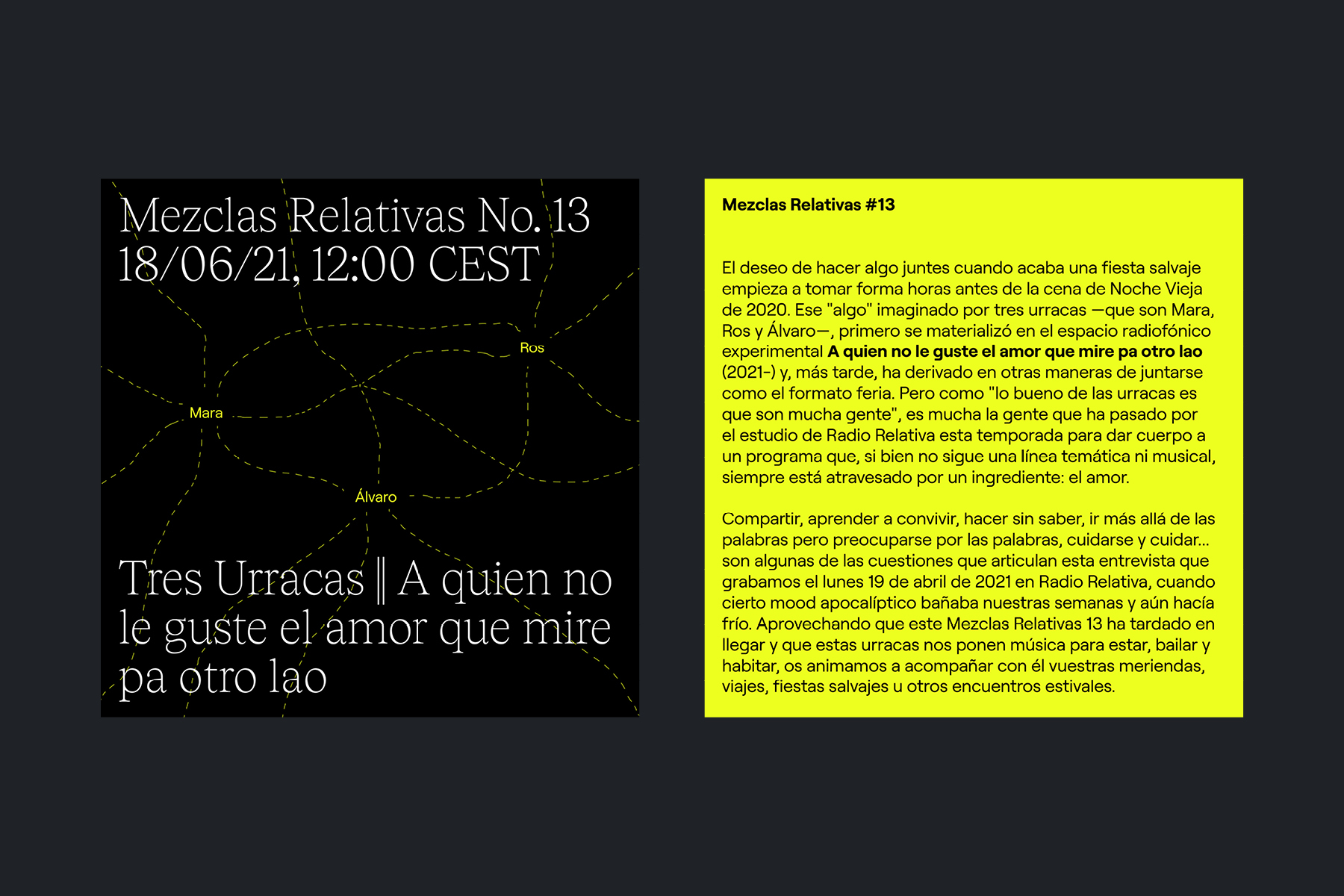
Textual and visual communication materials for the fourth season of Mezclas Relativas, a monthly radio show produced alongside Alberto García Aznar on Radio Relativa, which brings us closer to the creative projects and concerns of the people involved with this radio. <2021>
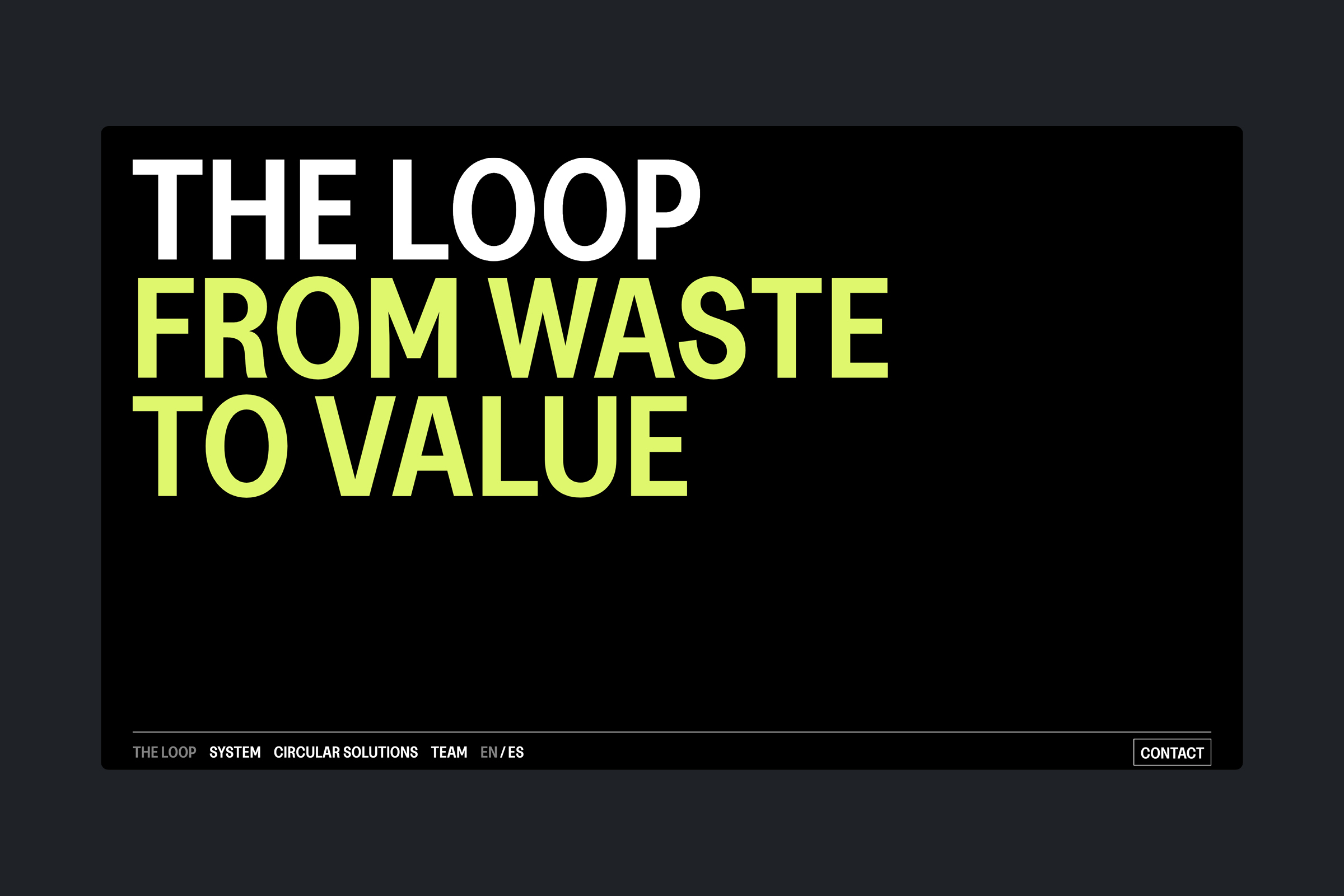
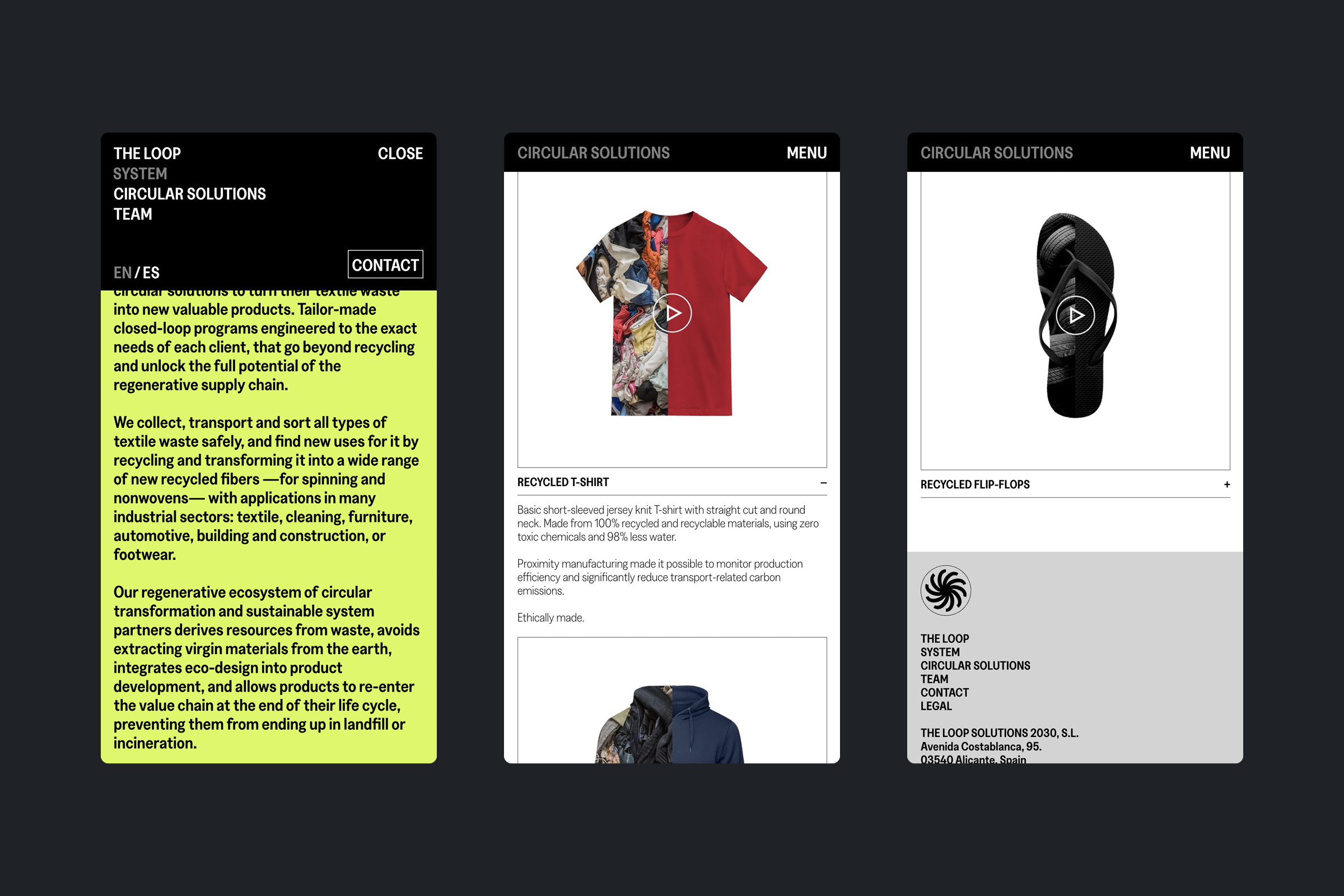
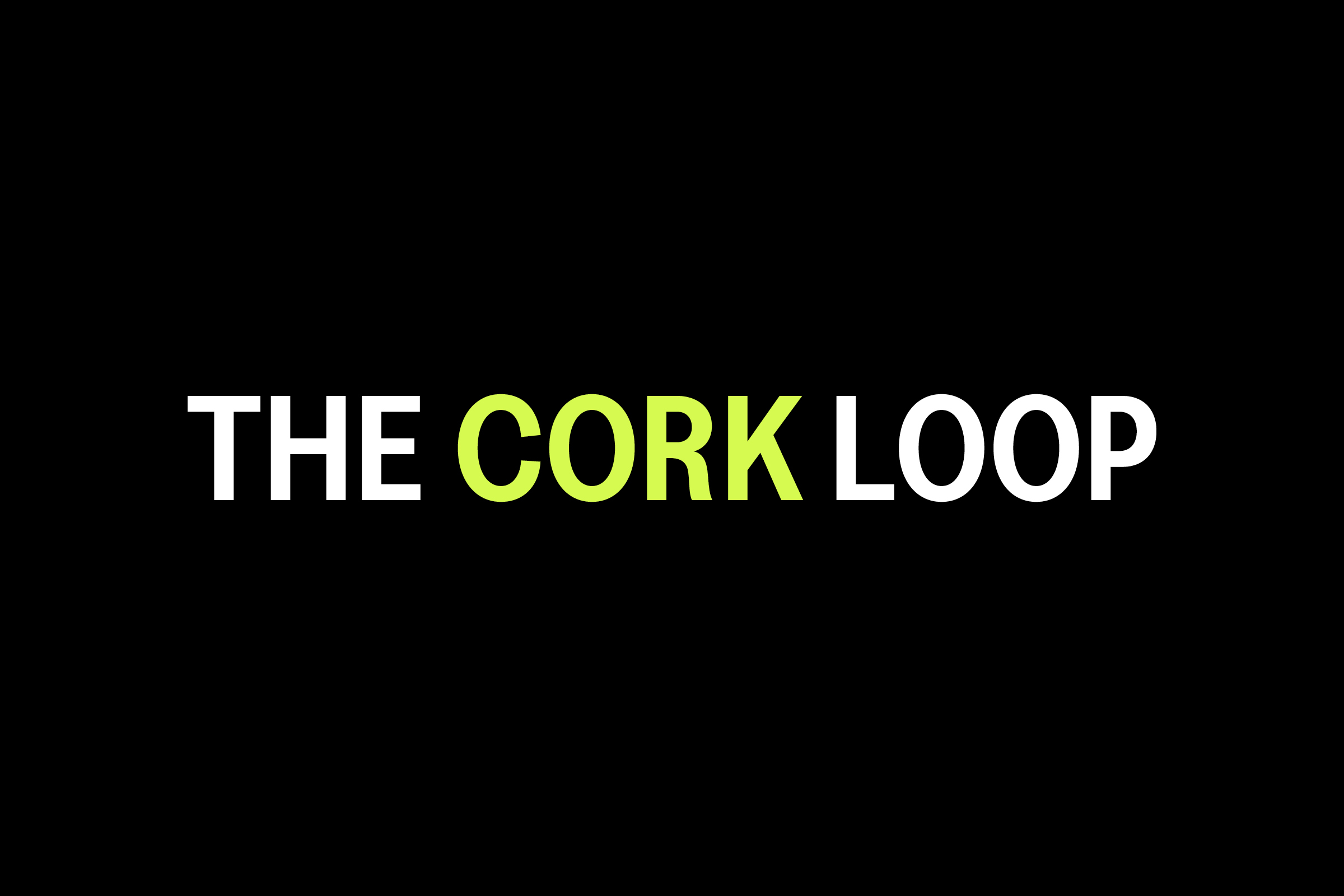
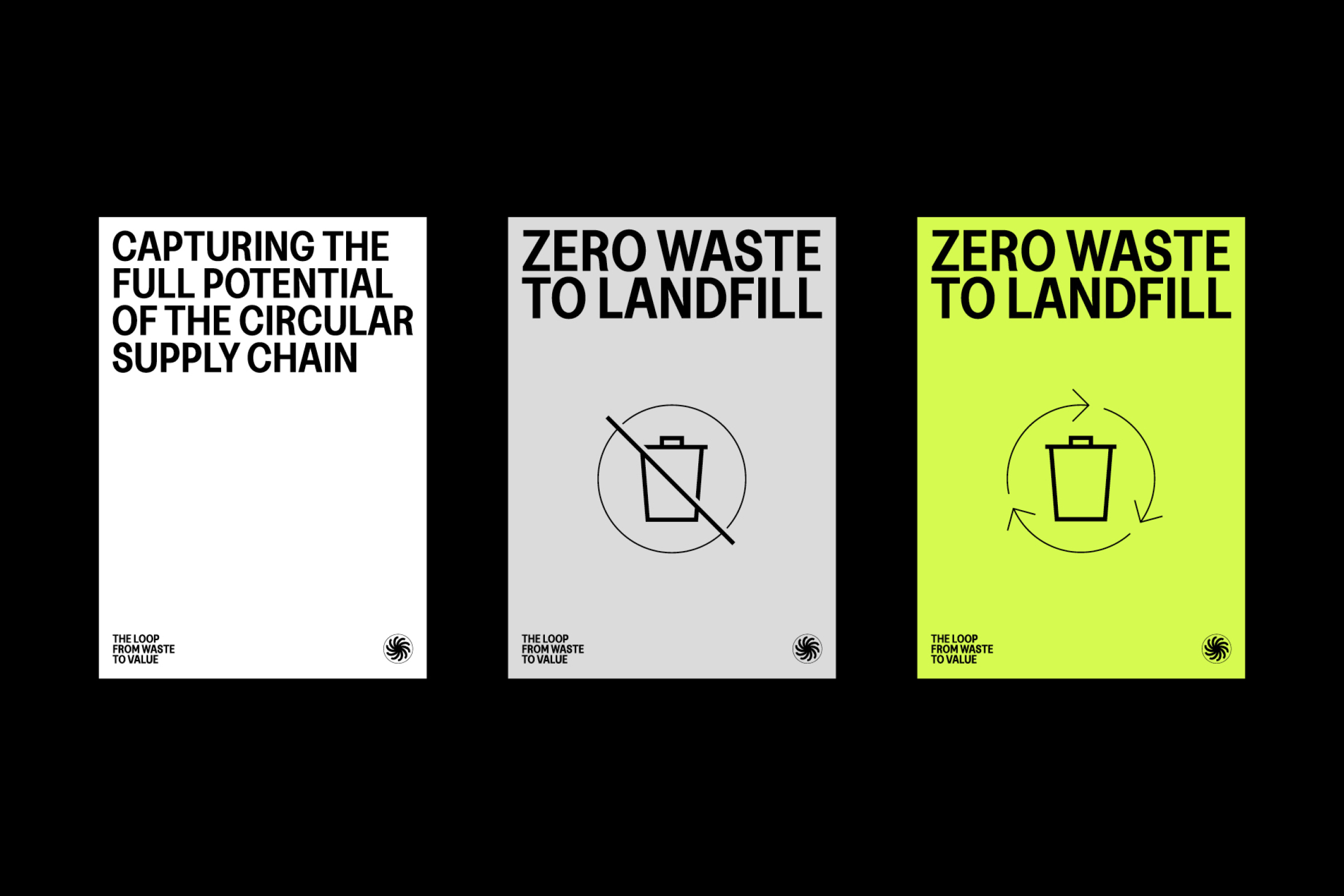
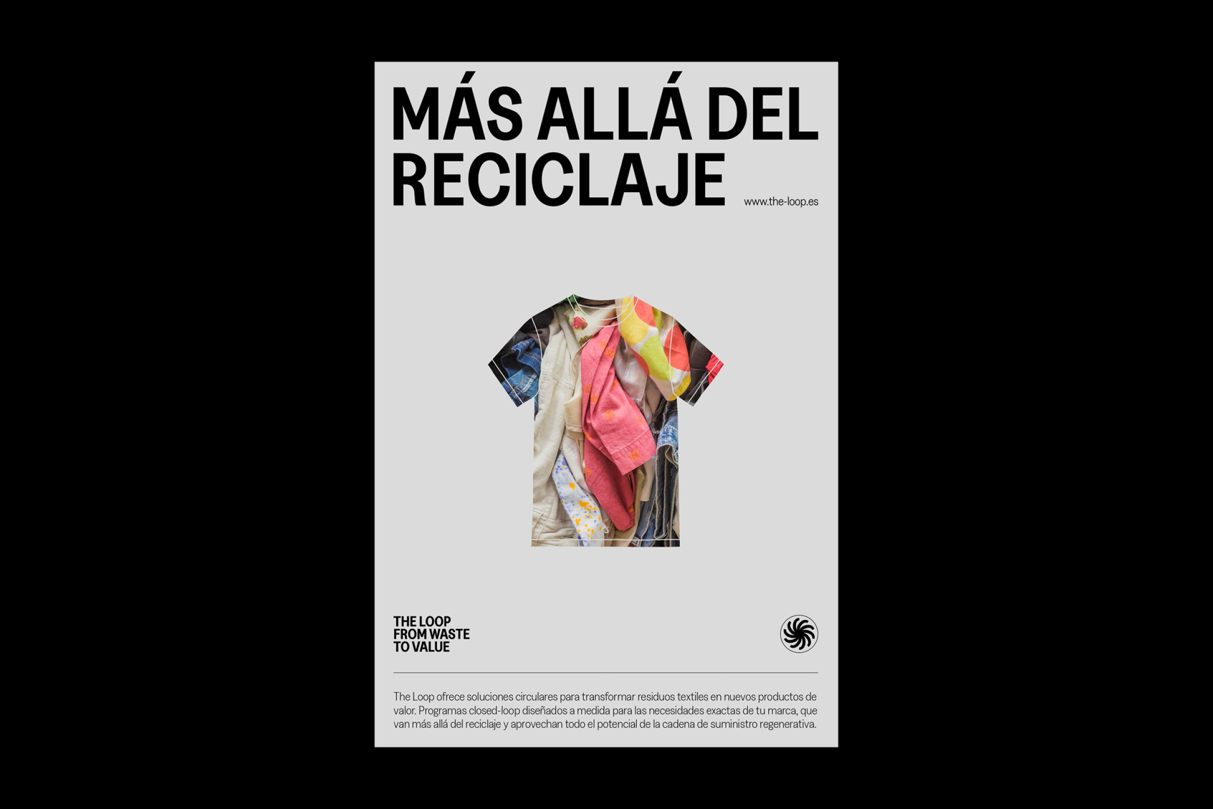
Visual identity and website for The Loop, a new circular innovation company offering solutions to transform textile waste into new value-added products. / Project developed at EPS. Web development: Fernando Espeso. <2021>
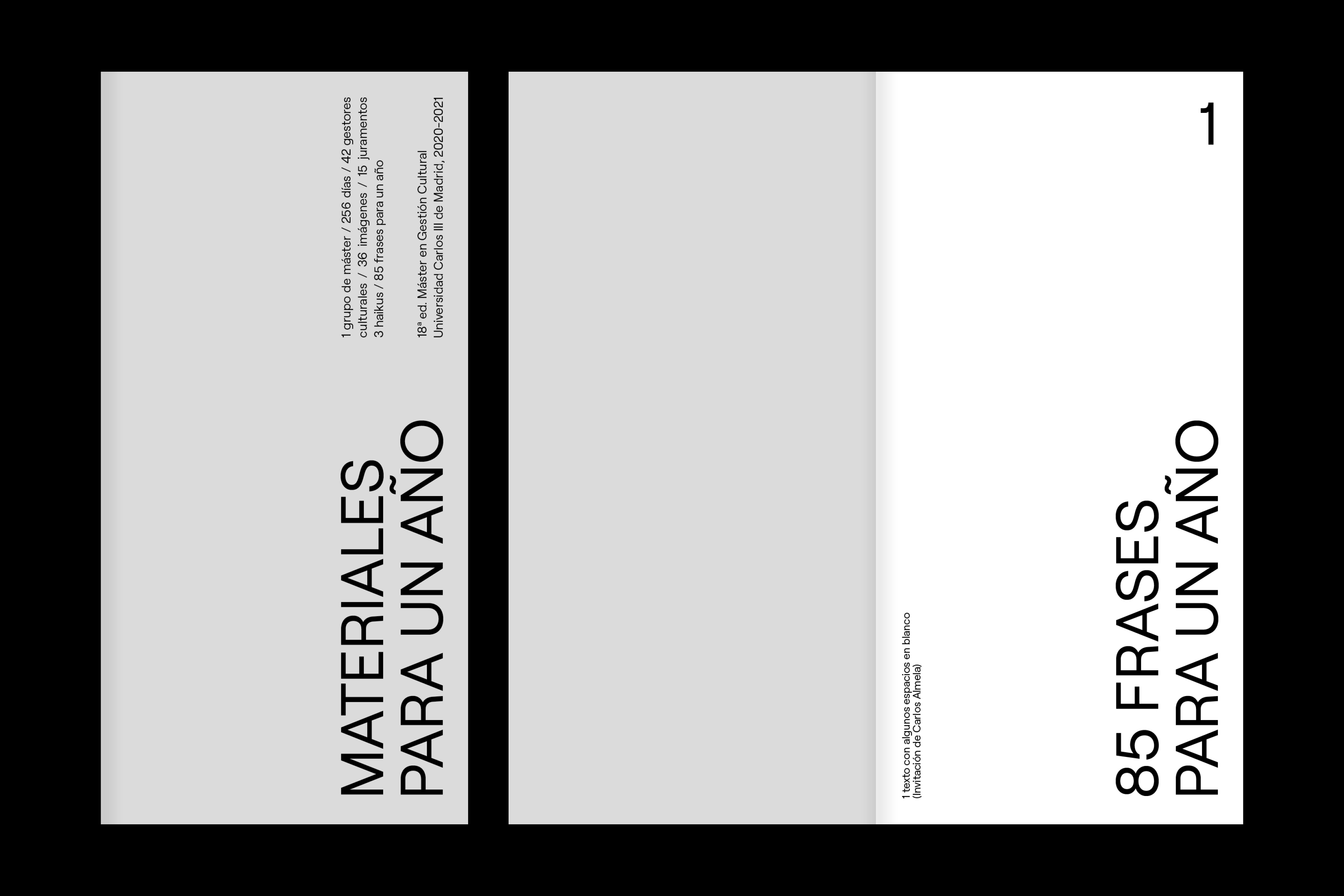
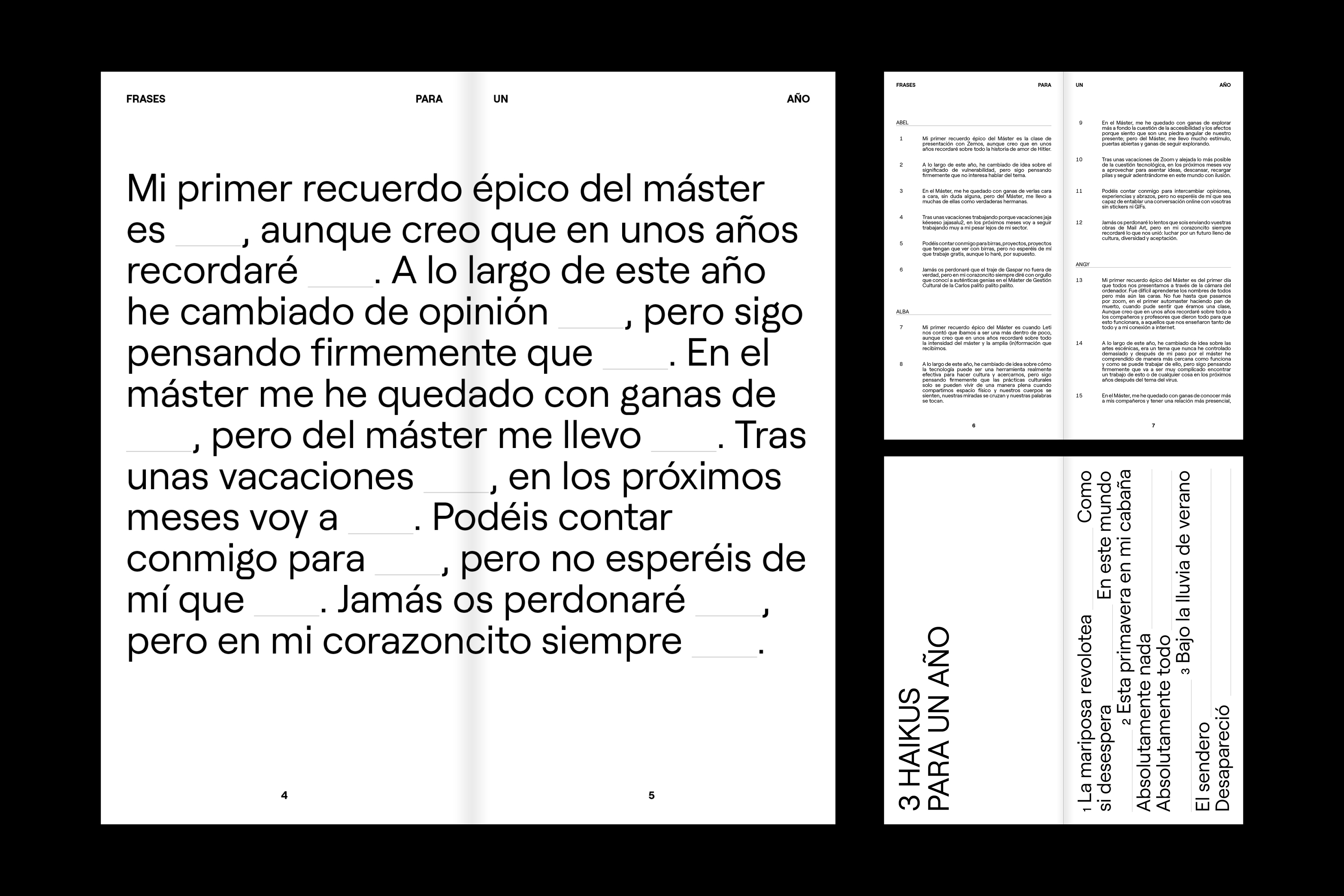
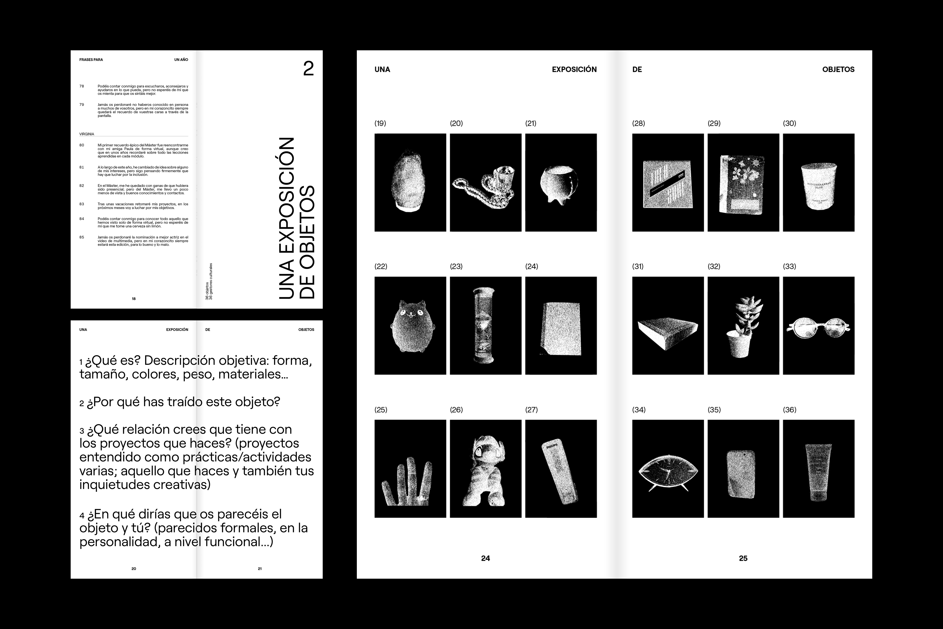
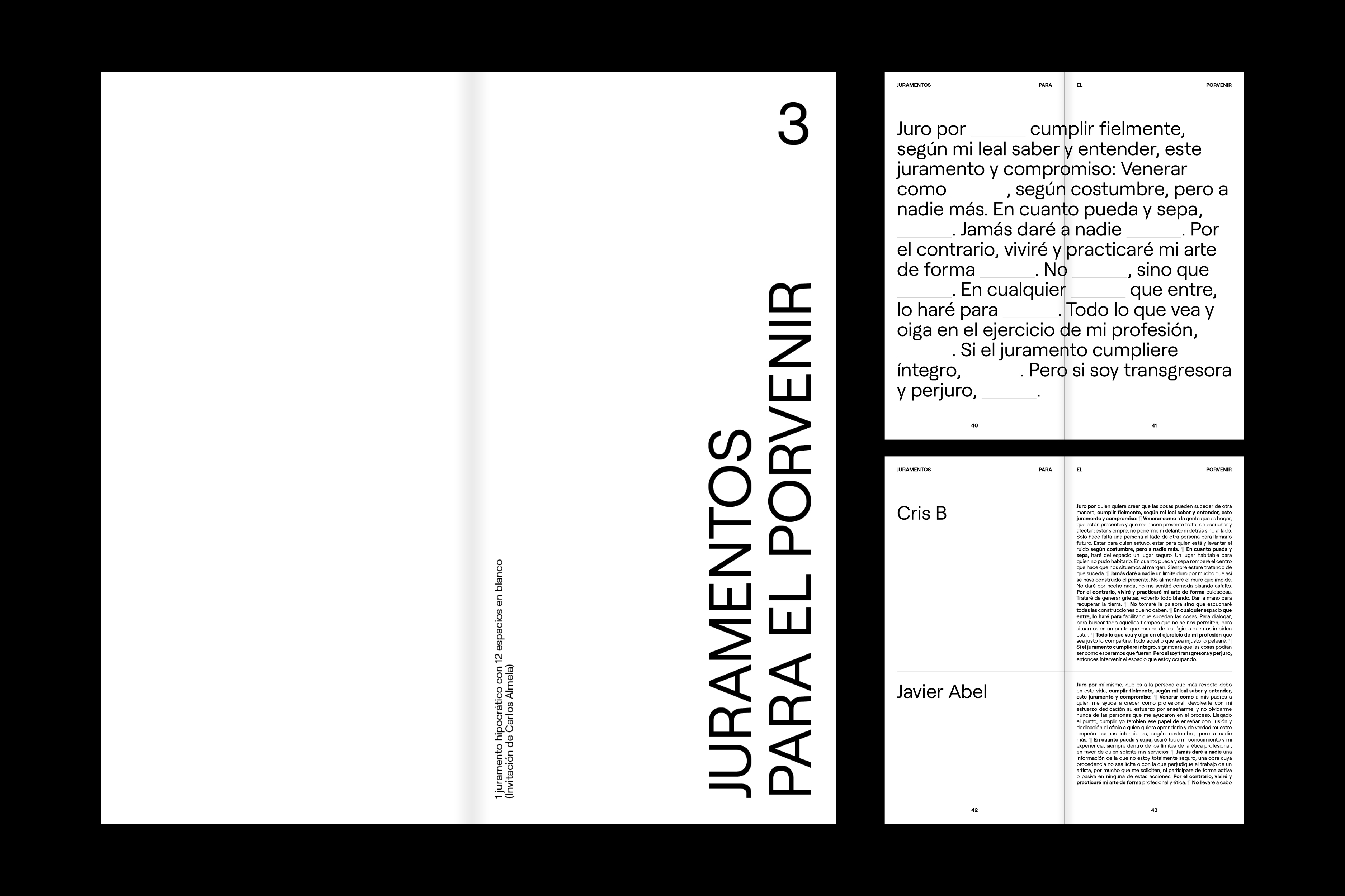
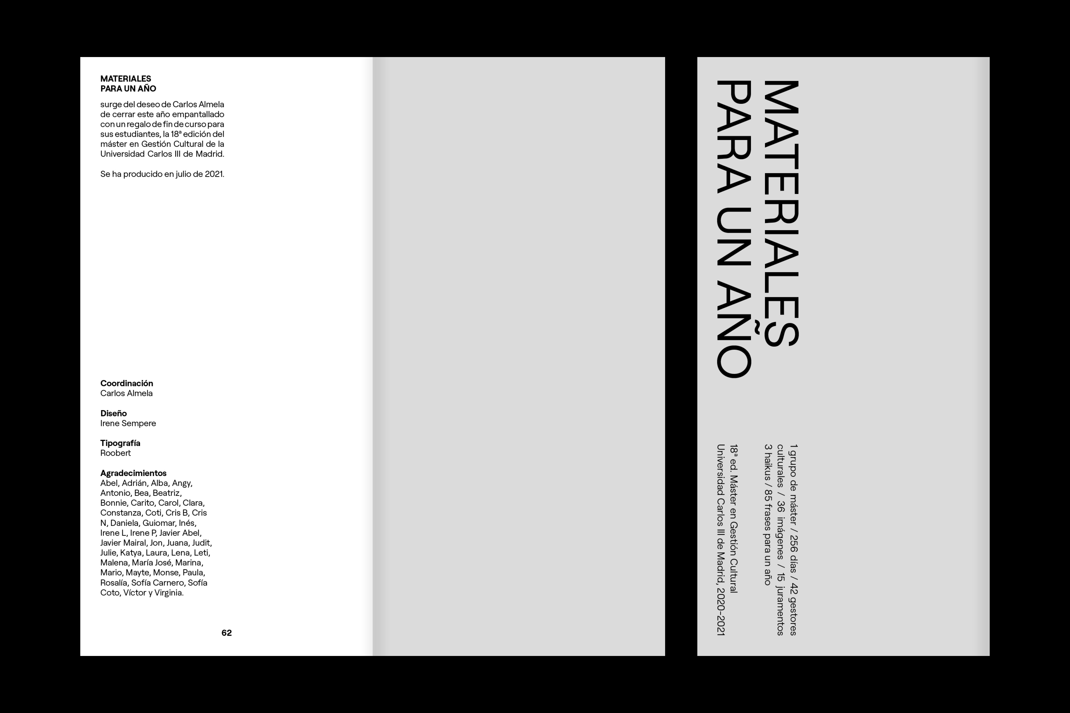
Title, content editing, and design of the digital publication “Materiales para un año”, which emerged from Carlos Almela’s (coordinator of the 18th edition of the Master’s in Cultural Management at the Universidad Carlos III de Madrid) desire to close the 2020-2021 course, marked by screens and social distancing, with a gift for his students. <2021>
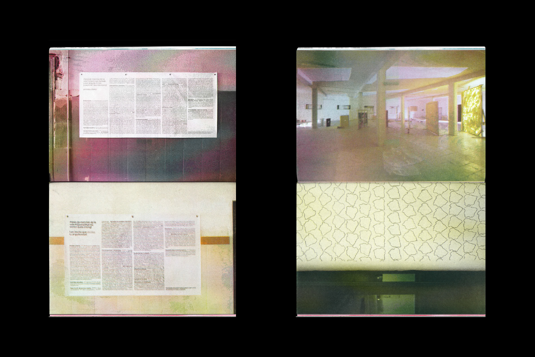
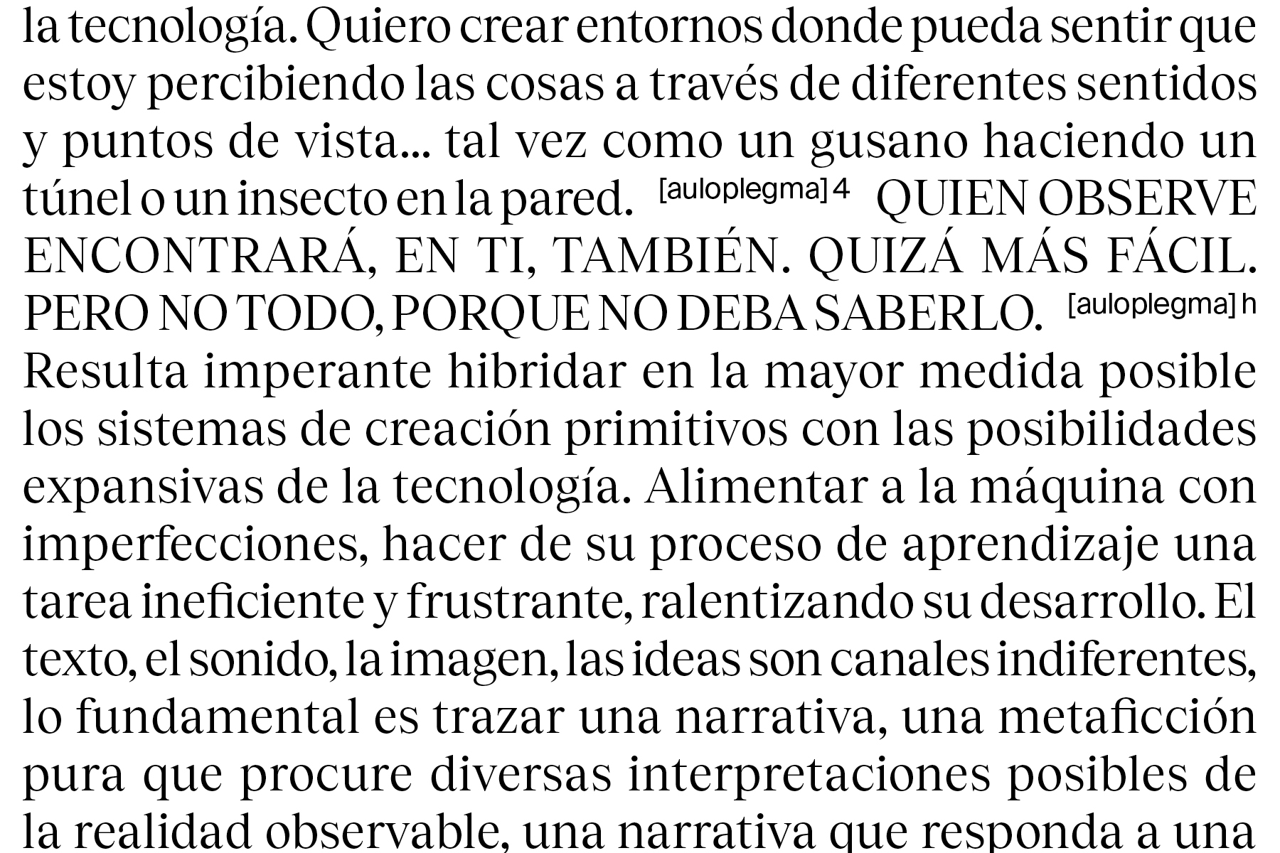
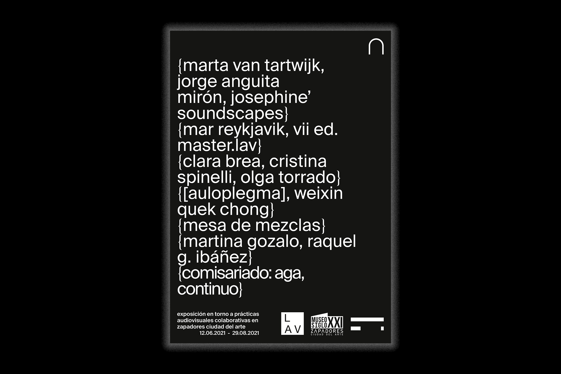
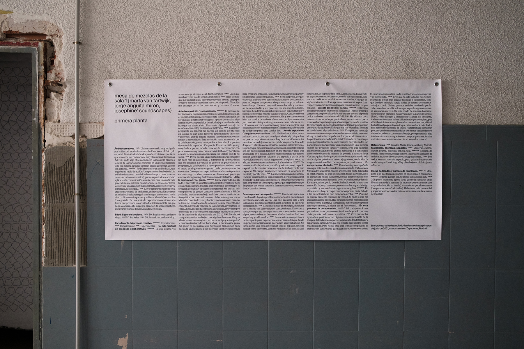
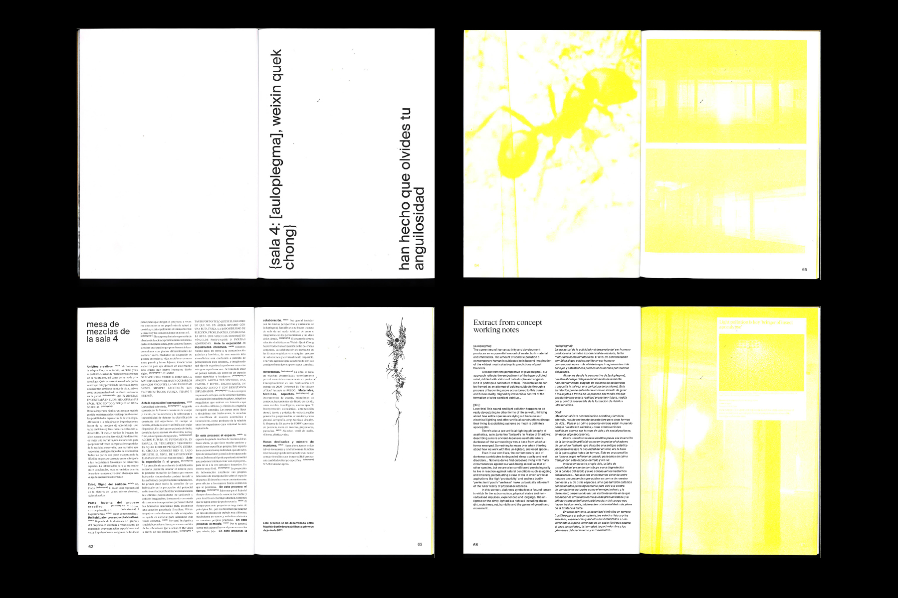
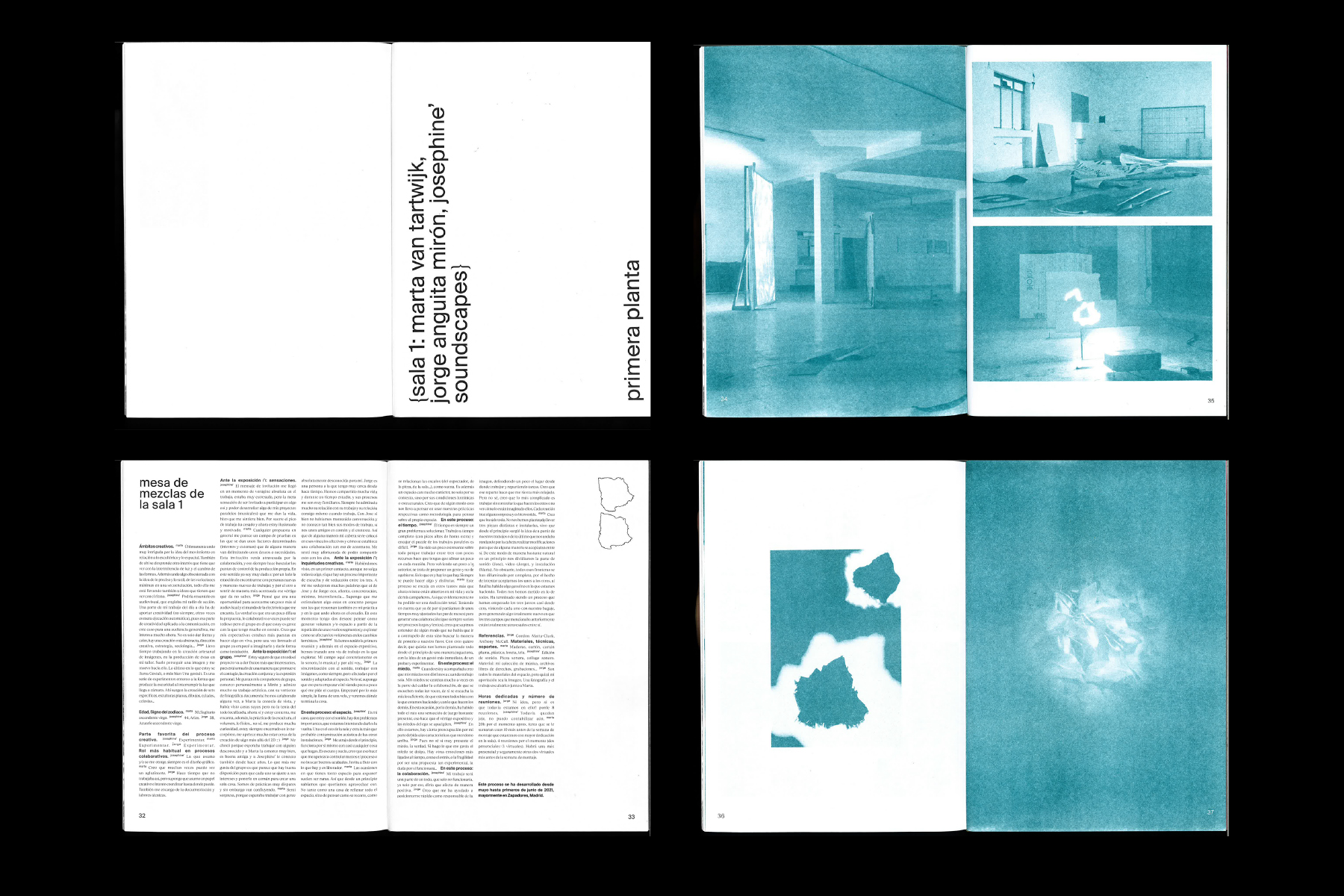
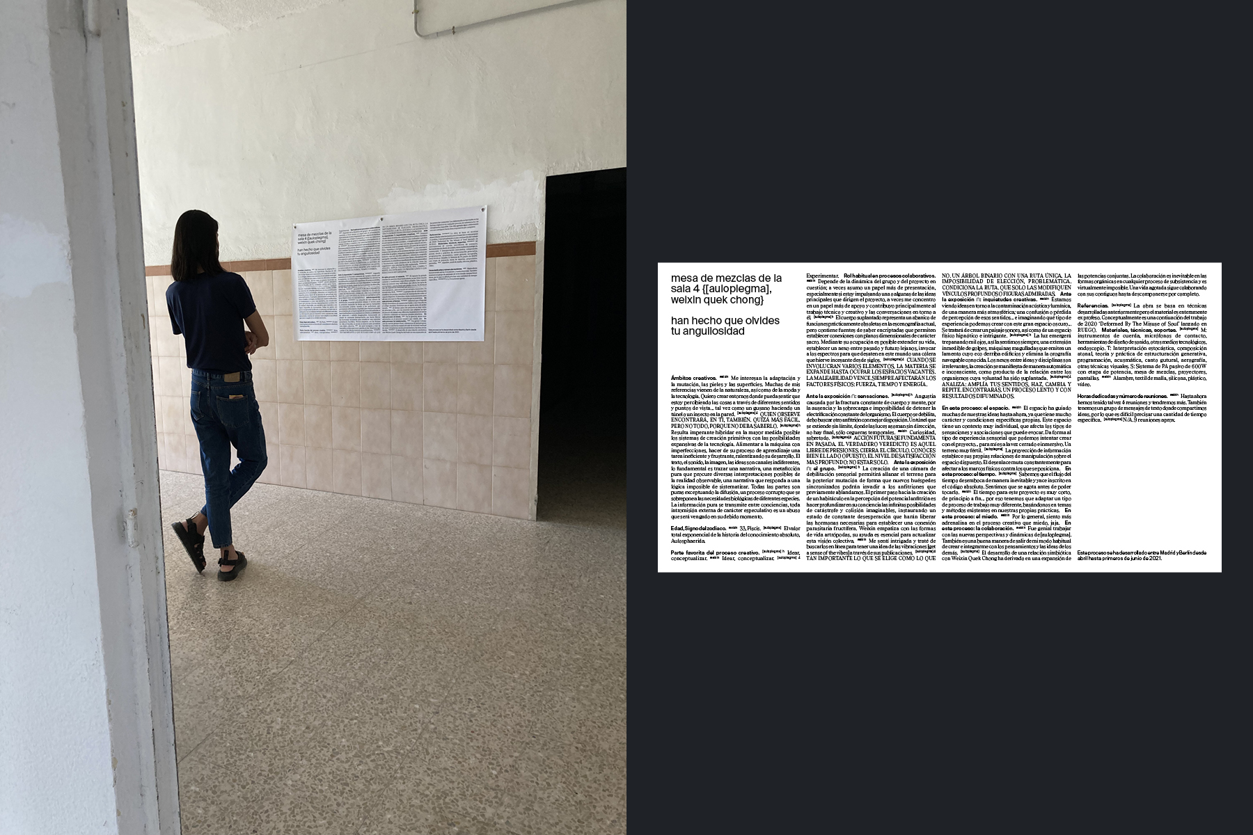
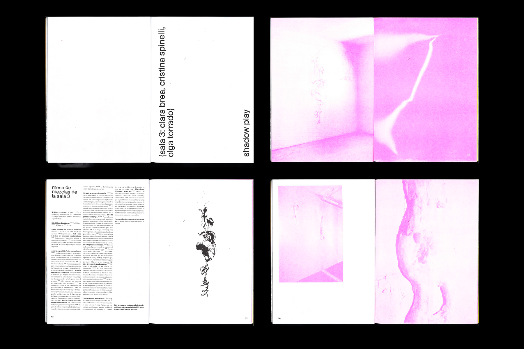
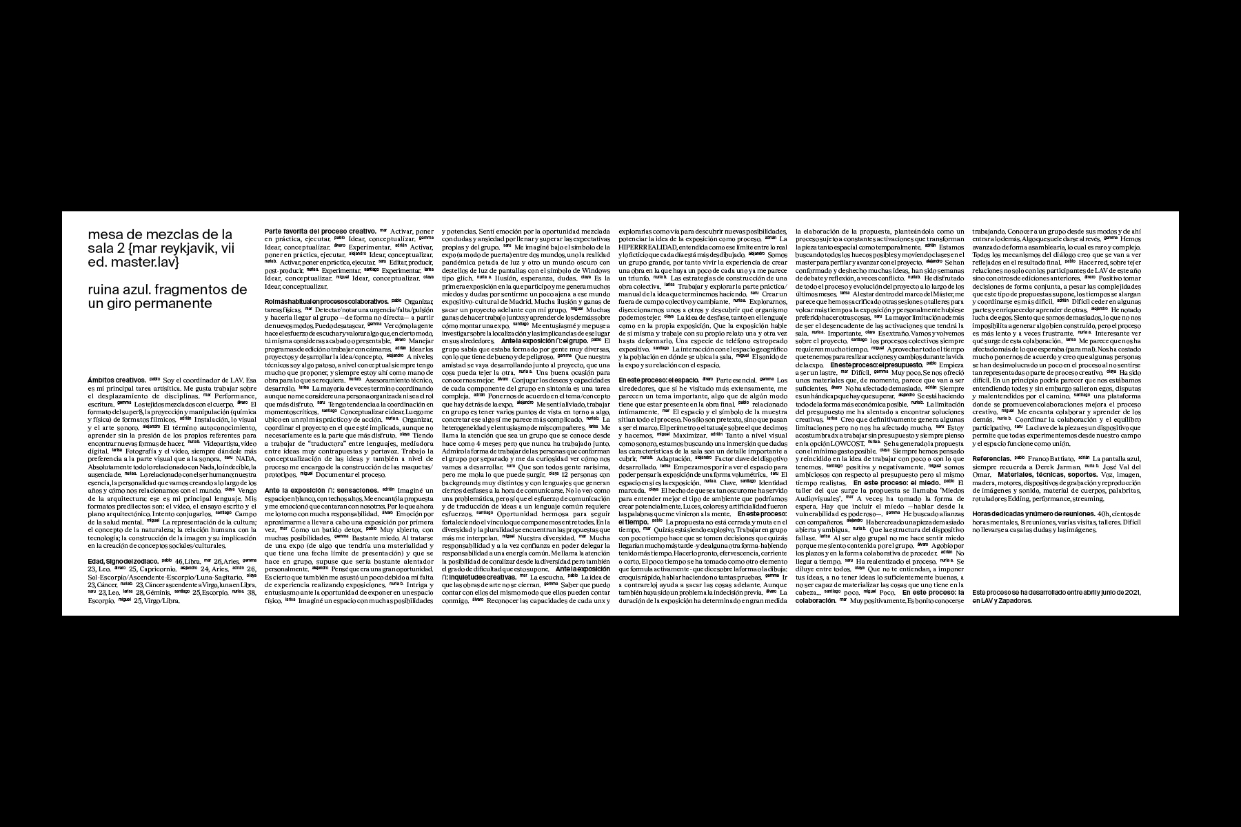
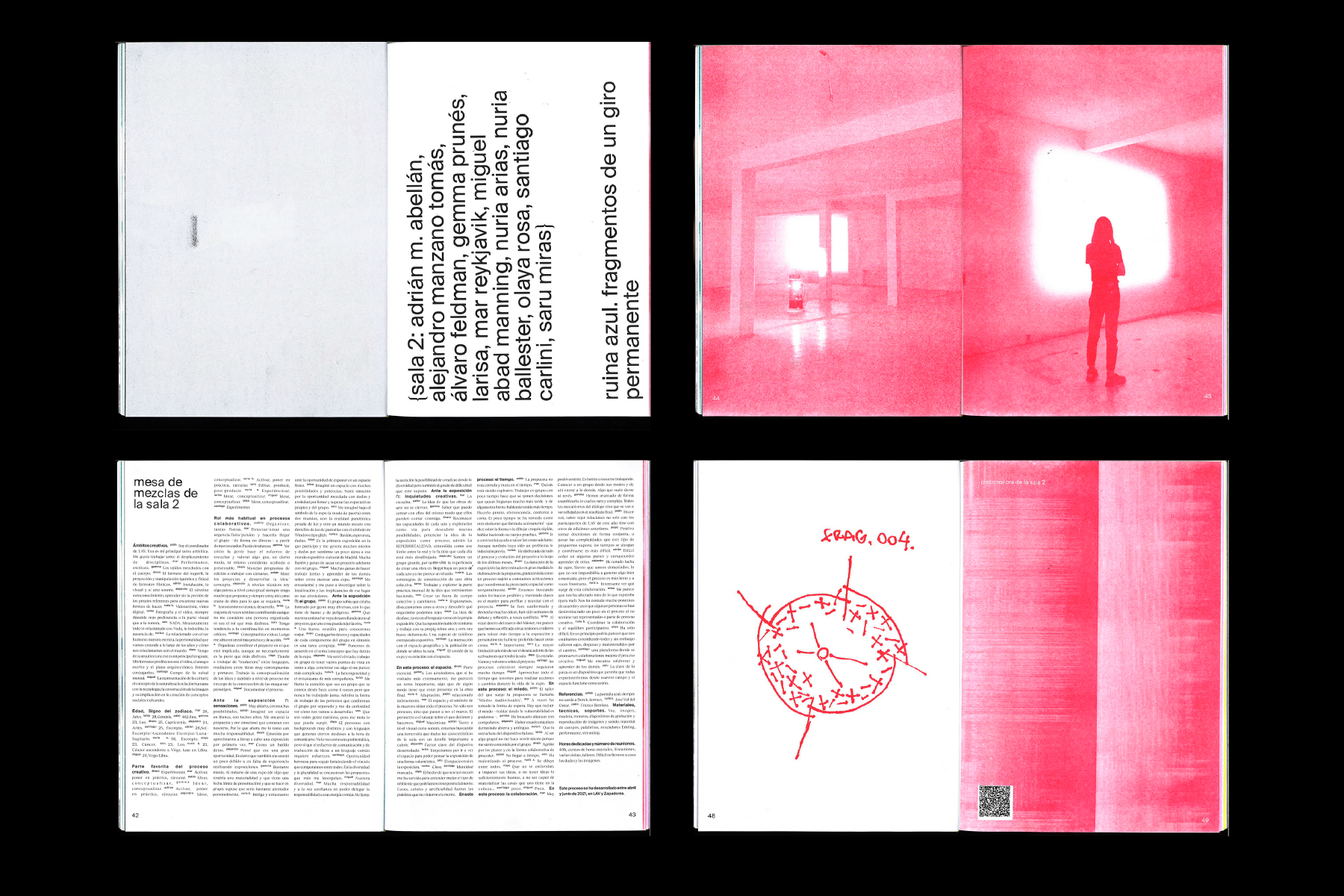
Editorial design of the catalog and labels for the exhibition on collaborative audiovisual practices “Intersección de conjuntos” curated by continuo. The five labels make visible through text the relationships and tensions that occurred during the creation of the four installations on display, as well as the exhibition project itself. / Photography: Nalia Arenas. Riso: Imprenta San Delfín. <2021>
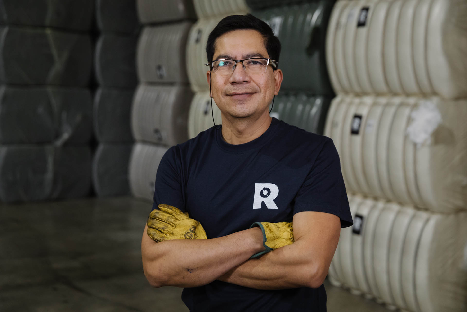

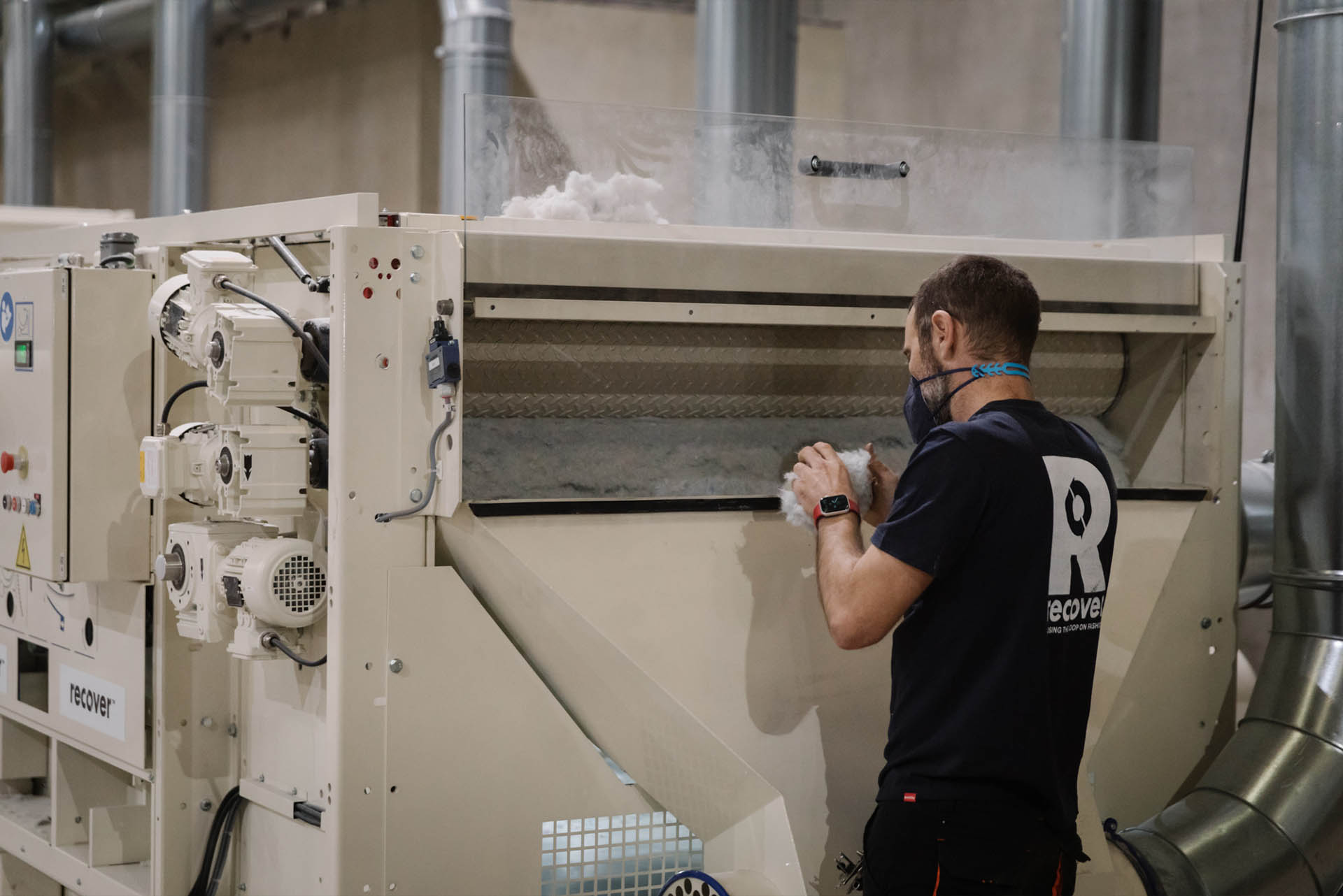

Art direction and brand restyling for Recover, in its new era as a global producer of recycled textile fiber. / Project developed at EPS. Photography and video: espíritu escalera. <2020>
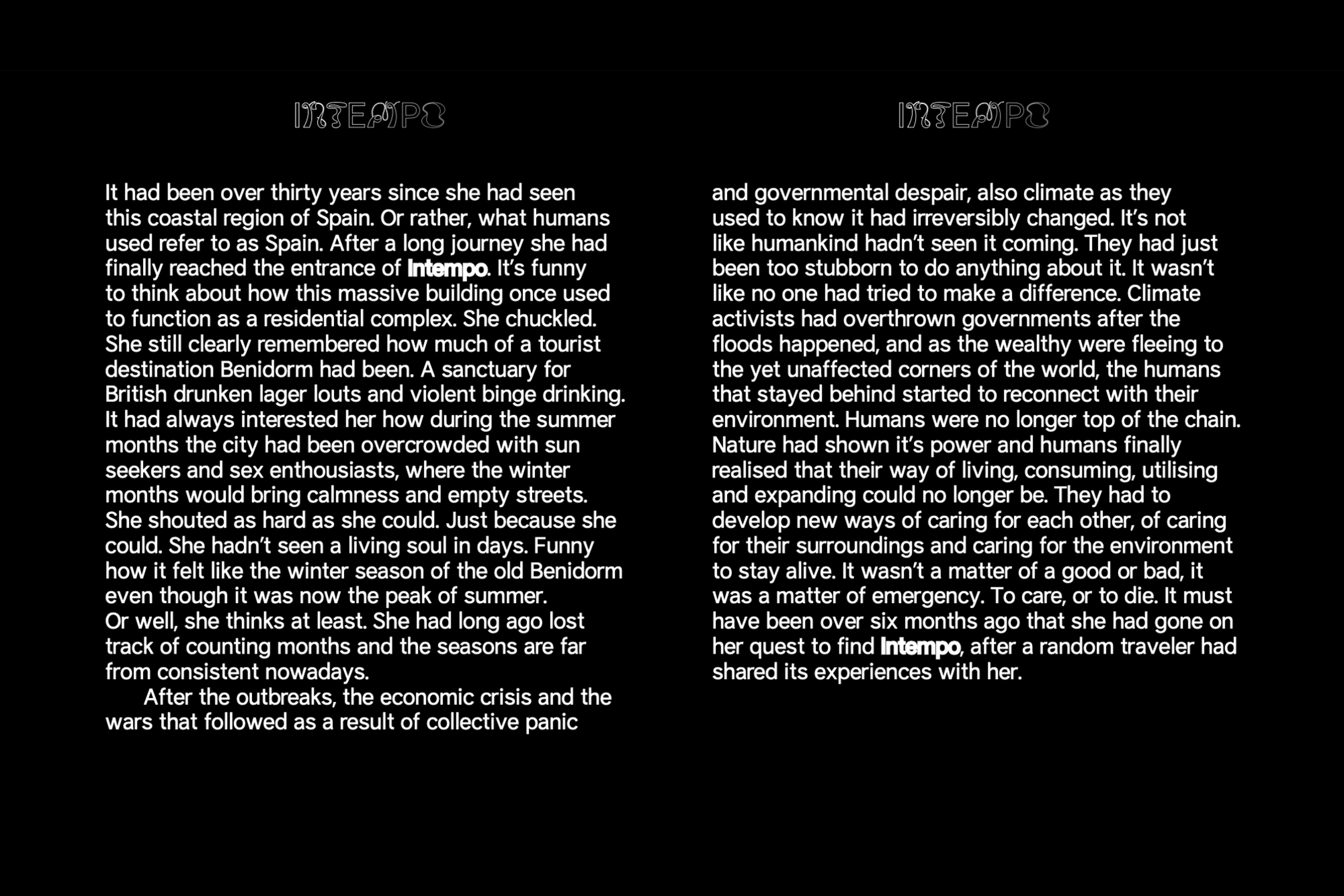
Intempo is a design fiction narrative and visual essay that explores alternative care structures, care ecotones, interdependent relationships, and interspecies coexistence in a post-apocalyptic world. Set in Benidorm, the story imagines the city’s empty skyscrapers as safe shelters for diverse species facing extreme climate conditions. / Project developed in collaboration with Carlos Pastor García and Erik Peters during Post-Inertia. Speculative Practices for Social Re-stabilization—an online residency promoted by Port-Ø (the critical and speculative design research group at Escola Massana), which aimed to explore the role of speculative design in moments of social re-stabilization, specifically in response to the Covid-19 pandemic. <2020>
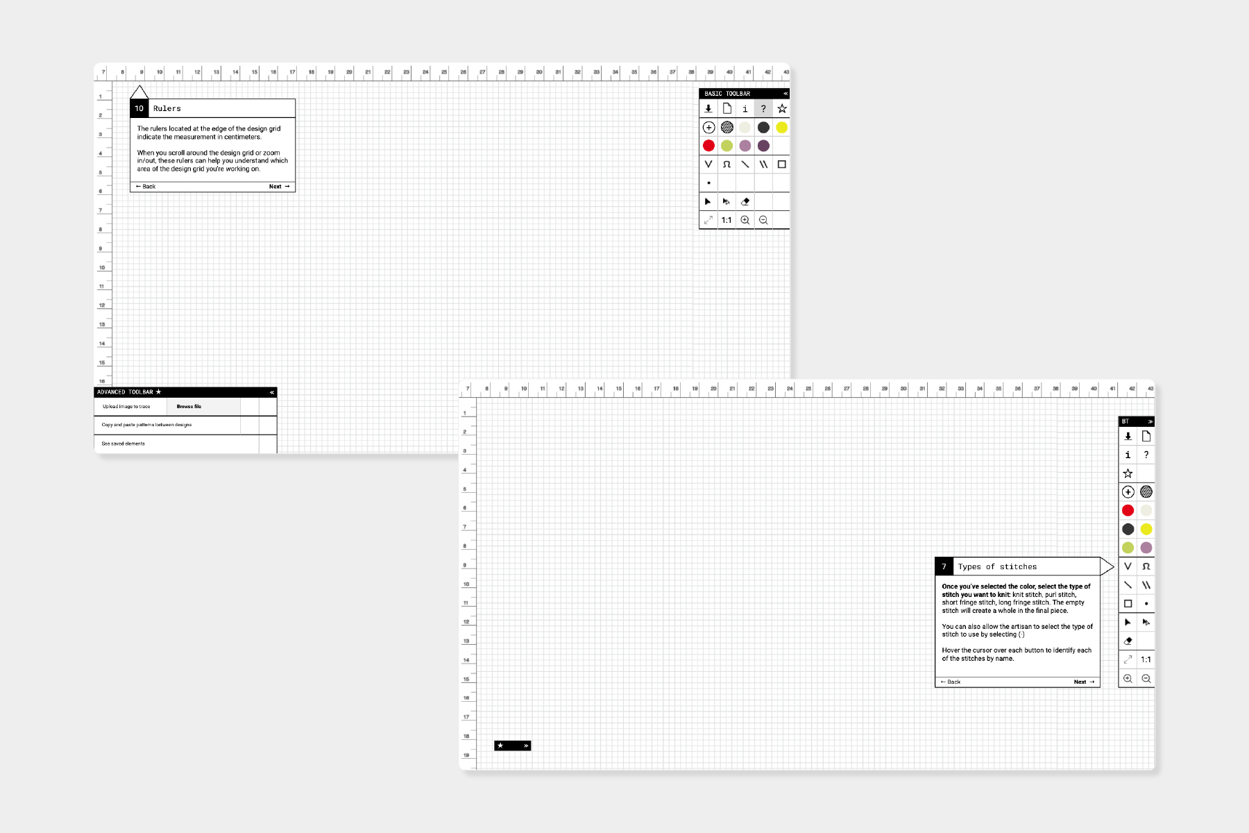
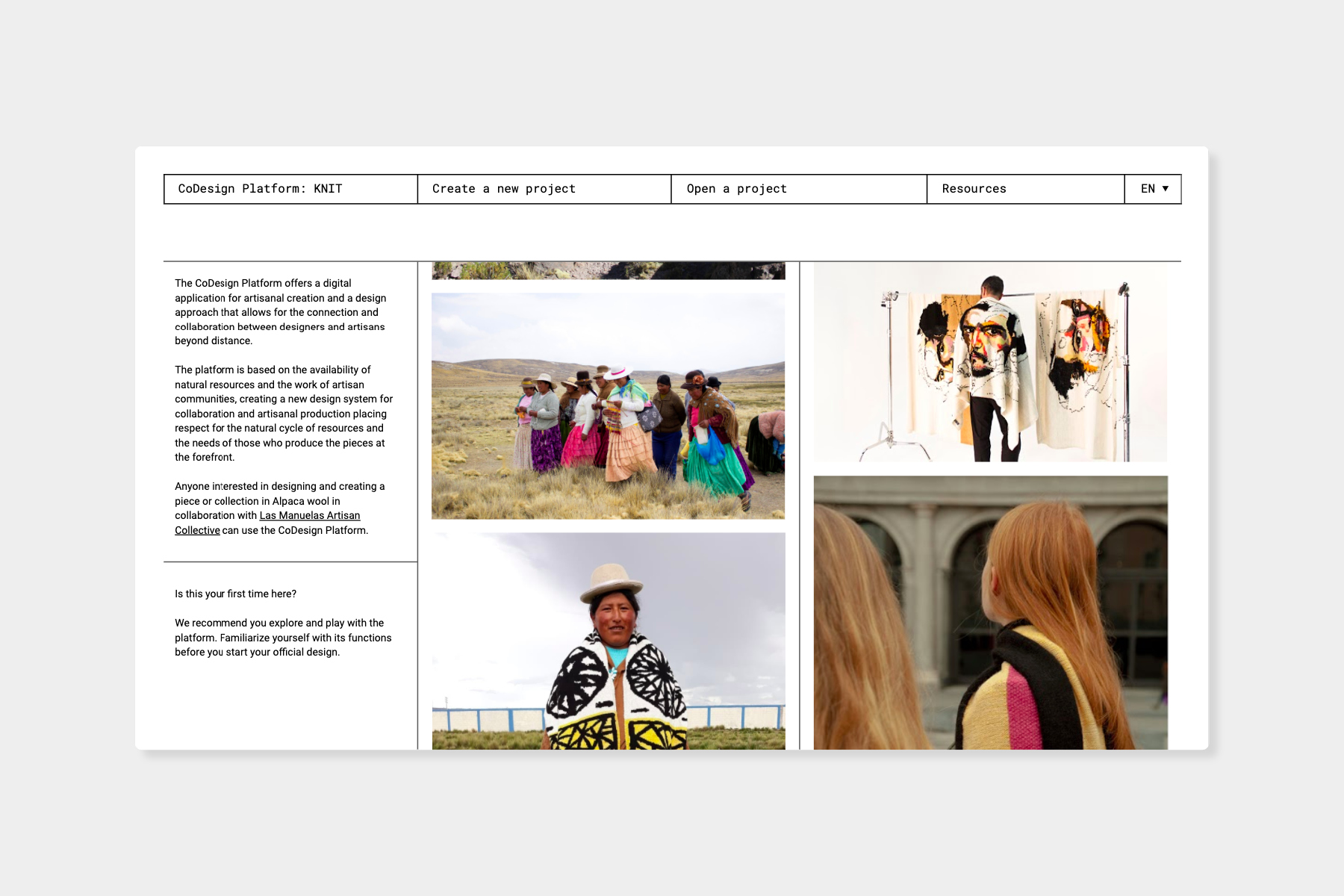
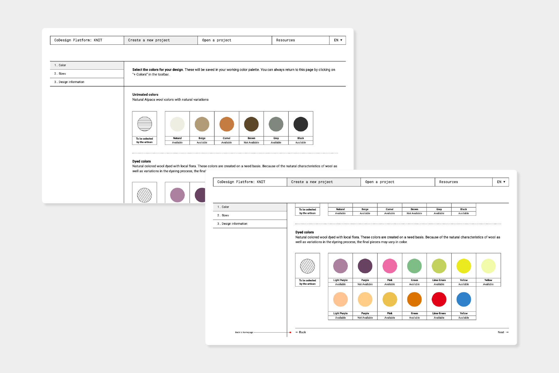
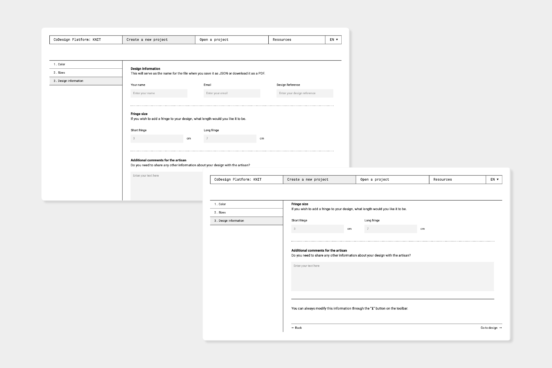
Design of the Co-Design Platform, an intuitive digital tool that works offline and facilitates communication between creators worldwide and Las Manuelas, a group of alpaca-wool weavers from the south of Puno (Peru), to revitalize the most emblematic Peruvian craftsmanship through a collaborative design methodology. “Las Manuelas” is a project driven by IED REC in collaboration with the Movimiento Manuela Ramos. / Web development: Margot Matesanz. <2020>
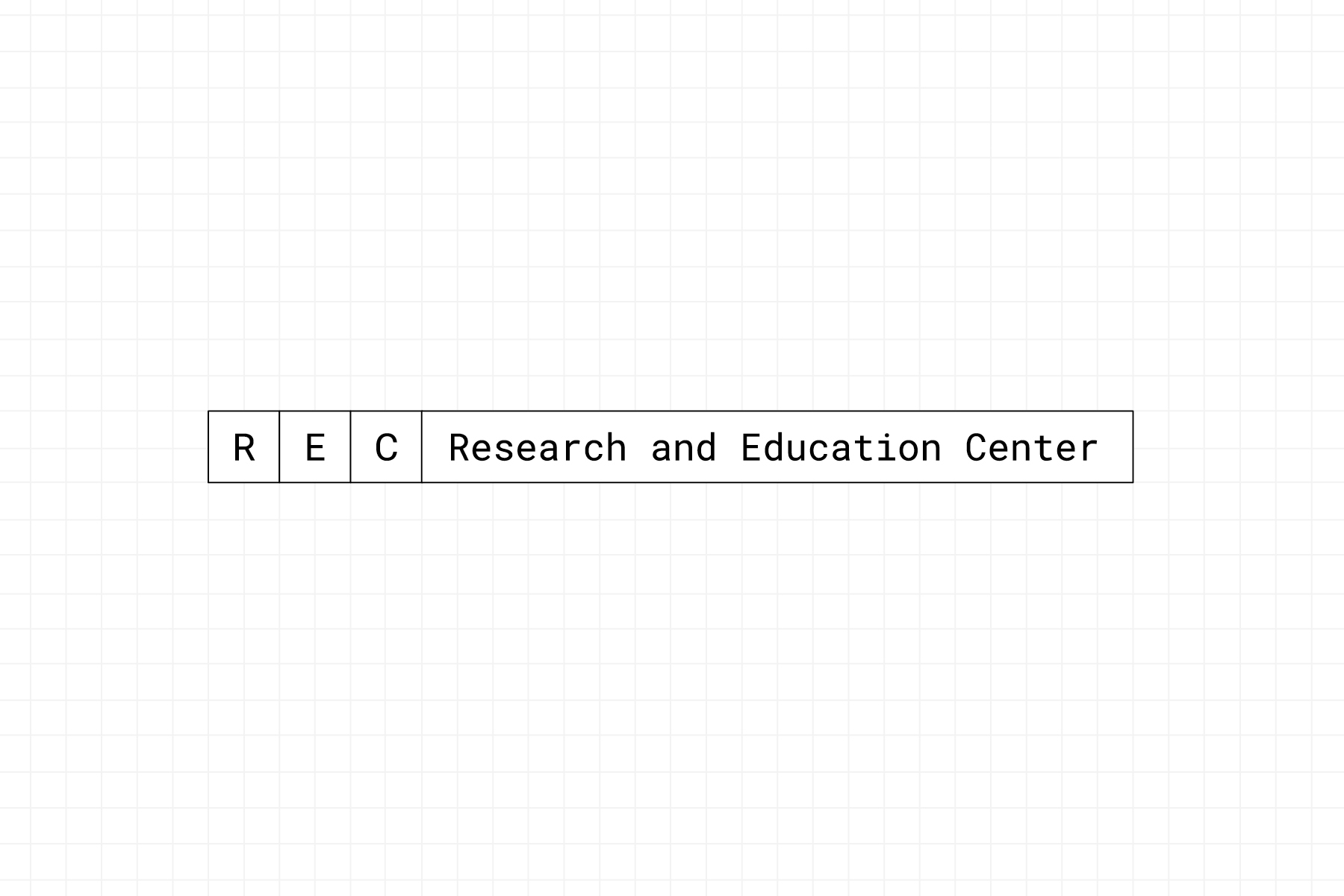
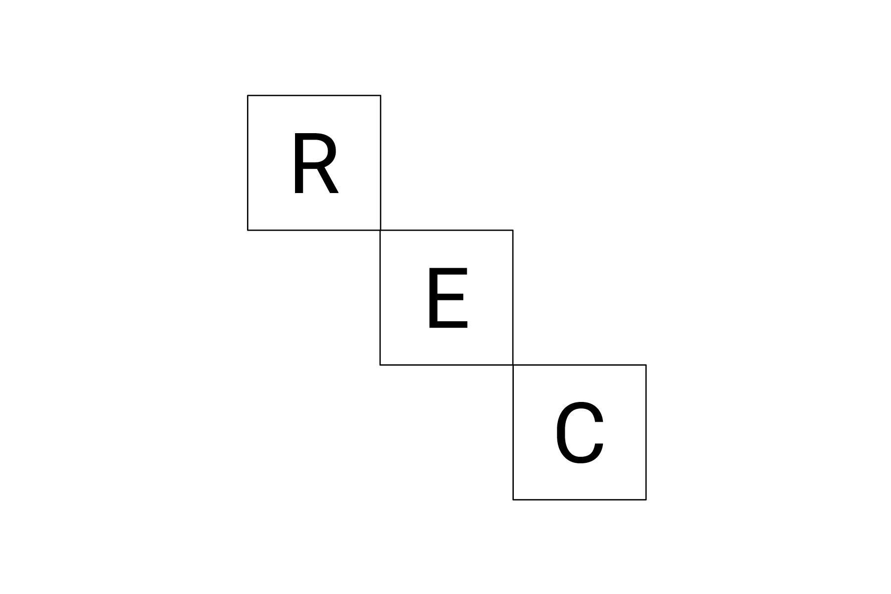
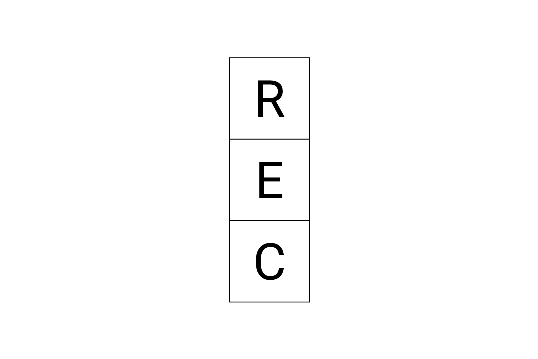
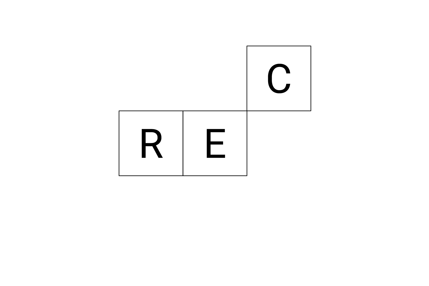
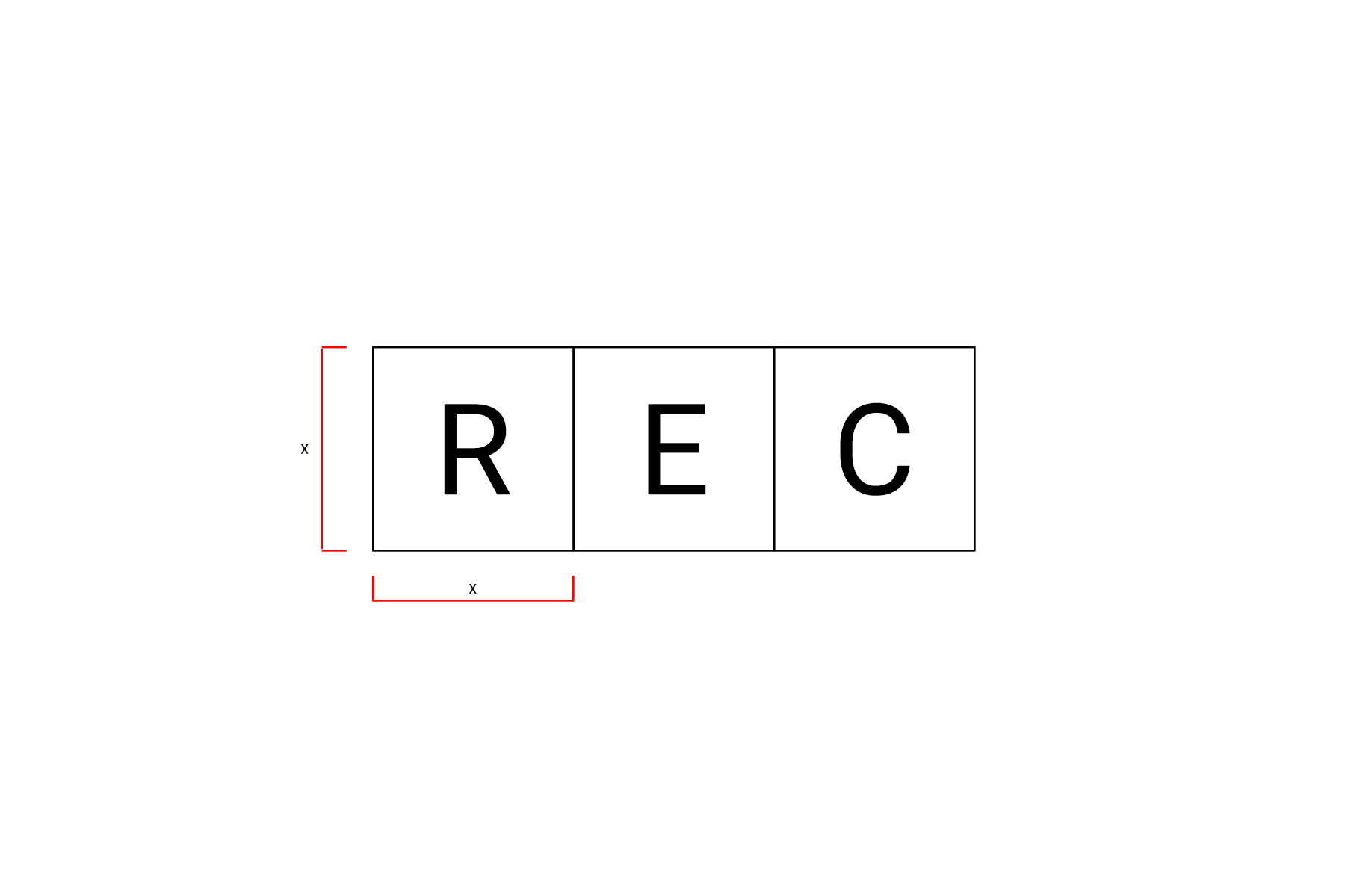
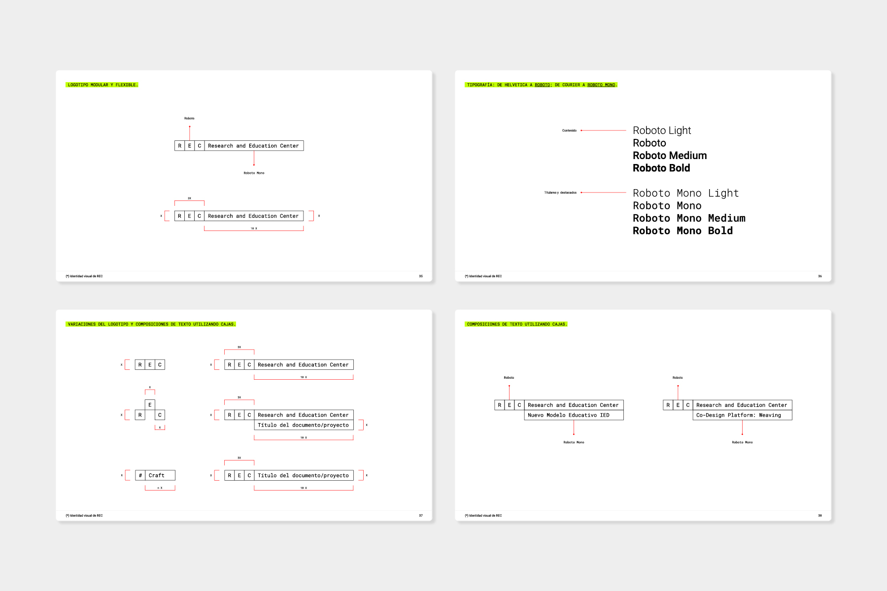
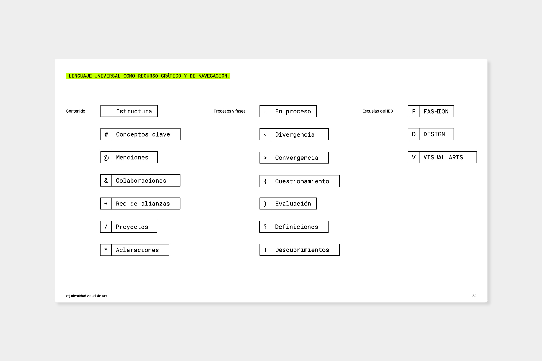
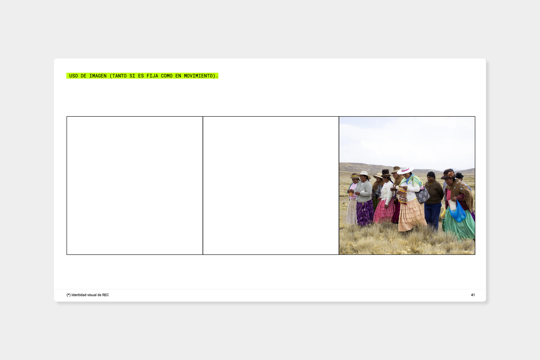
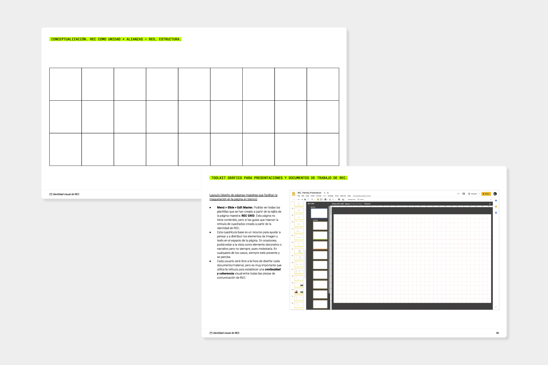
Brand architecture, flexible logo, and visual identity for IED REC, the education research area of IED Madrid. The entire project has been created in Google Drive, establishing a system of templates and modules that allows anyone on the team (both designers and non-designers) to independently develop research reports and impactful presentations while always respecting the project's identity. / Concept and logo developed in collaboration with Meg Gasiba. <2020>
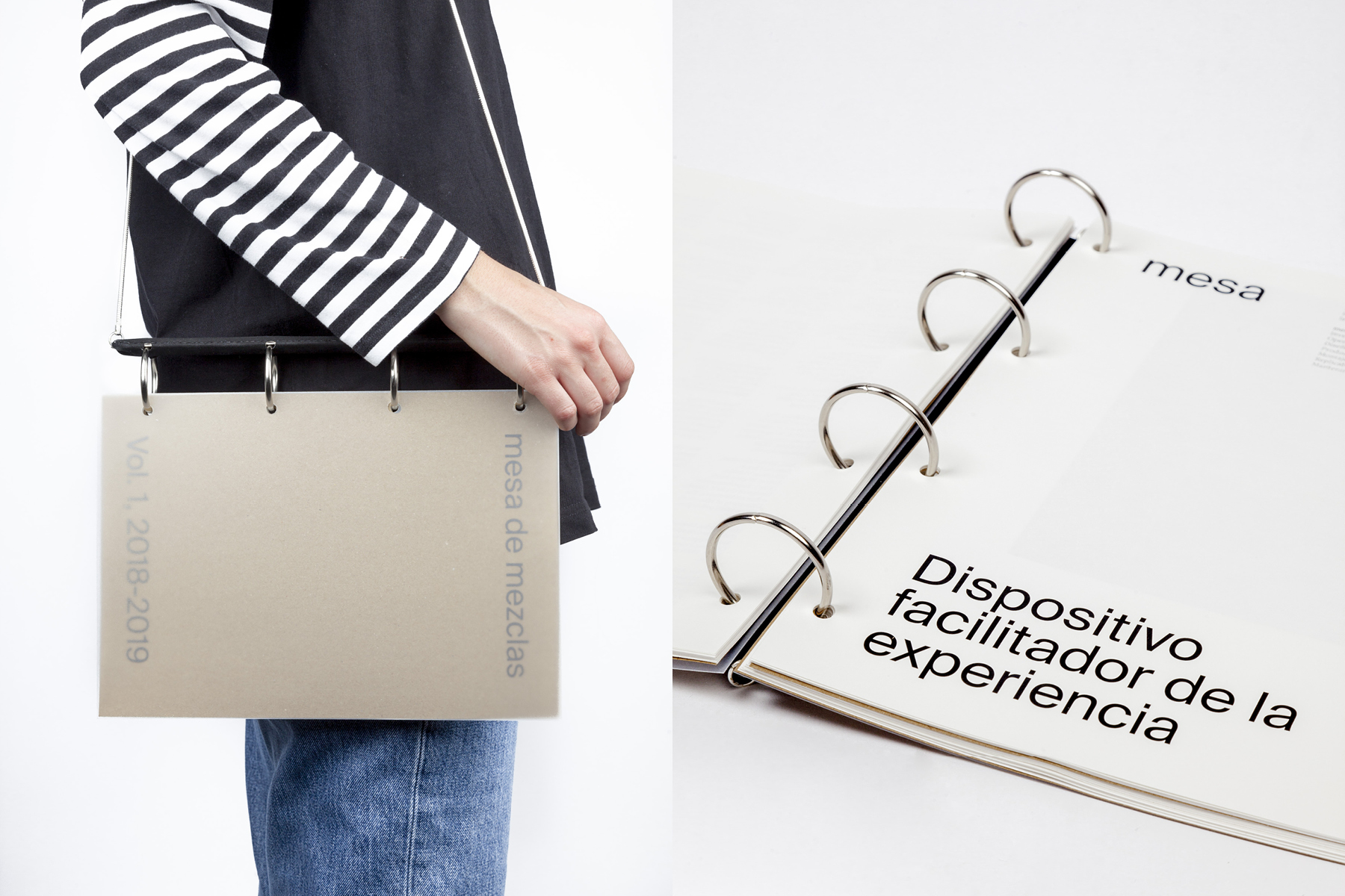
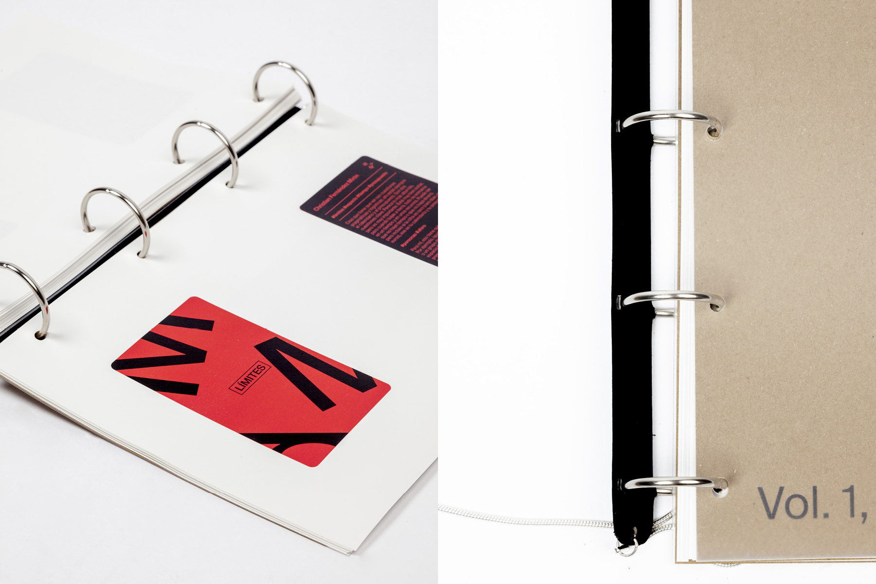
Design of “Volumen 1”, a reconfigurable and portable binder —which can be carried as a shoulder bag or a handheld bag— that collects a significant portion of the research and materials produced during the first year of the Mesa de Mezclas project, as well as the elements that facilitate the experience. / Binder body produced with the help of Christian Granados. Photography: Diego Navas. <2020>
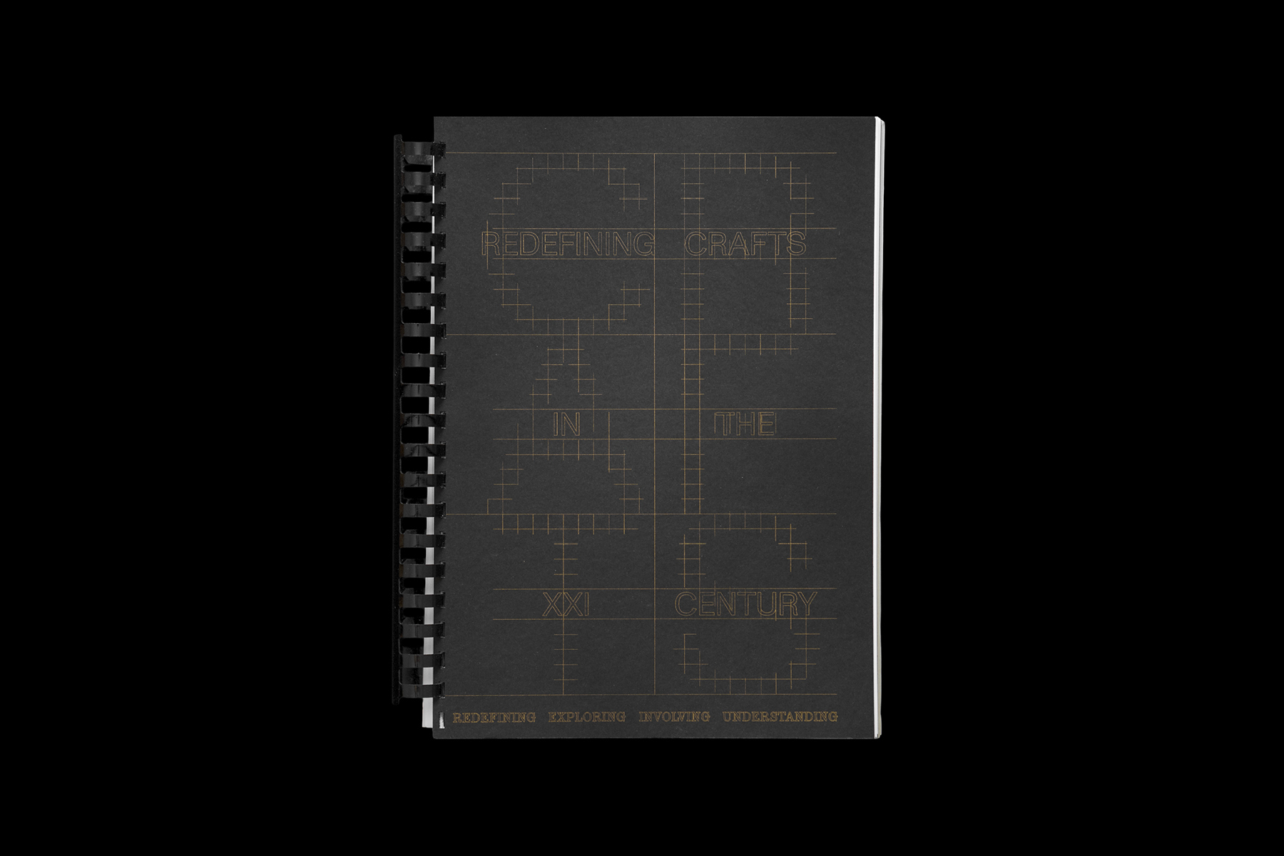
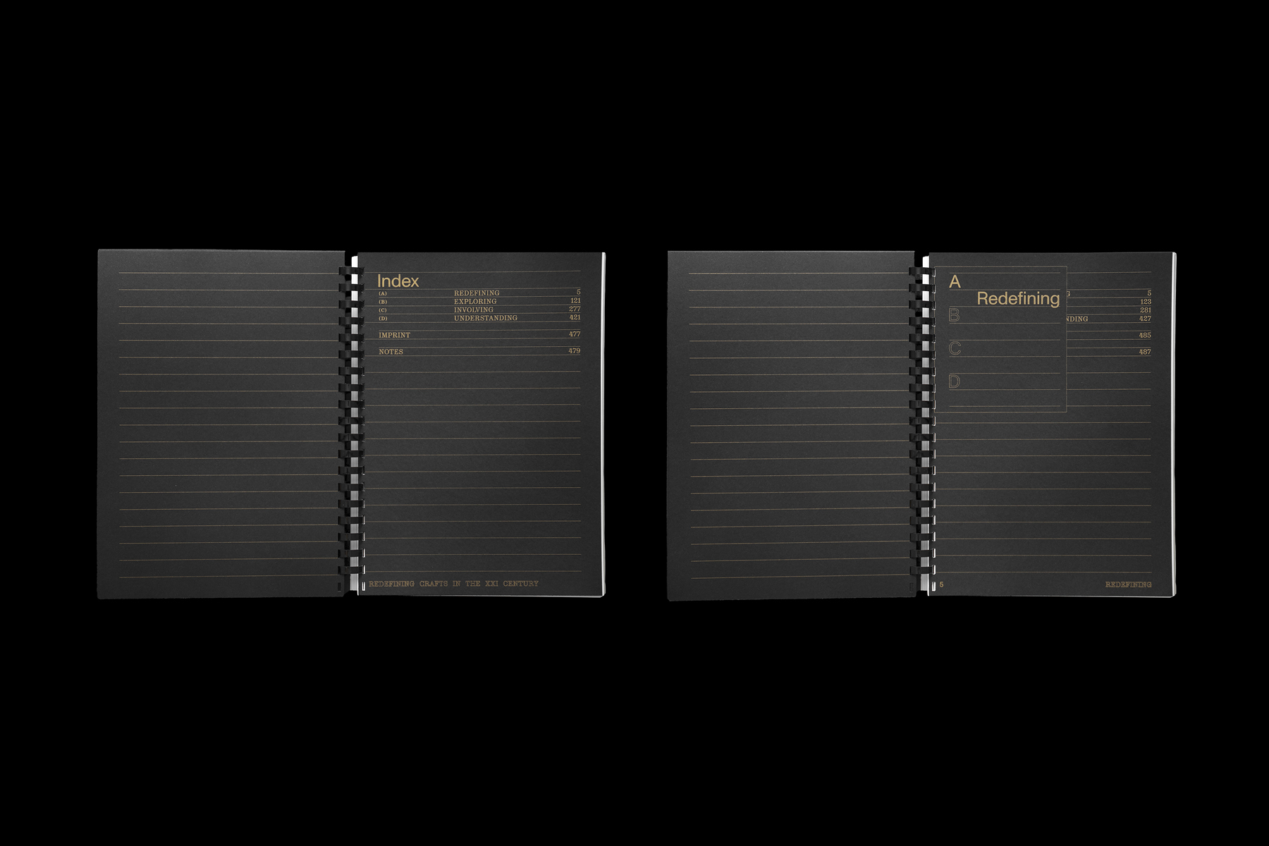
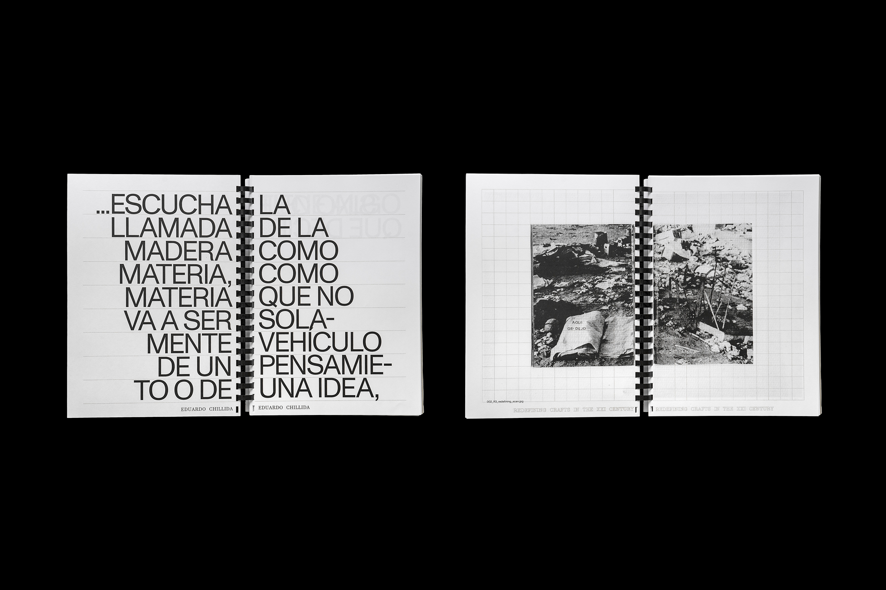
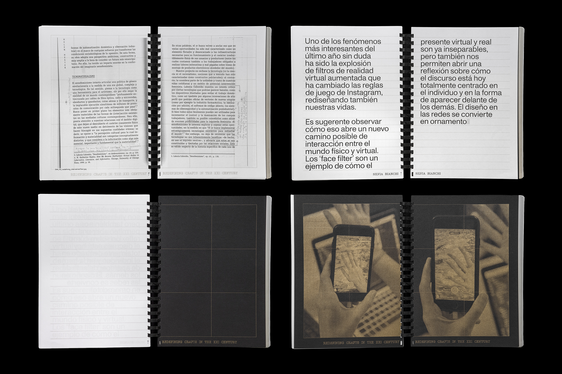
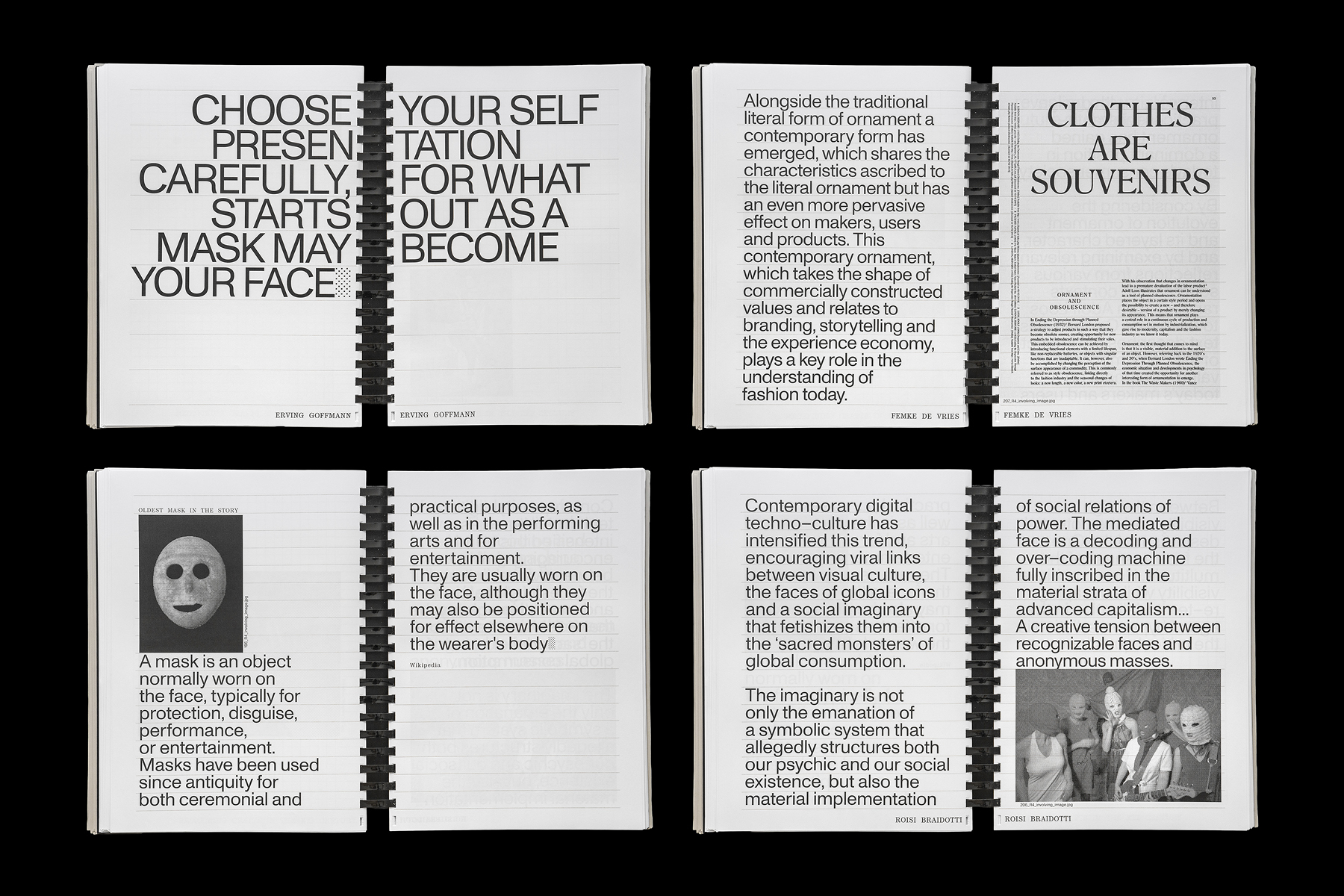
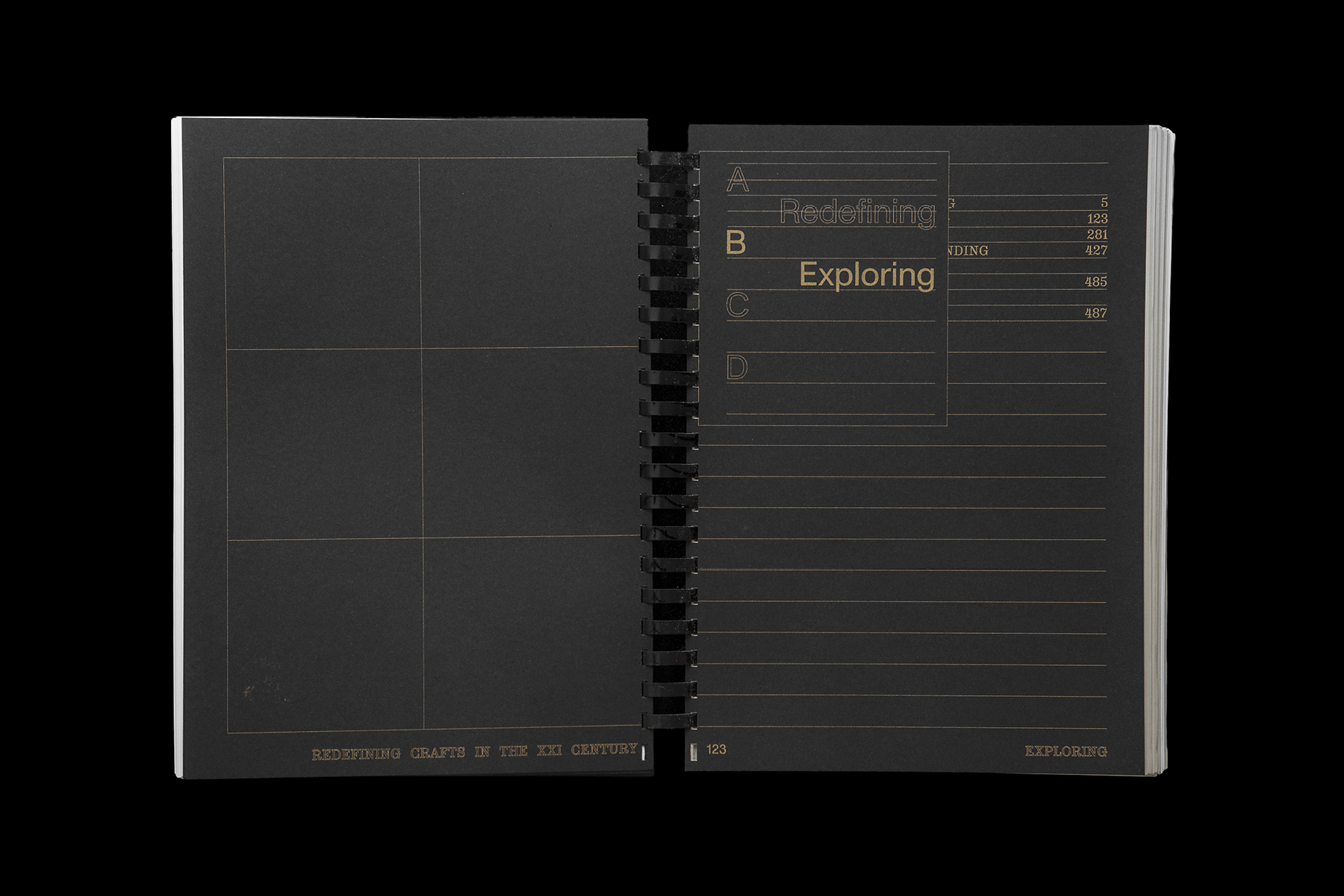
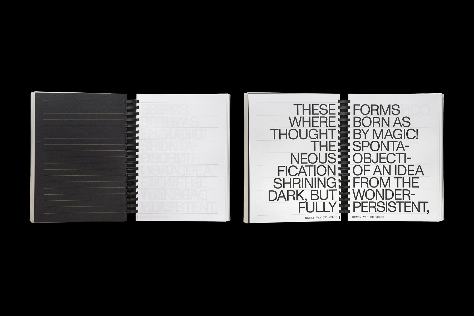
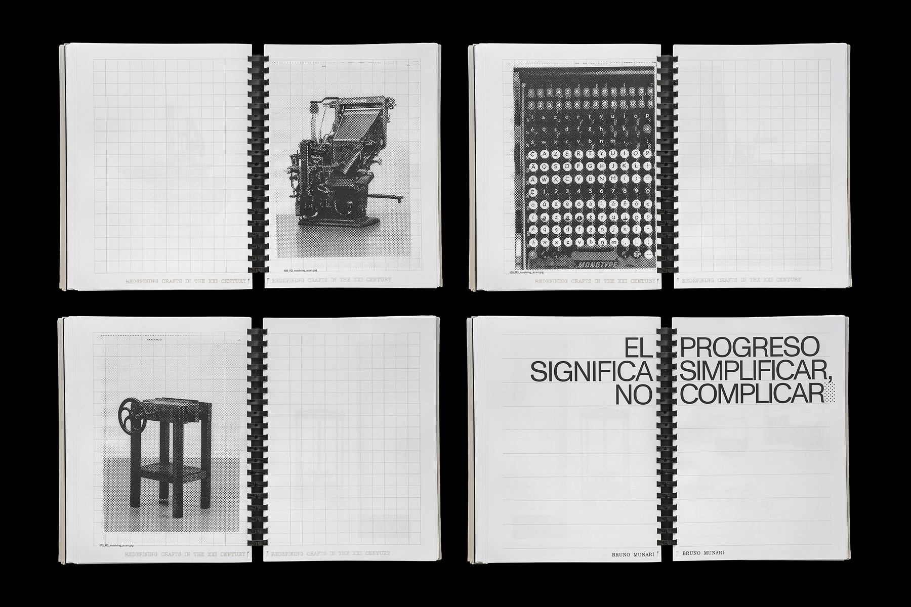
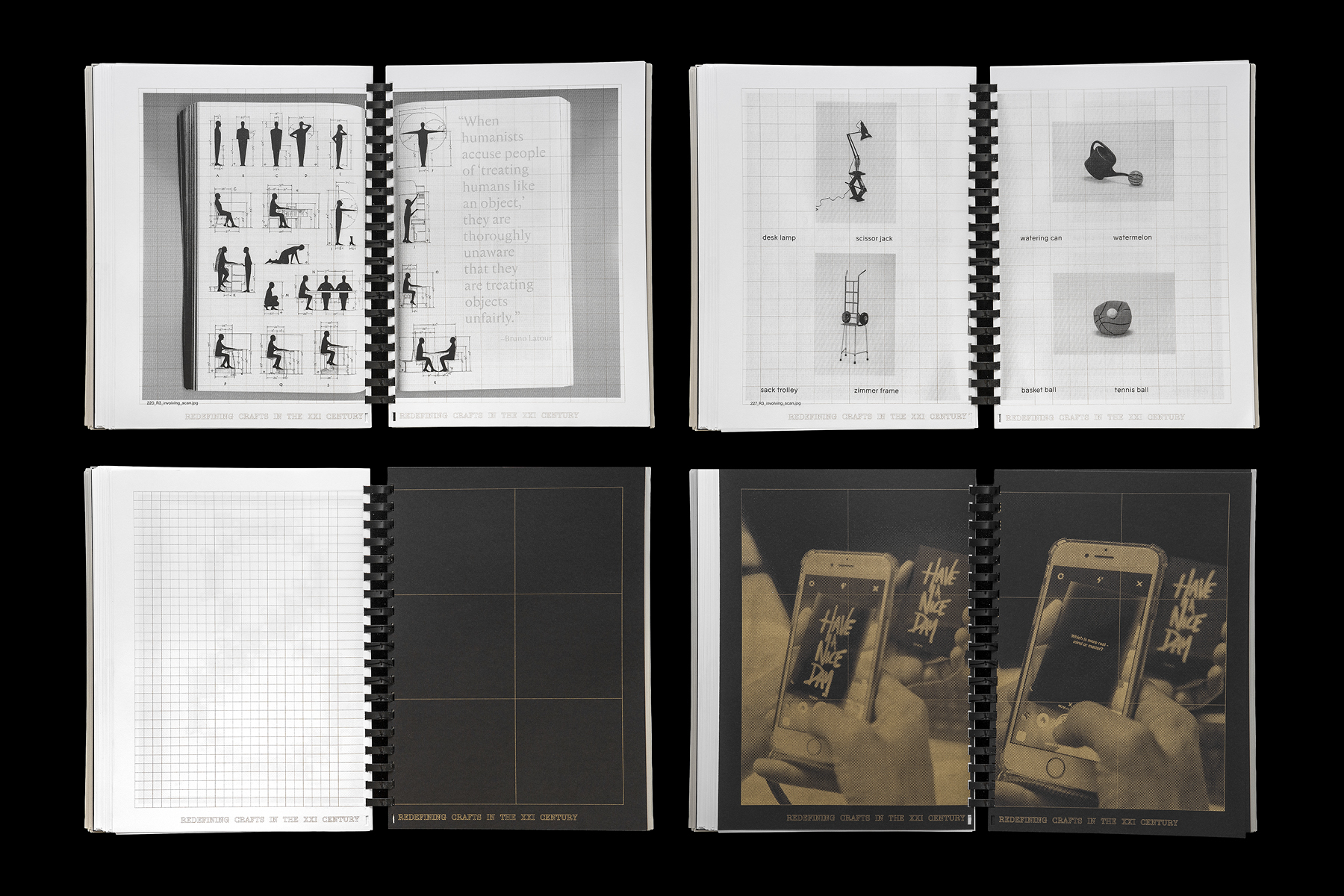
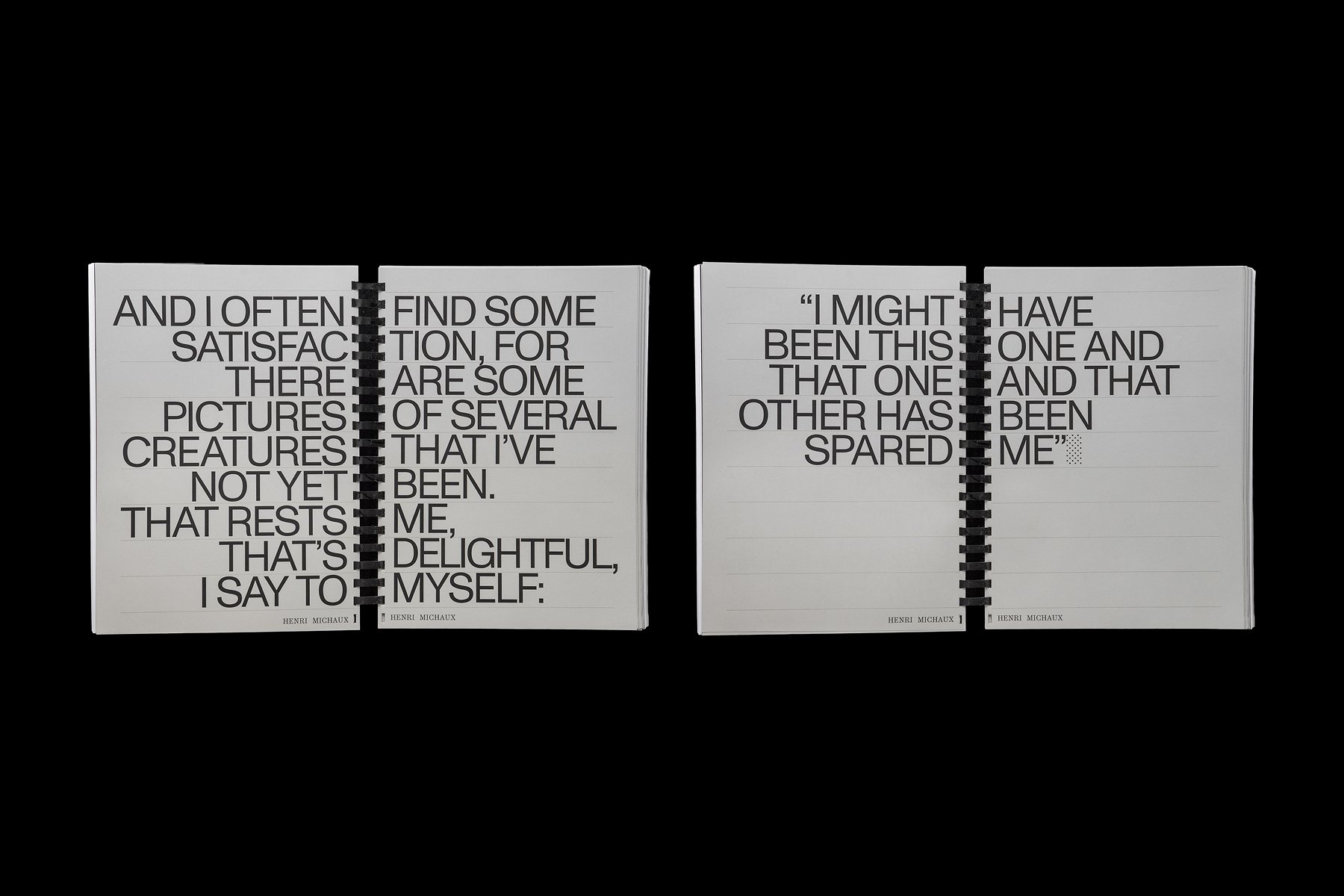
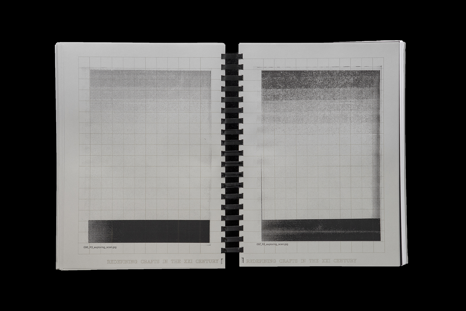
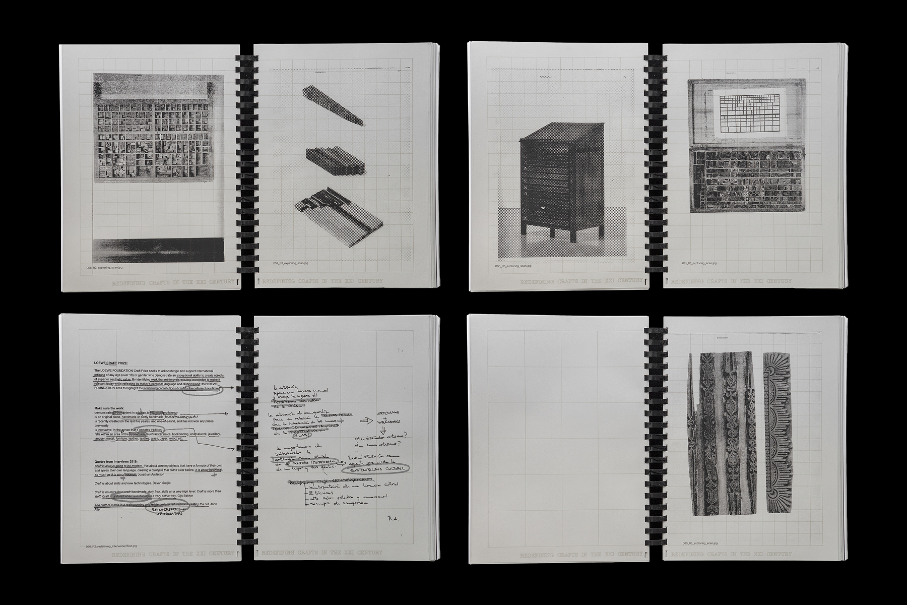
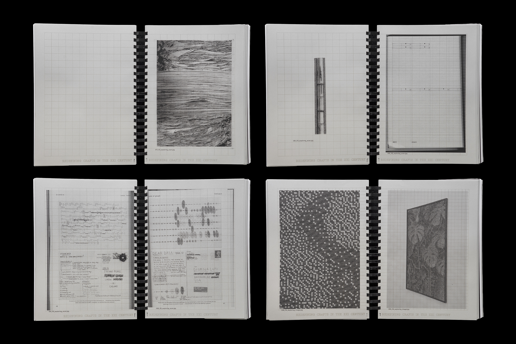
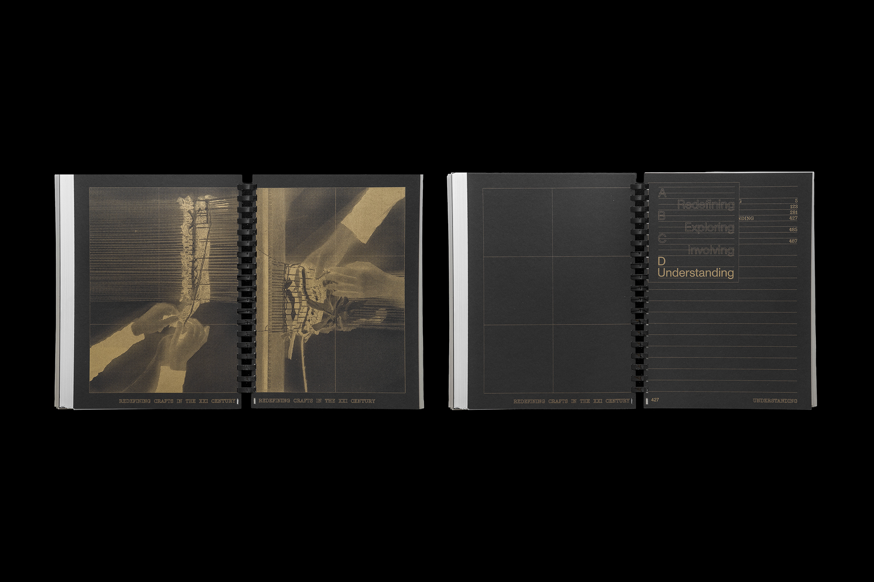
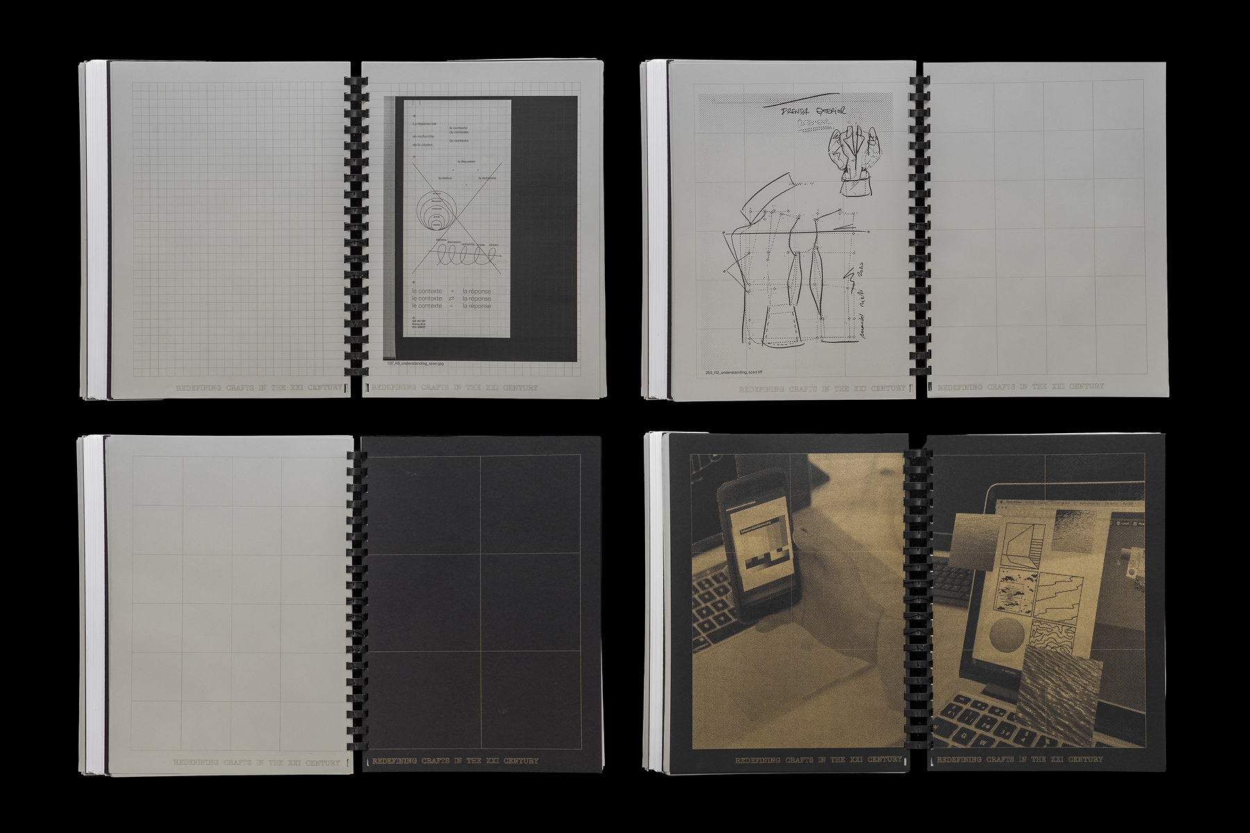
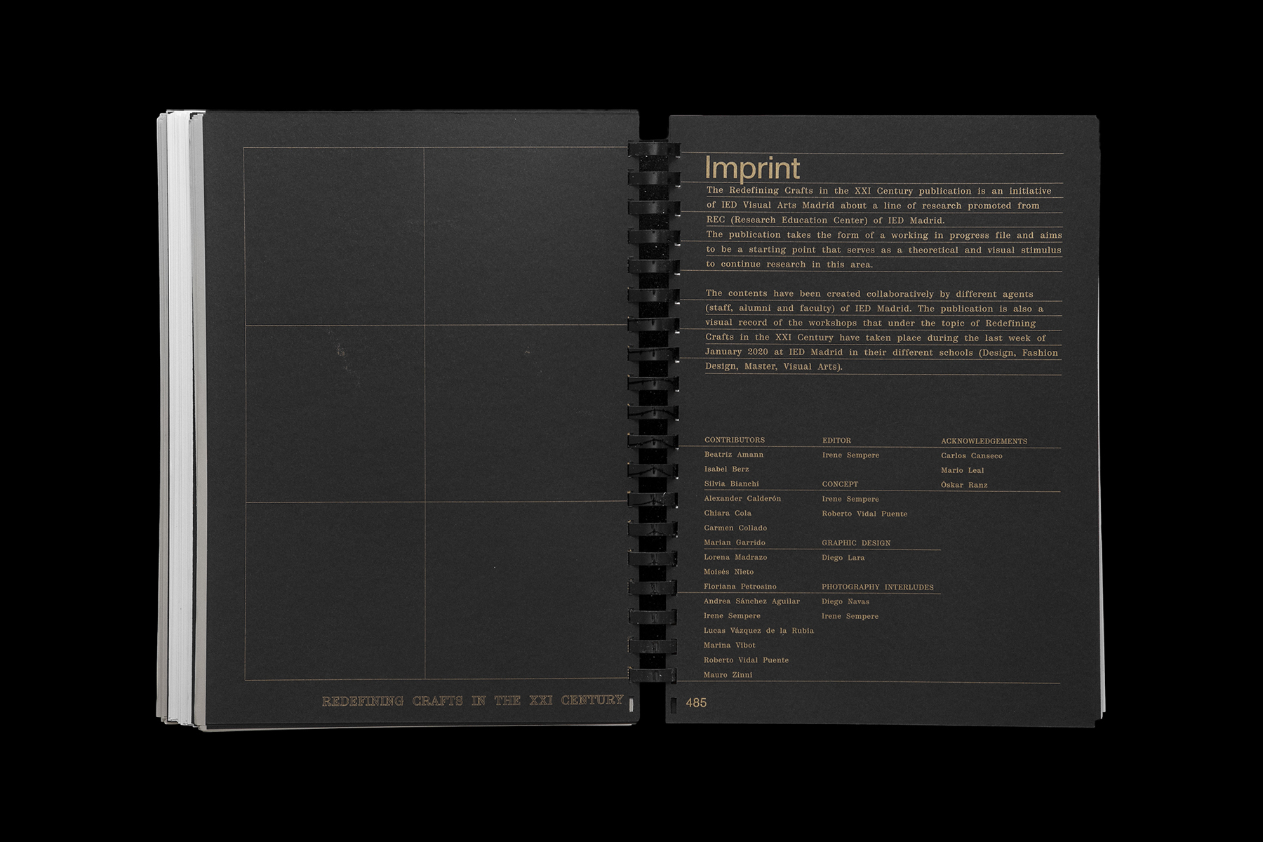
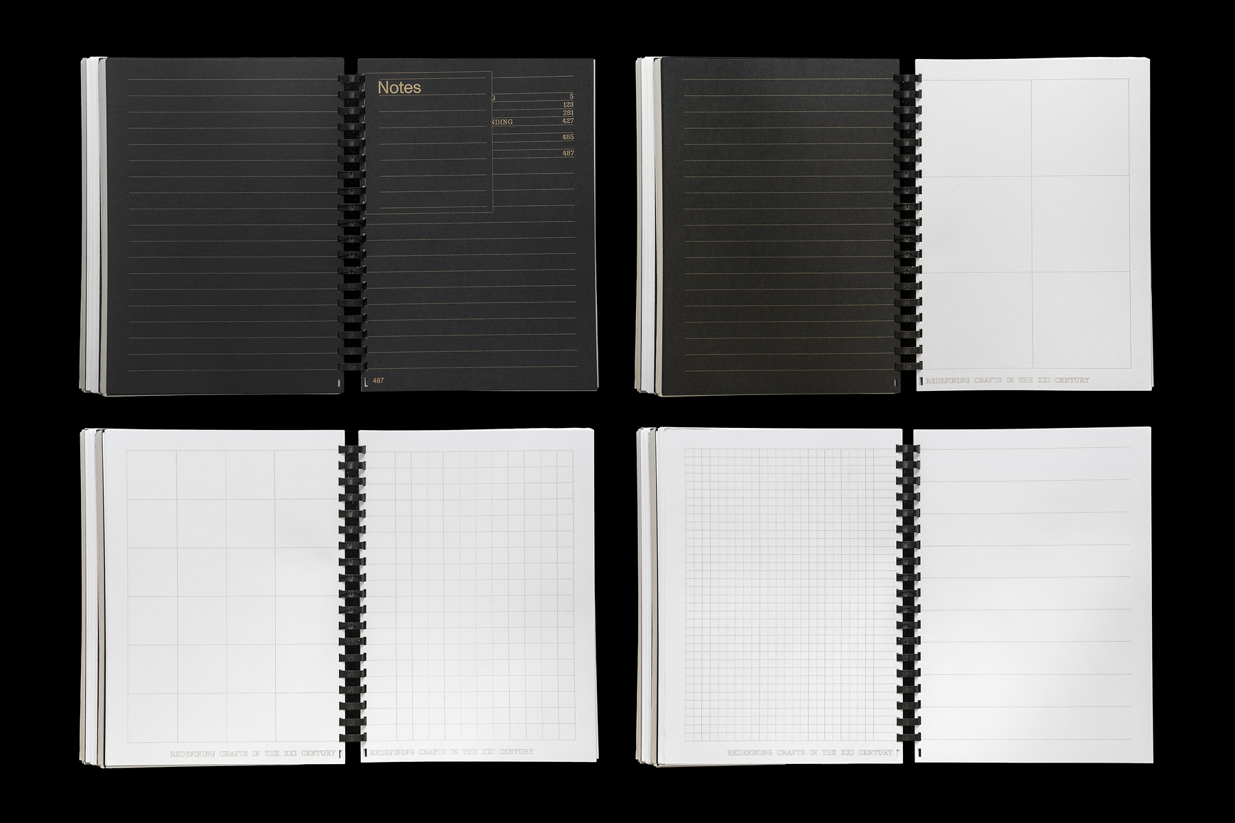
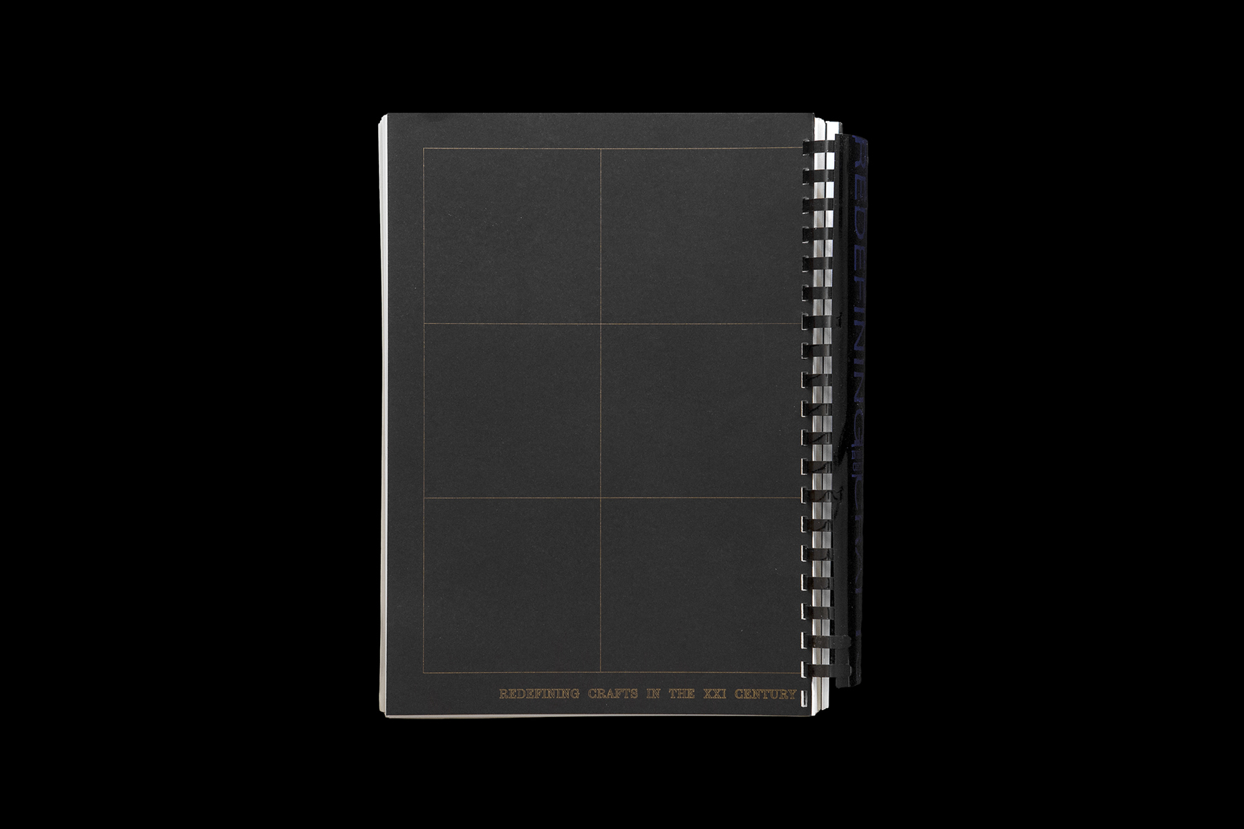
Concept, coordination, and editing of Redefining Crafts in the XXI Century, a publication built from contributions—both original and altered—from the faculty and staff of IED Madrid. It serves as a theoretical and visual stimulus to deepen the school's research line of the same name, initiated in 2014. / Concept developed in collaboration with Roberto Vidal. Graphic design: Diego Lara. Printed in risograph, with stamped spines and hand-bound with the support of Óskar Ranz at IED Madrid. Photography: Diego Navas. <2020>
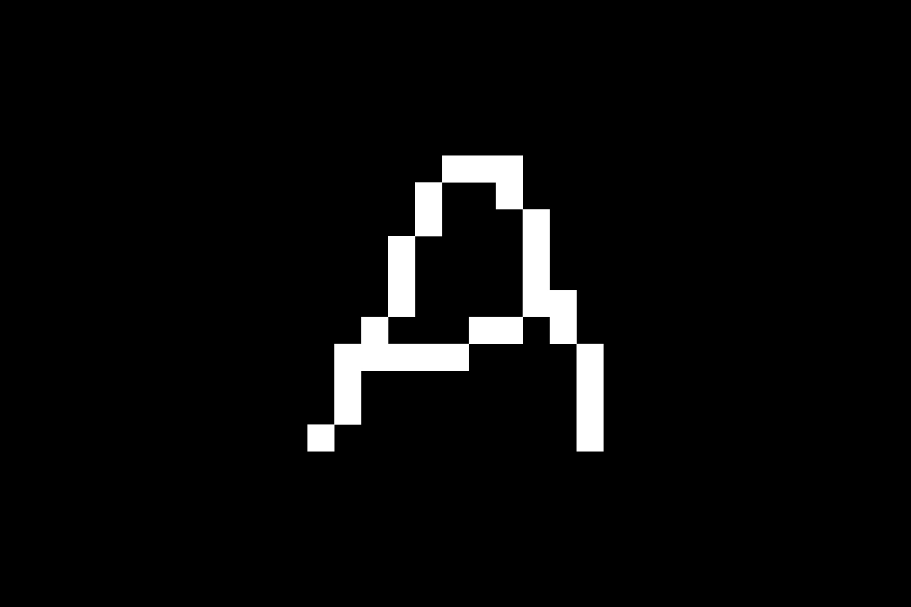


Design of the glyphs A-R-A-Ñ-A for the creation of the modular and flexible logo of ARAÑA, a 3m² independent art space located in the hallway of building in central Madrid, dedicated to illustration, contemporary drawing, and graphic work. / Photography: Paula Caballero. <2019>
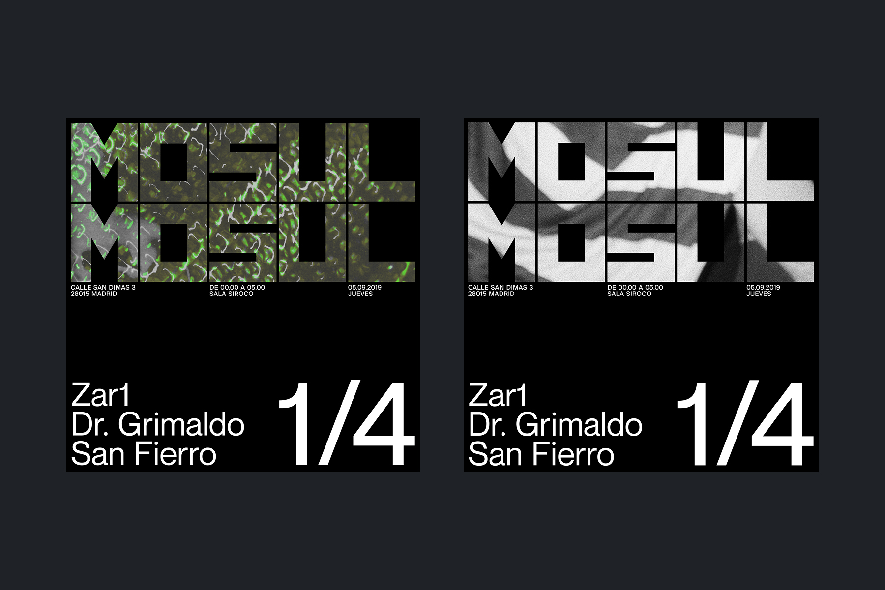
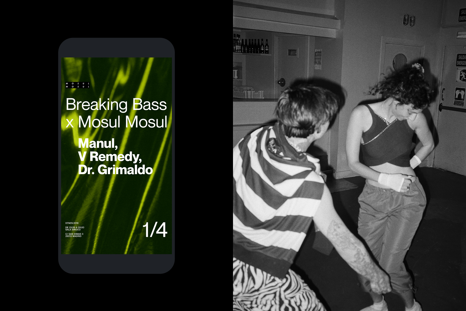
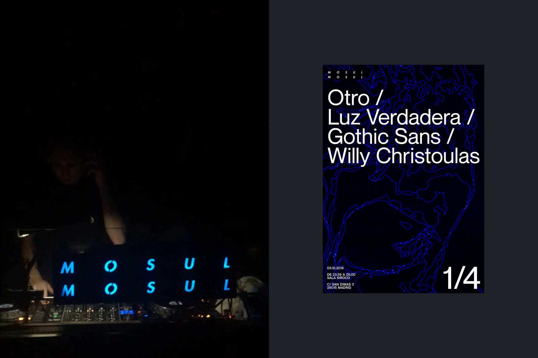
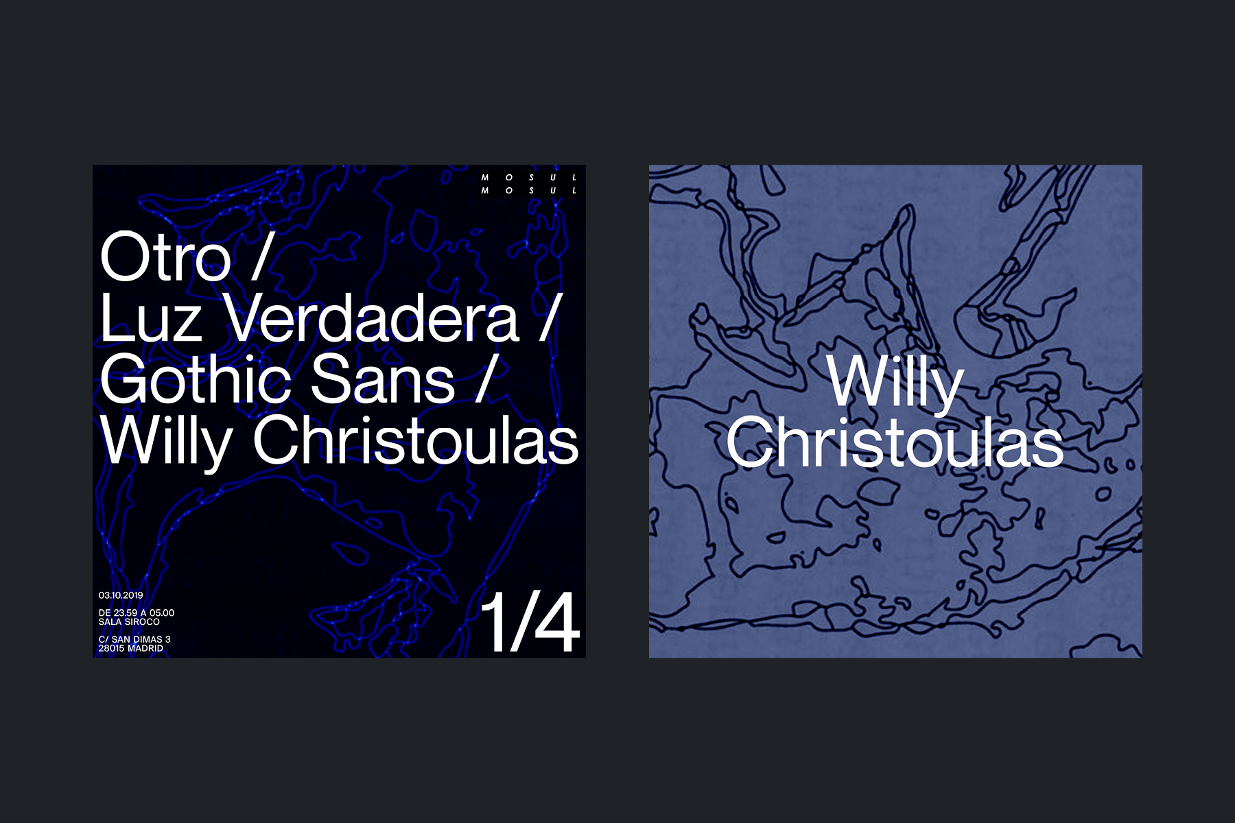
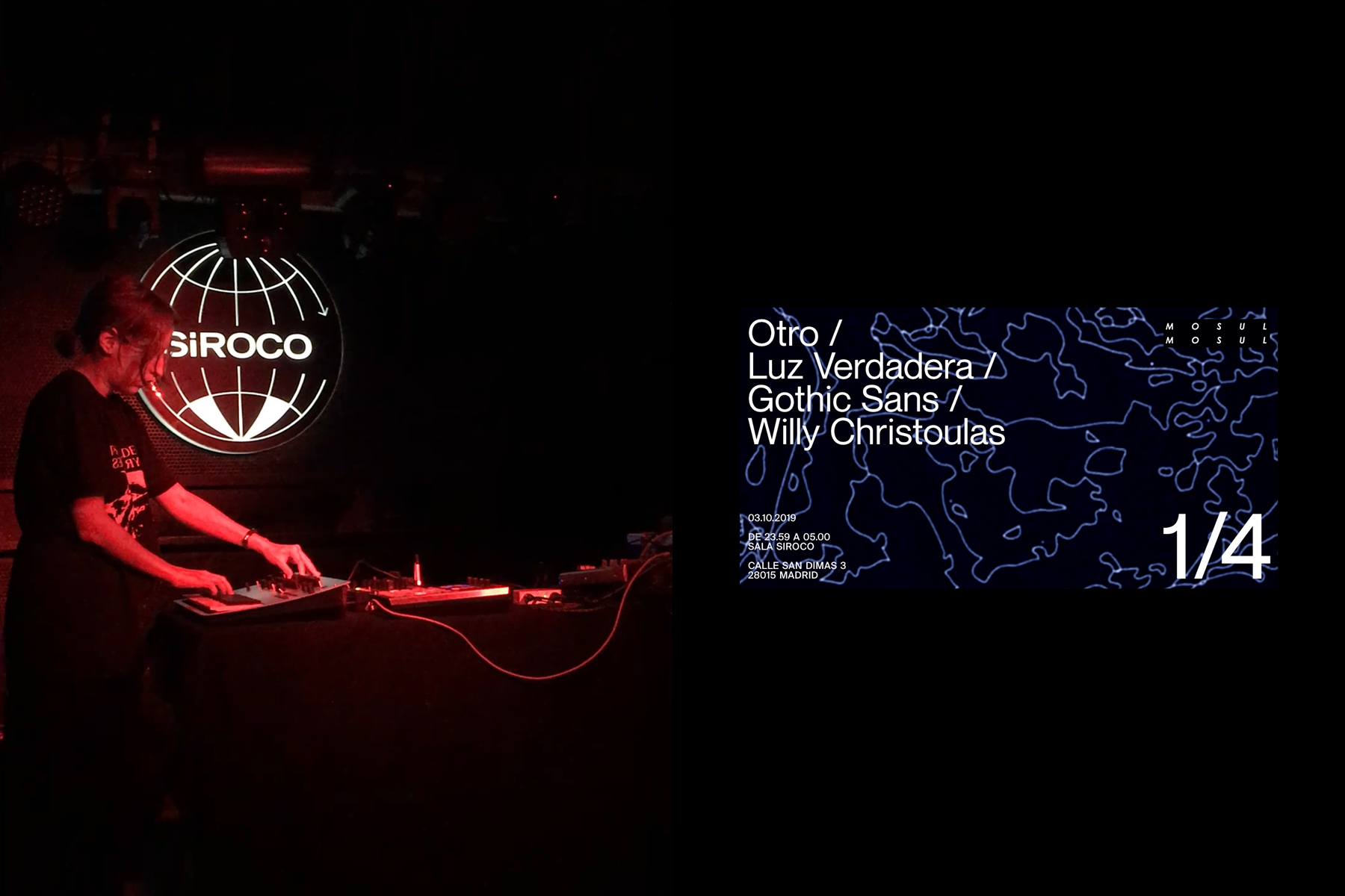
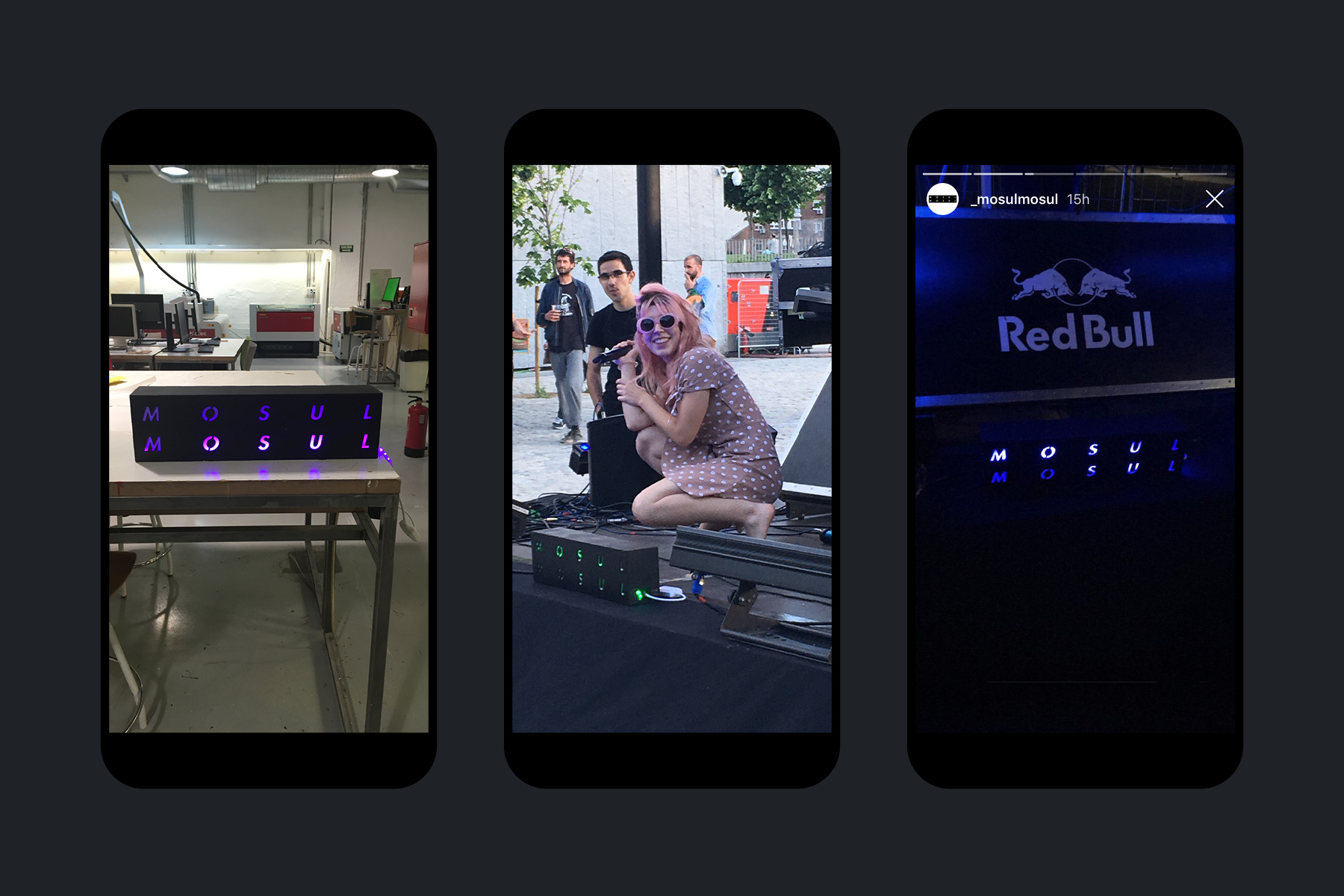
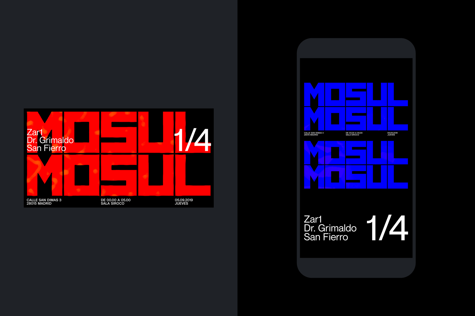
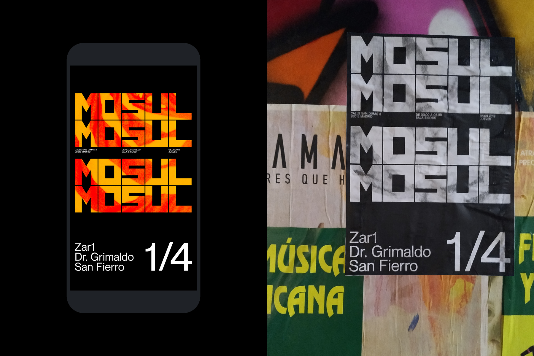
Posters for 1/4, the electronic music event series organized by Mosul Mosul at Sala Siroco in Madrid. + Design and production of a removable light box that serves as an identifying element for the collective, both in venues and alongside other brands. / Project developed as a member of Mosul Mosul. <2019>
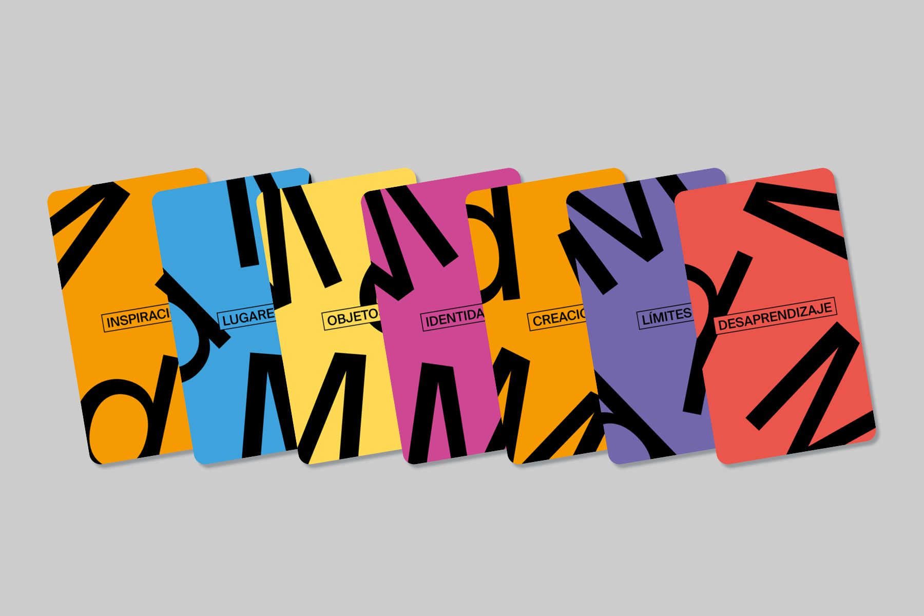
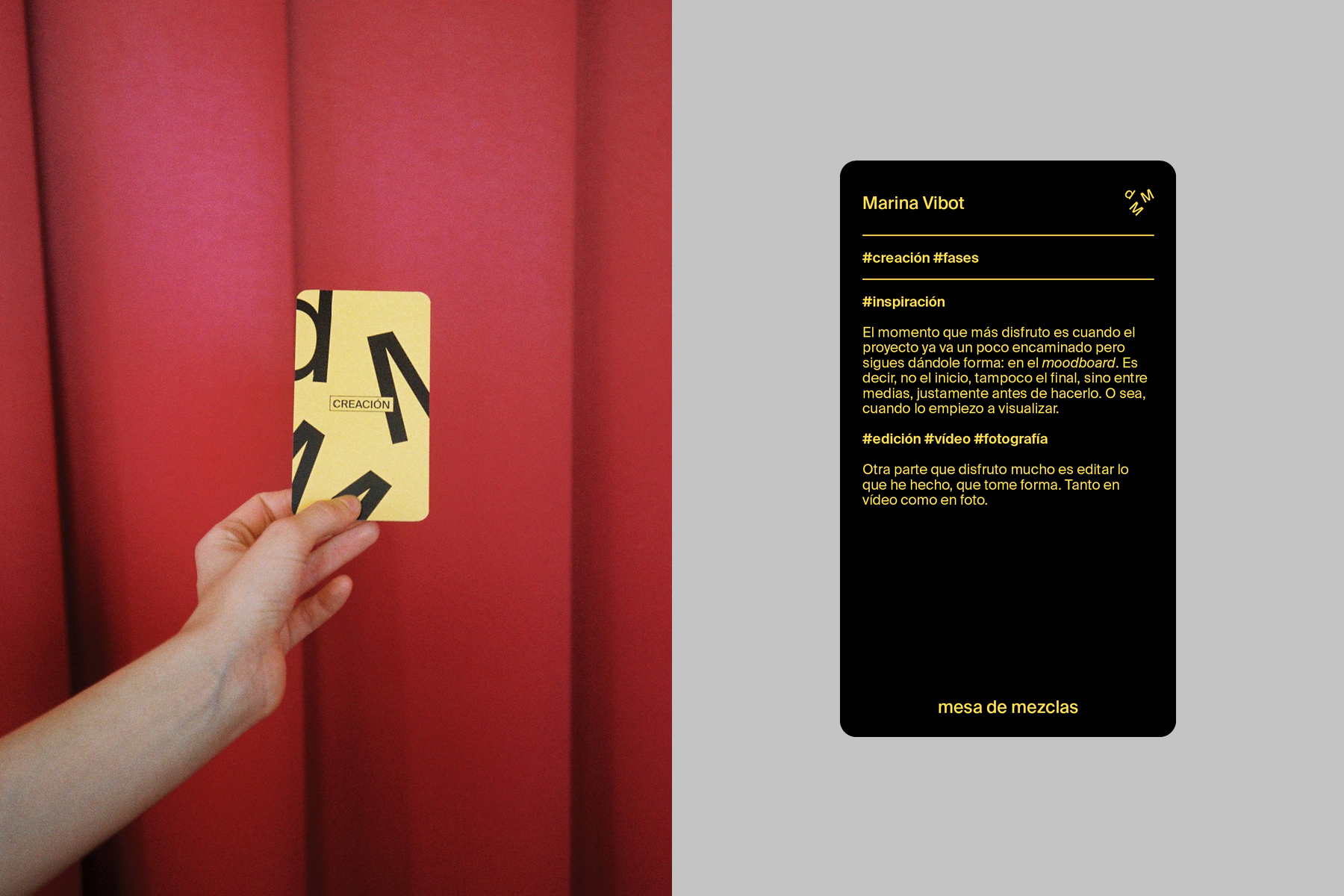
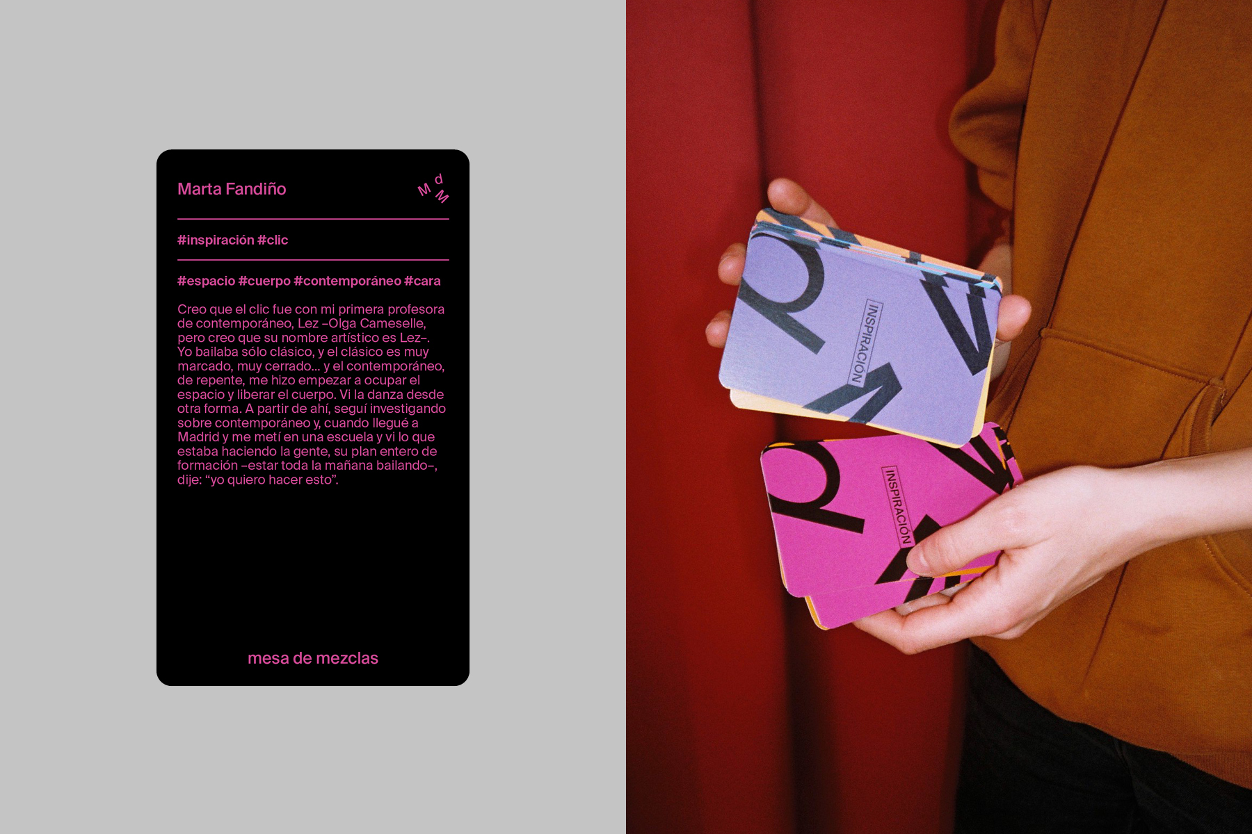
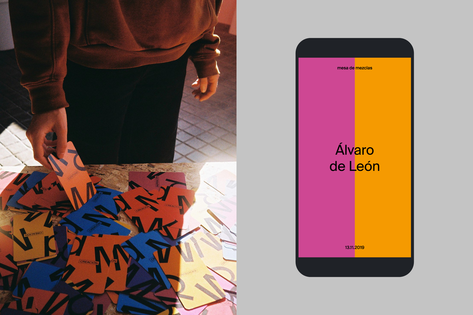
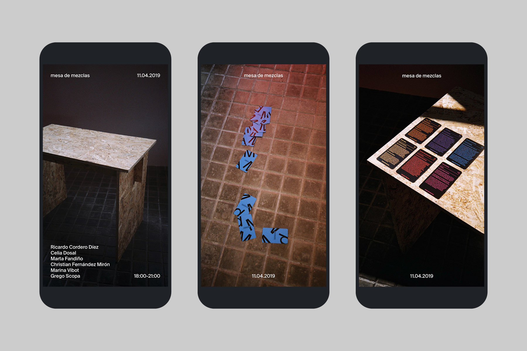
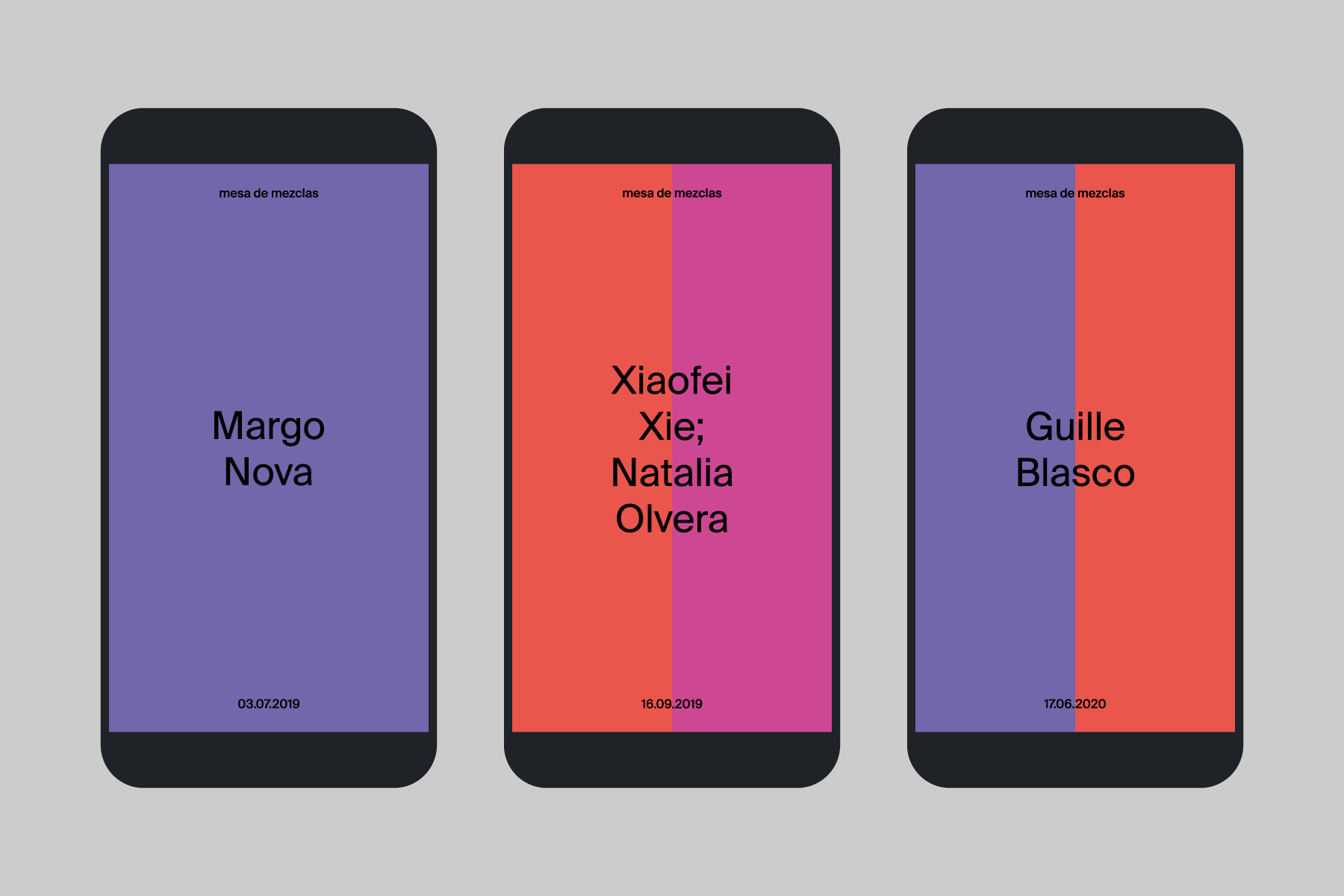
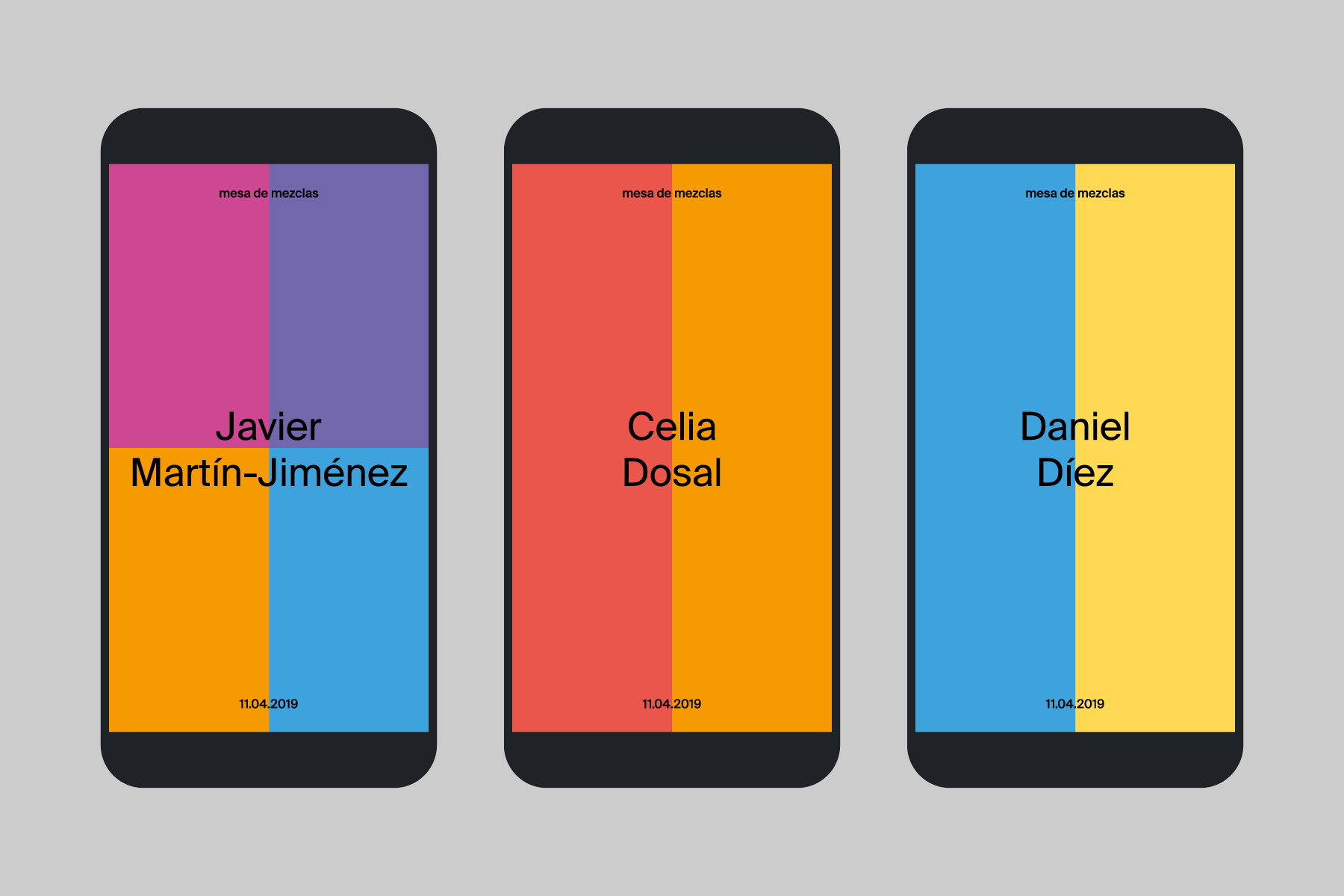
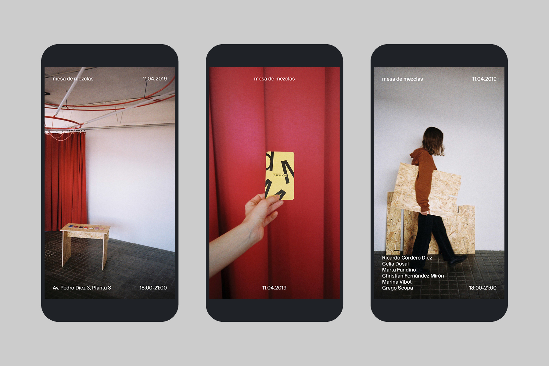
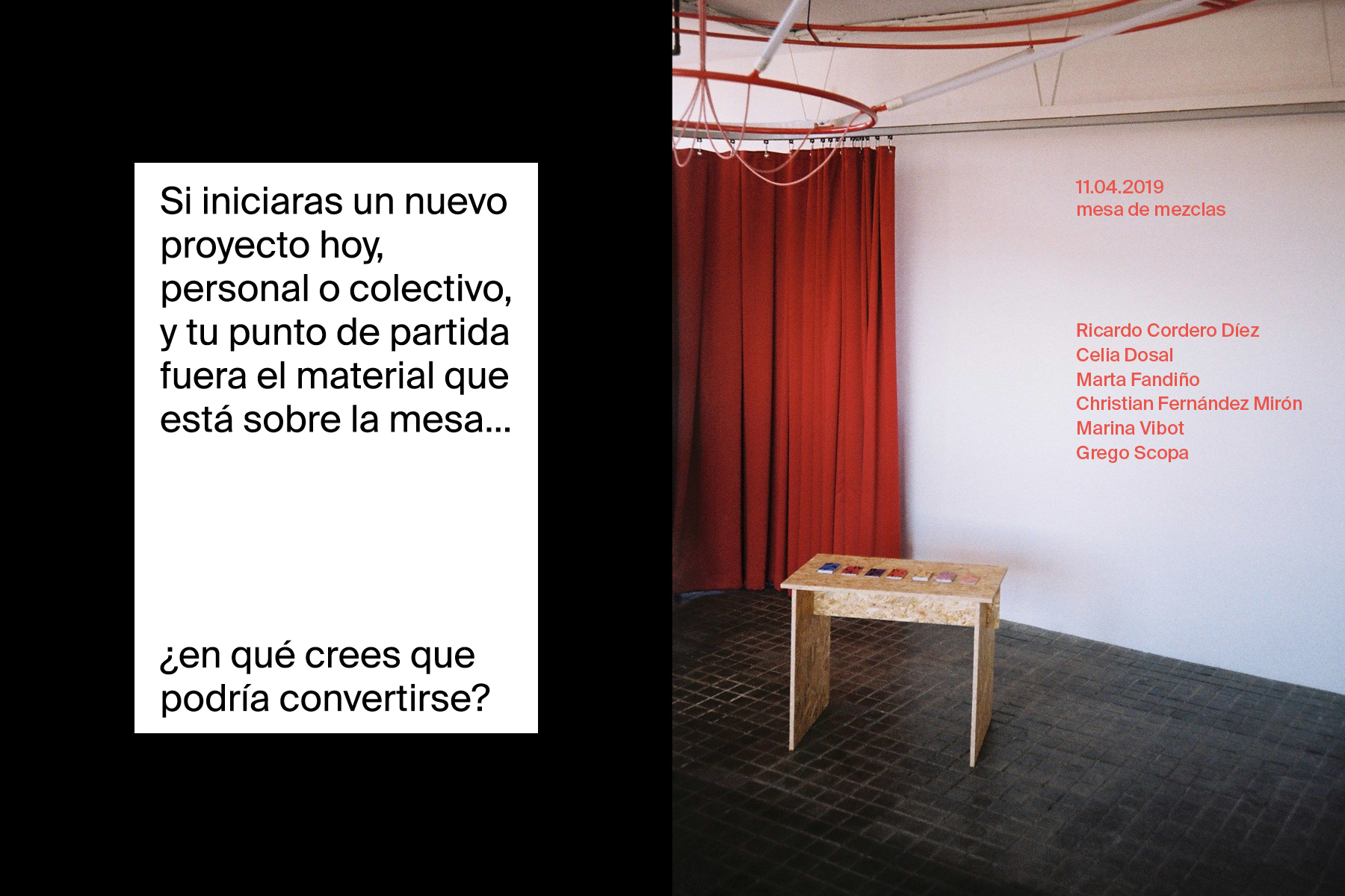
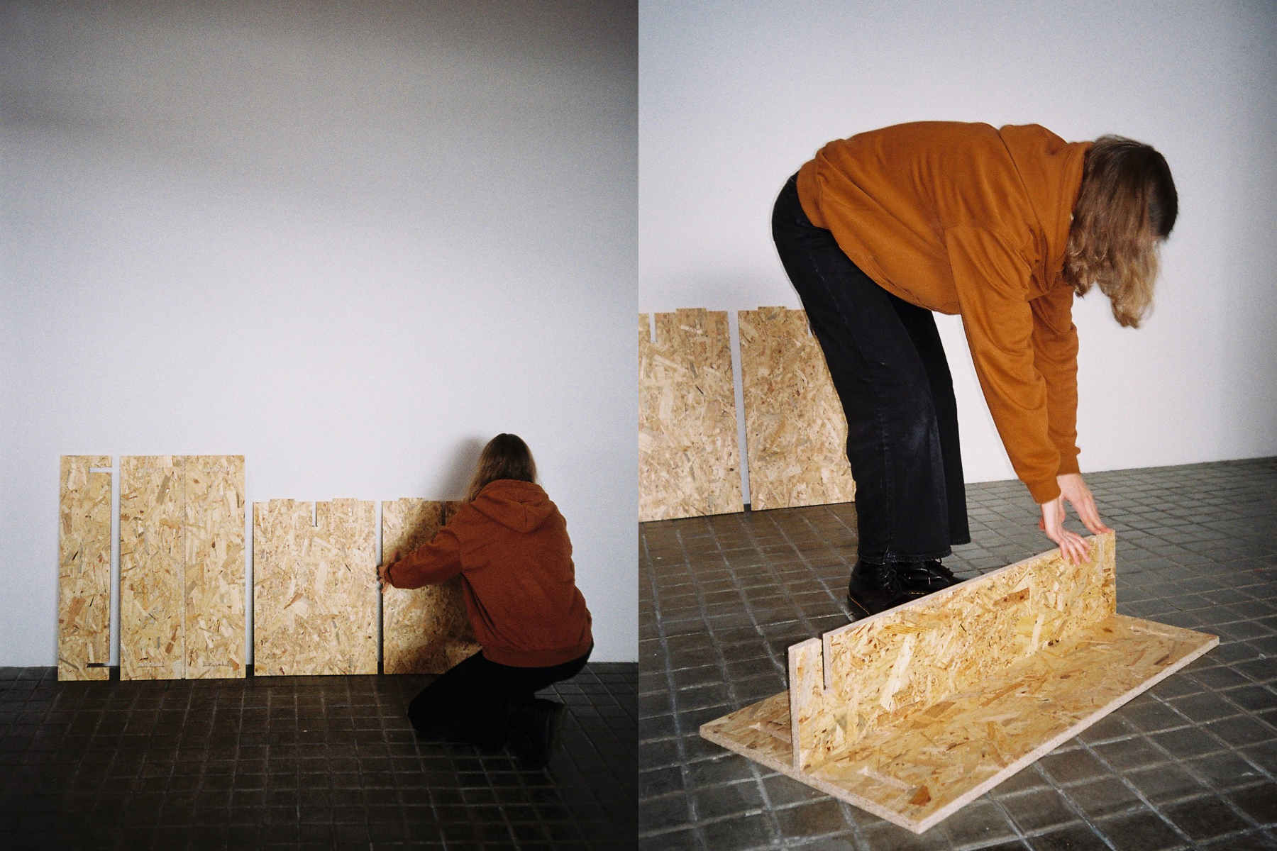
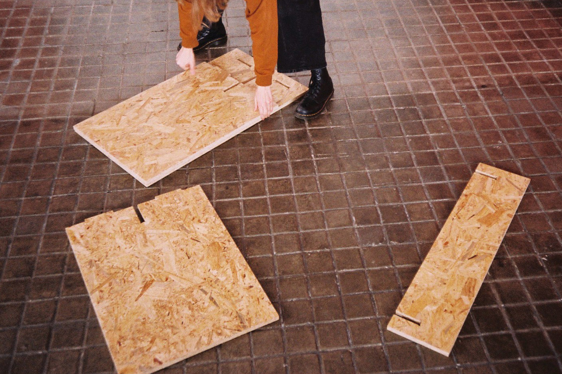
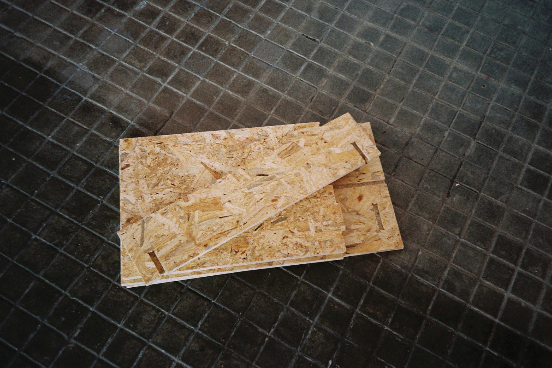
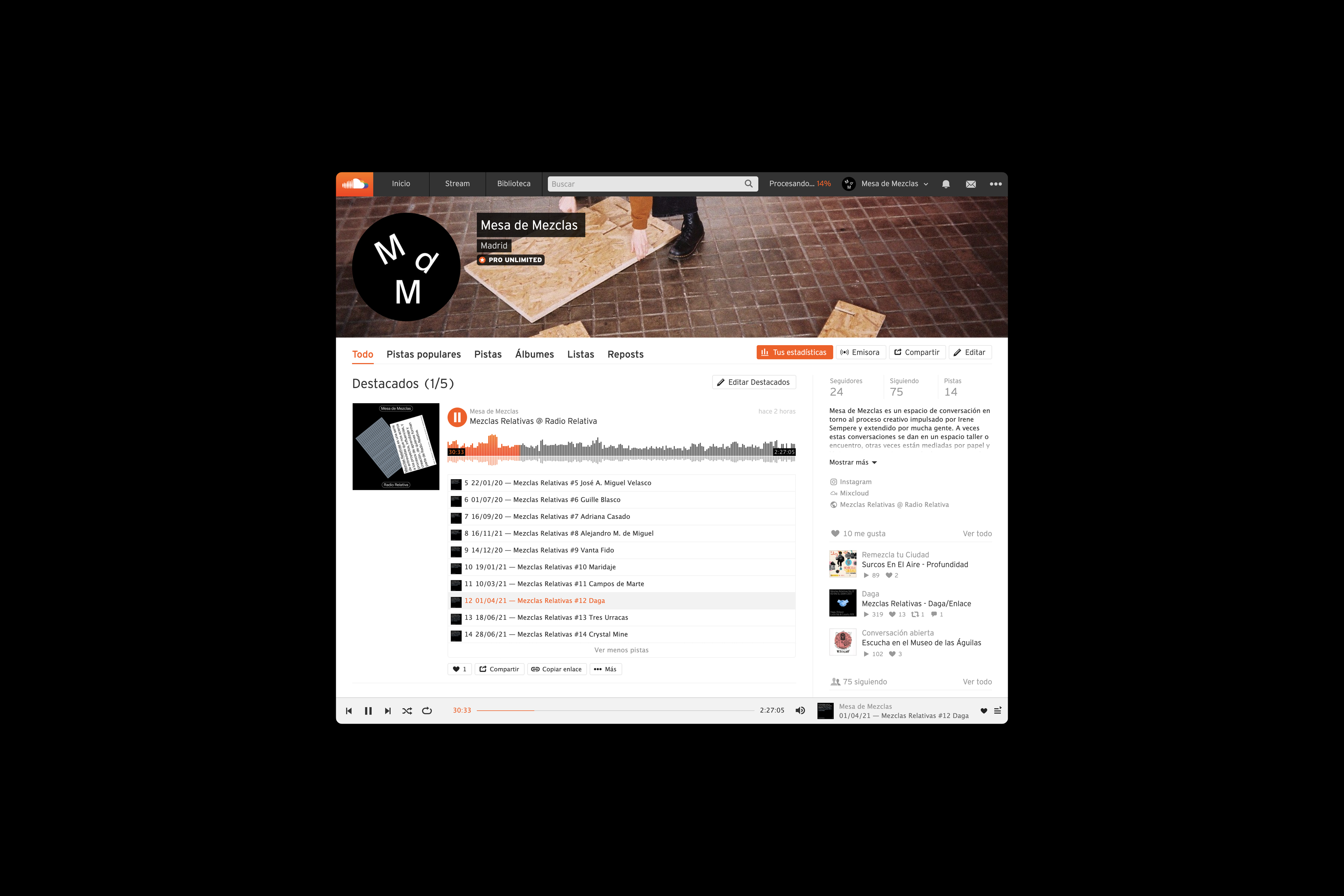
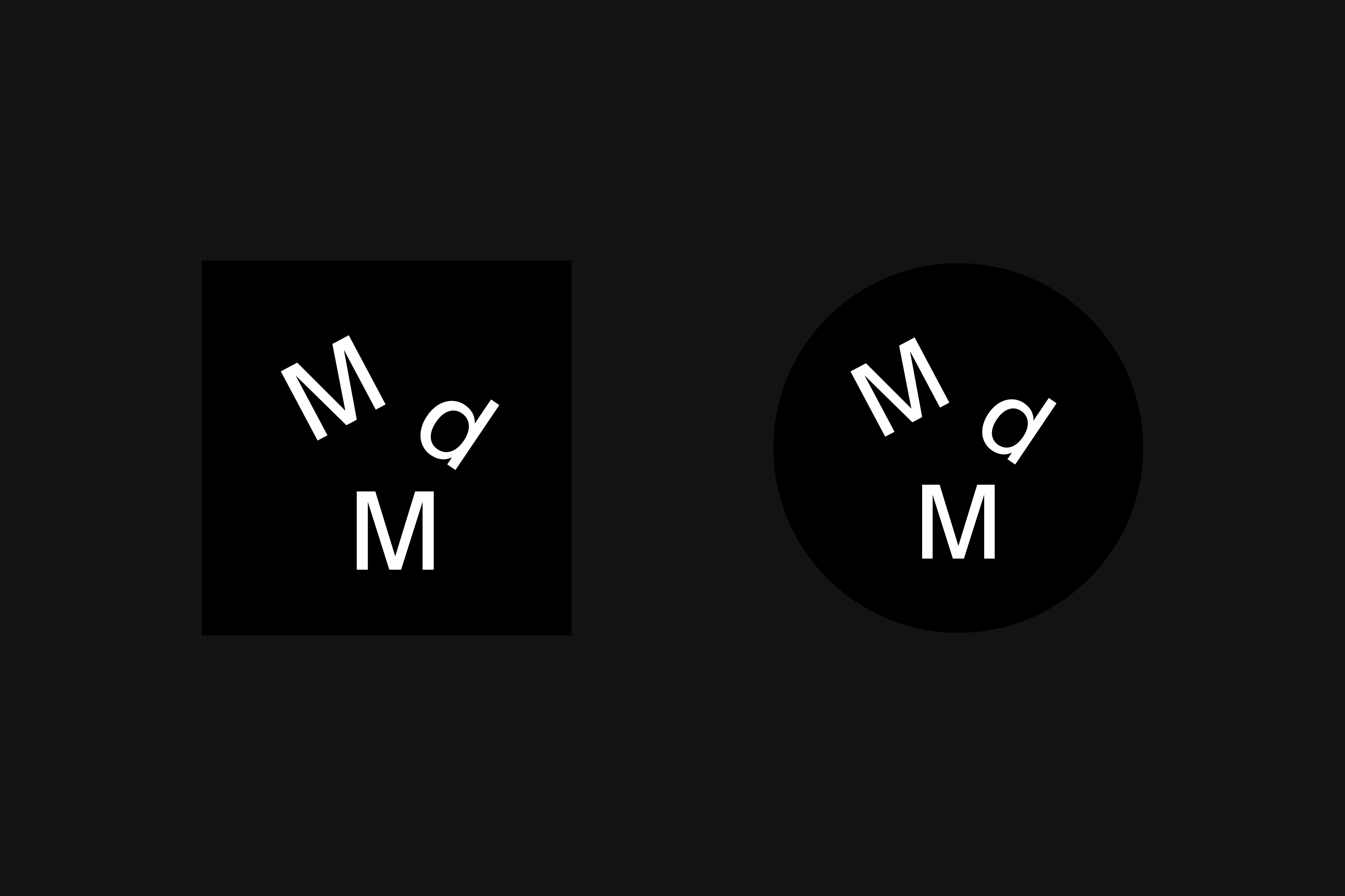
Exhibition and communication design for the first edition of Mesa de Mezclas: an interactive experience centered around a table where fragments of conversations with six individuals working across different creative fields are displayed in the form of cards. The arrangement of the letters “M”, “d”, and “M” that form the project’s symbol represents the table as a space for encounter—between disciplines, positions, and profiles—conversation, and remixing. / This project was my final thesis for the BA in Graphic Design at IED Madrid. Table production: Estudio Deemer. Photography: Marina Vibot. <2019>
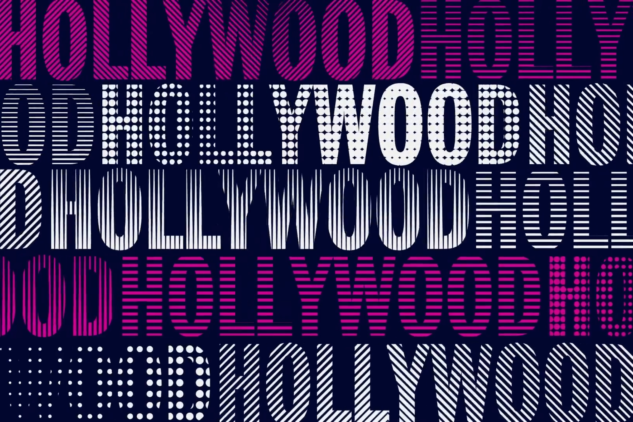
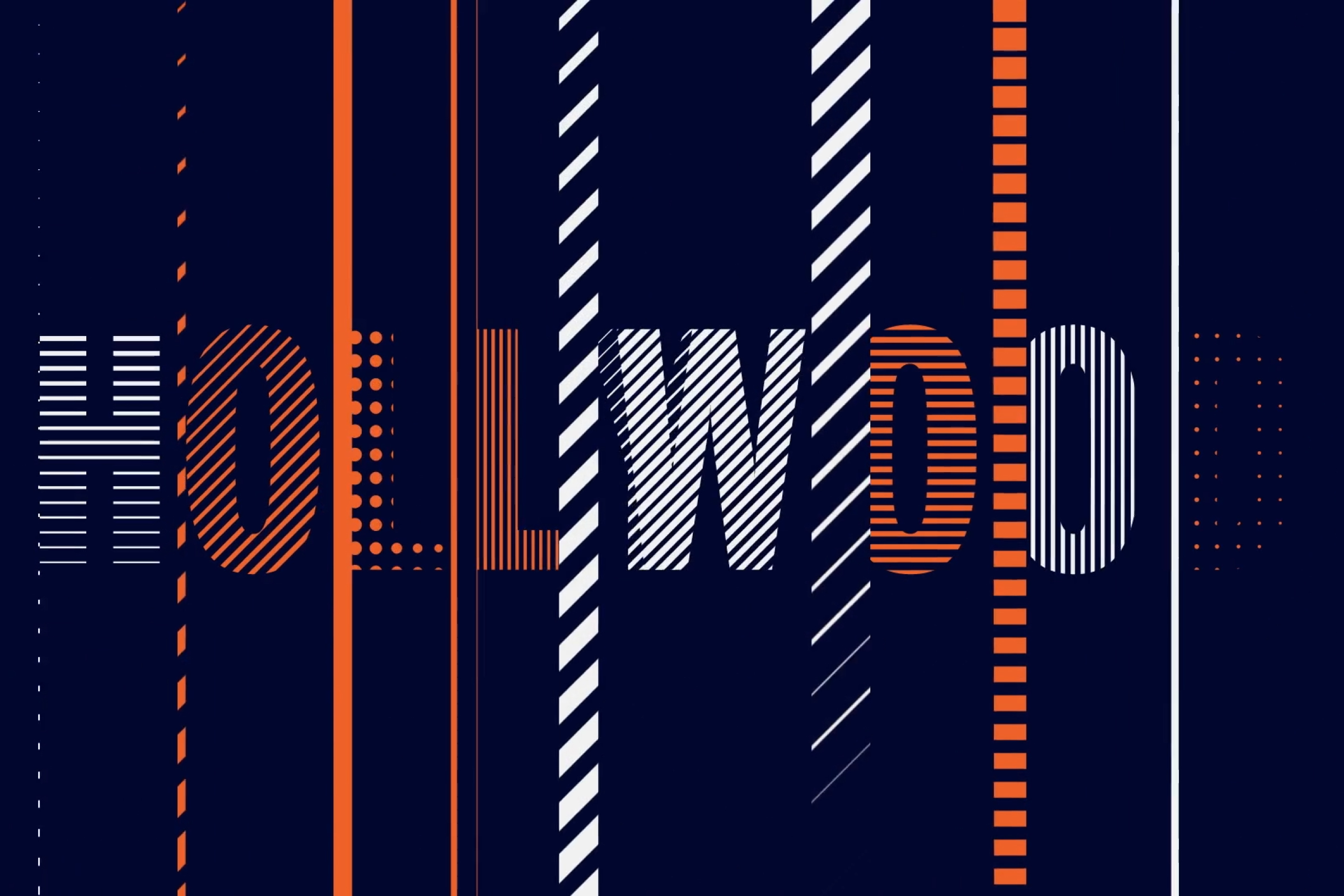
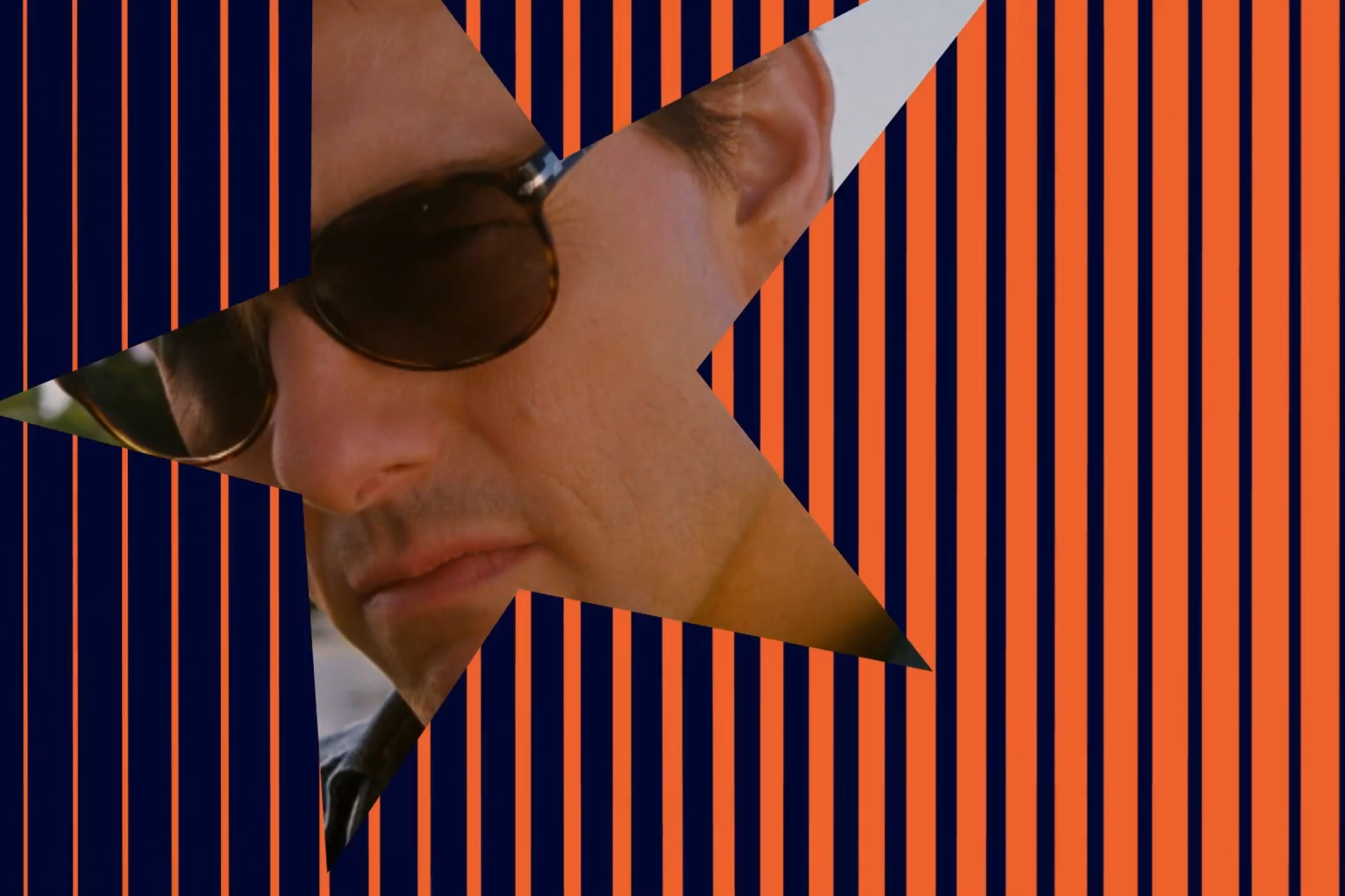
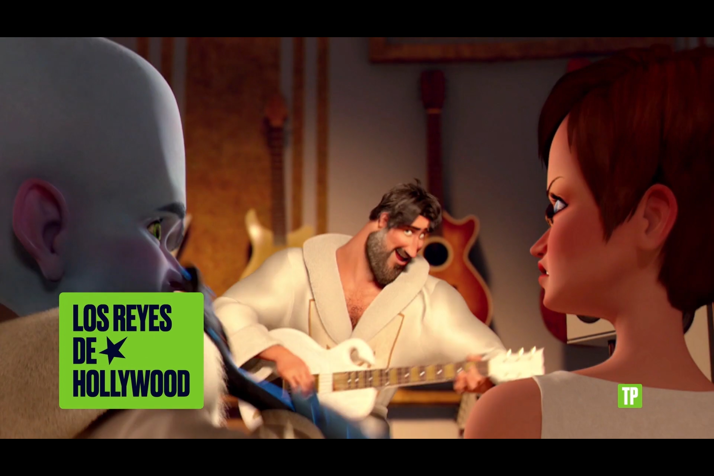
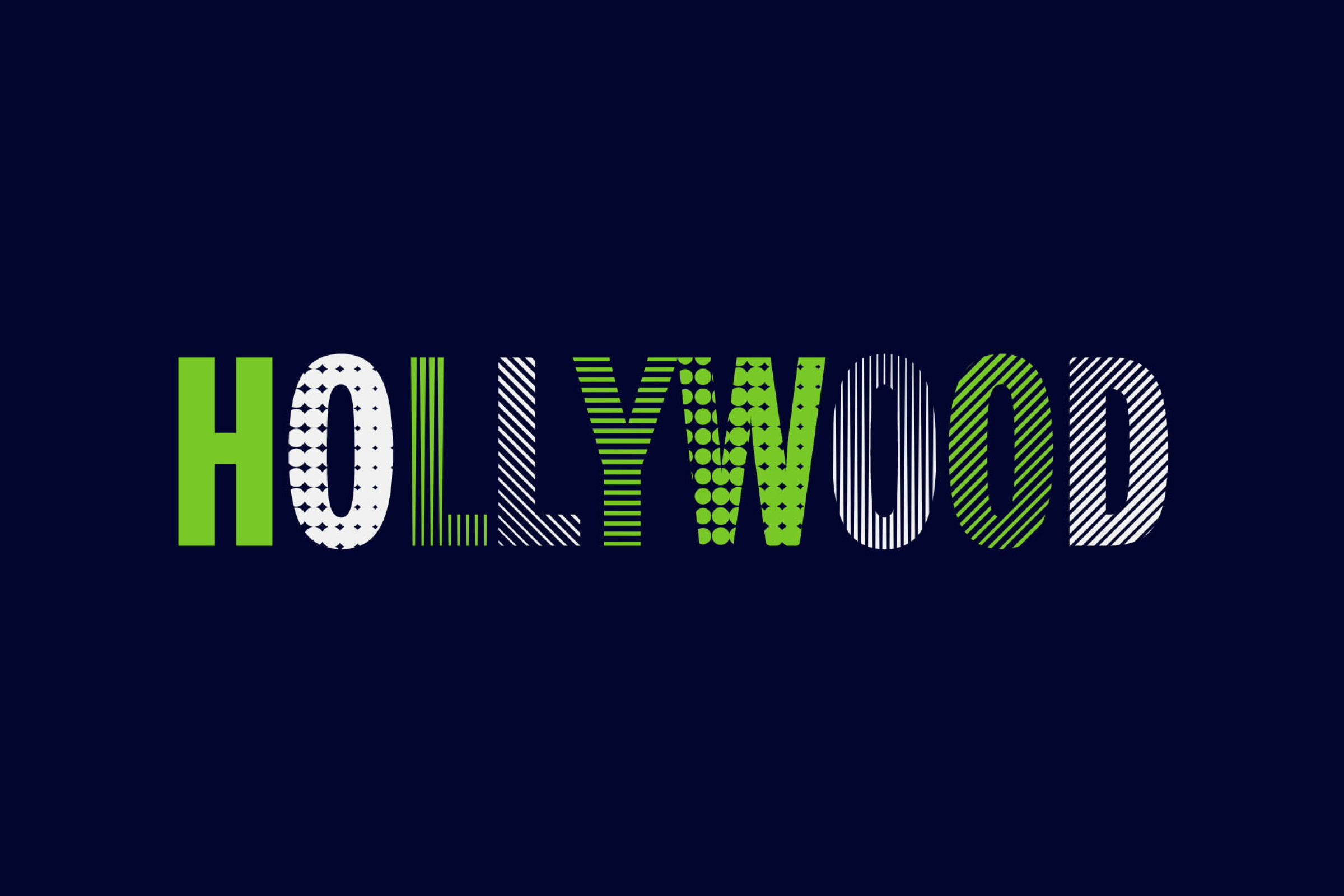
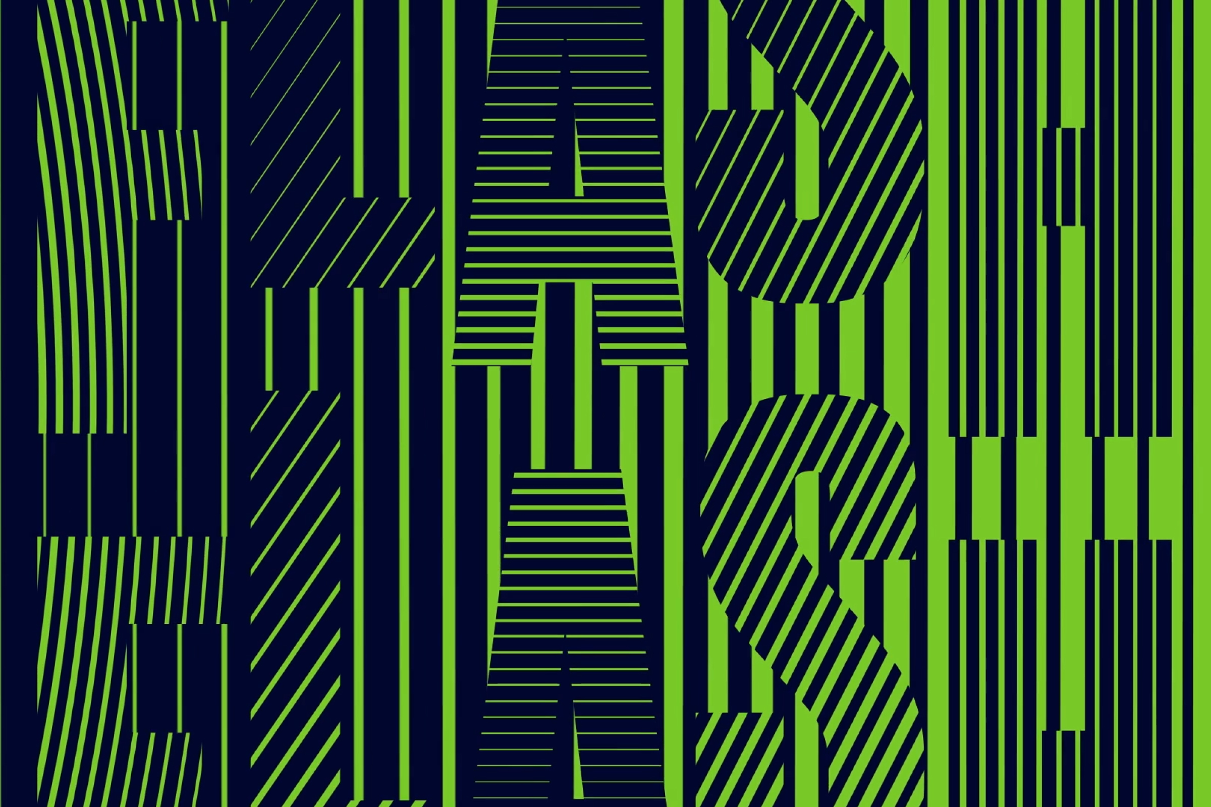
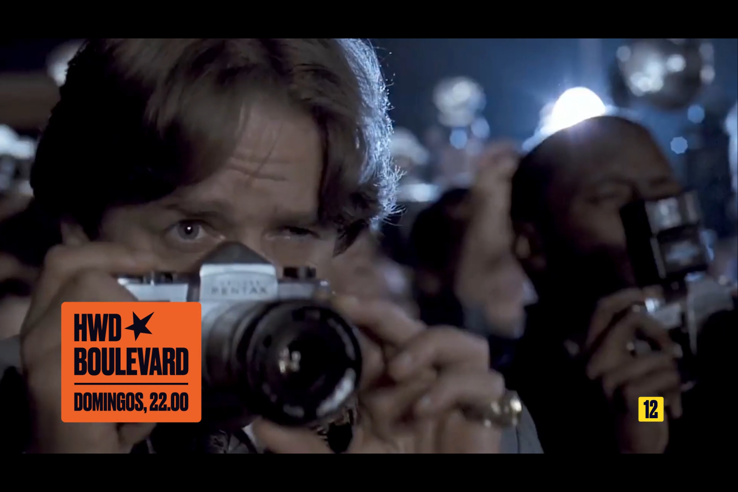
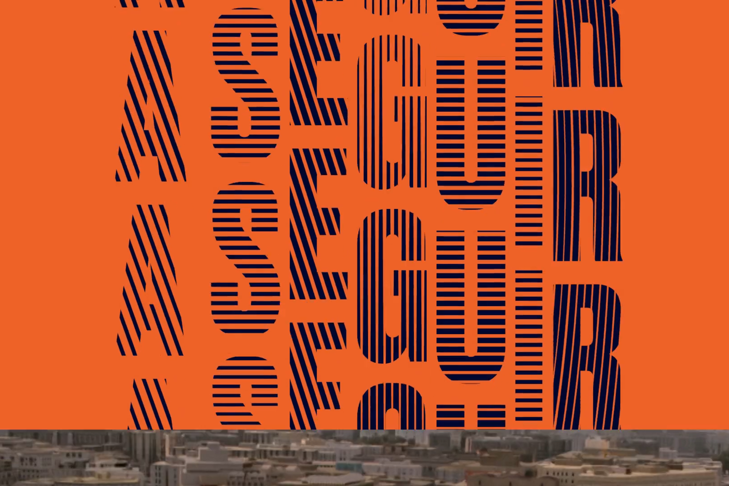


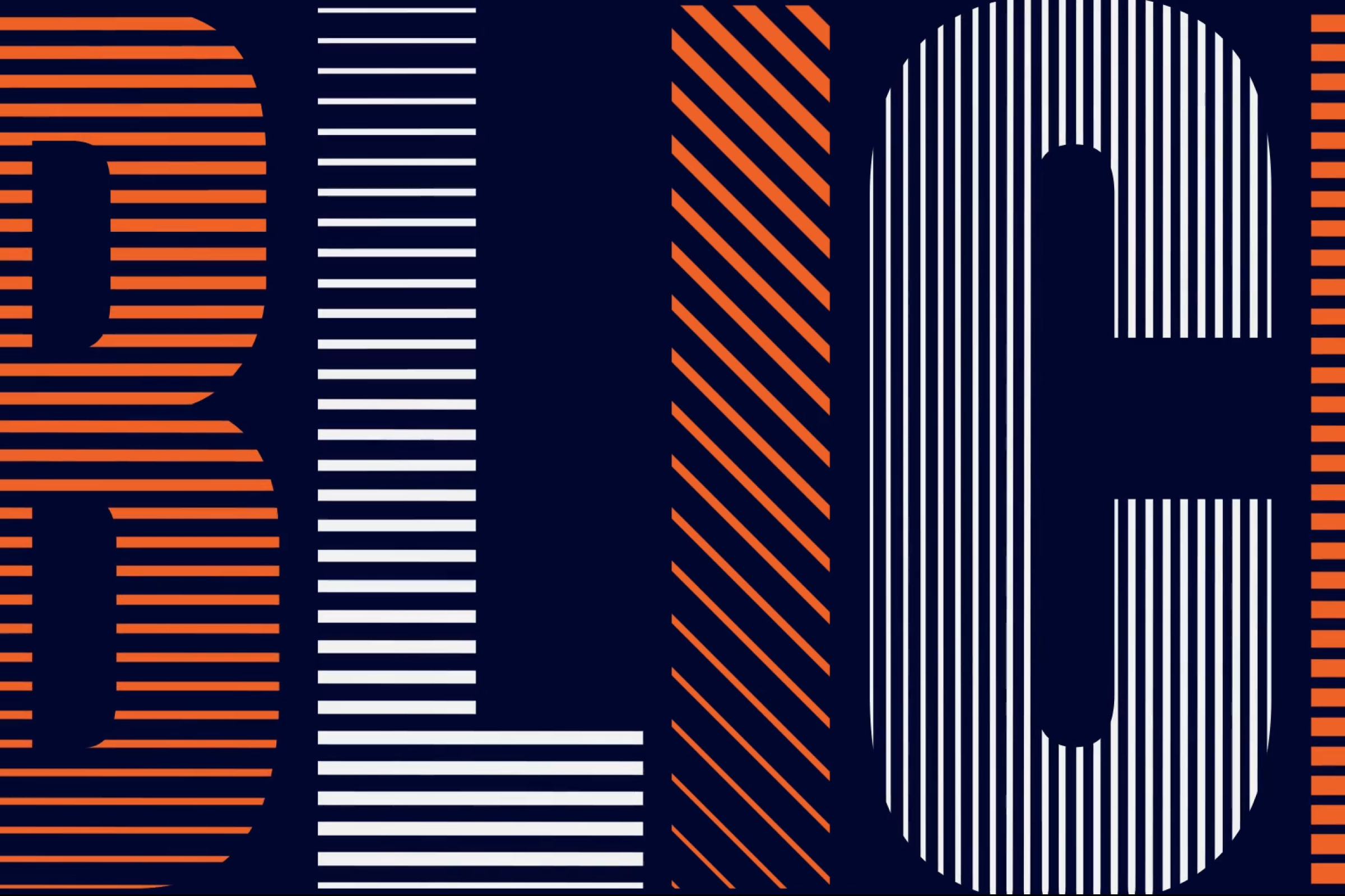
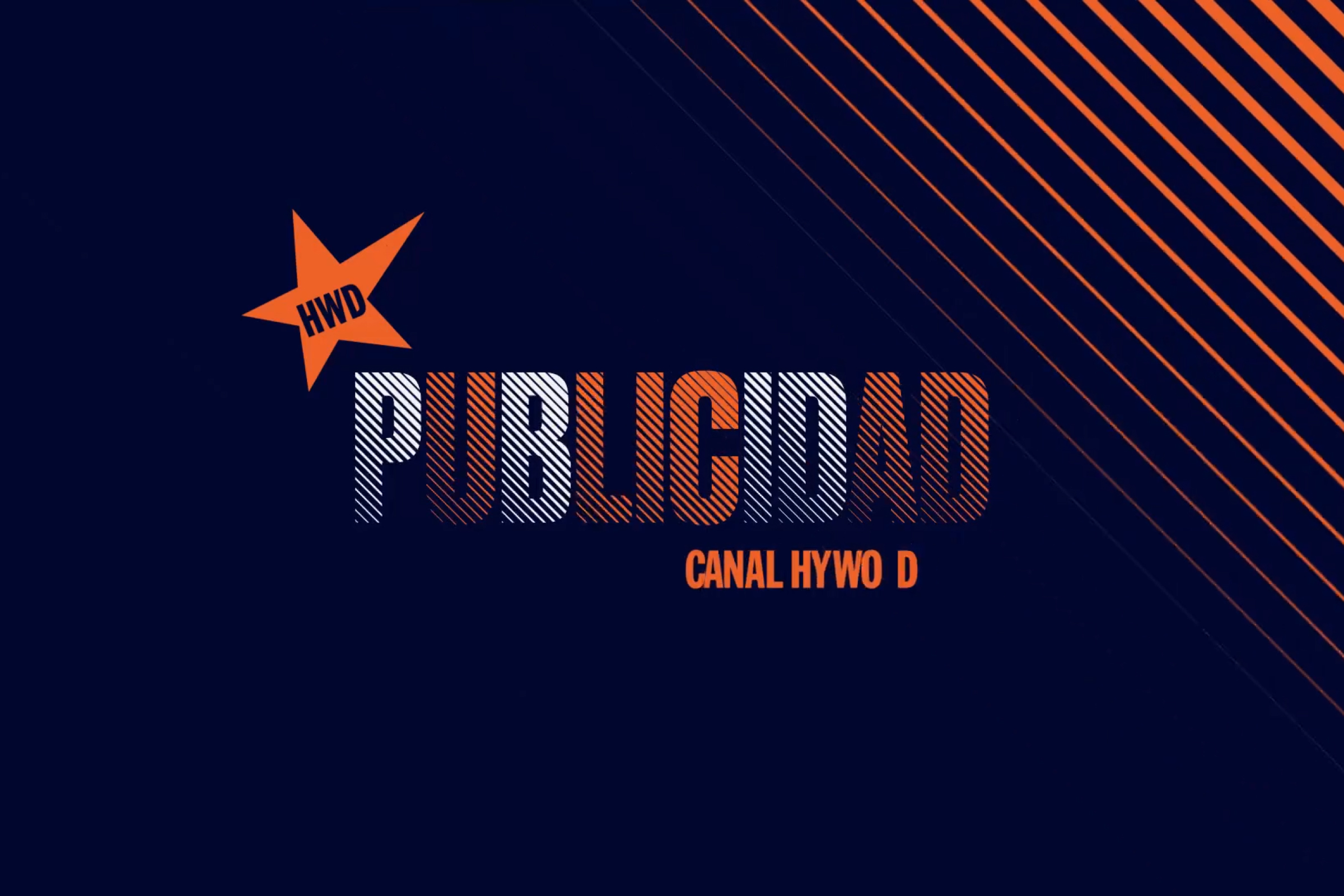
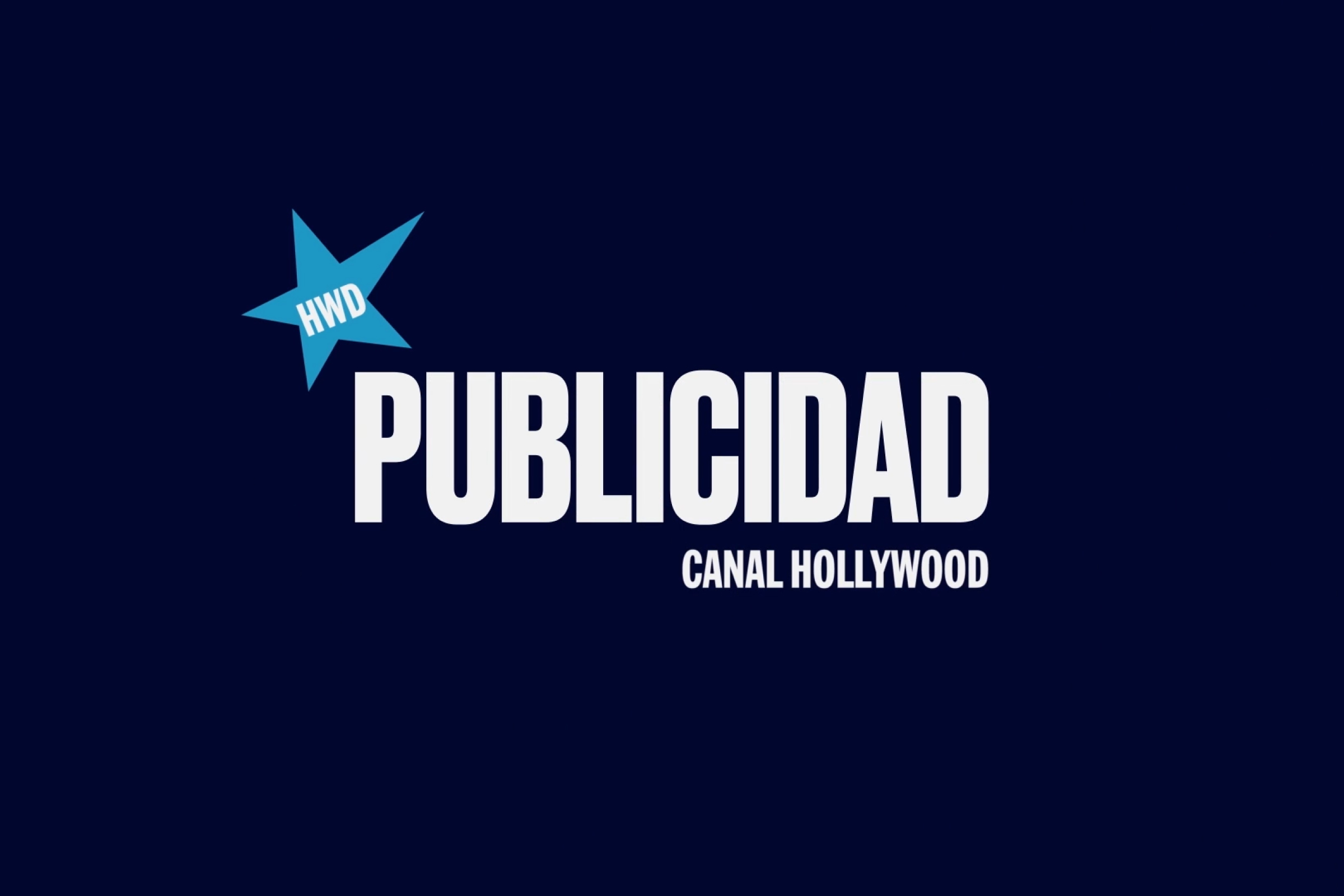
Visual territory exploration for the on- and off-air brand identity of Canal Hollywood, the leading pay-TV movie channel in Spain and Portugal and part of AMC Networks. Building on the identity created by EPS in 2007 and redesigned in 2011, the 2018 restyling sought to revitalize the channel’s visual language—aligning it with the aesthetics of streaming platforms and social media, while staying true to its classic roots. The goal was to connect with a 21st-century audience through a refreshed yet familiar look. / Project developed at EPS. <2018>
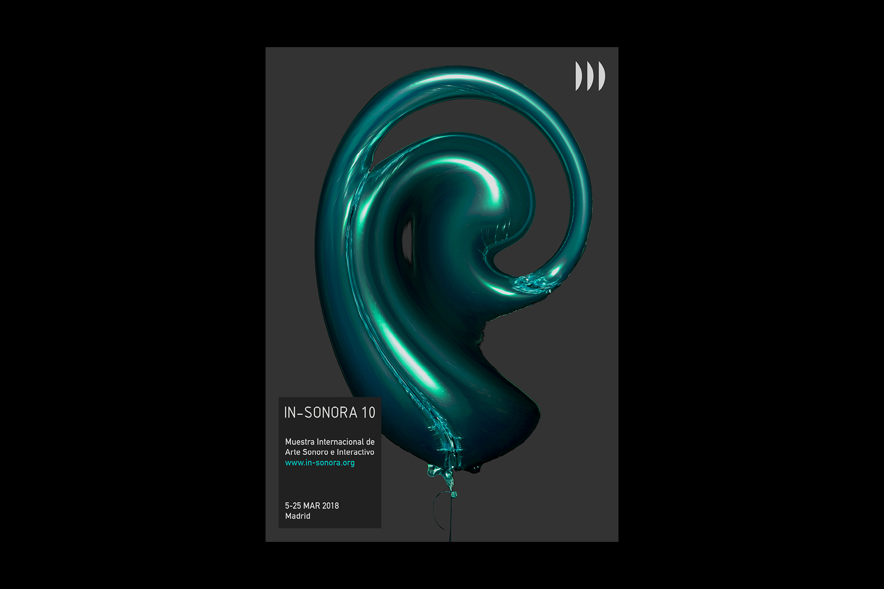
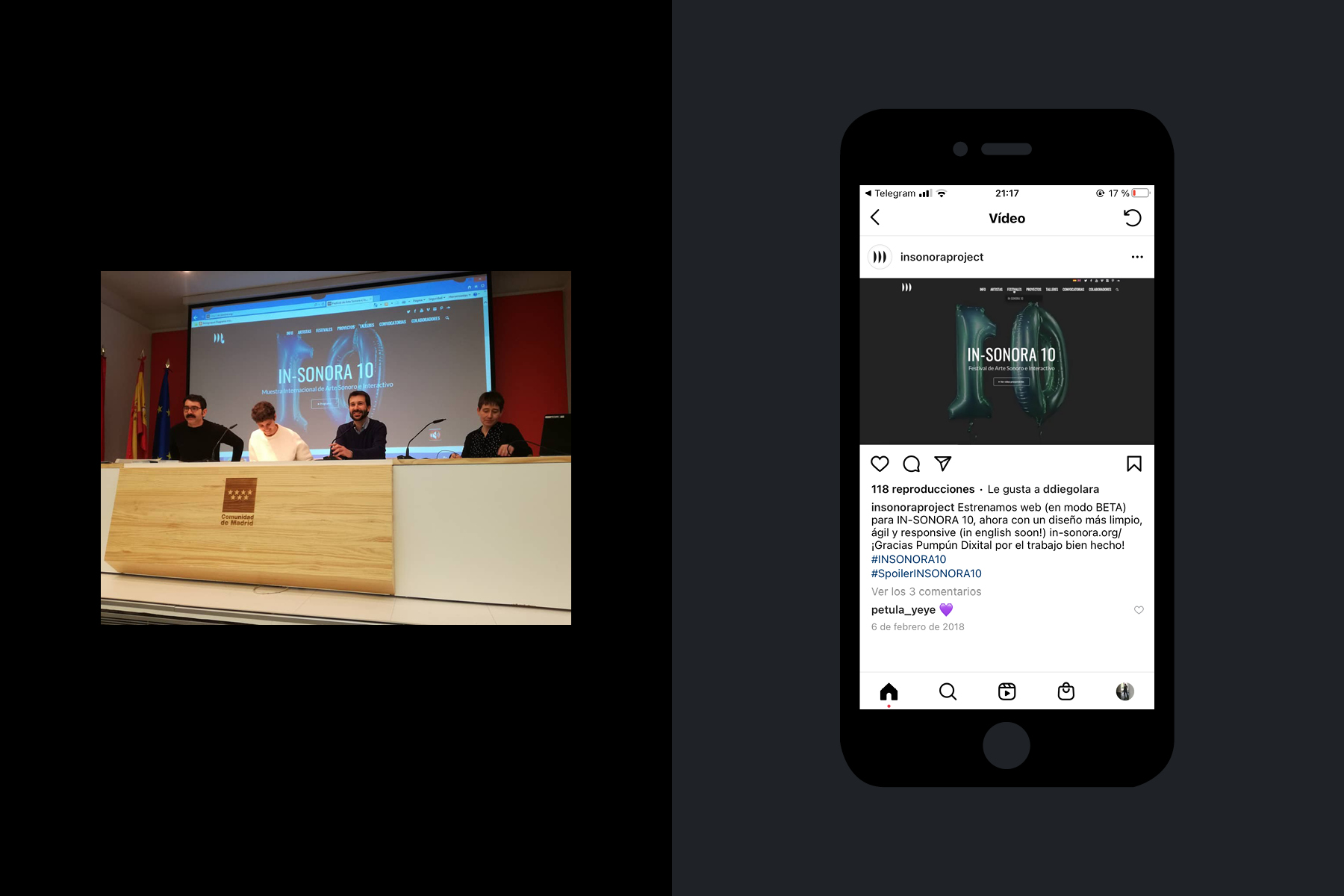
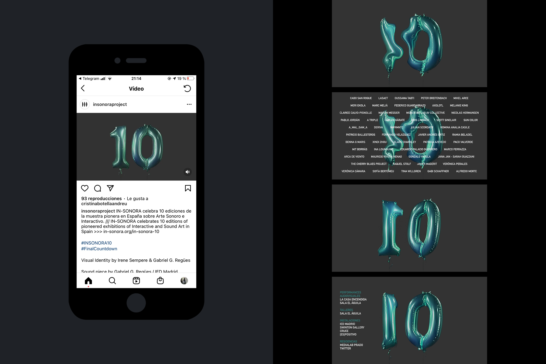
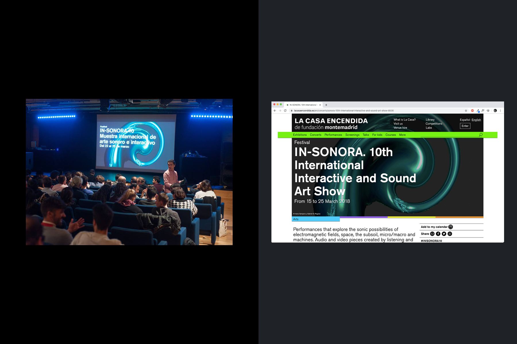
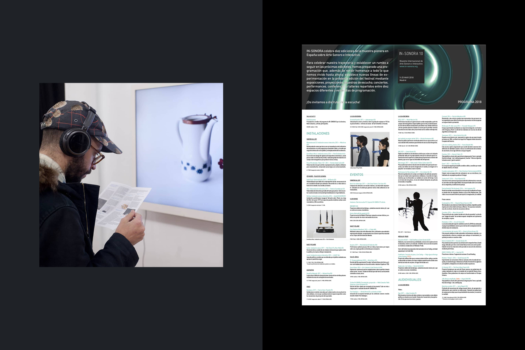
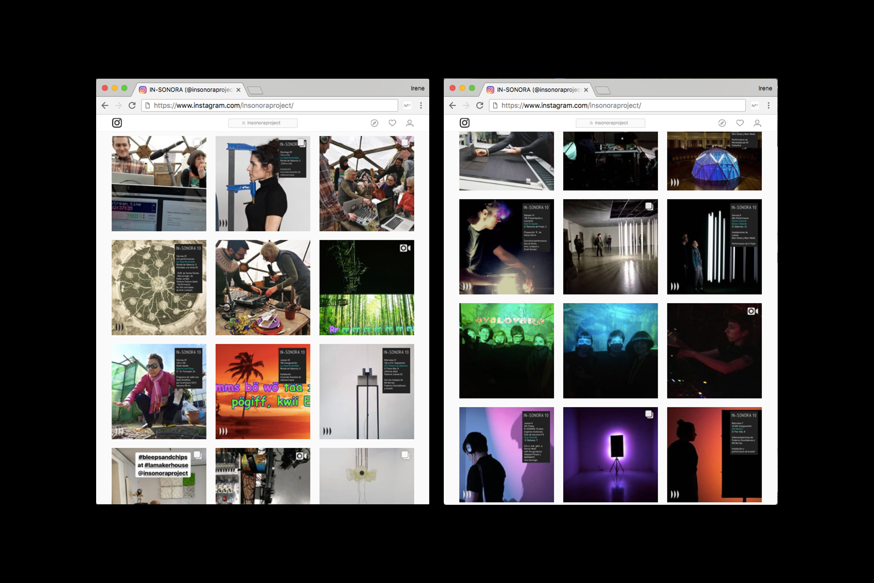
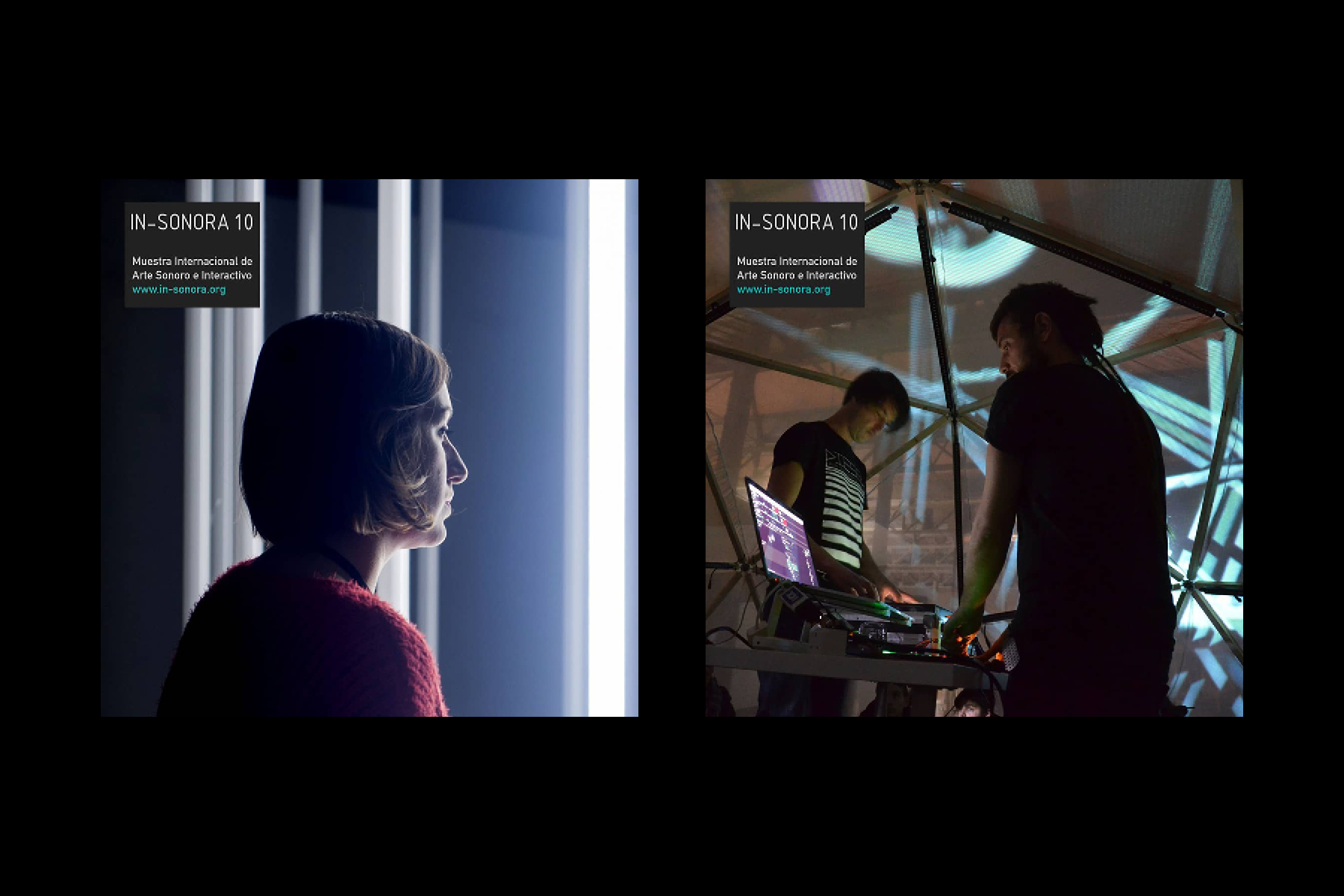
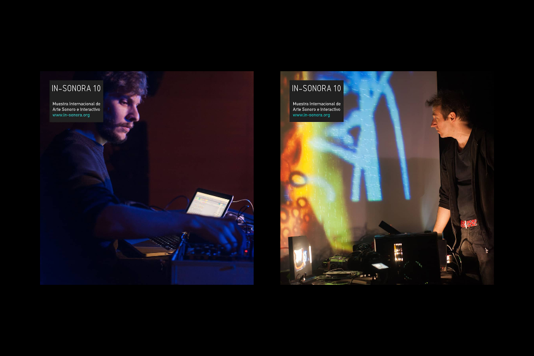
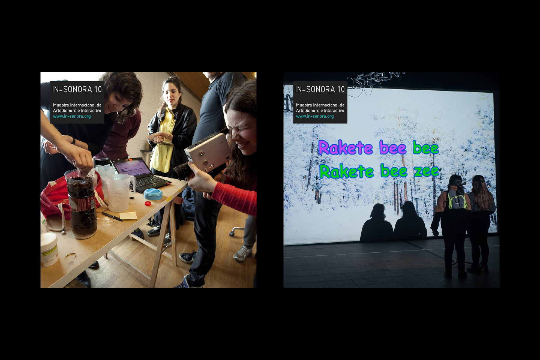
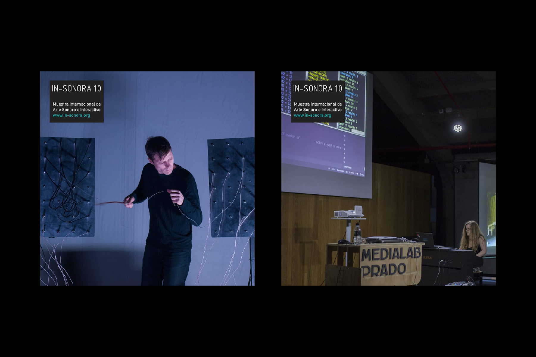
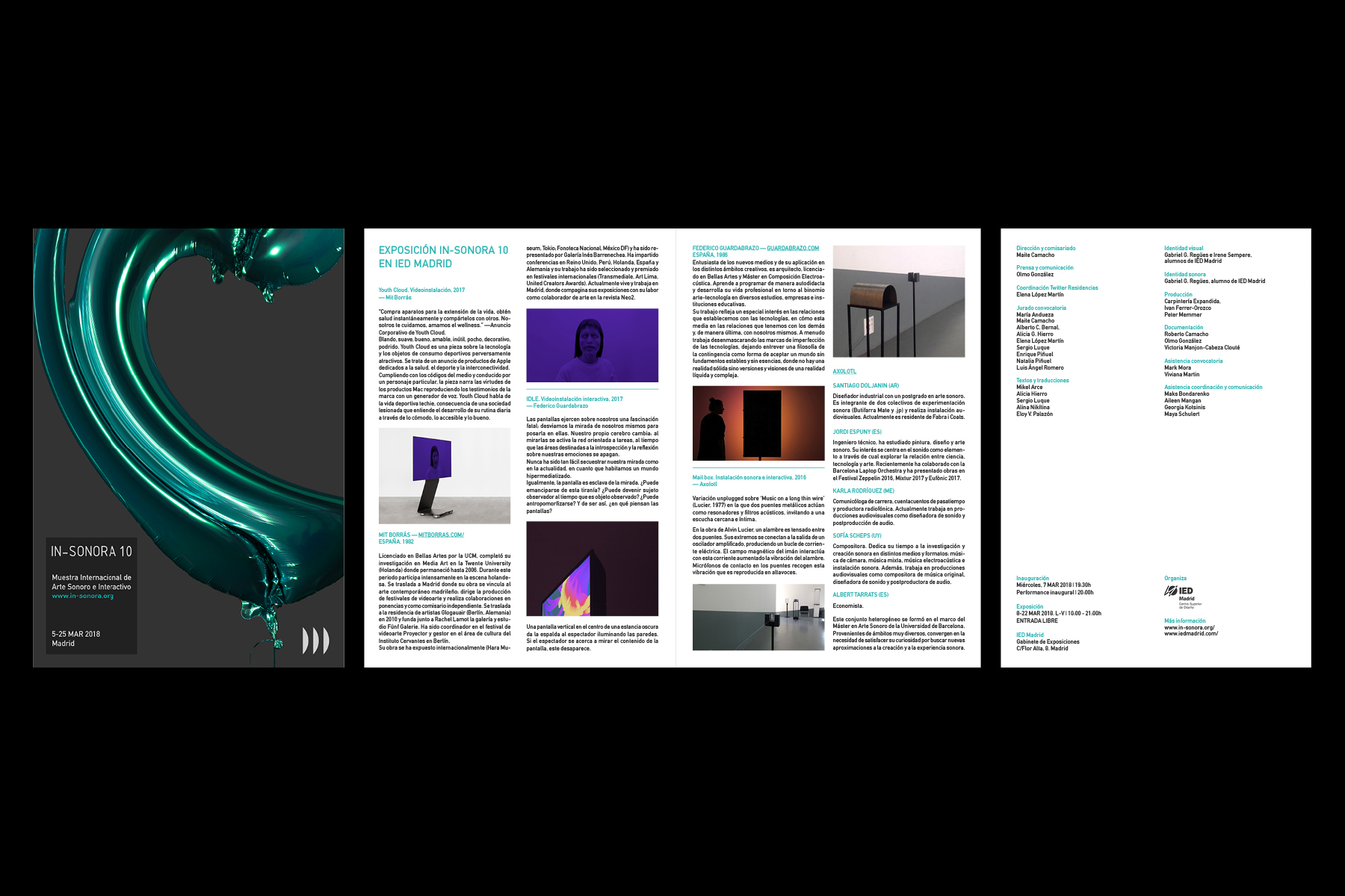
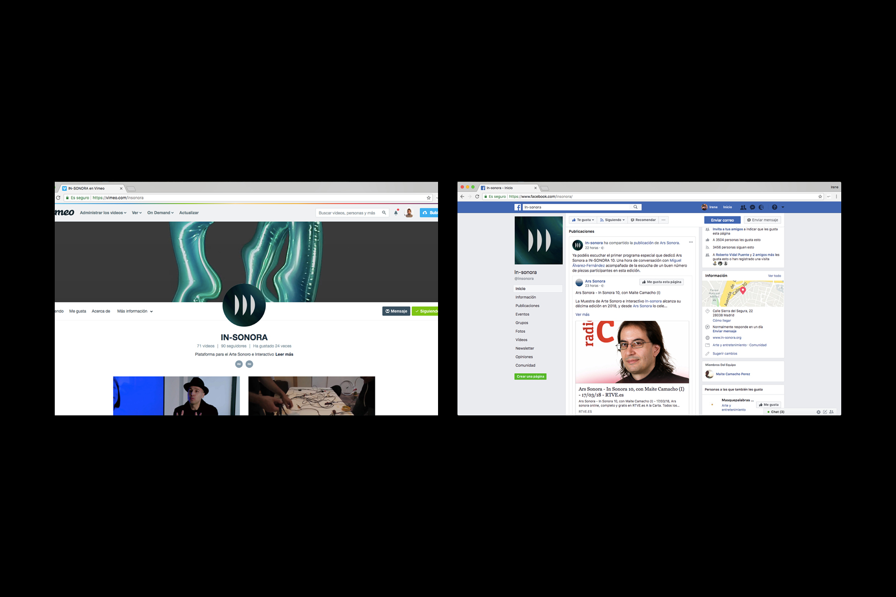
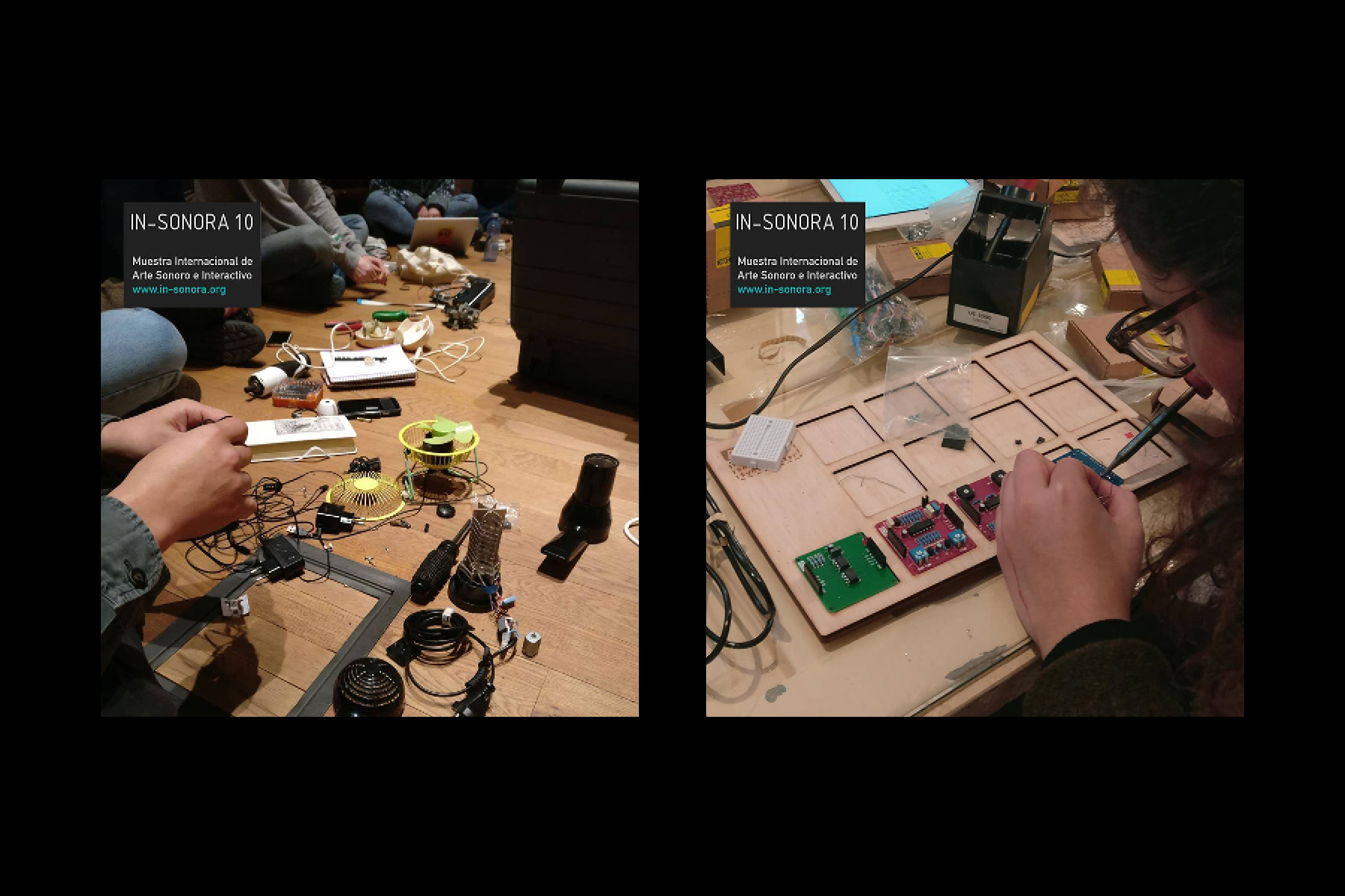
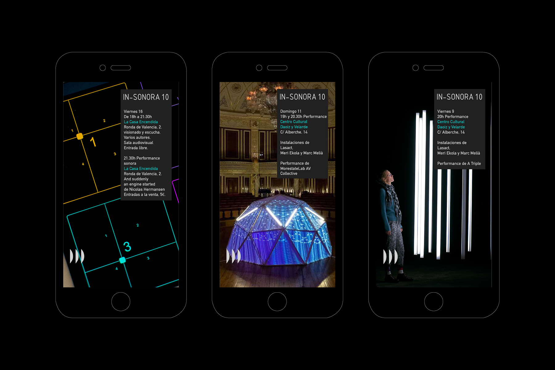
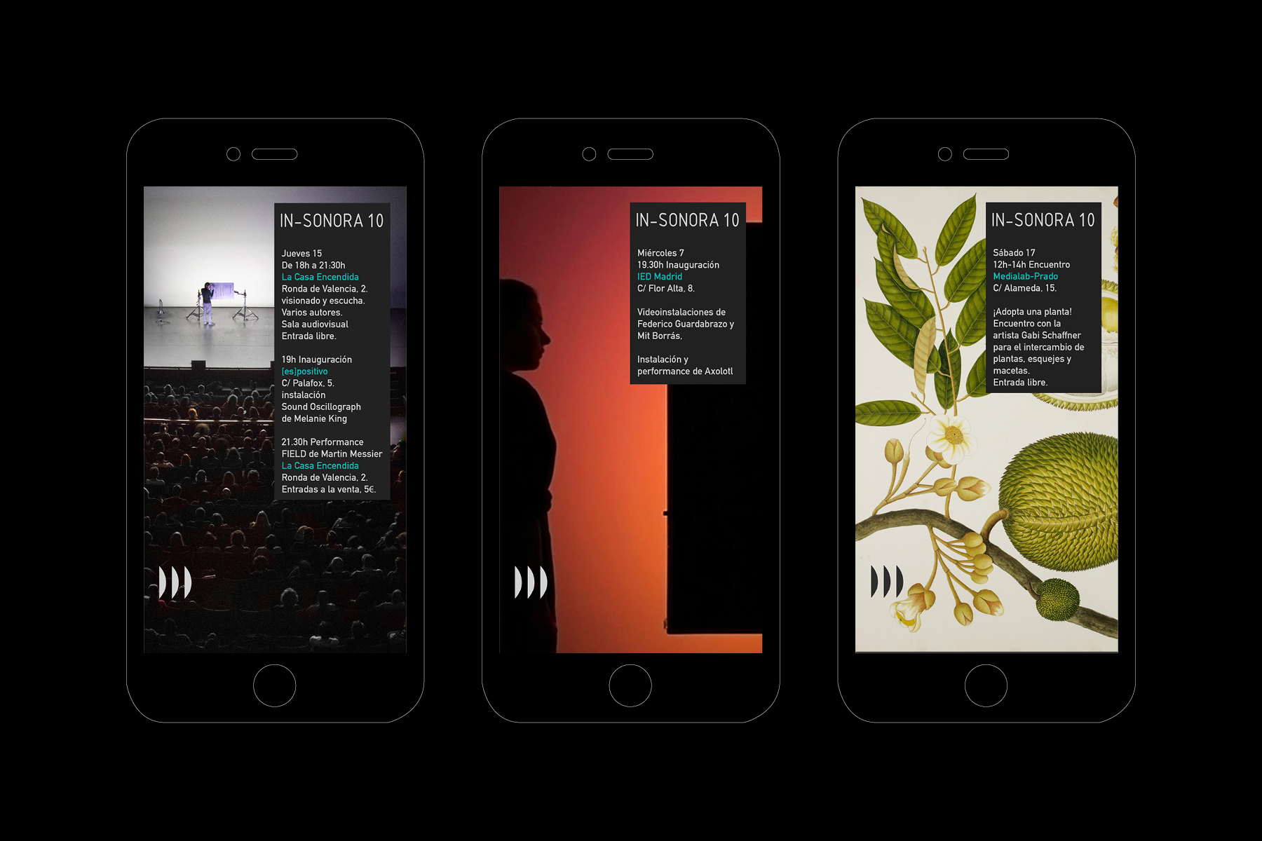
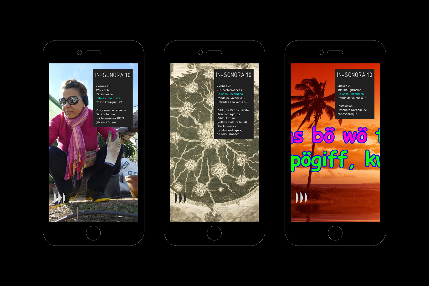
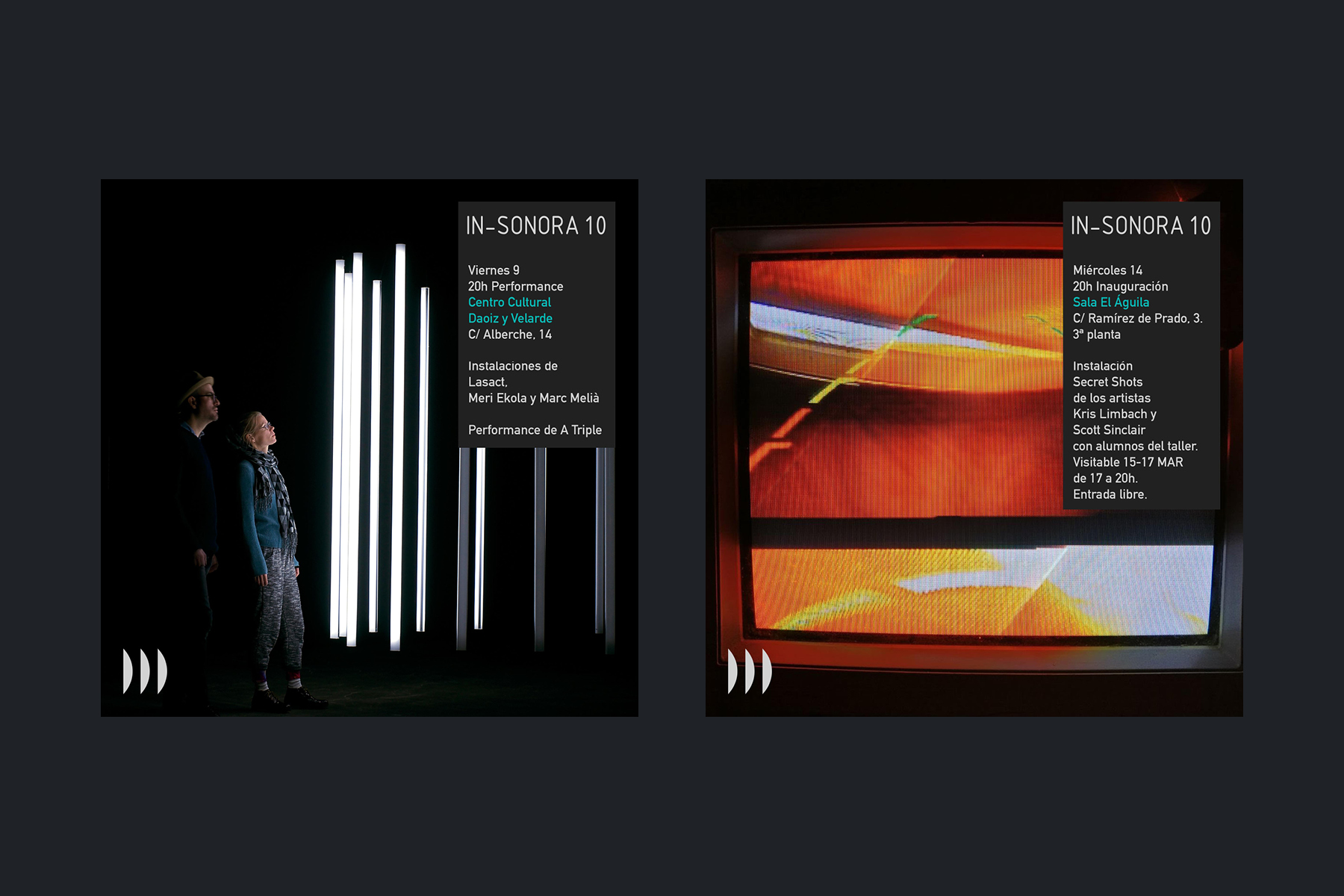
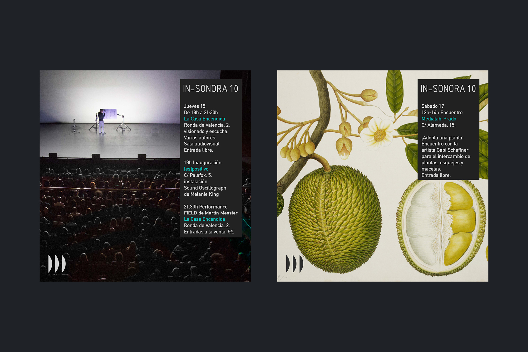
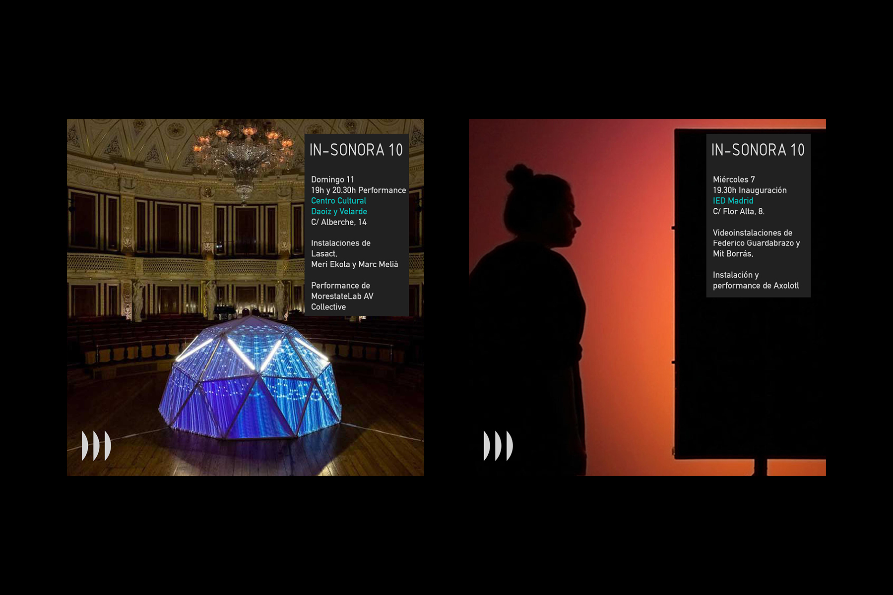
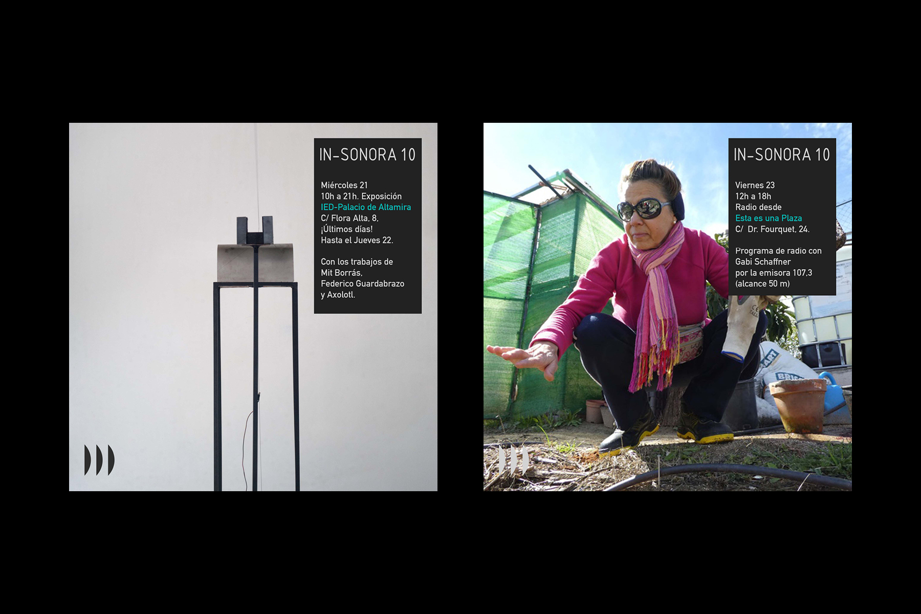
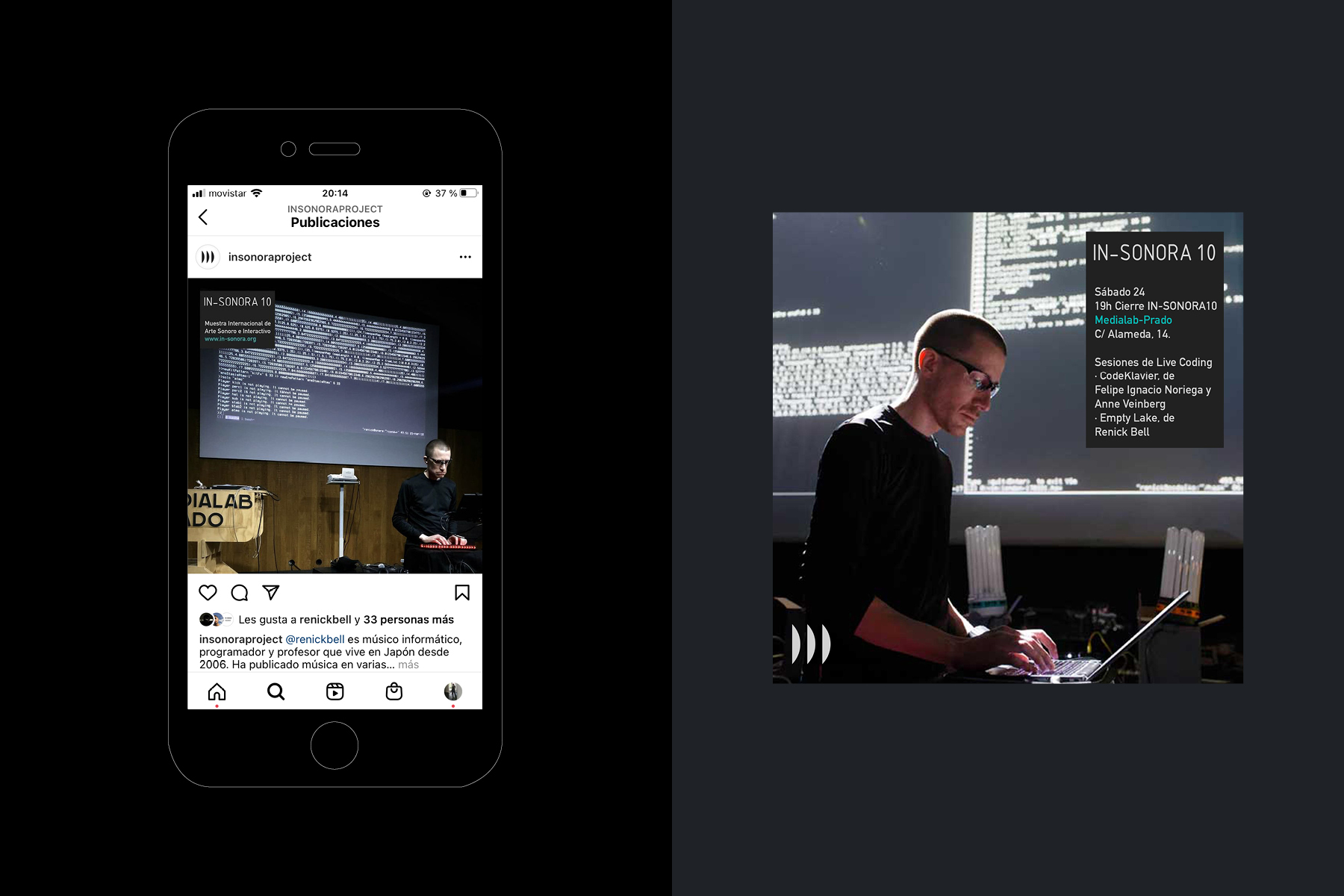
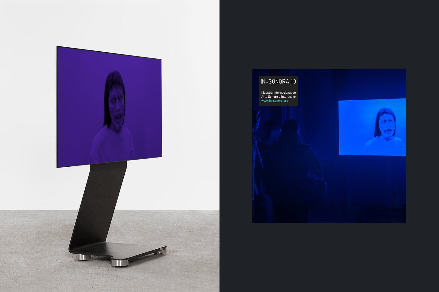
Concept, naming, visual identity, and promotional video for In-Sonora 10, the tenth edition of the international festival of sound and interactive art In-Sonora. The visual and sound identity revolve around the ideas of interaction, celebration, and evolution, reflecting the significant impact the festival has gained over its ten editions and 14 years, both nationally and internationally, without losing its experimental character. / Project developed in collaboration with Gabriel G. Regües. Sound design: Gabriel G. Regües. <2018>
Irene Sempere / ➀ Multidisciplinary designer, strategist, and facilitator based in Madrid. I have worked independently and within design studios, agencies, and interdisciplinary teams on projects spanning branding, visual identity, editorial design, web, user experience, and strategic and service design. I combine my design practice with teaching and cultural work. ➁ Since 2018, I’ve been running Mesa de Mezclas, a project that seeks to collectivize ideas, learnings, and experiences emerging from creative practices. ✷ Feel free to reach out to view my full portfolio or explore potential collaborations.















©2025 Irene Sempere